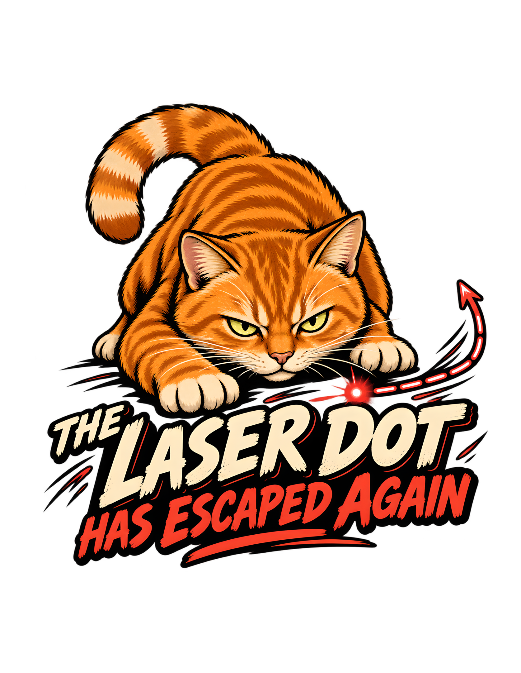
“THE LASER DOT HAS ESCAPED AGAIN” turns one of the most familiar cat-play situations into a tiny criminal investigation. The approved artwork shows an orange cat crouched low with intense focus, one paw stretched forward, while a small glowing red dot sits just beyond capture and a dashed red escape-route line curves away from it. The cat’s expression is serious enough for a high-priority pursuit. The target, of course, is a dot of light.
That contrast is the entire engine of the design. The canonical concept says the cat treats the disappearing laser dot as an elusive suspect that has once again evaded capture. The approved visual concept reinforces that framing with a focused hunting posture, a glowing-dot motif, an arcing escape route, strong motion cues, and bold readable lettering. The final artwork keeps the joke compact: cat, target, pursuit line, and verdict. Nothing else is needed.
Cats Judging Humans adds the editorial layer by treating the chase as a procedural failure on the human side. The cat is prepared. The cat is focused. The cat has clearly identified the suspect. The problem is that the suspect keeps vanishing because the human insists on operating a completely uncooperative red dot. From the feline perspective, this is less “playtime” and more “ongoing containment issue.”
That interpretation is brand humor, not a factual behavioral claim. The source supports only the concept of an orange cat chasing an elusive laser dot and the approved visual evidence in the artwork. The website page should therefore explain why the gag works, how the composition communicates it, and why the design feels unmistakably Cats Judging Humans without inventing product claims, behavioral science, or a backstory that is not present in the source.
The Joke Works Because the Cat Treats a Tiny Dot Like a Serious Suspect
The approved concept takes a trivial target and gives it the weight of a recurring case file. The orange cat is not merely looking toward a spot on the floor. Its body is compressed into a focused crouch, the eyes are narrowed, and one paw reaches forward with the kind of precision normally reserved for something that matters very much. That level of seriousness is what makes the joke readable before the viewer even reaches the words.
The laser dot is tiny. The cat’s commitment is enormous.
That imbalance gives the design its first layer of humor.
The phrase “THE LASER DOT HAS ESCAPED AGAIN” then reframes the visual as a repeated failure of containment. The important word is “again.” It tells the viewer that this has happened before. The cat has history with this target. The target has apparently developed a pattern of evasion. The chase is no longer a one-time incident; it is an unresolved operational problem.
Cats Judging Humans naturally makes the human responsible for that problem. Someone keeps presenting a suspect that can disappear instantly and reappear several feet away. From the cat’s point of view, this is terrible procedural design.
That is editorial framing.
The artwork itself does not show a human, a laser pointer, or any written case file. It does not need to. The cat’s posture, the bright red dot, the escape route, and the phrase already communicate the whole structure. The viewer understands that the cat is taking the situation far more seriously than the object deserves.
That is precisely why the design feels strong rather than random. It begins with a recognizable cat-owner visual, escalates it into a mock pursuit narrative, and lets the cat’s intensity carry the punchline. The joke never requires the cat to look foolish; the cat remains the most competent figure in the composition.
The page can therefore keep returning to one disciplined contrast: the cat is serious, the target is ridiculous, and the human-created system keeps producing the same result. That contrast is broad enough to support long-form editorial analysis without inventing a single extra fact about the chase.
The Orange Cat Becomes a Tiny Predator Without Turning the Scene Aggressive
The cat in the approved artwork is orange, crouched, and visibly intent on the glowing target. The visual concept describes a focused hunting pose, and the finished illustration follows through with a low body position, forward-reaching paw, alert ears, and a concentrated stare.
The design uses predator language, but the tone stays playful.
That distinction matters.
The cat is not shown attacking another animal, threatening a person, or behaving violently. The target is an obviously artificial glowing dot. The pursuit is exaggerated, but it remains harmless. That keeps the image inside the Cats Judging Humans personality: clever, judgmental, slightly superior, and funny rather than hostile.
The orange coat also gives the composition immediate warmth. Against the dark transparent-background framing and the cream-and-red typography, the cat becomes visually dominant without needing extra props. The viewer sees the face and reaching paw first, then notices the glowing red dot, then follows the dashed path away.
That sequence makes the cat feel active even though the artwork is static.
Cats Judging Humans can interpret the pose as complete professional commitment to an absurd assignment. The human has created a target with impossible capture mechanics, and the cat has nevertheless accepted the case.
That is humor.
The approved source does not make a factual statement about orange cats as a group, and the website should not invent one. The orange identity belongs to this design character. It is part of the visual language, not a behavioral diagnosis.
What the design does support is a clear emotional read: serious focus applied to a ridiculous target. The character feels driven and competent without becoming threatening, which is exactly the balance the brand needs.
The cat may look like a predator.
The suspect is still a dot.
The disproportion is the joke.
Visually, this also protects the cat’s dignity. The artwork does not make the orange cat clumsy, frantic, or foolish. The humor comes from the assignment itself, which lets the character stay focused and competent while the human-designed target remains impossible to secure.
The Glowing Red Dot Is Tiny Enough to Make the Cat’s Intensity Funnier
The glowing red dot is one of the smallest elements in the composition, but it is also one of the most important. It sits near the cat’s outstretched paw and burns brightly against the darker base, immediately explaining what the cat is pursuing.
Its scale is essential.
If the target were large or visually complex, the viewer might spend too much time decoding the scene. Instead, the dot is unmistakable and nearly absurd in its simplicity. That leaves all of the dramatic weight on the cat.
The cat crouches.
The eyes narrow.
The paw reaches.
The target is a circle of light.
That is enough.
The dot also creates a strong color relationship with the red lettering below. The lower phrase “HAS ESCAPED AGAIN” uses the same family of bright warm red, visually linking the target to the verbal punchline. The viewer does not need to consciously analyze that connection for it to work. The repeated color simply helps the design feel unified.
Cats Judging Humans can read the dot as the least cooperative participant in the household. It has no respect for boundaries, no interest in capture, and no apparent concern about the amount of feline labor being devoted to the case.
Again, that is editorial humor.
The source supports only the elusive laser-dot concept, not a detailed explanation of how or why it moves. The design wisely keeps the mechanics abstract. The glowing point is enough to activate the viewer’s familiarity with the situation.
Because the dot is so small, it also leaves more room for the cat’s face and paw to dominate the image. The target explains the scenario, but it never competes with the cat for attention.
The cat supplies the seriousness.
The dot supplies the absurdity.
Together they produce the chase.
That balance is one reason the target remains memorable despite its small size. It does not need detail because the cat’s reaction supplies importance. The viewer understands that the dot matters to the cat precisely because everything else in the composition treats it as significant.
The Escape-Route Line Turns Movement Into a Graphic Punchline
The dashed red route curving away from the laser dot is the design’s clearest motion cue. It begins close to the glowing target and bends upward and outward, ending in a directional arrow. That simple graphic device transforms a static image into a pursuit.
The line does more than show direction.
It implies evasion.
The dot is not merely sitting there. It appears to have fled.
That visual choice is what makes the wording “HAS ESCAPED AGAIN” feel earned rather than decorative. The phrase and the route reinforce one another. Without the route, the viewer would still understand the laser-dot reference, but the escape framing would be less immediate. With it, the dot behaves like a suspect leaving the scene.
The cat’s low body angle supports the same direction of travel. The head, eyes, paw, dot, and route all create a left-to-right visual sequence. The eye follows the action naturally.
This is one of the design’s most efficient choices because it adds narrative without adding clutter.
Cats Judging Humans turns the route into mock evidence. The cat had visual contact. The target moved. The human failed to secure the perimeter.
That is brand commentary.
The approved artwork does not label the line, explain its meaning, or surround it with a map. It does not need to. The route is simple enough to remain readable at apparel scale and strong enough to support the chase story.
The route line also acts as a bridge between illustration and typography. Its bright red tone echoes the lower phrase and leads the eye toward the verbal resolution, making the chase feel like one continuous visual sentence.
The viewer gets the joke instantly.
The suspect has escaped.
The pursuit continues.
The route line also prevents the glowing point from reading as a static decorative accent. It gives the target a history of movement and reinforces the idea that the cat is reacting to an escape rather than merely noticing a light on the floor.
The Cat’s Eyes Make the Chase Feel Personal
The cat’s eyes are one of the strongest character details in the approved artwork. They are narrowed and aimed directly toward the glowing dot, creating a concentrated line of attention that pulls the viewer into the chase.
That gaze gives the cat authority.
It also makes the joke feel personal.
This is not random movement. The cat has selected a target.
The expression is serious without becoming angry. There is no open mouth, no exaggerated snarl, and no chaotic panic. The face communicates determination and mild offense, which fits the Cats Judging Humans tone especially well.
The cat looks as though the dot has violated a rule.
That is a very different comedic energy from a cat simply pouncing.
The design’s brand personality depends on that distinction. Cats Judging Humans works best when the cat appears to have standards. Here, the standard is apparently that targets should remain available for capture.
The human has failed to provide that basic service.
That is editorial humor.
The source does not tell us what the cat is thinking. The website should therefore keep thought-language clearly framed as interpretation. What the visual objectively supports is focus, intensity, and direct attention toward the dot.
Those facts are enough.
The eyes lead to the paw.
The paw leads to the dot.
The dot leads to the escape route.
The route leads to the phrase.
The expression gives the brand a clear point of view. A cheerful or startled face would turn the design into generic pet humor. The narrowed, controlled gaze makes the cat look as though standards have been violated.
The cat is not just in the design.
The cat is directing the entire composition.
The gaze is equally important for brand identity because it makes the cat look evaluative rather than merely excited. The cat is not just participating in play. It appears to be assessing a recurring failure that somebody else should probably have solved by now.
The Reaching Paw Freezes the Exact Moment Before Another Failed Capture
One front paw reaches toward the laser dot while the rest of the cat remains compressed in a low crouch. That pose freezes the design at the perfect moment: the cat is close enough that success seems possible, but the phrase tells us the outcome has already gone wrong.
The target escaped.
Again.
That is more effective than showing the cat after the chase is over.
A post-chase pose would make the design feel reflective. The reaching paw makes it immediate. The viewer sees the attempt still happening while reading the verdict that the attempt failed.
This creates a small but satisfying time contradiction.
The body says “capture in progress.”
The words say “case reopened.”
Cats Judging Humans can interpret that as bureaucratic efficiency. The cat is already working the next attempt before the human has even acknowledged the failure of the previous one.
That is humor.
The approved artwork keeps the paw large enough to read clearly, which matters for apparel. The gesture is simple, strong, and central to the chase. It does not rely on tiny anatomy details or subtle motion that would disappear at distance.
The extended paw also gives the cat a strong silhouette.
The viewer can read “cat reaching for dot” even before inspecting the face.
The paw also creates the illusion that the dot is only barely out of reach. That tiny gap makes the repeated escape feel more aggravating and more plausible inside the joke. The cat is not losing by much, which preserves the character’s dignity.
The cat is in motion.
The dot is escaping.
The human is presumably responsible for all of this.
The website does not need to invent anything more complicated.
The reaching gesture also keeps the composition emotionally active. Even without animation, the viewer can imagine the next split second. That implied continuation gives the phrase extra force because the words already tell us the attempt will not conclude as cleanly as the pose suggests.
The Dark Base Lets the Orange Fur, Cream Type, and Red Chase Cue Dominate
The approved artwork is designed for a transparent-background production master, but the illustration itself uses a strong dark structural base behind the lower lettering and around key edges. That near-black mass gives the composition weight and creates high contrast for the cream and red type.
The orange cat also benefits from that contrast.
Warm fur against dark framing becomes immediately readable.
The cream lettering stays bright without needing a white box or poster background.
The red laser cue remains vivid.
The palette therefore organizes the design by function.
Orange establishes the cat.
Cream carries the main verbal statement.
Red carries urgency, motion, and the escaping target.
Near-black holds the system together.
This is very much in line with the broader Cats Judging Humans visual direction, where warm vintage colors and strong dark structure keep humorous concepts readable and commercial without becoming visually noisy.
The source does not require a full brand-logo treatment, and the artwork correctly avoids adding one. The design stands on its own.
Cats Judging Humans can read the palette itself as a hierarchy of evidence. The cat is the authority. The cream phrase is the report. The red dot is the suspect.
That is editorial interpretation.
The same limited palette helps the piece remain recognizably branded even without an official logo. Warm orange, cream, red, and near-black give the design a cohesive Cats Judging Humans character while allowing the artwork to stand alone as a commercial graphic.
Everything points back to the chase.
The artwork feels energetic, but not cluttered.
The palette makes the absurd pursuit look organized.
The cat would probably approve of that part.
The palette is especially effective because every warm accent has a job. Orange belongs to the cat, red belongs to pursuit and failure, cream carries the statement, and near-black creates structure. The result is energetic without becoming noisy or visually scattered.
The Typography Treats a Playtime Problem Like an Official Incident
The phrase is divided into a strong two-part hierarchy. “THE LASER DOT” appears in large cream lettering, while “HAS ESCAPED AGAIN” is emphasized below in red.
That structure mirrors the joke.
First: identify the suspect.
Second: report the failure.
The type is bold, distressed, and highly readable. It feels more like an incident poster or urgent field notice than a casual sentence, which raises the seriousness of the wording and makes the underlying subject even funnier.
The cat is chasing a point of light.
The typography behaves as though a major containment breach has occurred.
That tonal mismatch is exactly where Cats Judging Humans thrives.
The cream upper line is stable and authoritative.
The red lower line feels more urgent and active.
The color shift visually separates the subject from the outcome without requiring extra punctuation, banners, or explanatory text.
The lettering also forms a broad base under the cat, balancing the visual weight of the crouched body above. The phrase is not floating beneath the illustration as an afterthought. It is structurally integrated.
Cats Judging Humans can interpret the wording as an official feline incident report.
That is humor.
The lettering’s distressed surface also matches the illustrated line work, preventing a mismatch between polished type and textured art. Everything feels as though it belongs to the same visual system.
The approved phrase should remain exact because its rhythm matters. “THE LASER DOT HAS ESCAPED AGAIN” is concise, specific, and complete.
The type does not just state the joke.
It gives the joke its institutional tone.
That same hierarchy makes the words easy to scan in the intended order. The eye finds the large cream subject phrase first, then the red outcome. The type therefore performs the joke in sequence instead of simply presenting a block of copy beneath the cat.
The Word Again Gives the Design a Whole Invisible History
The final word is doing far more work than its size suggests.
“Again” tells the viewer that the cat and the laser dot have a history.
There have been previous attempts.
There have been previous failures.
The target has apparently demonstrated a reliable capacity for escape.
None of that needs to be shown.
One word creates the entire invisible backstory.
This is efficient comedy because it lets the viewer supply their own familiarity with the situation. Anyone who recognizes the laser-dot game understands why the pursuit can feel endless. The dot appears, the cat focuses, the dot moves, the cat follows, and the cycle repeats.
The design does not need to explain that sequence.
“Again” carries it.
Cats Judging Humans turns repetition into an indictment of human operations. If the suspect has escaped multiple times, why is the human still using the same containment procedure?
That is editorial humor.
The artwork itself remains focused on one moment, but the phrase expands that moment into a recurring pattern. That gives the design more narrative depth without adding more characters, panels, or props.
That one word also prevents the concept from becoming a single-action gag. The viewer imagines a whole series of prior incidents without being shown any of them. It is a compact narrative shortcut and one of the strongest pieces of writing in the phrase.
The cat is tired of the same failure.
The viewer gets the full implication in seconds.
That is exactly what an evergreen apparel phrase needs: a familiar setup, a compact escalation, and one word that makes the whole thing feel bigger than the scene.
Narratively, “again” also makes the cat’s seriousness more sympathetic inside the joke. If the target has escaped repeatedly, the intense expression feels less like overreaction and more like a professional finally losing patience with an obviously defective operating procedure.
The Composition Keeps Every Important Element Inside One Compact Pursuit Shape
The approved artwork forms a compact vertical silhouette. The cat occupies the upper half, the target and escape route sit close to the reaching paw, and the typography widens beneath the action.
That structure keeps the design visually unified.
The cat is not isolated from the phrase.
The dot is not floating in unrelated negative space.
The route does not wander far enough to become decorative noise.
Everything belongs to the same pursuit.
This is especially important because the concept could easily become too scattered. A literal “escaped suspect” treatment might invite maps, magnifying glasses, case files, evidence markers, or other props. The final artwork avoids all of that.
The joke stays focused.
Cat.
Dot.
Escape.
Verdict.
That economy gives the design a strong silhouette and keeps it legible from a distance.
Cats Judging Humans benefits from the restraint because the brand humor becomes sharper when the cat appears serious and the visual system treats the situation with unnecessary professionalism.
That is editorial interpretation.
The downward widening of the silhouette also gives the design a stable base. The cat’s body carries the action above, while the type spreads outward below, creating a strong centered shape that remains readable without a poster rectangle or environmental background.
The composition also respects the production context. The approved master is a large transparent PNG, so the design needs to function without a rectangular scene behind it.
The cat may have lost the suspect.
The composition has not lost control.
The compact silhouette also makes the design feel complete on its own. There is no need for a framing rectangle, scenery, or decorative border because the cat, route, and lettering already create a unified outer shape that reads as one finished commercial graphic.
The Retro Illustration Style Makes the Chase Feel Like a Classic Incident Poster
The source specifies a retro illustration poster format, and the approved artwork follows through with bold outlines, saturated warm color, distressed lettering, and simplified motion graphics.
That style matters because it changes the emotional tone of the chase.
A photorealistic cat staring at a laser dot might feel like a captured moment.
A retro illustrated cat with oversized type and a graphic escape route feels like a declared event.
The design becomes more emblematic and more theatrical.
That suits the Cats Judging Humans brand because the humor often depends on treating ordinary cat behavior as if it belongs to a larger institutional system. The vintage graphic treatment gives the cat that authority without needing a literal uniform, badge, or costume.
The cat remains a cat.
The world around the cat behaves as though the incident deserves documentation.
That is the joke.
The distressed treatment also prevents the composition from feeling too slick or technical. The laser cue is bright, but the overall design still feels warm and tactile rather than futuristic.
The source does not specify a named historical style or printing process, so the website should not invent one. “Retro illustration” and “distressed graphic treatment” are enough.
The style therefore supports both character and hierarchy. Heavy outlines keep the orange cat crisp, the red motion cue remains visible, and the bold lettering anchors the joke.
The important editorial point is that the style supports exaggeration.
The chase is familiar.
The presentation is grand.
The gap between those two things makes the design funny.
The vintage treatment gives the incident a sense of official permanence that ordinary play does not deserve. That mismatch is useful because it lets the design exaggerate importance without adding dialogue, labels, or other explanatory devices that would slow the punchline down.
The Artwork Avoids a Full Scene So the Pursuit Stays Instantly Readable
There is no room interior, no couch, no hallway, no human, and no visible laser pointer in the approved artwork.
That absence is a strength.
The design does not need a realistic setting because the core behavior is already universally legible. A crouching cat, a red dot, and a route line are enough to communicate the scenario.
Removing the environment also makes the cat more dominant.
The viewer does not spend time deciding where the chase is happening.
The only question that matters is whether the cat will catch the target.
The answer is already in the phrase.
No.
It escaped again.
Cats Judging Humans can interpret the missing human as especially appropriate. The human created the problem, but the cat is the one doing the work.
That is editorial humor.
The source supports a simple setting and compact composition, not a detailed domestic environment. The website should therefore celebrate the design’s economy rather than invent a room around it.
Minimal setting also leaves the viewer free to project the joke into their own home. The cat could be in a living room, hallway, bedroom, or anywhere else the game happens. The absence of a specific room makes the concept more reusable and more universal.
That narrow focus gives the image speed.
The viewer sees the cat.
The viewer sees the dot.
The viewer reads the phrase.
The joke is complete.
Anything more would be evidence the cat did not request.
By excluding a literal room, the design also avoids tying the gag to a specific household. The chase becomes portable. Any viewer who recognizes the behavior can mentally place it in their own home, which makes the editorial joke more immediate and reusable.
The Approved Production Master Locks the Visual Facts of the Design
The canonical source identifies an immutable approved production master for CJH-000026. It is a PNG asset with transparency, recorded at 6200 by 8000 pixels, and its metadata states that aspect ratio was preserved during local high-resolution processing.
For the website, that makes the approved artwork the visual authority.
The orange cat, low hunting crouch, narrowed eyes, reaching paw, glowing red dot, dashed escape route, and exact phrase are not suggestions to reinterpret. They are the facts of the finished design.
That matters because a long-form editorial page can easily drift into describing a concept rather than the actual asset.
This page should not.
The approved image is specific.
It does not contain a human.
It does not contain a room.
It does not contain a laser pointer.
It does not contain a logo.
It does contain the cat, the dot, the route, and the phrase.
Cats Judging Humans can expand the meaning around those elements, but it should not invent new visual evidence.
The approved master also preserves a generous safe margin, which reinforces the compact silhouette and keeps the important cat, route, and wording away from the edges. That is a production fact from the source, not a promise about any marketplace item.
The production metadata is also not a basis for product-performance claims. File dimensions and transparency are asset facts. They do not authorize statements about garments, materials, print durability, shipping, availability, or marketplace quality.
The cat’s target may be elusive.
The website’s visual source should not be.
The approved master also establishes a useful editorial boundary. The page may analyze what is visible and what the source explicitly says, but it should not infer printing characteristics, garment outcomes, or marketplace performance from production metadata that was never intended to support those claims.
The Design Is Evergreen Because the Chase Needs No Season, Trend, or Context
The canonical source marks the concept as evergreen.
The approved artwork supports that classification.
Nothing in the image depends on a holiday, season, current event, meme format, or temporary trend. The joke is built around a familiar cat-play scenario and a simple human observation: the cat takes the chase seriously even though the target is absurdly intangible.
That structure is durable.
The design does not need a date.
It does not need a cultural reference.
It does not need a specific platform.
The viewer only needs to recognize the situation.
Cats Judging Humans adds the brand layer by imagining the cat’s frustration as a recurring human systems failure. The target is unreliable. The human keeps reintroducing it. The cat keeps accepting the assignment.
That is editorial humor.
The evergreen quality also comes from the phrase itself. “THE LASER DOT HAS ESCAPED AGAIN” is specific enough to be funny but broad enough to remain understandable whenever the viewer encounters it.
There is no extra wording that could age badly.
Evergreen does not mean generic here. The concept remains specific to laser-dot play, but the behavior is familiar enough that the design does not require a momentary trend to explain it.
The visual language is similarly self-contained.
Orange cat.
Red dot.
Escape route.
Bold verdict.
The concept works because the behavior is familiar, the exaggeration is clear, and the joke does not rely on outside context.
The suspect may keep moving.
The design does not need to.
That evergreen quality is also strengthened by the absence of topical references. The design does not need a meme format, a celebrity, a holiday, or a dated cultural cue. The joke is built entirely from a recurring cat-owner scenario and a dry reinterpretation of it.
The Joke Speaks to Cat Owners Without Needing to Explain the Game
One reason the design works so quickly is that it assumes the viewer understands the basic setup.
There is a cat.
There is a red dot.
The cat wants the dot.
The dot refuses to cooperate with normal capture rules.
That familiarity lets the design skip exposition and move directly into character.
The cat is not merely interested.
The cat is conducting a pursuit.
The phrase elevates that pursuit into a recurring incident.
Cats Judging Humans uses that recognition to shift the joke toward human responsibility. The person operating the dot may think they are providing entertainment. The cat may have a different interpretation: somebody keeps releasing the same fugitive into the house.
That is editorial humor.
The website should avoid turning that recognition into unsupported behavioral science. The source does not make claims about why cats respond to laser dots, how they perceive them, or what play practices are appropriate. None of that belongs here.
Audience recognition also allows the brand voice to stay dry. The page does not need to shout that laser-dot play can look dramatic in the moment; the viewer already understands the visual exaggeration. The cat’s expression delivers the rest.
The design is about the joke.
The audience recognizes the scenario.
The cat supplies the authority.
The human becomes the invisible operator of a deeply flawed system.
That is enough to make the concept feel personal without overexplaining it.
Recognition does the work.
The cat handles the judgment.
For readers, that familiarity creates instant participation. They do not need to be told what a laser-dot chase looks like because the visual grammar is already recognizable. The website can therefore spend its space on interpretation rather than explaining the basic mechanics of the scene.
The Design Fits Cats Judging Humans by Making Human-Run Play Look Like a Containment Failure
The strongest Cats Judging Humans designs usually take an ordinary human-cat interaction and shift the authority toward the cat.
That is exactly what happens here.
The human believes this is play.
The cat appears to be running an operation.
The dot escapes.
The cat has evidence.
The human is responsible for the equipment.
The phrase does not accuse the cat of failing. It reports that the target escaped.
That distinction is important.
The cat remains competent.
The system is defective.
That is classic Cats Judging Humans logic.
The official brand voice is dry, clever, sarcastic, judgmental, playful, and slightly superior without becoming cruel. The approved artwork fits that balance because the cat’s seriousness is funny rather than threatening.
The design never needs to show the human being mocked directly.
The human is judged through implication.
Someone keeps releasing the same impossible target.
Someone has apparently learned nothing.
The cat, meanwhile, remains focused.
That is editorial interpretation grounded in the concept.
That final alignment between cat authority and human responsibility is what makes the design more than a generic funny-cat image. The cat is not merely chasing something. The cat is conducting an operation that the human has once again failed to support properly.
The canonical source confirms the central idea: an orange cat treats the vanishing laser dot like a suspect that has escaped custody yet again.
The final artwork compresses that into one clean visual system.
The cat has a case.
The dot has escaped.
The human may wish to review procedure.
Most importantly, the design preserves the brand’s hierarchy: the cat remains the evaluator, the human remains the invisible source of questionable procedure, and the joke lands without cruelty. The feline authority feels earned because the artwork never asks the cat to surrender composure.
“THE LASER DOT HAS ESCAPED AGAIN” succeeds because it never overcomplicates the behavior it is parodying. The approved artwork gives the viewer exactly what is needed: a focused orange cat, a low hunting crouch, narrowed eyes, a reaching paw, one glowing red target, a dashed escape route, and a bold two-part phrase that turns the whole scene into a recurring incident report.
The cat’s seriousness is the character.
The dot’s insignificance is the absurdity.
The word “again” supplies the history.
The route line supplies the motion.
The typography supplies the authority.
Together, those elements turn a familiar playtime moment into a compact Cats Judging Humans story about competence, pursuit, and a human-operated system that keeps releasing the same suspect.
The website page should preserve that balance. It can explain why the visual hierarchy works, why the retro treatment strengthens the gag, why the absence of a full scene keeps the concept immediate, and why the phrase feels evergreen. It should not invent behavior science, product claims, or visual details that are not present.
The final strength is proportionality. The design is dramatic enough to make the pursuit feel official, but simple enough that the viewer understands the joke in seconds. Nothing competes with the cat, the target, or the phrase.
The cat has already made the report.
The laser dot escaped.
Again.
Further questions should probably be directed to the human responsible for containment.