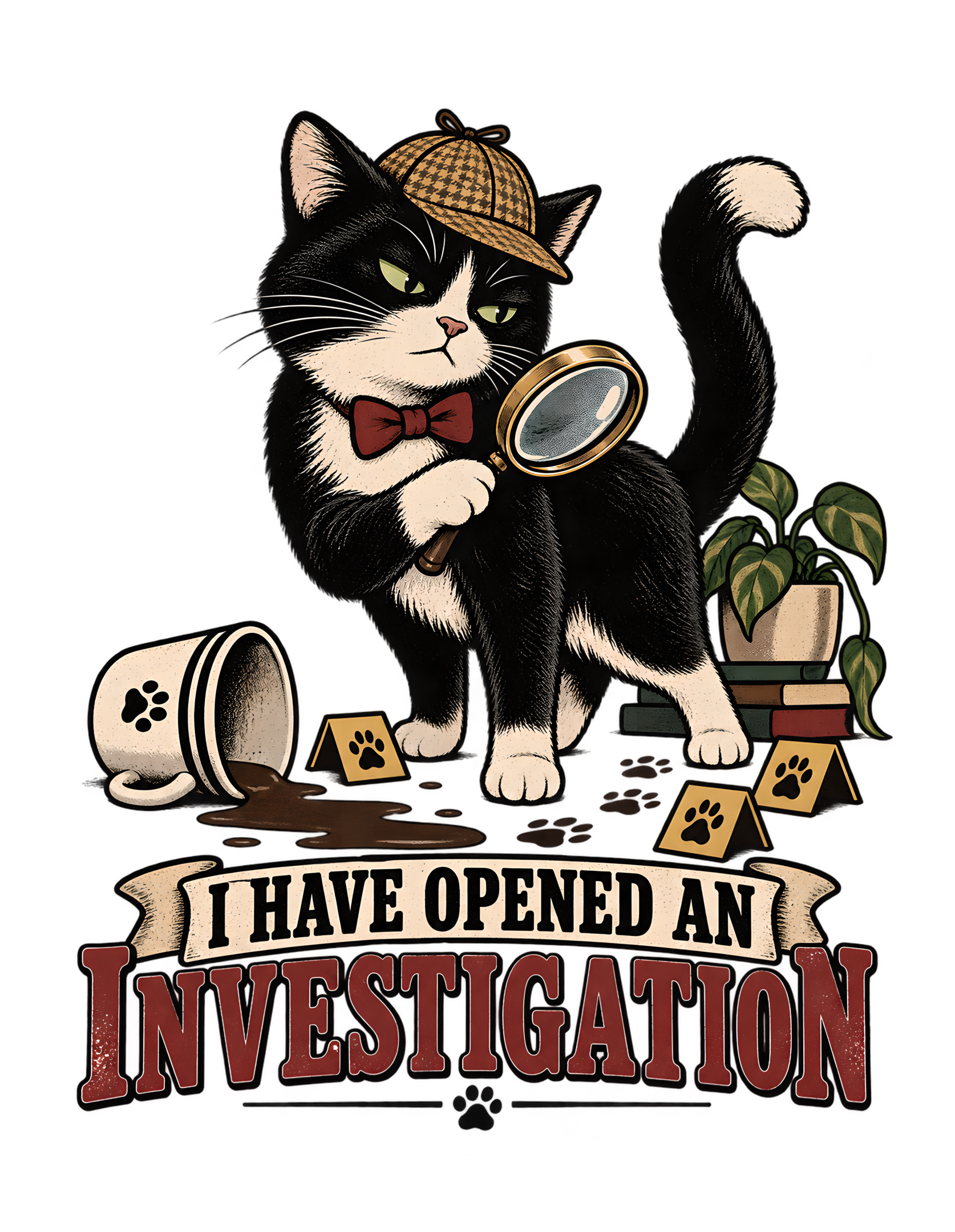
“I HAVE OPENED AN INVESTIGATION” takes one tiny domestic disturbance and gives it the procedural weight of a formal case. The canonical concept is simple and strong: a tuxedo cat stands alert beside a tipped cup, a small magnifying-glass motif, and a few paw-print evidence markers, staring toward the viewer as though an ordinary household noise has triggered a full inquiry. The approved visual direction is a vintage screen-print document parody, which means the cat’s suspicion is presented not as a passing reaction but as something structured, documented, and apparently authorized.
The joke works because the design never needs a dramatic event. A minor household incident is enough. That low-stakes trigger creates room for exaggerated seriousness. The cup is tipped, but the scene is not catastrophic. The cat is suspicious, but not panicked. The evidence markers are playful, not threatening. Everything about the setup says that the response is much more official than the problem deserves.
The Cats Judging Humans point of view sharpens the reversal. Humans normally believe they investigate unexplained noises and question the cat. This design changes the reporting structure. The cat opens the investigation, the cup becomes evidence, and the human becomes the likely person of interest. The marketplace description supports that exact reading by saying the tuxedo cat turns a minor household incident into a full investigation and seems to have already identified the human as a person of interest.
This page stays within the canonical source and approved artwork direction. It does not invent who tipped the cup, what caused the noise, where the incident happened, or whether the cat is secretly responsible. The unresolved cause is part of the comedy. The design is strongest when feline certainty outruns the available facts and the human realizes that procedure has already begun without their consent.
The Joke Begins When a Minor Household Noise Becomes a Formal Case
The central comic engine is the gap between the size of the event and the scale of the response. The source does not describe a dramatic emergency. It describes an ordinary household noise or minor incident. That matters because the design’s humor depends on feline overclassification. The event itself is small; the cat’s procedure is enormous.
A human might hear a clatter, notice a tipped cup, and move directly toward a practical solution. Pick it up. Check whether anything spilled. Continue with the day. The tuxedo cat rejects that entire workflow. The event has already become a case. Inspection is required. Evidence has been marked. Suspicion has been directed toward the human. The household has entered an investigative phase.
That shift from reaction to procedure is what makes the concept more specific than a generic “cat knocked something over” joke. The cat is not simply present near disorder. The cat is defining what the disorder means. This is a jurisdiction joke disguised as a household joke.
The source concept summary is unusually concise: the cat treats an ordinary household noise as a serious incident requiring immediate inspection and formal suspicion of the human. Each piece supports a different layer of the design. “Ordinary” keeps the trigger recognizable. “Serious” creates the comic inflation. “Inspection” gives the cat a role. “Formal suspicion” turns the viewer into the human under review.
Cats Judging Humans is particularly well suited to this kind of reversal because the brand repeatedly gives cats authority over human behavior. The humans may own the furniture, pay the bills, and believe they establish the rules, but the cat controls interpretation. Here, interpretation becomes procedure.
The tone also remains gentle because the incident is trivial. Nobody is endangered. Nothing in the source suggests a real crisis. The absurdity comes entirely from bureaucracy applied to something that does not need bureaucracy.
That is why the design feels dry rather than chaotic. The cat is not escalating emotionally. The cat is escalating administratively.
The human may think the matter is closed.
The cat has opened a file.
The same mechanism also explains why the concept can carry a long-form page without becoming complicated. The incident itself stays tiny, so the editorial interest comes from escalation, hierarchy, and point of view rather than from inventing more plot. That keeps the page faithful to the source. It also preserves the brand’s preferred tone: the cat does not need chaos to establish superiority. A single ordinary noise is enough to trigger a complete change in jurisdiction, and the human learns about that change only after the process is already underway.
The Tuxedo Cat Investigator Carries the Authority Before the Evidence Is Explained
The tuxedo cat is the visual center of the concept, and the role works because the cat appears composed rather than startled. The source describes the cat standing alert beside the tipped cup and staring toward the viewer like an investigator who already suspects someone. That outward suspicion is essential. The cat is not asking what happened. The cat is behaving as though the relevant question is who will be held accountable.
The black-and-white tuxedo pattern also creates a naturally high-contrast figure within a vintage graphic composition. That is a visual design observation, not a behavioral claim about tuxedo cats. The artwork assigns the investigator role creatively. The coat pattern simply helps the figure read clearly and supports the composed, official tone.
Expression matters more than costume here. The cat does not need a trench coat, detective hat, or elaborate office to communicate authority. The role is established through stance, gaze, context, and supporting investigative motifs. That restraint keeps the character recognizably feline instead of turning the design into a human character wearing a cat face.
The marketplace description deepens the reading by saying the cat seems to have already identified the human as a person of interest. That sentence tells us how the stare functions. It is not general curiosity. It is directed suspicion.
Cats Judging Humans works best when feline authority feels self-evident. The cat does not need to explain why it has jurisdiction. The viewer understands that the cat has simply assumed it. That assumption is funnier than a literal badge or job title because the authority seems to come from personality rather than credentials.
The character’s calmness also keeps the joke from becoming hostile. A furious cat would make the scene feel accusatory in a harsher way. A calm investigator feels theatrical. The cat looks like it expects cooperation because cooperation is obviously the correct response.
The human, meanwhile, has not even been shown.
That absence lets the stare land directly on the viewer.
Whatever happened, the investigator would like a statement.
Preferably without unnecessary human commentary.
That composure also makes the cat visually compatible with the document-parody framing. The surrounding design can look official because the central character behaves as though official treatment is deserved. A frantic expression would fight the structure. A composed expression supports it. The result is a useful alignment between character and graphic system: both communicate certainty. The human may still question the evidence, but nothing in the cat’s presentation suggests that the question will affect the investigation’s schedule.
The Tipped Cup Is Evidence, but It Never Solves the Mystery
The tipped cup is one of the most efficient choices in the entire visual concept. It establishes that something happened without establishing who caused it. That ambiguity keeps the design funny.
The source does not tell us the cat tipped the cup. It does not say the human tipped it. It does not identify what was inside, where it stood, what exact noise occurred, or whether the cup was damaged. Those omissions are useful boundaries, not missing information that needs to be filled.
The cup works because it is ordinary. Viewers do not need context to understand that a tipped household object is out of place. It is enough to justify attention while remaining too minor to justify a full investigative apparatus.
That ratio is perfect for Cats Judging Humans. The evidence is small. The confidence is enormous.
If the scene showed a major disaster, the cat’s procedural seriousness might become reasonable. If nothing were visibly wrong, the investigative framing could feel disconnected from the image. The tipped cup creates the middle ground where the cat has a reason to inspect but no reason to behave as though a formal case has begun.
That makes the cup more than a prop. It is the bridge between ordinary domestic life and the invented feline bureaucracy.
It also preserves a useful tension between the viewer and the investigator. The viewer can still imagine several explanations. The cat appears to have narrowed the possibilities already.
That tension is where the joke lives.
In visual storytelling terms, the cup is evidence. In household terms, it may simply need to be stood upright. In feline procedure, however, it has already crossed into Exhibit A.
The cat does not need the mystery solved immediately.
An open case has advantages.
Most importantly, it allows suspicion of the human to continue.
The cup’s usefulness also comes from how little interpretation it requires. Viewers understand immediately that its position is abnormal, yet the object does not dictate a complete story. That gives the design room for personal recognition. Someone may imagine a bump, a paw, a clumsy human, or a mystery that never gets solved. The canonical artwork does not need to choose among those possibilities. It only needs the cup to establish that the feline department has something tangible to inspect.
The Magnifying Glass and Paw Markers Create a Complete Feline Evidence System
The small magnifying-glass motif and paw-print evidence markers work together because they divide the investigative idea into two readable parts. The magnifying glass communicates scrutiny. The paw markers communicate documentation. Together, they turn the cat’s suspicious stare into a system.
The source is careful to keep these details restrained. The magnifying glass is a motif, not the whole scene. The paw-print markers are described as a few playful case-file elements, specifically without clutter. That economy matters. The design needs enough investigative language to establish the role, but not so much that the viewer starts decoding props instead of reading the joke.
The magnifying glass is especially effective because it says “look closer” rather than “case closed.” That supports the unresolved nature of the incident. The cat is investigating, not presenting a final scientific conclusion. Of course, the cat may already suspect the human, but the procedure still looks active.
The paw-print markers make the procedure unmistakably feline. They are not just decorative paw symbols floating around a cat design. They serve a functional role inside the invented bureaucracy. Evidence is being marked according to feline rules.
That detail is very on-brand because Cats Judging Humans often works best when cats do not merely occupy human systems; they redesign those systems around feline priorities. A human evidence marker would make the scene a detective parody. A paw evidence marker makes it feline administration.
There is also a useful contradiction in the supposed objectivity of the process. Evidence markers imply neutrality and careful documentation. Yet the investigator using them is already staring at the human with suspicion. The system looks formal, but impartiality was never promised.
That is where the design becomes more than a cute cat-with-magnifying-glass concept. The investigative props reinforce the power imbalance.
The human may ask who established the evidence protocol.
The cat may note that questioning procedure is itself suspicious.
The magnifying-glass motif also keeps the investigator role distinct from other CJH authority roles. A manager might have a clipboard, a ruler might have ceremonial framing, and an inspector might use a checklist. Here, the magnifying glass immediately shifts the joke toward clues and uncertainty. That gives the design its own identity inside the wider brand world while preserving the same basic relationship: the cat evaluates, the human becomes accountable, and feline confidence arrives before human explanation.
The Human Becomes a Person of Interest Without Ever Appearing in the Artwork
One of the smartest editorial choices in the concept is the invisible human. The source never requires a person to appear in the composition. Instead, the marketplace description says the cat seems to have already identified the human as a person of interest.
That lets the viewer occupy the missing role automatically.
The cat looks outward. The tipped cup is present. Evidence markers suggest that the scene has been processed. The phrase announces an investigation. The human viewer completes the accusation.
This is more flexible than showing a specific person being questioned. A visible human would bring age, gender, clothing, expression, and household role into the scene. None of those details are present in the source, and none are necessary for the joke.
By removing the human, the artwork broadens the accusation. Every viewer can become the one who needs to explain themselves.
The absence also gives the cat complete narrative control. There is no competing facial expression and no human body language suggesting innocence, confusion, or objection. The only visible interpretation belongs to the investigator.
That asymmetry is very Cats Judging Humans.
The human exists in the design as an implied accountability problem.
The cat, meanwhile, occupies the role of the person asking questions.
That reversal is affectionate rather than cruel because the stakes remain small. The human is not being accused of something serious. They are simply being subjected to a wildly disproportionate process because a household object moved.
The missing human also helps the humor stay dry. Nothing needs to be acted out. The viewer can imagine the entire interrogation from one suspicious stare.
The cat gets the first statement.
The cat gets the last look.
The human gets the uncomfortable feeling that this meeting was scheduled without them.
Because the paw markers are few, they reward attention without becoming necessary to understand the image. That is useful for a design that must work at several viewing distances. The cat and phrase can deliver the broad joke first. The evidence markers then provide a second layer for anyone who looks longer. Their role is therefore both narrative and compositional: they deepen the case-file idea while helping the scene feel intentionally processed rather than randomly decorated.
The Document-Parody Layout Makes Feline Suspicion Look Institutional
The canonical visual direction describes a vintage screen-print document-parody layout. That choice gives the cat’s suspicion something larger than personality: structure.
A document parody evokes records, case files, forms, notices, evidence logs, or administrative paperwork without trying to reproduce any real legal document. The design borrows the visual seriousness of documentation and applies it to a trivial household incident.
That is exactly the right kind of exaggeration.
The cat does not merely think the human is suspicious.
The suspicion appears to have entered the system.
Cats Judging Humans frequently uses authority roles because they make feline judgment sound official. A cat can become a manager, inspector, reviewer, ruler, or committee chair. Here, the role is investigator, and the document structure makes that role believable inside the joke.
The layout also helps with visual organization. The central tuxedo cat, tipped cup, magnifying-glass motif, paw evidence markers, and main phrase all need to feel like parts of one idea. The document-parody frame gives them a shared visual container.
That cohesion matters at apparel scale. A loose collection of detective props could look busy. A document-style emblem feels intentional.
The parody also suggests repeatability. The source does not literally say the cat has handled previous cases, so the page should not invent a case history. But the visual language of procedure makes it feel as though the system could be used again.
That implication is enough to deepen the humor.
The human thought this was one weird noise.
The visual system suggests the department is always open.
There is paperwork for this.
Apparently there is paperwork for everything.
The invisible human also makes the design unusually participatory for static artwork. The viewer does not merely observe a joke about someone else. The cat’s outward stare invites the viewer into the suspect position. That creates a direct relationship without requiring a speech bubble or explicit second-person wording. It is a quiet form of engagement, and it fits the brand especially well because Cats Judging Humans is strongest when the audience feels that the feline judgment may have been aimed at them personally.
The Phrase Works Because It Announces Procedure Instead of Directly Accusing Anyone
“I HAVE OPENED AN INVESTIGATION” is strong copy because it never says who is guilty.
That restraint gives the line more authority.
The cat does not shout an accusation. The cat does not even explain what is being investigated. It simply announces that a formal process has begun.
That wording sounds reasonable enough to be dangerous.
Opening an investigation implies jurisdiction, evidence, standards, and the right to ask questions. None of those powers have been granted to the cat by any visible authority. The cat behaves as though they were granted long ago.
That is the core Cats Judging Humans reversal.
The phrase also divides labor cleanly with the illustration. The image supplies the incident through the tipped cup and investigation motifs. The words supply the institutional response.
Because the line does not explain the evidence, it stays compact and memorable. Because the image does not need to spell out the process, the composition stays visually clean.
The first-person “I” matters too. This is not a passive notice saying an investigation exists. The cat personally opened it.
That creates character in four words.
The feline authority is decisive.
The human has not been consulted.
The process has begun.
The phrase is also evergreen. “Opened an investigation” is durable procedural language rather than a temporary internet expression. It can remain understandable without a current meme format or cultural reference.
Most importantly, the line lets suspicion stay implied. The human still has room to protest innocence.
The cat still has room to ignore that protest until the paperwork is complete.
The layout’s institutional feeling also strengthens the phrase by making it seem like part of an established workflow. The cat has not simply made a dramatic announcement; the graphic system appears prepared to record it. That distinction gives the joke more depth. Humans often use forms and procedure to make decisions appear objective. The design borrows that visual logic and hands it to the cat, whose suspicion of the human was never especially objective in the first place.
Vintage Screen-Print Styling Gives the Household Case Long-Standing Authority
The vintage screen-print treatment is not merely an aesthetic wrapper around the joke. It strengthens the idea that the cat’s authority is established.
Distressed textures, bold silhouettes, limited colors, and strong typography can make a newly invented household procedure feel as though it has existed for years.
That is funny because the incident itself is temporary and trivial.
A cup has tipped.
The visual language responds as though a department with historical precedent has activated.
The source also marks the concept as evergreen, and the vintage treatment supports that status. The design does not depend on an app interface, modern device, seasonal event, celebrity reference, or fast-moving trend. Its humor comes from a stable domestic relationship: cats notice things, humans get judged, and minor household events become disproportionately important.
The vintage direction helps the piece sit comfortably inside the broader Cats Judging Humans catalog, where retro illustration, screen-print influence, and emblematic layouts support the brand’s dry authority.
The style also helps control complexity. Strong graphic shapes make the tuxedo cat read quickly. Limited colors keep the tipped cup and evidence motifs from competing. Distress adds character without changing the narrative.
That visual discipline matters because the concept already contains multiple layers.
The style should not become another layer the viewer has to solve.
Instead, it should make the whole case feel official.
The household event may be new.
The feline right to investigate appears to have been grandfathered in.
The wording also leaves the investigation open-ended in a commercially useful way. It does not depend on one specific object, one particular room, or one exact human mistake. The approved artwork supplies the tipped cup as the current case, but the phrase itself describes a reusable feline attitude. That combination gives the design specificity without trapping it inside a narrow story. The cat has opened this investigation; the viewer can easily imagine that there will be others.
The Compact Composition Keeps the Investigator, Evidence, and Phrase Readable as One Unit
The source describes a compact central figure, and that choice is essential for turning the concept into one complete apparel graphic.
The tuxedo cat should remain the first read.
The tipped cup establishes that an incident occurred.
The magnifying-glass motif signals investigation.
The paw markers signal documentation.
The phrase provides the official declaration.
These elements work because they are hierarchical rather than equal. The design is not asking the viewer to inspect five separate illustrations. It is presenting one feline authority figure surrounded by supporting evidence.
The approved production asset reinforces that contained approach. The canonical source records an immutable transparent PNG at 6200 by 8000 pixels, with aspect ratio preserved and a documented 300-pixel safe margin. Those are production provenance facts, not claims about a garment or marketplace product.
Editorially, the technical metadata supports the same conclusion as the visual concept: this is a finalized, centered production composition whose internal hierarchy should be respected.
That matters for the landing page because the approved artwork remains the factual visual authority. The page can analyze the role of the cup, markers, cat, and typography, but it should not casually introduce new props or scenarios that are absent from the source.
The compact structure also creates layered readability.
From a distance, the viewer can understand cat plus phrase.
At closer range, the evidence motifs make the investigator role more specific.
That second look adds richness without being required for basic comprehension.
The investigation is detailed.
The silhouette remains disciplined.
The vintage style also helps the joke avoid looking technologically dependent. A contemporary dashboard or digital case interface could date the piece quickly. A screen-print document parody feels intentionally timeless. That allows the humor to focus on hierarchy rather than software. The cat’s authority appears to come from an older, more mysterious source than any app or device. Humans may update their tools. Feline suspicion, according to the visual language, has already achieved institutional permanence.
The Open Mystery Rewards a Second Look Without Turning the Design Into a Puzzle
The design gives the viewer enough information to understand the situation but not enough to solve it.
That is exactly right for this concept.
The first read is immediate: suspicious tuxedo cat, tipped cup, formal investigation.
The second read adds the magnifying-glass motif and paw-print evidence markers, which make the cat’s procedure more elaborate than initially expected.
What the design never adds is a culprit.
The source does not identify who caused the incident. Preserving that uncertainty keeps the joke alive.
If the cat were clearly shown knocking over the cup, the design would become a story about denial. If the human were clearly shown causing it, the cat’s suspicion would become justified. Both would narrow the concept.
The unresolved case lets two incompatible ideas coexist.
The viewer suspects the cat.
The cat suspects the viewer.
Neither position is conclusively supported.
That tension creates replay value because viewers can project their own household experiences into the gap. A person may remember a mysterious clatter from another room, an object moved overnight, or the exact suspicious stare their cat gives when everyone is trying to work out what happened.
The design does not need to choose one event.
The investigation becomes a reusable frame for small domestic mystery.
That is different from making the artwork a literal puzzle. There is no hidden answer the viewer needs to decode.
The joke is that the cat behaves as though the answer is inevitable.
It will presumably be the human.
Evidence permitting.
Or not.
The production metadata supports the same disciplined reading. Because the approved asset is immutable and its aspect ratio is preserved, the landing page should treat the composition as settled evidence rather than material to reinterpret. That means the prose can discuss why the cat dominates, why the evidence motifs remain subordinate, and why the overall mass reads clearly. It should not add new scenery or investigative props merely to make the article longer. The approved artwork is already the case record.
Audience Recognition Comes From the Suspicious Feline Stare After an Unexplained Noise
The published marketplace description identifies the emotional recognition point very clearly: cat lovers who recognize the suspicious feline stare after any unexplained noise.
That sentence explains why the investigator concept can be exaggerated so far without losing relatability.
The starting point is familiar.
Something makes a sound.
The cat notices.
The human notices the cat noticing.
For a brief moment, everyone is looking at everyone else.
The design takes that ordinary social geometry and gives the cat official authority.
The article should stay disciplined around that familiarity. The source does not provide a scientific explanation of feline hearing, vigilance, curiosity, or reaction to noise. It uses a recognizable domestic experience as a comic premise. That is enough.
Cats Judging Humans then reframes the familiar moment from the cat’s side. Instead of the human asking whether the cat caused the noise, the cat asks whether the human can account for their whereabouts.
That reversal is what turns recognition into a brand joke.
The visual concept’s evidence markers and magnifying-glass motif make the cat’s suspicion more formal, but the stare is what makes the viewer feel personally included.
The human becomes part of the scene without appearing.
That is an efficient form of audience engagement.
The viewer does not need to be told, “This is about you.”
The investigator is already looking in their direction.
The second-look quality also gives the design a useful rhythm. The viewer can laugh at the broad premise immediately, then notice that the feline bureaucracy is more developed than expected. That progression mirrors the human experience inside the joke: first there is a small incident, then suddenly there are procedures. The artwork therefore rewards closer attention in the same way the fictional investigation demands it, which is a neat alignment between subject and viewing experience.
The Concept Is Evergreen Because Household Mystery Needs No Trend or Seasonal Context
The canonical source marks the design as evergreen, and the premise earns that classification.
There is no holiday.
No current event.
No celebrity.
No platform interface.
No product trend.
No seasonal costume.
The humor comes from a durable household situation: something happens, the cat notices, and the human becomes implicated.
The investigative language is equally durable. Magnifying glasses, evidence markers, case files, and the phrase “opened an investigation” are broadly understandable. They do not require the viewer to know a particular meme format or moment in internet culture.
The vintage screen-print direction reinforces that durability by avoiding a visual language tied to one software interface or contemporary aesthetic trend.
Evergreen does not mean generic, though.
This design is specific because the exact role is investigator, the physical evidence is a tipped cup, the authority is feline, and the human is treated as a person of interest.
That combination gives the piece its identity.
Cats Judging Humans can place the design alongside other authority-based concepts without making it redundant. A manager cat, committee-chair cat, ruler cat, and investigator cat all share the brand’s judgmental worldview, but each turns a different human situation into a different false institution.
Here, household mystery is the institution.
The case remains open.
That is enough to keep the joke active in any season.
That recognition does not require claiming that every cat responds to noises in the same way. The source is describing the design’s audience appeal, not establishing a behavioral rule. Keeping that distinction clear matters. The joke works because many cat owners understand the social moment of a suspicious stare, not because the page needs to universalize feline behavior. The design can remain relatable and exaggerated at the same time, which is one of the brand’s most useful creative balances.
The Artwork Fits Cats Judging Humans by Making Feline Suspicion More Official Than Human Logic
The deepest brand fit comes from the reversal of accountability.
Humans normally assume they investigate the cat.
They hear the noise.
They find the tipped object.
They look toward the feline suspect.
“I HAVE OPENED AN INVESTIGATION” refuses that sequence.
The cat gets there first.
The cup becomes evidence.
The human becomes suspicious.
The phrase establishes that the system belongs to the cat.
That is pure Cats Judging Humans logic. The cat does not have to prove that humans are incompetent. The cat simply creates a procedure in which human competence is subject to review.
The tone stays playful because the authority is theatrical rather than threatening. The cat is not cruel. The cat is not aggressive. The cat is simply more certain than the available facts justify.
The source’s marketplace description and concept summary both support that reading. One describes formal suspicion of the human; the other says the human already appears to be a person of interest.
That second-person pressure is what turns the artwork from “funny detective cat” into a branded judgment piece.
The viewer is not merely observing feline authority.
The viewer is accountable to it.
The published concept’s strong brand-fit and commercial scores make sense in that context. Those scores are catalog metadata rather than visual claims, but they confirm that the concept was selected because it strongly matches the brand’s voice and reusable commercial logic.
The household mystery may be minor.
The feline standards are not.
The human is advised to cooperate.
The final brand fit is therefore less about detective imagery than about control of interpretation. The cat gets to decide what the event means, which evidence matters, and who should answer questions. That is the same power relationship behind many Cats Judging Humans concepts, expressed here through an investigator rather than a manager or ruler. The visual language changes, but the editorial logic stays stable: humans act, cats evaluate, and the feline version of events somehow acquires official status first.
“I HAVE OPENED AN INVESTIGATION” succeeds because every visible idea supports the same compact power reversal. The tipped cup supplies evidence without supplying an answer. The magnifying-glass motif communicates scrutiny. Paw-print evidence markers make the procedure feline. The tuxedo cat’s suspicious stare turns the viewer into the implied person of interest. The vintage document-parody treatment makes the whole process look far more official than the incident deserves.
That imbalance is the joke.
The design never needs to solve the mystery. In fact, a solved mystery would reduce the comic tension. The cat is funniest when it behaves as though the investigation is legitimate while the evidence remains incomplete.
The phrase is equally efficient. It announces procedure rather than guilt, which lets the cat sound measured while behaving completely unreasonably. The human still has the theoretical right to explain themselves. The cat has the practical right to ignore the explanation until the case file is complete.
The concept remains evergreen because neither household mystery nor feline suspicion needs a trend cycle. It is recognizable, specific, and flexible enough for viewers to map their own minor domestic incidents onto it.
The tipped cup has been marked.
The investigator has taken jurisdiction.
Management thanks you for your cooperation and reminds you that anything you say may be silently judged.The design’s final strength is restraint. It never needs to reveal a culprit, stage an interrogation, or explain the household noise in detail. The approved concept already contains everything necessary: a suspicious tuxedo cat, one ordinary piece of evidence, a few feline case markers, and a phrase that turns suspicion into procedure. That economy keeps the joke sharp. Humans may still believe they deserve a chance to present facts, but the artwork’s entire visual system suggests that feline administration has moved beyond the preliminary stage. The viewer is left with the most useful possible conclusion: the case is open, the cat is confident, and the human should probably avoid touching anything until the investigator has finished silently judging the scene.