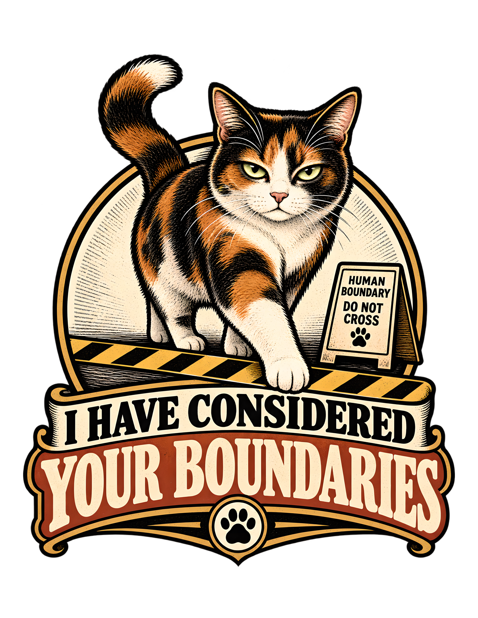
“I HAVE CONSIDERED YOUR BOUNDARIES” turns one very small act into a complete Cats Judging Humans ruling. The canonical concept is precise: a cat acknowledges the existence of human boundaries with great seriousness and then proceeds to disregard them. The approved artwork makes that idea immediate. A calico cat steps forward across a black-and-gold striped boundary line while maintaining direct eye contact with the viewer. Beside the line, a small sign reads “HUMAN BOUNDARY DO NOT CROSS” and includes a paw mark. Below the scene, the large phrase “I HAVE CONSIDERED YOUR BOUNDARIES” converts the action into a dry statement of policy.
The humor depends on confidence rather than chaos. The cat is not shown tearing down the rule, hiding from it, or looking guilty after crossing it. One front paw simply moves beyond the marked limit while the cat’s expression remains composed. The tail rises in a strong curve behind the body, the circular frame gives the scene emblem-like structure, and the woodcut-inspired treatment makes the tiny domestic disagreement feel absurdly official.
This page treats the approved artwork as the factual visual authority and the canonical source as the factual concept authority. It does not claim that every cat behaves this way, and it does not expand the design into unsupported behavioral science. The factual visual reading stops with what the source and artwork show. The Cats Judging Humans layer begins where the satire begins: humans can mark a boundary, name a boundary, warn against crossing it, and still discover that management has reviewed the request and declined to consider it binding.
The result is a compact joke about limits, authority, and the difference between acknowledging a human rule and accepting human jurisdiction.
The Joke Begins With Acknowledgment, Not Confusion
The phrase “I HAVE CONSIDERED YOUR BOUNDARIES” is funny because it grants the human one very specific victory: the boundary was noticed. The cat is not portrayed as confused about the rule or unaware that a limit exists. The wording implies a complete review process. The boundary has been presented, considered, and placed into the record.
What the phrase does not promise is compliance.
That distinction gives the design its dry authority. A simpler joke might say the cat ignores rules. This design is more formal. The rule receives attention and still fails.
The approved artwork makes the same argument visually. The cat is positioned at the point of crossing, with one front paw extending beyond the striped line. The nearby sign removes uncertainty about what the line means. Within the visual joke, the rule is obvious.
That makes the action feel deliberate rather than accidental.
Cats Judging Humans works especially well when human systems are treated as proposals that require feline approval. Here, the human has done everything a rule-maker could reasonably do. The boundary is visible. The warning is posted. The wording is explicit.
Management has considered all supporting materials.
The appeal has not changed the outcome.
That bureaucratic framing also keeps the humor playful instead of aggressive. The cat is not attacking the human or destroying property. The joke is about jurisdiction. Humans assume the right to define the limit; the cat behaves as though that assumption itself remains subject to review.
The design therefore turns a tiny physical action into a much larger argument about authority.
The human says, “Do not cross.”
The cat’s response is more sophisticated.
“Your input has been received.”
The concept summary in the source explicitly describes this sequence: the cat acknowledges the boundary with seriousness and then disregards it. That source wording is what makes the design more than a generic rule-breaking joke. The humor depends on the dignity of the review process and the complete uselessness of the result.
The boundary is therefore not merely a prop. It is the human argument in physical form, and the cat’s movement is the answer.
The wording also gives the design a useful asymmetry between courtesy and obedience. “Considered” sounds almost cooperative, which makes the refusal sharper when the image shows the crossing already underway. The human receives recognition without control. That distinction is the whole joke in miniature and gives the phrase enough sophistication to carry the page without needing a second punchline.
The Calico Cat Carries the Decision Through Body Language
The central figure is a calico cat with clearly visible black, orange, and cream patches. The cat’s body is positioned in forward movement, with one front leg extended across the warning line, the other legs still supporting the body behind it, and the tail lifting in a broad curve.
That pose is important because the entire joke depends on composure.
If the cat were running, scrambling, or looking backward, the image might suggest mischief or escape. Instead, the movement feels measured.
The cat is not fleeing a rule.
It is proceeding through one.
The face reinforces the same idea. The expression is steady and mildly unimpressed rather than frightened or excited. The body remains unmistakably feline, which keeps the humor grounded. The cat does not need a human gesture, a costume, or an exaggerated facial expression to communicate authority.
The viewer supplies the administrative interpretation.
That is one of the strongest recurring Cats Judging Humans mechanisms: ordinary feline posture becomes evidence of a complete institutional hierarchy once humans begin reading meaning into it.
The calico coat also gives the design a visually specific subject without requiring any unsupported breed claim. The canonical source identifies the cat type as calico, and the approved artwork clearly supports that identity.
The natural patchwork of the coat helps the cat stand out against the cream and gold interior of the circular frame while still integrating with the rust and black used throughout the composition.
Everything about the body language says the same thing.
The cat has not asked whether crossing is allowed.
The cat has simply decided that crossing is the next step.
Human policy remains available for reference.
The calico identity is also visually important because the coat supplies a natural three-color pattern that works with the limited print palette. The subject remains specific while the composition stays readable.
The cat’s body remains feline throughout, which keeps the joke grounded in ordinary posture rather than costume-based anthropomorphism.
The forward pose also gives the design momentum without turning the cat into an action character. The body remains natural, and the humor comes from how decisively the ordinary step is framed. That restraint preserves the cat-first identity of the artwork and keeps the authority joke grounded in a recognizably domestic animal rather than a human figure wearing feline traits.
Direct Eye Contact Turns the Viewer Into the Human Being Overruled
The cat’s direct gaze is one of the most important choices in the approved artwork. The eyes face outward toward the viewer while the paw crosses the boundary.
That creates a specific relationship.
The viewer is not merely observing a cat breaking a rule somewhere else. The viewer is placed in the position of the human who established the rule and is now watching the cat reject it.
The cat does not look away.
That changes the action from sneaky to authoritative.
A sneaky crossing would imply that the boundary still has power and must be evaded. Direct eye contact suggests the opposite. Within the satire, the cat is willing to cross while the rule-maker watches.
The human therefore loses two things at once: the boundary and the illusion that enforcement mattered.
This visual reversal fits Cats Judging Humans perfectly because the brand often works by shifting the human from owner to employee, applicant, visitor, or junior administrator.
Here, the human becomes the person whose policy has just been reviewed.
The cat is the reviewer.
The gaze makes that hierarchy personal without requiring a human figure in the artwork.
The viewer feels seen.
Nothing in the source requires the page to claim that real cats understand boundaries in this human sense. The design is visual satire, and the gaze is a storytelling tool.
What the artwork clearly supports is a cat crossing a marked limit while looking directly outward.
CJH supplies the interpretation.
Management has read the policy.
Management would like to know why the policy was written without consultation.
The gaze keeps the cat emotionally steady. That matters because the viewer is not asked to interpret panic, excitement, or surprise. The image communicates certainty.
The viewer’s position is especially efficient because one outward stare replaces the need for a visible human reaction.
The gaze also creates a clean editorial bridge between the artwork and the brand premise. Cats Judging Humans depends on the idea that the human is being evaluated, and the direct stare lets that relationship exist visually before any explanatory text is read. The viewer is not simply witnessing noncompliance; the viewer appears to be the person whose rule is being tested.
The Black-and-Gold Line Makes the Human Boundary Physically Legible
The striped boundary line is the visual hinge of the design. It turns the abstract idea of “your boundaries” into something the viewer can see immediately.
The diagonal black-and-gold pattern reads as a warning rather than ordinary decoration. That matters because the joke depends on the rule being clear.
The viewer should understand the spatial logic before reading every word.
One side is where the human wants the cat to remain.
The other side is where the cat is going.
The cat’s front paw crosses at exactly the point where human intention and feline action diverge.
The line also gives the artwork strong apparel-scale readability. Even when the smaller sign becomes secondary, the caution-style stripe remains bold enough to communicate restriction.
That allows the image and phrase to work at two speeds.
At first glance, the viewer sees a cat crossing a marked line.
At closer range, the sign clarifies whose line it is and the typography delivers the full statement.
Cats Judging Humans turns that visual device into an editorial joke about the limits of rule-making.
Humans often believe that visibility strengthens authority.
The design imagines a cat reaching a different conclusion.
The line is visible.
The line is clear.
The line has been crossed anyway.
Inside the fictional bureaucracy of the artwork, the warning system has performed perfectly.
Compliance remains unavailable.
The warning stripe functions as both setting and plot. It tells the viewer where the conflict is before the phrase explains why the conflict matters.
The striped line also gives future section imagery a clear visual motif without forcing every illustration to reproduce the approved artwork.
Because the line is visually simple, it can carry a surprising amount of narrative information. Its orientation creates a before-and-after space, its warning colors imply importance, and the cat’s paw provides the exact moment of transition. The design therefore turns one geometric device into both setting and plot, which is unusually efficient for a compact apparel graphic.
The Boundary Sign Makes Human Ownership of the Rule Explicit
The small sign beside the line reads “HUMAN BOUNDARY DO NOT CROSS.” That wording gives the whole concept a sharper point.
This is not a neutral barrier.
It is a human boundary.
The rule belongs to the people.
That single word changes the joke from ordinary disobedience into a contest of authority.
The sign also looks official enough to imply that the human did not merely make a casual request. Someone has labeled the restriction, placed it beside the line, and given it the visual language of enforcement.
The cat steps past it anyway.
The paw icon beneath the wording adds another layer of absurdity. Even the sign explaining a human limit exists inside an image saturated with feline symbolism.
That contradiction does not need to be logical.
It needs to be funny.
The sign is also wisely secondary. It is not large enough to compete with the central phrase, but it rewards closer inspection by confirming that the boundary is specifically human-made.
That helps the page stay grounded in the source concept: human limits are acknowledged and then disregarded.
Cats Judging Humans interprets the sign as the human department’s strongest attempt at documentation.
The cat responds with one step.
No argument appears.
No appeal form is visible.
The visual hierarchy tells us which side of the administrative process won.
The sign may say “DO NOT CROSS.”
The cat appears to have read it as supporting material.
The sign turns the phrase’s abstract idea into a literal human rule. It gives the page a factual visual anchor for discussing authority without inventing another scene.
The sign’s official tone gives the cat something concrete to overrule, which strengthens the design’s mock-administrative logic.
The sign also narrows the satire in a useful way. The boundary is not framed as a law of nature or a neutral obstacle. It is specifically human-made. That keeps the design aligned with the Cats Judging Humans relationship, where people build systems and cats assess whether those systems deserve cooperation. The sign is therefore evidence of human intent, not just background decoration.
One Paw Over the Line Is Enough to Complete the Entire Story
The approved artwork does not show the cat far beyond the boundary. One paw is enough.
That is excellent visual timing.
The cat is captured at the exact moment when the rule stops being theoretical.
The line has not been dramatically destroyed. The sign has not been knocked over. The scene remains orderly.
But the principle has already failed.
That restraint makes the design stronger.
A more chaotic image would turn the joke into destruction or rebellion. This one turns it into procedure.
The cat simply advances.
The extended paw creates the clearest visual connection between subject and boundary. It gives the viewer a single focal action that can be understood instantly.
That also helps the design stay compact and commercially readable without becoming crowded.
Cats Judging Humans often works best when the cat’s authority requires very little effort. Humans establish systems. Cats alter those systems through ordinary behavior.
Here, the human creates a warning line.
The cat defeats it with a normal step.
The disproportion between effort and outcome is the comedy.
The humans invested in signage.
Management invested in one paw.
The result is final.
The single paw placement captures the entire turning point in one still image. The design does not need a before-and-after sequence.
The one-paw crossing also makes the humor easy to understand before the viewer reads the full phrase.
The single-paw timing also makes the image easy to remember. The viewer does not need to reconstruct a sequence of events. The crucial action is frozen at its most legible point: the rule still exists, the cat still sees it, and the violation is already happening. That visual compression is a major reason the concept reads so quickly.
The Circular Frame Makes a Tiny Domestic Dispute Feel Institutional
The central scene is enclosed by a large circular frame that gives the design the structure of an emblem.
That choice changes the tone.
Without the frame, the image might read as a loose illustration of a cat crossing tape. With it, the scene feels organized, official, and almost commemorative.
The boundary violation has become worthy of documentation.
That is exactly the kind of disproportion that supports Cats Judging Humans.
The cat takes one step.
The design responds as if precedent has been established.
The circle also helps the artwork remain visually coherent on a transparent background. It contains the cat, the sign, and the striped boundary inside one strong silhouette before the eye moves downward into the typography.
The result is a two-part structure.
The upper emblem shows the decision.
The lower lettering records the decision.
The circular framing also echoes the small paw medallion at the bottom of the composition, giving the artwork a repeated formal geometry.
Nothing about this requires a claim that the image represents a real institution.
The source explicitly frames the design as a woodcut-inspired emblem composition, and that is the useful reading.
The visual language feels official.
The subject matter remains ridiculous.
That contrast is the joke.
Management has created an emblem for a policy it just rejected.
The circular frame also keeps the approved artwork compact enough to read as one emblem, which is part of the source’s stated visual concept.
The emblem structure turns a domestic disagreement into something that looks almost commemorative, increasing the satire through scale.
The frame also creates a kind of ceremonial seriousness without claiming any literal institutional meaning. It makes the scene look worthy of preservation, which is absurd in exactly the right way. The human sees a minor household boundary dispute. The composition presents it like a historic decision. That scale mismatch is one of the design’s strongest satirical tools.
The Woodcut-Inspired Treatment Gives the Joke Weight Without Clutter
The canonical visual concept calls for a woodcut-inspired emblem composition with bold texture and restrained detail, and the approved artwork clearly follows that direction.
The outlines are strong.
The fills carry print-like texture.
The cat, sign, stripes, frame, and lettering all belong to the same graphic system.
That consistency matters because the design contains several visual elements but still needs one immediate idea.
A softer or more photographic treatment could make the scene feel more like a snapshot. The print-inspired approach makes it feel more like a declaration.
The seriousness of the style also increases the humor.
A cat crossing a line is a small event.
The artwork gives that event the visual gravity of an official notice.
The restrained detail keeps the design from becoming noisy.
There is no furniture, landscape, human figure, or unrelated prop competing for attention.
Every visible component supports the same sequence.
Rule.
Warning.
Crossing.
Verdict.
Cats Judging Humans benefits from this economy because the brand voice is strongest when the sarcasm feels precise.
The design does not need to explain every possible meaning of “boundaries.”
The image gives the viewer one concrete example.
The phrase expands the idea.
Management considers the record sufficient.
The source specifically asks for bold texture and restrained detail, and that balance is visible in the approved art. The style feels substantial without becoming cluttered.
The texture adds age and seriousness without requiring the page to invent a historical setting or backstory.
The texture contributes to the same effect by making the artwork feel established rather than temporary. The rough print character suggests something stamped, carved, or formally produced, which contrasts with the ordinary act at the center. The cat’s one-step violation is treated with visual permanence, as though future humans may need to study the precedent carefully.
Cream, Rust, Gold, and Black Make the Rejection Feel Vintage and Controlled
The approved artwork uses a restrained palette built around cream, rust orange, gold, black, and the natural black-orange-cream patterning of the calico cat.
That palette supports both readability and mood.
Black creates structure through outlines, lettering, and the darkest coat areas.
Cream provides strong contrast.
Rust and gold add warmth while maintaining the vintage print character.
The striped boundary fits naturally into that system, which prevents the warning device from looking like a separate modern graphic pasted into the scene.
This cohesion matters because the calico cat already carries multiple colors.
A noisier palette could make the central figure harder to read.
Instead, the surrounding colors support the cat and repeat tones already present in the coat.
The result feels intentional.
The palette also helps keep the joke playful rather than aggressive. The boundary looks serious enough to register as a rule, but the overall design remains warm and stylized.
Cats Judging Humans does not need harsh visual menace to establish hierarchy.
The human limit is formal.
The cat’s rejection is calm.
The color system keeps both ideas inside the same dry comic register.
Management prefers violations that coordinate with the brand palette.
The warm palette also allows the warning system to feel integrated rather than pasted on. Even the boundary belongs to the same visual world as the cat.
The palette reinforces the art style while keeping the calico coat readable against the frame and lettering.
The color balance also keeps the composition from becoming too severe. Black supplies authority, but cream and rust soften the presentation. Gold gives the warning system enough emphasis to remain readable without turning the whole image into a harsh safety graphic. The result is formal enough to support the joke and warm enough to keep the brand tone playful.
The Typography Converts a Simple Crossing Into a Formal Verdict
The large lower phrase reads “I HAVE CONSIDERED YOUR BOUNDARIES.”
That sentence is the final interpretive key.
The image already shows the cat crossing a marked human limit, but the typography tells the viewer how to understand the action.
This was not an oversight.
This was a review.
The upper words “I HAVE CONSIDERED” establish process.
The larger “YOUR BOUNDARIES” identifies the item under review.
The wording is more formal than the action, which creates the central contrast.
The cat crosses a line.
The language makes it sound like the conclusion of a committee.
That is classic Cats Judging Humans territory.
The cat does not need to say “I ignored you.”
The more polite phrasing is funnier because it implies the human received due consideration before being overruled.
The typography also has enough visual weight to function as part of the illustration rather than as a caption pasted beneath it.
Its vintage serif character matches the emblem structure above and helps the whole design feel like one finished object.
The human boundary is shown visually.
The rejection is recorded verbally.
The combination leaves very little room for appeal.
Management has completed its review.
The phrase remains distinctive because “considered” sounds reasonable until the crossing reveals what the word actually means inside the joke.
The text and image operate as two halves of the same joke: the image shows the decision, and the phrase supplies the reasoning.
The typography also benefits from the phrase’s internal pacing. “I HAVE CONSIDERED” feels like the opening of a reasoned statement, while “YOUR BOUNDARIES” delivers the subject under review. The visual hierarchy mirrors that rhythm. The viewer first receives the process, then the object, and finally looks back at the cat to discover what consideration actually produced.
The Paw Medallion Seals the Ruling Without Becoming a Brand Logo
A paw symbol appears inside a circular medallion at the bottom center of the artwork.
It is a small but effective finishing detail.
The central scene already uses formal visual language through the circular frame, warning sign, striped line, and structured typography.
The paw medallion gives the lower edge a final feline seal.
It does not need to function as the official Cats Judging Humans logo.
Its role inside the design is thematic.
The ruling belongs to the cat.
The repeated circular geometry also helps balance the composition. The larger circular frame contains the action above. The smaller circle anchors the typography below.
That creates a strong vertical flow from subject to statement to seal.
Cats Judging Humans often benefits from this kind of mock-official visual language because the brand turns ordinary feline behavior into policy, review, enforcement, and administrative judgment.
The paw medallion completes that transformation without adding another joke.
The cat crossed the line.
The phrase recorded the conclusion.
The paw closes the file.
The humans may retain copies for their records.
The paw medallion works because it is simple. It reinforces feline authorship without requiring another sentence.
The small medallion acts as a visual period at the end of the ruling, which helps the composition feel complete.
The medallion also works as a visual signature without introducing marketplace language, product messaging, or an unrelated brand element. It belongs inside the joke world. That restraint matters because the design already has a clear phrase and a strong central subject. The paw seal reinforces authorship without asking the viewer to process another layer of copy.
The Missing Human Lets Every Viewer Become the Person Who Set the Rule
No human figure appears in the approved artwork.
That absence makes the joke broader.
The sign represents the human position, and the cat’s gaze places the viewer directly on the receiving end of the decision.
There is no single owner, roommate, family member, or character whose boundary is being ignored.
“Your boundaries” can therefore belong to anyone looking at the image.
This is a strong editorial choice because it keeps the design from becoming a scene about one specific dispute.
The human is represented by rules.
The cat is represented by action.
That is enough.
The absence also keeps the tone playful.
There is no visible argument.
No person is shown angry, defeated, or embarrassed.
The joke remains entirely inside the contrast between a carefully marked restriction and a cat that treats the restriction as nonbinding.
Cats Judging Humans turns the audience into the unseen human who believed signage would solve the problem.
Management has reviewed that belief.
The findings are not encouraging.
Leaving the human unseen keeps the satire broad and avoids turning the design into a conflict between named characters.
The absent human also means the design can speak to any viewer without assigning one specific personality to the person being judged.
The absence of a human face also avoids telling the audience how to react. No one in the artwork looks angry, embarrassed, or defeated. That leaves room for the viewer to supply the emotional response. The cat’s certainty remains the only visible attitude, which strengthens the sense that the feline perspective is the dominant one inside the composition.
Calm Defiance Makes the Design Funnier Than Chaos Would
The approved cat looks composed.
That is a crucial tonal choice.
The concept could have been drawn as destruction: ripped tape, knocked-over signs, scattered objects, or exaggerated motion.
Instead, the scene remains controlled.
The cat simply crosses.
That changes the joke from “cats cause chaos” to “human authority may not be recognized.”
The latter is much more aligned with Cats Judging Humans.
The brand voice is dry, sarcastic, clever, judgmental, and mildly superior. Calm defiance suits that voice better than frantic rebellion.
The cat does not appear emotionally invested in winning.
The cat behaves as though the human boundary never had final authority in the first place.
That is the larger comic idea.
Humans often communicate seriousness through rules, signs, and marked limits.
The design imagines a cat interpreting all of that as information rather than obligation.
Nothing in the source requires the page to present this as a universal behavioral truth.
It is satire.
The visual joke works because the cat’s confidence is so disproportionate to the human effort represented by the warning system.
The humans created infrastructure.
Management took one step.
Case closed.
Calm defiance protects the brand tone from becoming hostile. The cat’s superiority is funny because it is understated.
The design’s calm tone is what keeps the superiority playful rather than aggressive or cruel.
This calmness also gives the cat a more elevated kind of comic confidence. Chaos would suggest loss of control. Here, the opposite is true: the cat looks completely in control while disregarding the rule. That is much closer to the brand’s mildly superior voice. The cat is not fighting authority; the cat behaves as though authority was misassigned from the beginning.
The Design Is Evergreen Because the Conflict Is About Limits, Not Trends
The canonical source marks the concept as evergreen, and the approved artwork supports that classification.
There is no holiday, season, date, current event, technology reference, celebrity, or platform-specific joke carrying the design.
The humor depends on something much simpler.
A human establishes a limit.
A cat crosses it.
The wording turns that action into a judgment about authority.
That structure does not require updating.
The visual treatment also helps. The woodcut-inspired style feels deliberately graphic rather than tied to one contemporary interface or social-media aesthetic.
The boundary sign and caution stripe communicate the rule without depending on a specific cultural event.
The phrase remains broad enough to work beyond the literal line shown in the art, while the image keeps the joke concrete.
Cats Judging Humans can therefore treat the design as part of an ongoing catalog about human rules and feline evaluation rather than as a one-season gag.
Humans will continue inventing boundaries.
Within the fictional logic of the brand, management will continue reviewing them.
No sunset clause has been approved.
The source explicitly marks the concept as evergreen, so the absence of trend-based references is not incidental; it is part of the design’s intended role.
The evergreen status also makes the piece useful as a standing example of CJH’s broader interest in human rules and feline authority.
The evergreen strength also comes from the phrase itself. “Your boundaries” is broad enough to remain relevant without depending on a temporary reference, while the visual line gives the idea a concrete form. The design can therefore stay specific and general at the same time: one literal boundary in the artwork, one larger human-limit joke in the phrase.
The Design Fits Cats Judging Humans by Making Human Limits Look Advisory
“I HAVE CONSIDERED YOUR BOUNDARIES” fits Cats Judging Humans because every part of the design reinforces the same hierarchy.
The human creates the boundary.
The human labels the boundary.
The human warns against crossing.
The cat sees all of that and proceeds.
The cat is not cruel.
The cat is not confused.
The cat simply refuses to treat human preference as final authority.
That distinction is where the brand’s dry superiority works best.
The visual language intensifies the joke through formal structure. The striped line looks official. The sign looks official. The circular frame looks official. The typography looks official. The paw medallion looks like a seal.
Everything treats the disagreement with more seriousness than the underlying action deserves.
That disproportion is the comedy.
A household limit becomes policy.
A cat’s step becomes precedent.
A human request becomes an item that was considered and denied.
The design therefore feels unmistakably at home in the Cats Judging Humans catalog.
The humans were heard.
Management remains unconvinced.
The source gives the concept a very high brand-fit score, and the approved artwork makes the reason clear: it turns one ordinary human-cat power reversal into a complete feline ruling.
The design’s place in the catalog is strongest when read as judgment rather than rebellion: the cat does not rage against the system; it simply declines to recognize it.
The final brand fit is strongest because the design reverses the expected power structure without becoming cruel. The human makes a reasonable request. The cat acknowledges it. The humor comes from the fact that acknowledgment does not change the outcome. That is pure Cats Judging Humans: the staff may submit preferences, but management reserves final interpretation rights.
The result is not feline rebellion for its own sake; it is a miniature review process in which human authority is politely acknowledged and then quietly demoted.
“I HAVE CONSIDERED YOUR BOUNDARIES” succeeds because the source and the approved artwork make the same argument in different forms. The source describes a cat that acknowledges a human boundary with great seriousness and then disregards it. The artwork shows a calico doing exactly that: stepping across a marked black-and-gold line, looking directly toward the viewer, beside a sign that says “HUMAN BOUNDARY DO NOT CROSS.”
Everything else supports that action. The circular frame gives it emblem-like authority. The woodcut-inspired texture makes the scene feel formal. The cream, rust, gold, and black palette keeps the design cohesive. The large typography turns the cat’s step into a written ruling. The paw medallion closes the case.
The comedy remains dry because the cat never looks chaotic. It looks certain.
That certainty is the essence of the Cats Judging Humans interpretation. The human has limits, warnings, and documentation. Management has reviewed all three.
The boundary was considered.
The boundary did not survive the meeting.
The design never needs to escalate beyond that. Its strength is the precision of the reversal. Humans establish a visible rule; the cat demonstrates that visibility and authority are not the same thing. That is enough to make the image memorable, the phrase reusable, and the judgment unmistakably feline.