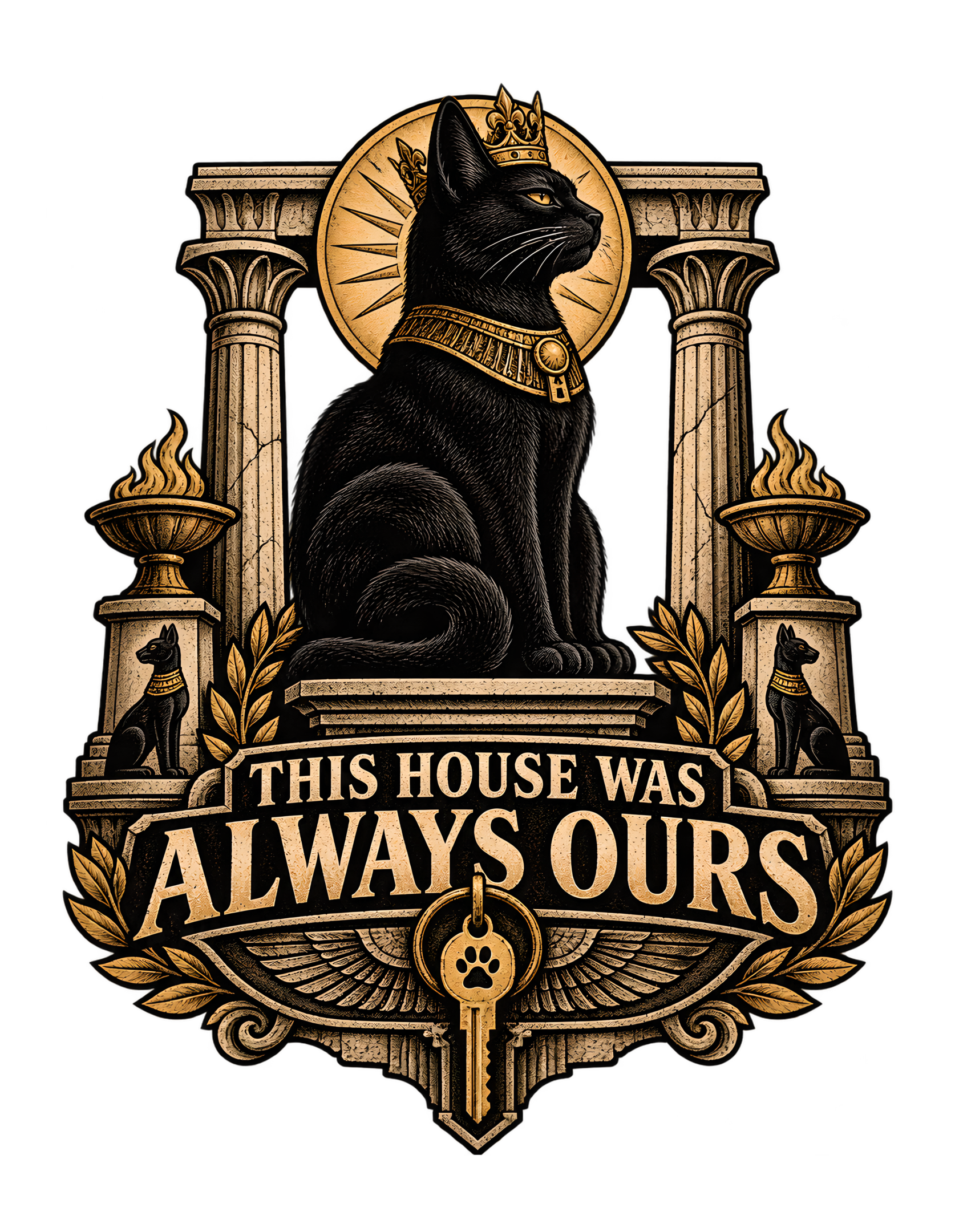
“THIS HOUSE WAS ALWAYS OURS” takes a familiar cat-owner power imbalance and treats it as if it were a matter of historical record. The canonical concept is explicit: a cat presents modern household ownership as merely the latest chapter in an ancient feline claim over human civilization. The approved artwork makes that premise visible with a regal black cat seated in profile at the center of a monumental emblem. The cat wears a crown and an ornate gold-toned collar. Tall classical-looking columns rise on both sides. Flame-filled braziers add ceremony. Smaller black-cat figures occupy the lower side structures. A warm circular disc behind the cat’s head strengthens the central silhouette. Beneath everything, the phrase “THIS HOUSE WAS ALWAYS OURS” appears in large authoritative lettering, and a modern house key marked with a paw hangs below like a ceremonial relic.
The joke depends on scale. Human beings treat home ownership as a serious modern institution involving keys, access, rooms, maintenance, and responsibility. The cat, according to the design, regards all of that as temporary paperwork inside a much older arrangement. The monument says permanence. The key says present-day household. The word “always” says the present never displaced the original claim.
Nothing here needs to be mistaken for literal history. The visual language is satire. Its purpose is to exaggerate something cat owners already recognize: many cats occupy domestic space with extraordinary confidence, as though the chair, the hallway, the closed door, the food bowl, and the human schedule were all parts of a system designed for feline use.
This page treats the approved artwork and canonical source as the factual authority. Every other observation is editorial interpretation in the Cats Judging Humans voice: dry, clever, mildly superior, playful, and very doubtful that human property paperwork settled the matter.
The Word “Always” Turns a Household Joke Into a Historical Claim
The phrase works because of one word: “always.” A present-tense claim such as “this house is ours” would already fit familiar cat humor. Cats often occupy a home with the confidence of creatures who regard access, comfort, doors, furniture, and human attention as normal entitlements. “Always” enlarges that everyday attitude into something absurdly permanent.
The wording implies that human ownership did not replace feline ownership. It merely appeared later. That turns the human into a temporary administrator rather than the ultimate authority.
The approved artwork supports that interpretation because the cat is not shown taking over. It is already centered inside a ceremonial structure. Nothing suggests a struggle, a recent victory, or a contested transfer. The cat simply occupies the position of authority as though it has always belonged there.
That makes the humor dry rather than chaotic. The cat is not announcing a revolution. The monument is recording a continuity.
Cats Judging Humans works especially well when ordinary domestic experience is elevated into institutional language. Here, a familiar cat-owner thought—“this cat acts like it owns the place”—becomes a claim so large that human title, keys, and household routines look like recent procedural details.
The wording also avoids naming one specific address, owner, or room. That broadness matters. The phrase can apply to any household in which a cat has established itself as the obvious senior resident.
The human may have paperwork.
The cat has precedent.
Management considers the chronology decisive.
The phrase also gains force because it never explains the supposed history behind the claim. That omission keeps the satire clean. No dates, dynasties, or literal ancient events are supplied, so the viewer is free to understand “always” as pure feline confidence. The design does not ask to be believed factually. It asks the viewer to recognize the attitude. That difference matters because the joke becomes more universal when the historical language stays symbolic rather than specific.
There is also a useful asymmetry in the phrase: the human reader is addressed indirectly, while the cat’s side is stated as fact. The design does not say “we think this was ours” or “perhaps this was ours.” It uses declarative language. That certainty is what gives the joke its edge. Humans may debate ownership; management has moved on to archival formatting.
The Black Cat Reads as a Sovereign Because It Does Almost Nothing
The approved artwork centers a black cat in a calm seated profile. The pose is upright, composed, and visually still. There is no lunge, no theatrical gesture, no attack, and no scramble for attention.
That restraint is one of the design’s strongest decisions.
Authority comes from certainty rather than action.
The cat does not look as though it is trying to convince anyone. It appears to assume that its status is already understood.
That is extremely compatible with the Cats Judging Humans voice. The humor is strongest when the cat behaves as though the human explanation is unnecessary. The cat does not need to prove superiority because the entire composition has already been built around it.
The black coat creates a strong silhouette against the warm circular disc and lighter architectural frame. That helps the cat remain visually dominant even though the artwork contains columns, flames, laurels, smaller figures, typography, and a key.
The profile pose also resembles formal portraiture more than an ordinary domestic snapshot. The cat appears represented for posterity. That strengthens the ownership premise without turning the animal into a human character.
Crucially, the body remains feline. The paws are paws. The ears, whiskers, chest, and seated posture remain catlike. The design does not need to anthropomorphize the body because the cat’s natural composure already supports the joke.
The human sees a pet.
The artwork presents a ruler.
The cat, naturally, sees no contradiction.
The stillness also separates authority from aggression. The cat does not need to bare teeth, raise a paw, or confront anyone. Its posture alone suggests that the surrounding system belongs to it. That is much closer to ordinary cat behavior than a theatrical dominance pose would be. Many cat owners recognize the unnerving confidence of an animal that simply sits in the exact place it prefers and waits for the human environment to adjust around it.
The profile view supports that certainty because the cat is not even facing the viewer directly for approval. It appears occupied with its own status rather than performing for an audience. That visual independence reinforces the comic hierarchy: the human is observing the cat’s world, not the other way around.
Columns and Pedestals Turn Domestic Entitlement Into an Institution
The architectural framing does more than make the design look grand. It changes the scale of the joke.
Tall classical-looking columns rise on either side of the cat. Carved pedestals and architectural bases create symmetry and permanence. The central figure is not merely sitting inside a decorative frame; it appears embedded in a system.
That matters because the canonical concept is about an ancient feline claim over human civilization. The architecture provides the visual shorthand for that idea without requiring a literal historical reconstruction.
Columns suggest permanence.
Pedestals suggest public importance.
Symmetry suggests official order.
Carved stone-like surfaces suggest something intended to outlast one household, one owner, or one generation.
The design therefore does not need to show a modern house directly. The current household is represented elsewhere by the key. The architecture carries the “ancient claim” side of the concept.
This separation is useful. It keeps the image from becoming a literal scene of a cat sitting in a living room surrounded by fake ruins. Instead, the whole thing reads like an emblem or monument built to formalize feline authority.
Cats Judging Humans turns that visual seriousness into the punchline. Humans may believe they own the house because they maintain it, clean it, unlock it, and pay for it. The monument quietly suggests that those tasks are operational responsibilities, not evidence of sovereignty.
The transparent-background emblem structure strengthens the idea further. It is symbolic rather than tied to one particular property.
The human sees a home.
Management sees an institution.
The architectural frame also gives the phrase a physical home inside the composition. The words do not feel added after the illustration; they seem built into the same structure that supports the cat. That integration makes the ownership statement feel like part of the institution rather than commentary on it. The result is stronger because image and language do the same job: both insist that feline authority is established, formalized, and older than the human viewer’s current arrangement.
The Crown and Collar Elevate Rank Without Turning the Cat Into a Person
The crown above the cat and the ornate gold-toned collar around its neck provide the clearest ceremonial markers of status in the artwork.
The important part is how little they change the cat itself.
The animal still sits naturally. The head remains feline. The paws are not turned into hands. There is no human costume with sleeves, no scepter, and no complicated theatrical pose.
That restraint keeps the visual joke grounded in ordinary cat ownership.
The crown says rank.
The collar says ceremony.
The cat’s body says this is still the same kind of creature that might occupy the center of a bed or stare at a closed door until a human solves the problem.
That contrast is what makes the design feel specific to Cats Judging Humans rather than generic fantasy royalty.
The crown is also visually restrained enough that it does not overwhelm the face. The cat remains the subject. The accessory confirms a conclusion the posture already communicates.
The collar performs a similar function. Its gold details echo the surrounding ceremonial palette and help connect the central animal to the monument. The circular ornament on the collar also harmonizes with other rounded shapes in the composition.
Nothing in the source requires a literal historical office or title. These elements are visual shorthand for status.
The human sees decorative accessories.
The cat sees insignia.
Management is willing to tolerate either interpretation as long as everyone remembers who is centered in the monument.
The absence of human approval is one of the most important tonal choices. A visible coronation would imply that people still control the process because someone had to grant the title. Here, the crown simply exists. The cat’s rank appears self-evident. That makes the joke sharper because the human system has been removed even from the act of recognizing authority. Management did not request permission, and the composition offers no evidence that permission was ever considered relevant.
The Circular Disc Makes the Cat the Unmistakable Center of the Emblem
Behind the cat’s head and upper body is a warm circular disc with radiating marks. It is one of the most useful compositional devices in the artwork because it immediately separates the black silhouette from the architectural background.
The face and ears remain readable.
The viewer’s eye lands on the cat before moving outward to the columns or downward to the phrase and key.
That hierarchy is essential in a detailed apparel graphic.
The disc also gives the cat an iconic presence without forcing one literal symbolic interpretation. It can read as a medallion, ceremonial backdrop, decorative sun, or simply a strong framing device.
The exact historical meaning is not important.
The visual message is.
The cat is central.
The cat is elevated.
The surrounding structure exists in relation to it.
That arrangement mirrors the joke perfectly. The entire human household is being reframed as something that exists around feline authority.
The circular field also helps the design work at reduced viewing size. Even when smaller carved details become less obvious, the dark cat against the lighter disc remains legible.
That gives the artwork layered readability: the first glance delivers the ruler; the second look reveals the institution.
Cats Judging Humans benefits from that efficiency because the punchline does not depend on reading every ornament.
Management prefers systems that remain legible even when the humans are distracted.
The collar also prevents the design from relying entirely on the crown. Rank is distributed through several small visual signals instead of one oversized symbol. That makes the cat feel embedded in a ceremonial system rather than dressed for a joke. The visual authority therefore survives even if a viewer notices the crown only after the face. The cat’s posture, collar, backdrop, and monument all reinforce one another, which gives the concept consistency rather than novelty for novelty’s sake.
Braziers, Smaller Cat Figures, and Laurels Build a Complete Ceremonial World
The approved artwork contains several secondary details that deepen the premise without competing with the central cat.
Two flame-filled braziers stand symmetrically on the sides. Smaller black-cat figures occupy lower architectural positions. Laurel branches frame the bottom of the composition.
Each element contributes a different kind of ceremonial authority.
The braziers make the scene feel like an occasion. Nothing about the flames suggests danger or chaos. They are controlled and symmetrical, turning the household ownership claim into something formal enough to merit ritual.
The smaller cat figures expand the idea beyond one individual. They imply continuity, precedent, and an institution larger than the current ruler. The human may think the disagreement is with one cat. The artwork suggests there is an archive.
The laurels add recognition and victory. They make the ownership claim look celebrated rather than debated.
Together, these details transform the emblem from a single royal portrait into a complete fictional system.
That is important because the concept summary is not merely “a regal black cat.” It is about an ancient feline claim over modern household ownership.
These supporting elements make the claim feel inherited.
They also remain visually subordinate. None of them steals attention from the cat, phrase, or key.
Cats Judging Humans turns that hierarchy into another quiet insult to human confidence.
The humans thought they were negotiating with one cat.
Management appears to have departments.
Because the disc sits directly behind the head, it also clarifies the facial profile against a busy frame. That is important in a design where the expression carries much of the attitude. The cat looks composed and slightly aloof, not excited by the ceremony. The disc helps preserve that expression as the emotional center. The viewer can absorb the face first and then discover how much architecture has apparently been commissioned to support that expression.
The Modern House Key Is Where the Ancient Joke Becomes Domestic
The modern house key hanging at the bottom center is one of the most important details in the design because it anchors the entire historical exaggeration in everyday life.
Without the key, the artwork would still communicate feline royalty.
With the key, it becomes specifically about household ownership.
The canonical visual concept describes the key as hanging beneath the cat like a ceremonial relic, and the approved artwork follows that direction closely.
That transformation is funny because a key is normally practical. It opens and closes. It grants access. It lives in a pocket or by the door.
Here, it is elevated into an object of ceremony.
The surrounding monument tells the viewer that this ordinary object belongs inside a much older ownership system.
Cats Judging Humans uses that contrast to expose the human assumption behind the joke.
The human thinks, “I have the key, therefore I control the house.”
The cat appears to think, “You have been issued the tool required to perform door services.”
Both interpretations fit the same object.
Only one is being carved into a monument.
The placement beneath the phrase strengthens the effect. The key looks like supporting evidence attached to the ownership statement.
The architecture is ancient-looking.
The key is modern.
The cat sits comfortably above both.
Management has accepted your credentials.
Ownership remains unchanged.
The braziers also help the composition feel balanced from left to right. Their matched placement makes the scene appear planned and formal, which is exactly what the satire needs. A random flame or decorative object would feel ornamental. Two ceremonial fires imply protocol. The cat’s ordinary domestic entitlement is therefore framed as something with procedure, symmetry, and ritual. The human household may be informal; feline authority, according to the artwork, has standards.
The Paw Mark on the Key Completes the Ownership Reversal
At the center of the hanging key is a paw symbol.
It is a small detail, but it makes the power reversal unmistakable.
The key remains recognizably human household technology. Nothing about its basic function changes.
Its symbolic allegiance does.
That is exactly what the design does with home ownership as a whole.
The human system remains visible—there is still a key, still a house, still access, still responsibility—but the artwork quietly reassigns who the system ultimately serves.
The paw mark therefore does not need to be the official Cats Judging Humans logo. It works inside the fictional world of the design as a feline seal.
This matters because the whole joke is about authority rather than branding.
The viewer already understands what keys mean. The paw symbol simply asks whether carrying one makes a human the owner or the authorized operator.
That question feels familiar because cats often turn doors into a recurring domestic negotiation. Humans open them. Humans close them. Humans are then informed, sometimes immediately, that the previous decision was incorrect.
The artwork does not need to show any of those situations.
The marked key summarizes them.
The human may keep it in a pocket.
Management has already stamped it.
The smaller cat figures are especially effective because they repeat the species without repeating the exact central pose. They create a lineage-like rhythm while remaining architectural details rather than narrative characters. That helps the “always” claim feel visually supported. One cat could be making a personal boast. Several feline forms built into the monument imply that the boast has predecessors. The humans may have arrived recently. The visual record appears inconveniently feline.
The Typography Behaves Like a Monumental Inscription
The phrase “THIS HOUSE WAS ALWAYS OURS” is integrated into the architectural base rather than placed beside the illustration like an ordinary caption.
That makes the words feel permanent.
The upper line, “THIS HOUSE WAS,” is comparatively smaller.
The lower line, “ALWAYS OURS,” carries much greater visual weight.
That hierarchy gives permanence the strongest emphasis.
The phrase does not read like something the cat said in the moment. It reads like something the monument exists to preserve.
That choice is especially effective for Cats Judging Humans because the brand voice works best when absurd claims are delivered with total seriousness.
A playful handwritten treatment might make the joke feel casual.
This typography makes the joke feel official.
The cat does not appear to be trying to make the viewer laugh.
The entire design is simply recording what management considers obvious.
The large lettering also gives the artwork strong first-read clarity. At a distance, the phrase and cat are immediately understandable. Closer inspection reveals the crown, collar, smaller cat figures, braziers, laurels, carved details, and key.
That layered structure makes the image more rewarding without making comprehension dependent on fine detail.
The inscription is the ruling.
Everything else is supporting documentation.
Management considers the filing complete.
The laurels also soften the lower composition, where the phrase and key could otherwise feel heavy. Their curved shapes create movement around the central declaration and make the ownership claim appear honored rather than merely printed. That matters to the joke because the cat is not asking for recognition. The design behaves as though recognition has already been granted. The human viewer encounters the celebration after the supposed verdict, which is a very poor position from which to file an appeal.
The Controlled Palette Makes the Design Feel Serious Enough for the Satire
The approved artwork uses a restrained palette dominated by black, cream, gold, and warm stone or brown tones.
That limitation is a strength.
The design contains many elements, but the controlled palette keeps them visually unified.
Black establishes the cat and much of the deepest structure.
Cream gives the typography and carved surfaces strong contrast.
Gold carries ceremony through the crown, collar, flames, laurels, ornament, and key.
Warm stone tones prevent the architectural frame from feeling flat.
The result is detailed without becoming noisy.
That matters because the satire depends on the design looking more serious than the underlying domestic dispute deserves.
The colors give the monument authority.
The cat’s black silhouette remains dominant.
The gold details imply rank.
The cream lettering remains readable.
Nothing looks accidental.
Cats Judging Humans often benefits from this kind of visual discipline because the humor lands harder when the design itself refuses to wink too much.
The composition treats feline ownership with complete seriousness.
The viewer supplies the laugh.
Even the key appears to have been promoted into a ceremonial object simply because management decided ordinary hardware was no longer sufficient.
The humans may consider that unnecessary.
Management has reviewed the budget and disagrees.
The key’s central placement gives it almost legal-evidence status within the visual joke. It hangs directly beneath the phrase, as though the modern object has been entered into the record after the historical claim was already established. That ordering matters. The monument comes first; the key comes second. Human ownership tools appear as later additions to a system the cat treats as older. The object is practical, but the composition turns practicality into ceremony.
The Woodcut-Inspired Texture Makes the Claim Feel Older Than the Current Household
The canonical visual concept specifically describes the design as a woodcut-inspired emblem, and the approved artwork visibly follows that direction through dense linework, engraved-looking surfaces, strong outlines, and carved texture.
That style supports the joke rather than merely decorating it.
The phrase says the house was “always” theirs.
The texture makes the claim feel archived.
A smooth contemporary graphic could still communicate a royal cat, but it would not naturally suggest that the claim predates the current household.
The engraved treatment does.
It gives the impression of something formalized, reproduced, and preserved.
Cats Judging Humans uses that visual age to exaggerate the cat’s confidence. The humans may have changed locks, furniture, wall colors, or routines. The style suggests feline ownership has survived all of it.
The texture also rewards a second look.
From a distance, the cat, phrase, architecture, and key read clearly.
Closer inspection reveals linework in the fur, decorative carving, small figures, flame details, laurels, borders, and structural ornament.
That is useful for apparel art because the main concept remains visible while the detail gives the viewer something more to discover.
The style is therefore part of the punchline.
Management’s claim appears older than your renovation.
The paw mark also gives the key an unmistakable feline signature without needing extra text. It is efficient visual storytelling: the viewer already knows what a key means, and the paw changes who seems to control its meaning. The design does not need another badge, label, or explanatory caption. One small symbol converts a familiar human object into a piece of cat-centered evidence. Management has not replaced your key. Management has clarified its department.
The Design Works From Across the Room and Rewards a Second Look
A strong apparel design has to survive reduction, distance, and quick viewing. This one is structured around large elements that remain readable before the viewer notices the finer ornament.
The black cat is a bold central silhouette.
The warm disc creates separation behind the head.
The columns create an obvious frame.
The phrase is large.
The key is centered beneath it.
Those are the first-read elements.
The second read reveals the smaller cat figures, the ornate collar, the crown details, the braziers, the laurels, the carved textures, and the paw mark on the key.
That layering matters because over-detailed graphics can become muddy, while overly simple graphics can feel disposable.
Here, the detail is concentrated inside a strong hierarchy.
Cats Judging Humans benefits from that structure because the joke lands quickly but the fictional world behind the joke feels deeper on inspection.
The viewer can laugh at the claim immediately.
Then the viewer notices that management has apparently commissioned supporting statues.
Then the paw-marked key becomes visible.
Then the whole thing becomes even more absurd.
That sequence rewards attention without requiring attention for basic comprehension.
Management approves both the executive summary and the appendices.
The typographic hierarchy also makes the phrase perform at different viewing distances. “ALWAYS OURS” carries enough size and weight to survive quick viewing, while “THIS HOUSE WAS” establishes the sentence structure on closer read. That is particularly useful for apparel artwork, where the design may be seen from across a room before the viewer approaches. The joke therefore has a fast version and a complete version, both supported by the same visual hierarchy.
Everyday Cat Ownership Is What Makes the Monument Feel Recognizable
The design is grand, but the emotional source of the joke is ordinary domestic life.
Cats often create an amusing imbalance between practical dependence and apparent authority. Humans provide food, open doors, maintain routines, arrange spaces, and manage the household. The cat can still behave as though those services are baseline obligations.
The artwork does not need to depict every one of those moments.
The viewer brings them into the image.
That is why the monument works.
A person who has ever moved because the cat was sleeping in the preferred seat already understands the phrase.
A person who has opened a door, closed it, and then reopened it understands the key.
A person who has watched a cat inspect a newly arranged room understands the regal profile.
The design takes those ordinary experiences and gives them the scale the cat might consider appropriate.
Cats Judging Humans does not ask the viewer to resent that arrogance. The humor depends on affectionate recognition.
The cat’s certainty is part of the charm.
The human continues providing care.
The cat continues behaving as though the service contract predates both parties.
The monument is merely honest about who management believes the house was designed for.
The restrained colors also help preserve the source artwork’s old-world seriousness without tying it to a literal historical culture. Warm stone, cream, gold, and black create an impression of age and ceremony while remaining clearly stylized. That makes the satire safer and stronger: the image borrows emotional language from monumentality without pretending to document a real place, era, or ritual. The palette communicates mood, not historical proof.
The Missing Human Makes the Viewer the Temporary Administrator
No human figure appears in the approved artwork.
That absence is useful because it prevents the joke from becoming a conflict between one specific owner and one specific cat.
Instead, the viewer occupies the human position.
You see the key.
You read the phrase.
You observe the monument.
You are left to understand that the human side of the ownership debate has not been granted visual representation.
That is a very Cats Judging Humans choice.
The human is not defeated in a dramatic scene.
The human is simply unnecessary to the cat’s version of history.
The design therefore avoids cruelty. No person is mocked directly. No owner is shown being humiliated.
The satire is aimed at human certainty about authority.
The cat does not need to argue with that certainty because the monument behaves as though the argument happened centuries ago.
This makes the concept broad and reusable.
Any cat owner can project their own household into the absent human role.
The artwork supplies the feline verdict.
The viewer supplies the experience that makes it believable.
Management did not forget to include the human.
Management determined the human was operational staff.
The engraving-like treatment also gives the cat itself more visual weight. Fur lines, architectural scratches, and ornamental textures all belong to the same graphic language, so the subject and frame feel carved from one system. That unity matters because the concept depends on the cat seeming native to the monument. The artwork does not look like a modern cat pasted onto old architecture. It looks as though the architecture was always intended to contain the cat.
The Concept Is Evergreen Because Cat Ownership Keeps Recreating the Same Joke
The canonical source marks the design as evergreen, and the artwork supports that classification.
There is no holiday, date, celebrity, current event, platform trend, or temporary technology reference carrying the concept.
The joke depends on a durable relationship: humans believe they own and manage the home, while cats often behave as though the humans are simply responsible for maintaining feline territory.
That conflict does not need updating.
The word “always” actually strengthens the evergreen quality because permanence is built into the phrase itself.
A new human could move in.
A new key could be cut.
Furniture could be replaced.
The household could be renovated.
The cat’s fictional historical claim remains untouched.
The emblem structure also avoids anchoring the design to one room or architecture style in the present-day home. The modern domestic world is represented by the key, while the rest of the visual language stays deliberately timeless and ceremonial.
Cats Judging Humans can therefore return to the design repeatedly without the concept expiring.
The humans may change.
Management appreciates continuity.
The fast-read structure is one reason the dense detail does not become clutter. The eye has obvious priorities: cat, phrase, key, then ornament. The smaller elements enrich the concept only after those priorities are understood. That is exactly how a strong emblem should behave. The design can be appreciated quickly by someone scrolling past or slowly by someone inspecting the carved details. Management supports both short-form attention and unnecessary prolonged review.
The Design Fits Cats Judging Humans by Making Human Ownership Look Temporary
“THIS HOUSE WAS ALWAYS OURS” fits Cats Judging Humans because it takes a familiar domestic imbalance and gives the cat the final institutional word.
Humans do the visible work of ownership.
They maintain the property.
They manage access.
They hold the keys.
They arrange the rooms.
They handle the practical obligations.
The cat occupies the space with complete confidence.
The design turns that confidence into a civilizational claim.
The crown, collar, columns, circular disc, braziers, smaller cat figures, laurels, engraved texture, monumental phrase, and paw-marked key all support the same reversal.
Human ownership becomes administration.
Feline ownership becomes culture.
That is obviously satire, but it is satire grounded in a recognizable relationship.
The cat is not cruel.
The human is not humiliated.
The joke simply places human certainty under feline review.
Anyone who has ever rearranged furniture around a sleeping cat, opened a door on command, or apologized for occupying the preferred seat already understands the premise.
The design belongs naturally in the brand because it does not need a speech bubble or visible reaction.
The whole emblem is the cat’s verdict.
You may hold the key.
Management holds the house.
The brand fit is also strengthened by the fact that the cat never needs to speak. No speech balloon explains the ownership claim from the cat’s mouth because the monument itself does the talking. That makes the judgment feel larger than personality. It becomes institutional. Cats Judging Humans often turns ordinary feline behavior into a system of review, supervision, or authority. This design takes that logic to its largest scale: the entire human concept of property is now under feline jurisdiction.
“THIS HOUSE WAS ALWAYS OURS” succeeds because the canonical concept and approved artwork tell the same joke at different scales. The concept says modern household ownership is merely the latest chapter in an ancient feline claim. The artwork gives that claim a crown, monumental architecture, ceremonial flames, smaller cat figures, laurels, engraved texture, authoritative typography, and a modern house key transformed into a feline relic.
The central black cat remains the most important element. It is calm, composed, and entirely certain. That certainty is what connects the grand visual language back to ordinary cat ownership. The joke is not that the cat literally ruled a civilization. The joke is that anyone who has lived with a confident cat can imagine the animal believing it should have.
The key brings the satire into the present. The word “always” reaches backward. The architecture suggests permanence. The paw mark quietly reassigns the human credential.
Cats Judging Humans turns the result into a familiar domestic ruling: humans may maintain the property, but maintenance and ownership are apparently separate departments.
You have the keys.
You pay the bills.
You open the doors.
Management appreciates your service.