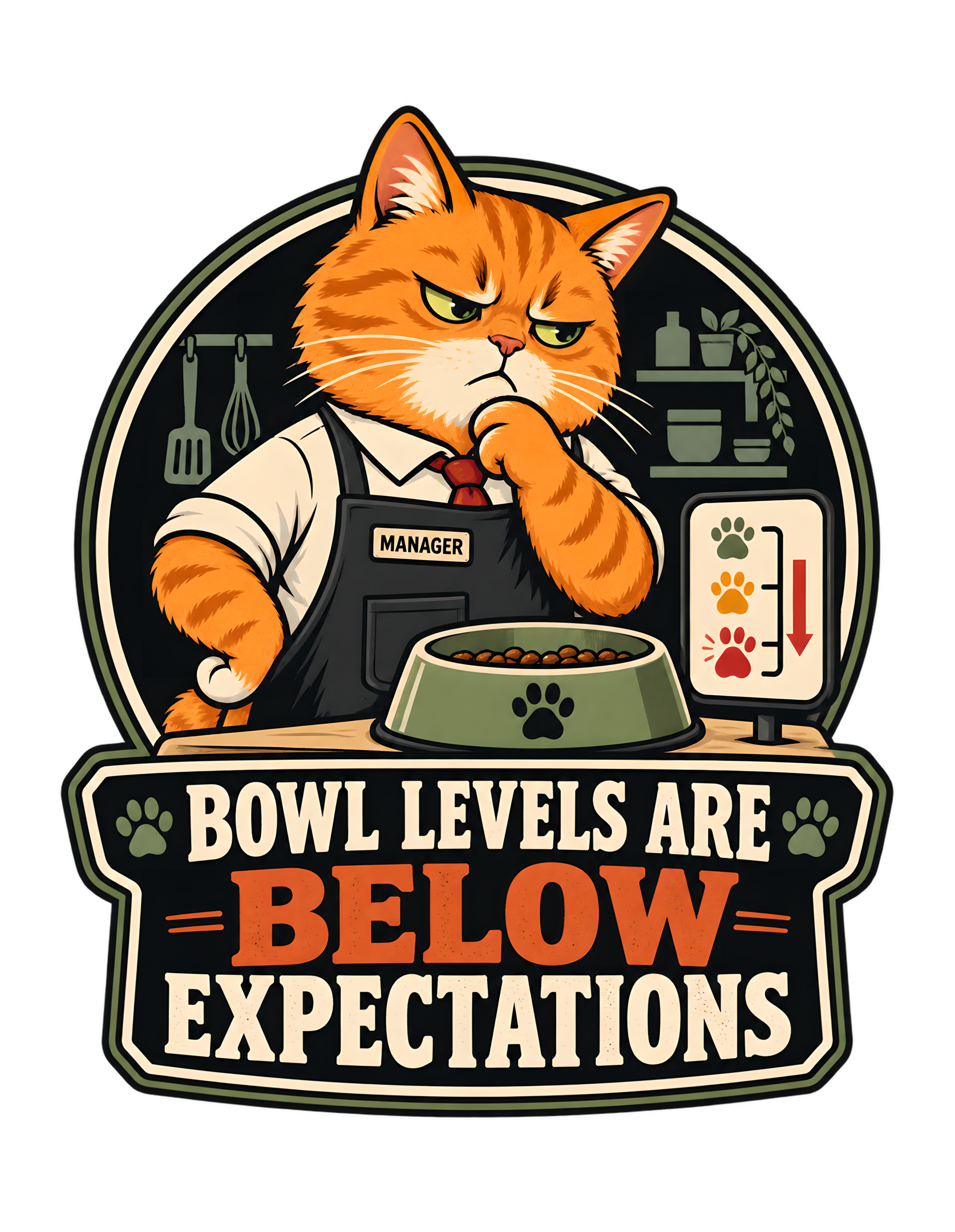
“BOWL LEVELS ARE BELOW EXPECTATIONS” takes one of the most recognizable cat-owner disagreements—the apparently unacceptable state of a food bowl that is not actually empty—and turns it into a formal service-level failure. The canonical concept is deliberately simple: an orange cat sees a partially filled bowl and treats the remaining amount not as food, but as evidence that human performance has slipped below the required standard. The approved production artwork makes that joke immediately legible through a compact vintage badge composition built around an orange manager cat, a green food bowl, a descending paw-print gauge, restrained kitchen cues, and the large phrase “BOWL LEVELS ARE BELOW EXPECTATIONS.”
The important comic move is not hunger itself. It is escalation. The cat is not shown pleading, panicking, or improvising. The cat appears to be evaluating. The white shirt, red tie, dark apron, visible “MANAGER” label, concentrated expression, and paw-under-chin pose transform an ordinary food-bowl complaint into a performance review. The nearby gauge makes the visual logic even clearer: bowl level is being treated like a measurable service standard, and the trend is going the wrong way.
That framing is extremely natural for Cats Judging Humans. Humans may believe that a partially filled bowl is adequate. The cat has introduced a different metric. The human position is therefore not rejected emotionally; it is rejected administratively.
This page stays grounded in the supplied canonical source and in the approved artwork itself. It does not claim that every cat reacts this way, does not invent feeding advice, and does not turn the joke into a factual statement about feline nutrition or behavior. The page is about the design: why the visual hierarchy works, how the manager role intensifies the humor, why the gauge is such an efficient prop, and how a familiar domestic disagreement becomes a compact Cats Judging Humans performance report.
The production master is recorded as an immutable transparent PNG at 6200 by 8000 pixels with preserved aspect ratio and a documented safe margin. Those technical facts matter only as provenance here: the editorial page is not a product-specification sheet. They simply confirm that the approved artwork is a finalized production asset whose visual composition should be treated as authoritative rather than casually reinterpreted.
The Joke Begins With a Bowl That Is Not Empty Enough to Satisfy Management
The design’s central premise is funny because the bowl is visibly not empty. There is food in it. That matters. If the bowl were completely bare, the cat’s concern would look practical. By keeping food visibly present, the artwork shifts the conflict away from necessity and into standards.
The human position is easy to imagine: there is still food.
The feline position is equally clear: that is not the metric under review.
This gap is where the entire Cats Judging Humans joke lives. The cat does not need to argue that the bowl contains nothing. The cat simply treats the current level as unacceptable.
That is a much stronger premise than a generic “hungry cat” gag because it creates a specific relationship between cat and human. The human has completed a task incompletely. The cat is now evaluating service quality.
The canonical concept summary states that a cat converts the perfectly ordinary sight of a partially filled bowl into a serious performance problem requiring immediate human correction. The approved artwork follows that premise faithfully. The bowl sits prominently in front of the orange cat, and the visual emphasis is not on desperation but judgment.
Cats Judging Humans can therefore frame the joke as a dispute over expectations rather than food itself.
Humans often evaluate a household task by asking whether it is technically finished.
Cats, in this design, evaluate whether it has been finished to feline standards.
Those are different systems.
The phrase “BOWL LEVELS ARE BELOW EXPECTATIONS” sounds like language from a quarterly review, an operations dashboard, or a service report. Applying that language to a food bowl is what gives the design its dry tone.
The cat is not saying, “Feed me.”
The cat is saying, “Your performance has been measured.”
That distinction turns a familiar domestic moment into something much more specific.
Management has inspected the bowl.
Management is disappointed.
The presence of remaining food will be entered into the record as irrelevant context.
The most important reading is that the joke never depends on literal emptiness. The human and cat are looking at the same evidence and applying different standards, which keeps the humor rooted in perspective rather than contradiction.
The visual argument is strongest because the bowl remains visibly serviceable to a human eye. That lets the design preserve a genuine disagreement instead of manufacturing an emergency. The human can be technically correct while still failing the cat’s invented standard, which is exactly the kind of administrative absurdity the phrase is built to support.
The Orange Cat Manager Turns a Food Complaint Into a Performance Review
The approved artwork does not present the orange cat as merely annoyed. It presents the cat as management.
That visual role is established through several visible details: a white shirt, a red tie, a dark apron, and a small label reading “MANAGER.” The cat also holds one paw beneath its chin in a thoughtful, evaluative pose. The expression is narrowed and serious rather than frantic.
Those choices matter because the joke depends on authority.
If the cat were simply staring at the bowl, the scene would still be recognizable. But the manager styling gives the cat a professional framework for the complaint. The bowl is no longer only a bowl. It has become a service metric.
The anthropomorphic clothing is deliberately restrained. The design does not turn the cat into a fully human office character with a desk, paperwork, and elaborate props. The feline face, paws, ears, and orange tabby markings remain the dominant visual identity.
That balance keeps the joke feline.
Cats Judging Humans works best when human systems are borrowed to explain cat attitudes, not when the cat stops feeling like a cat entirely.
The manager role also fits the larger brand language. Cats frequently appear as supervisors, evaluators, household authorities, and questionable decision-makers’ overseers. This artwork uses that recurring power structure in a kitchen setting.
The human is absent from the composition, which makes the authority feel even more complete.
Management does not need the employee present in order to document the problem.
The cat’s pose also adds restraint. The paw under the chin reads as assessment rather than outrage. That is consistent with the brand’s preferred dry humor. The cat does not need to yell. The standards are self-evident.
The result is a compact visual character: orange cat, kitchen manager, bowl-level auditor.
A partially filled bowl has been reviewed.
A decision has been reached.
The human will be informed.
The manager role also keeps the cat’s authority visually contained. The clothing signals responsibility without requiring a full office setting, so the domestic feeding joke remains the first read rather than becoming a costume joke.
The manager costume also creates a useful contrast with the orange tabby face. The cat remains expressive and recognizably feline while the role is communicated through a few simple garments. That restraint keeps the humor focused on authority rather than costume complexity, which helps the central joke survive reduction and quick viewing.
The Paw-Print Gauge Makes an Absurd Standard Look Measurable
The small gauge beside the bowl is one of the most efficient supporting elements in the approved artwork. It turns the cat’s dissatisfaction into something that looks quantified.
The gauge uses paw-print markers in green, orange, and red, with a strong downward red arrow beside them. There is no need for numerical values. The visual logic is immediate: the condition has moved from acceptable toward unacceptable.
That matters because measurement makes the joke feel official.
Without the gauge, the cat could simply be expressing a preference.
With the gauge, the preference appears to have been converted into a monitored performance indicator.
This is exactly the kind of bureaucratic overstatement that suits Cats Judging Humans. The cat is not merely disappointed by the amount of food. The household appears to have failed a tracked operational standard.
The visual is also smart because it avoids overexplaining. A literal chart with percentages, labels, or instructions would add clutter and weaken the apparel composition. The paw icons and arrow provide enough information at a glance.
Green suggests approval.
Orange suggests warning.
Red suggests that the human should probably stop arguing.
The gauge is especially funny beside a bowl that still contains food. The viewer can see the contradiction directly. There is no objective emergency, yet the visual system behaves as though a threshold has been breached.
That contrast gives the joke structure.
Human assessment: food remains.
Feline assessment: performance declining.
Management dashboard: unacceptable.
The gauge also supports the phrase “BELOW EXPECTATIONS” because it gives “below” a visual direction. The red arrow points downward while the headline emphasizes the same concept verbally.
That alignment between prop and phrase makes the design feel tightly integrated rather than decorated.
Cats Judging Humans does not need to establish what the official minimum level is.
The cat knows.
The human was apparently expected to know.
That will be addressed during onboarding.
Because the gauge uses icons rather than explanatory copy, it works as visual shorthand. The viewer understands declining status before reading every word, which gives the design an unusually efficient second layer.
The gauge also creates a visual reading order that starts with the cat, drops to the bowl, and then confirms the problem beside it. That sequence makes the complaint understandable before the viewer reaches the large phrase. In effect, the illustration supplies evidence first and lets the typography deliver the formal ruling afterward.
The Food Bowl Is the Smallest Object With the Largest Authority
The green food bowl is physically smaller than the cat and smaller than the main typography, yet it is the object around which the entire concept revolves.
That makes it a strong visual anchor.
It sits prominently in front of the cat, centered enough to be unmistakable, and it contains visible food. The bowl also carries a paw motif, reinforcing the feline ownership of the situation without requiring additional branding inside the design.
The color choice helps it stand apart from the orange cat and dark badge background. The muted green fits the limited vintage palette while remaining distinct enough to read immediately.
The bowl’s visual simplicity is important.
It does not need labels.
It does not need a measurement line.
It does not need a human hand reaching toward it.
The gauge supplies the evaluation, and the cat supplies the authority.
The bowl supplies the evidence.
That three-part relationship makes the design efficient.
One of the most useful things about this concept is how quickly the viewer understands the dispute. Anyone can see that there is food remaining. The phrase then tells us that the remaining amount has somehow failed inspection.
The visual does not require a long setup.
That matters for apparel and social presentation, where a design has to communicate before the viewer chooses to examine details.
The bowl is therefore more than a prop. It is the argument.
The human defense is visible inside it.
There is food.
The cat’s counterargument is also visible.
The level is lower than the cat considers acceptable.
Cats Judging Humans thrives on exactly this kind of impossible standard.
The cat is technically provided for.
Management has determined that “technically” is not a service level.
The bowl also prevents the concept from drifting into abstract workplace satire. Whatever the cat’s title may imply, the dispute remains unmistakably domestic and connected to one ordinary household object.
Because the bowl stays centered and unobstructed, it works like a piece of evidence placed on the table during review. The cat’s relationship to it is direct and unmistakable. That clarity makes the absurdity sharper: the disputed object is right there, plainly containing food, yet the evaluation has already moved to service-level failure.
The Kitchen Cues Keep the Manager Joke Grounded in Ordinary Home Life
The approved artwork includes restrained kitchen details rather than an elaborate restaurant or corporate environment. A spatula and whisk hang at the left. Shelving, jars, containers, and a trailing plant appear on the right. These cues are simplified and subordinate to the cat, bowl, gauge, and phrase.
That restraint is useful.
The joke is about household service, not professional food service.
The kitchen environment keeps the premise recognizable as a cat-owner moment.
A more elaborate commercial kitchen could make the manager role too literal. A completely blank background could make the joke feel generic. The approved artwork finds a middle ground: enough domestic context to establish the setting, but not enough to compete with the central silhouette.
The kitchen also supports the concept because feeding is one of the most ordinary human responsibilities in a cat household. The design then transforms that routine responsibility into a service-quality dispute.
The human is not shown.
That absence keeps the focus on the cat’s interpretation of the situation.
The kitchen appears to be functioning.
The bowl contains food.
The manager remains dissatisfied.
That is all the visual evidence the joke needs.
The plant and shelving also soften the workplace framing. The cat may be dressed like management, but it is clearly still operating inside a home.
That blend keeps the tone playful rather than severe.
Cats Judging Humans does not need to claim that the household has become an office.
It only needs to suggest that the cat evaluates it like one.
The design therefore makes the kitchen a performance environment without changing what it is.
A bowl is still a bowl.
A whisk is still a whisk.
A cat is still a cat.
The only thing that has changed is the reporting structure.
The kitchen details are intentionally secondary, which helps the design avoid becoming a room illustration. They establish place, then step back so the cat’s evaluation remains dominant.
The domestic cues also prevent the piece from feeling like generic corporate satire with a cat pasted into it. The joke begins in a kitchen and only borrows management language to exaggerate the cat’s response. That grounding is important because the best CJH humor starts with recognizable life before escalating it.
The Paw-Under-Chin Pose Makes the Judgment Feel Considered, Not Emotional
The cat’s pose is one of the strongest reasons the artwork feels dry rather than frantic. One paw is raised beneath the chin in a familiar thinking gesture while the other arm rests lower across the body.
The result is a posture of assessment.
The cat appears to be considering the evidence.
This is much funnier than a dramatic open-mouth complaint would be.
A loud reaction would frame the bowl level as an immediate emotional crisis. The thoughtful pose reframes it as a documented failure that has already passed through review.
That shift in tone is central to Cats Judging Humans.
The brand’s cats are most effective when they seem confident enough not to overreact.
The human behavior can be questionable.
The cat does not need to become chaotic in response.
The pose also complements the manager styling. A tie and apron establish role, but posture establishes attitude.
The cat looks like someone who has seen this performance problem before.
That creates implied history without requiring the article to invent any actual previous incident.
Visually, the paw-under-chin gesture also helps keep the cat’s upper body compact inside the circular badge. The silhouette remains contained, which is useful for apparel readability.
The pose therefore serves both humor and composition.
Cats Judging Humans can summarize the moment very simply:
The bowl was inspected.
The manager reflected.
The manager found the situation disappointing.
No shouting was required.
The human will receive corrective feedback.
The seriousness of the pose also lets the viewer do more of the comedic work. The art does not have to signal “this is funny” through exaggerated cartoon behavior.
The cat treats the issue seriously.
The viewer understands that the issue is ridiculous.
That gap is the punchline.
The pose also gives the cat a kind of patient disappointment. That tone matters because the brand’s superiority is funniest when it feels settled rather than explosive.
The cat’s stillness gives the human viewer nowhere to redirect the blame. Nothing about the pose suggests confusion or panic. The expression says the assessment is complete. That certainty is what turns a minor household disagreement into a verdict and keeps the scene aligned with the brand’s quietly superior voice.
The Phrase Sounds Like Corporate Language Applied to the Wrong Emergency
“BOWL LEVELS ARE BELOW EXPECTATIONS” is funny because it sounds completely reasonable in the wrong context.
The phrase uses the language of targets, standards, dashboards, and performance reviews. It suggests that an expected level has been established, measured, and missed.
Nothing about the wording sounds emotional.
That is exactly why it works.
A human saying “the bowl is getting low” would sound ordinary.
A cat declaring that bowl levels are below expectations sounds like an operations problem requiring management intervention.
The phrase also avoids saying the bowl is empty.
That is essential.
The design is built around the fact that the bowl still contains food. The language therefore does not make a false claim. It simply establishes an aggressively high standard.
That is a very feline kind of technicality.
Cats Judging Humans often works by letting the cat win through framing rather than evidence.
The human can point to the remaining food.
The cat can point to the expectation.
The argument is no longer about whether food exists.
It is about whether the service met specification.
The phrase’s structure also reads cleanly in stacked typography. “BOWL LEVELS ARE” introduces the metric. “BELOW” becomes the dramatic middle word. “EXPECTATIONS” delivers the formal conclusion.
That hierarchy gives the headline visual rhythm while preserving the dry tone.
The wording is also evergreen because it does not depend on a current meme, platform, or cultural event. The humor comes from a familiar household disagreement expressed in institutional language.
As long as cats continue to have opinions about bowl levels, the phrase remains understandable.
Management has set expectations.
The humans were not consulted.
That is not considered a flaw in the process.
The phrase avoids unnecessary setup words. It behaves like a result already pulled from a report, which makes the cat’s conclusion feel pre-approved and the human’s objection feel late.
The phrase also benefits from sounding impersonal. It does not say “I am upset” or “feed me now.” It states that levels are below expectations, as though the standard exists independently of the cat’s mood. That detached wording makes the cat’s subjective preference sound like an objective finding.
The Word BELOW Does Double Duty as Meaning and Visual Emphasis
The typography gives the word “BELOW” special treatment, and that choice strengthens both the reading order and the joke.
“BOWL LEVELS ARE” appears above in cream. “BELOW” is much larger and rendered in a muted burnt-orange tone. “EXPECTATIONS” returns to cream below.
This creates a clear hierarchy.
The viewer can understand the phrase quickly even at a distance.
More importantly, “BELOW” is the exact word the nearby gauge visualizes.
The downward arrow points toward the lower end of the gauge.
The typography emphasizes “BELOW.”
The bowl itself sits physically above the text but conceptually below the cat’s standard.
These elements all reinforce one another.
That integration makes the design feel intentional rather than assembled from separate jokes.
The orange emphasis also echoes the cat’s fur, creating color continuity between subject and phrase. The result is a strong visual link between management and the judgment being issued.
Cats Judging Humans benefits from this kind of hierarchy because the brand’s humor is often delivered through one decisive word.
Here, “below” is not merely descriptive.
It is the verdict.
The rest of the phrase explains what has failed.
The gauge confirms the direction.
The cat confirms the authority.
The human, again, is not shown because no further testimony is required.
The treatment is also effective at apparel scale. A single large color-shifted word gives the composition a bold center without requiring additional decorative elements.
The design therefore communicates its logic in layers:
Bowl.
Gauge.
Below.
Expectations.
Manager.
The viewer puts the system together almost instantly.
That is efficient visual storytelling.
It also leaves management free to continue being disappointed in silence.
Emphasizing one word also improves memory. Viewers can retain the basic logic—below expectations—even after the smaller compositional details have passed.
The emphasized middle word creates a visual pause that mirrors the logic of the sentence. First there is a metric, then a negative directional finding, then the standard that has been missed. The reader does not merely read a joke; the typography makes the evaluation feel sequential and procedural.
The Vintage Badge Structure Turns a Kitchen Complaint Into an Official Emblem
The approved artwork uses a compact badge-like structure rather than a full scene with walls, counters, and large environmental depth.
That choice is important for the design’s identity.
The cat and kitchen cues sit inside a rounded upper frame. The food bowl and gauge remain contained within the same central mass. The phrase is built into a substantial lower plaque-like section.
Together, those pieces create one unified emblem.
That visual format makes the complaint feel official.
A loose illustration might show a cat beside a bowl.
A badge looks like a declaration.
The vintage structure also fits the brand’s established visual language: bold silhouettes, strong typography, distressed influence, limited-color composition, and emblematic forms.
The format does not need to imitate a real corporate seal.
It simply borrows the confidence of one.
That is useful because the joke depends on the cat treating an ordinary domestic issue as a formal matter.
The compact shape also makes the design portable across presentation contexts. The production asset is a tall transparent PNG, and the artwork itself holds together as a centered unit rather than requiring a rectangular background.
That is a technical source fact about the approved master, not a claim about any specific product.
Editorially, the badge gives the scene a finished quality.
The cat, bowl, gauge, and phrase all belong to the same system.
Nothing feels like an afterthought.
Cats Judging Humans can therefore treat the artwork almost like a service-level crest issued by feline management.
The bowl is underperforming.
The badge has been created.
The matter is now institutional.
The badge form gives the scene visual closure. The viewer does not have to search for where the illustration ends and the wording begins because both have been designed as one object.
The emblem structure also makes the artwork feel like a complete identity rather than an illustration plus caption. That matters because the central premise is institutional. A complaint framed like a badge suggests policy, continuity, and precedent—exactly the opposite of the trivial household trigger that started the joke.
The Limited Palette Keeps the Design Readable While Preserving Its Vintage Tone
The approved artwork uses a restrained palette rather than a broad range of bright colors. Orange fur, cream lettering and shirt details, black and near-black framing, muted green kitchen and bowl elements, red accents, and warm neutral tones create the main visual system.
That limitation helps the design read cleanly.
The orange cat remains the dominant subject.
The green bowl separates clearly from the fur.
The red tie and downward gauge arrow introduce focused emphasis.
The cream typography stands out against the dark base.
The palette also supports the vintage graphic character of the design. It feels deliberate rather than glossy or overly modern.
This is especially effective because the concept already contains multiple information elements: cat, bowl, gauge, kitchen cues, manager label, and a three-line phrase.
Too many colors would make those elements compete.
The controlled palette instead creates hierarchy.
Cats Judging Humans benefits from this kind of discipline because the humor should remain the first impression.
The viewer should not need to decode the art style before understanding the joke.
The palette also avoids making the food itself visually dominant. The bowl level matters conceptually, but the cat remains the authority.
That is the correct hierarchy for the design.
Management is the subject.
The bowl is the problem.
The gauge is the report.
The phrase is the conclusion.
Color helps keep those roles distinct.
The result feels premium without becoming elaborate.
The design does not need visual excess to communicate feline standards.
One disappointed orange manager is enough.
The limited color system also helps the cat’s expression remain readable. Strong tonal separation around the eyes, muzzle, shirt, tie, and dark apron keeps the face from disappearing into the badge.
The palette supports that same sense of control. None of the accents compete aggressively for attention, and the red is reserved for the strongest warning cues. That limited visual vocabulary lets the design feel disciplined even while the subject matter is intentionally ridiculous.
The Human Is Missing Because the Human Has Already Failed the Review
No human appears in the approved artwork.
That absence is useful.
The joke is entirely framed from the cat’s side.
The viewer is invited to occupy the human position implicitly.
The bowl is in front of us.
The cat is evaluating it.
The gauge is falling.
The phrase states the judgment.
There is no need to show the employee who caused the problem.
That structure makes the design more universal. Any cat owner can imagine themselves as the person responsible for the service-level failure.
The artwork does not specify who filled the bowl, when it was filled, or what happened before the scene.
Those details are not needed.
The complaint is already fully formed.
Cats Judging Humans often becomes funnier when the human is represented by consequences rather than by a visible character.
Here, the human exists as an unseen service provider whose performance has been measured.
That gives the cat more visual authority.
The cat owns the frame.
The cat owns the gauge.
The cat owns the phrase.
The human owns the corrective action.
That is a clean power structure.
It also keeps the composition compact. Adding a person would create another focal point and could weaken the badge silhouette.
The approved artwork instead lets the viewer become the missing staff member.
Management has called the review meeting.
You are already attending.
Leaving the human offstage also protects the design from becoming too specific. The viewer can supply their own kitchen, routine, and feeding debate without the artwork dictating a single household story.
The missing human also keeps the tone from becoming confrontational. There is no visible argument, only a completed judgment. That lets the viewer laugh from the position of the absent staff member rather than watching a literal conflict play out inside the artwork.
The Design Works Because Cat Owners Recognize the Standard as Ridiculous and Familiar
The concept does not need a complicated setup because the emotional logic is familiar: the cat has decided that the visible amount of food is unacceptable even though the bowl is not empty.
The canonical marketplace description captures that idea directly by describing a merely partial bowl as a serious failure in household service levels and noting the familiar joke that half full somehow means unacceptable.
That recognition is the bridge between the exaggerated manager framing and ordinary cat-owner life.
The design does not need to claim that every cat behaves this way.
It only needs enough familiarity for viewers to recognize the joke.
That is an important distinction.
Cats Judging Humans uses recognizable experiences as comic territory, not as scientific rules.
The humor succeeds because the human can see the absurdity and still think, “Yes, that feels familiar.”
The manager role then amplifies the familiar moment without replacing it.
A cat staring at a partially filled bowl is ordinary.
A cat monitoring that bowl with a performance gauge is the brand version of the same moment.
The exaggeration is therefore anchored in something small and domestic.
That keeps the design relatable.
It also makes the cat’s seriousness more entertaining.
The viewer knows that food remains.
The cat appears unconcerned with that defense.
Management does not dispute the existence of food.
Management disputes the adequacy of the level.
That is the whole case.
The human can appeal.
The appeal has been denied.
Audience recognition is strongest when the design stops before it becomes explanation. The viewer already understands the domestic argument, so the artwork can spend its energy elevating that argument into management language.
The source is strongest when it stays at that level of recognition. It does not need to explain feeding schedules, appetite, or any biological reason for the complaint. The design is not educational animal behavior content. It is an observational joke about how a cat can make an ordinary service decision feel inadequate.
The Evergreen Strength Comes From a Household Standard, Not a Passing Trend
The canonical source marks the concept as evergreen, and the design supports that classification.
There is no holiday.
There is no celebrity.
There is no current event.
There is no platform interface.
There is no temporary slang that the joke depends on.
The concept rests on two durable ideas: cats have opinions about food, and humans are expected to provide it.
The artwork then reframes that relationship through management language.
That combination is broad enough to remain understandable over time.
The vintage illustration style also supports the evergreen quality because it does not try to look tied to one digital moment.
The badge structure, limited palette, manager role, and service-level gauge all create a self-contained world.
Cats Judging Humans can return to this kind of concept repeatedly without needing the exact same setting or phrase. Other designs can place cats in different roles—supervisor, inspector, executive, committee chair—while the core relationship stays consistent.
The cat has standards.
The human has responsibilities.
The standard has not been met.
That is durable comic territory.
The food-bowl version remains specific because of the phrase and gauge. It is not just a generic “feed the cat” design.
The exact joke is that the bowl has fallen below expectation, not that food is absent.
That precision gives the design identity.
Evergreen does not mean vague.
It means the premise can survive without external context.
This one can.
As long as a human can look at a bowl and say “there is still food in there,” management will have something to review.
The evergreen quality also comes from the absence of a required season or occasion. The phrase can make sense whenever the ordinary human-cat service relationship is recognizable.
The same durability comes from the phrase’s general structure. Any viewer who understands the idea of standards and expectations can understand the joke without knowing a platform trend or cultural reference. The familiar feeding context supplies the rest, making the concept portable across time and format.
The Artwork Fits Cats Judging Humans by Turning Feline Preference Into Human Accountability
The design fits the Cats Judging Humans world because it changes the direction of accountability.
In ordinary human thinking, the cat depends on the person for food.
In the artwork, that dependency becomes authority.
The human is no longer the provider making a choice.
The human is the service department being evaluated.
That reversal is central to the brand.
The orange cat’s managerial clothing, thoughtful pose, food bowl, performance gauge, and large formal phrase all reinforce the same relationship.
Nothing in the composition asks the cat to justify the standard.
The human is expected to meet it.
The joke therefore stays playful while preserving feline superiority.
The cat is not threatening anyone.
The cat is disappointed.
That is much more on-brand.
The design also avoids relying on cruelty, anger, or exaggerated hostility. The cat’s expression is stern, but the scene remains clearly comic.
A bowl level has become a performance issue.
The stakes are intentionally too small for the seriousness being applied.
That mismatch gives the piece its charm.
Cats Judging Humans can summarize the design’s worldview in one administrative sentence:
The human believed the bowl was adequate.
Management used a different rubric.
The page therefore fits naturally beside other CJH concepts that turn ordinary household behavior into inspections, reviews, policies, and authority structures.
The setting changes.
The standard changes.
The evaluator does not.
Humans remain under review.
That accountability reversal is the brand’s deepest comic move: cats depend on humans materially while behaving as if humans depend on feline approval institutionally.
That is also why the design feels like a strong fit for the wider CJH catalog. The cat is not merely demanding something; it is evaluating the human’s ability to provide it correctly. The brand’s hierarchy remains intact: the human performs the task, the cat decides whether the task met standard.
“BOWL LEVELS ARE BELOW EXPECTATIONS” works because every part of the approved artwork supports the same compact idea. The orange cat is management. The partially filled bowl is evidence. The paw-print gauge is the performance indicator. The downward arrow establishes the direction of concern. The kitchen cues keep the situation domestic. The large stacked phrase formalizes the verdict.
Nothing in the design needs to claim that the bowl is empty.
That is the point.
The joke is built on the difference between adequacy and expectation. The human can see remaining food and conclude the task is complete. The cat can see the same bowl and conclude that service quality is declining.
Cats Judging Humans turns that disagreement into a tiny management system.
The result is specific enough to have its own identity while staying broad enough to remain evergreen. It is not a trend joke. It is a household standards joke. It does not need a visible human because the viewer already understands who is being evaluated.
Management has finished the review.
The bowl remains partially full.
The expectations remain completely unreasonable.
Corrective action is still required.