“THE HUMAN HAS BEEN RETRAINED” takes one of the oldest household misunderstandings in cat ownership and gives it a management review. The human may believe that feeding, opening doors, and providing attention are examples of responsible pet care. The cat in this design has reached a different conclusion: these are learned service behaviors, and the training program has finally produced acceptable results.
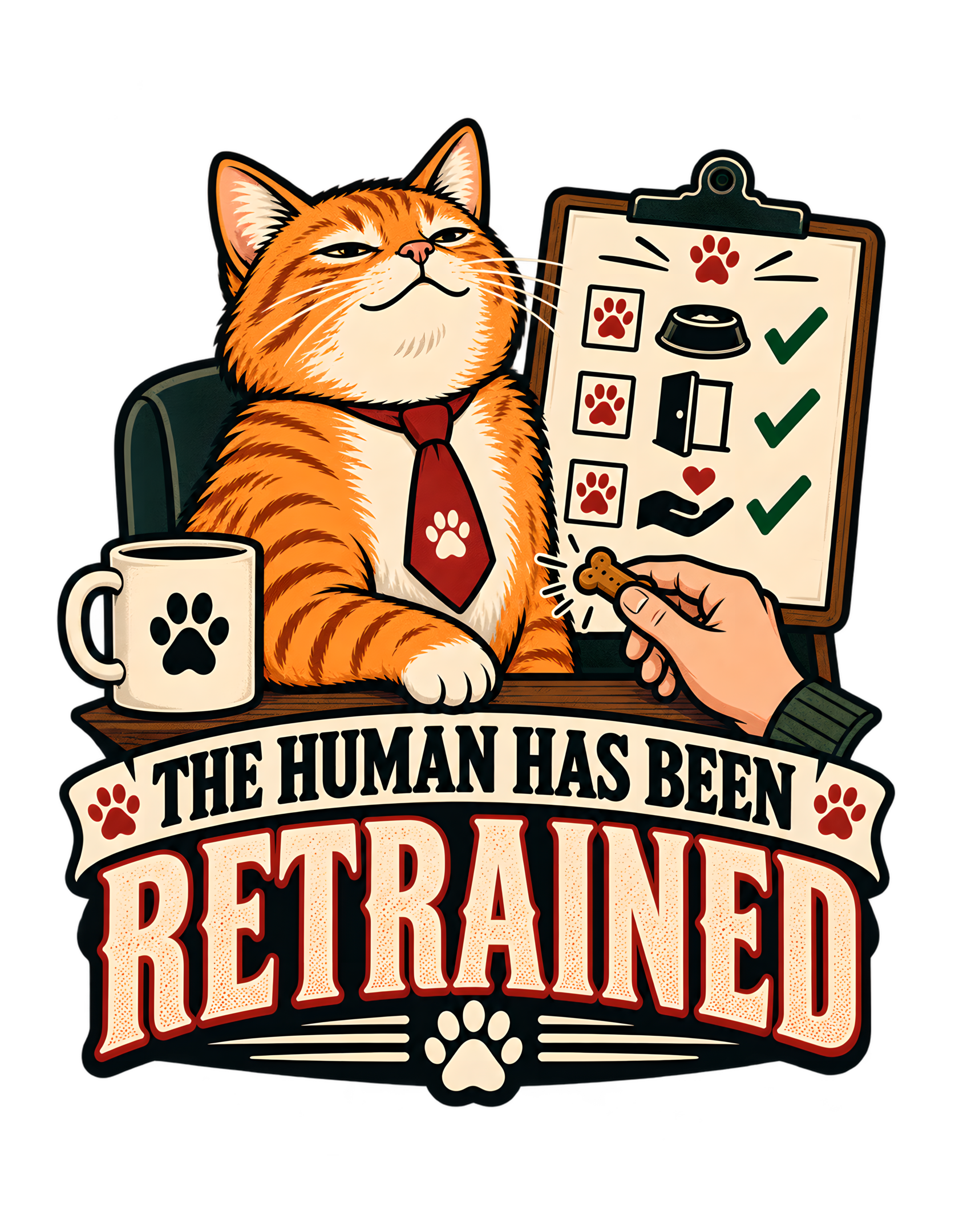
The canonical concept is explicit. An orange cat proudly reviews the human’s progress in delivering treats, opening doors, and providing attention on command. The approved artwork turns that role reversal into a compact document-parody scene. A self-satisfied orange tabby sits behind a desk in a red tie, one paw resting with complete confidence while a human hand offers a small treat. Beside the cat, a clipboard displays simple paw-marked tasks paired with icons for a bowl, a door, and attention, each followed by a green check. A paw-marked mug sits nearby. Beneath the scene, the phrase “THE HUMAN HAS BEEN RETRAINED” fills the lower half in large vintage-style lettering.
The joke works because the design never treats the cat as a grateful recipient. The cat looks like the evaluator. The human hand is evidence. The checklist is documentation. The completed checkmarks transform ordinary household care into a training record.
This page stays anchored to the canonical source and the exact approved artwork. It does not invent prices, materials, product availability, shipping details, or any hidden training process beyond what the source and visible design support. The artwork remains the factual visual authority. Cats Judging Humans supplies the editorial interpretation: humans may believe they trained the cat, but the paperwork appears to show a very different organizational chart.
Apparently the retraining was successful.
The Joke Reverses the Entire Idea of Pet Training
The central joke in “THE HUMAN HAS BEEN RETRAINED” is a clean role reversal. Humans normally speak about training pets as though the human sets the rules, teaches the behavior, and evaluates the outcome. This design quietly flips every part of that structure.
The cat is not the trainee. The cat is the evaluator. The human is the one demonstrating learned responses.
That reversal is already present in the canonical concept summary, which says the cat frames successful treat delivery, door opening, and attention on command as proof that the human has finally completed feline training. The approved artwork makes that idea immediately visible without needing a long explanation. The orange tabby sits in the position of authority. The human appears only as a hand presenting a treat. The clipboard records successful household tasks.
What makes the joke particularly effective is that the human behaviors are ordinary. A person who lives with a cat may reasonably provide food, open a door, or offer attention. The design does not invent bizarre duties. It takes familiar acts of care and changes the interpretation.
From the human perspective, these actions are kindness or routine. From the cat’s perspective, they are evidence that training has taken hold. Cats Judging Humans works best when feline superiority emerges from a recognizable household pattern rather than random arrogance. That is exactly what happens here. The cat does not need to announce that humans are servants. The checklist proves the point more elegantly.
The role reversal also gives the phrase its past-tense confidence. “Retrained” implies the process has already happened. The cat is not making a request or threatening future instruction. The evaluation is complete.
Humanity, at least in this household, has shown improvement.
The concept is especially strong because the human is not portrayed as resisting the process. The evidence says the opposite: the tasks are complete. That gives the cat’s superiority a surprisingly generous tone. The trainee succeeded. The humor comes from who gets to define success, not from humiliating the person who performed the work. The design therefore manages to be judgmental and approving at the same time, which is unusually on-brand. The cat may have rewritten the organizational chart, but the human still receives credit for improvement.
The Orange Cat Looks Like a Reviewer, Not a Recipient
The approved artwork depends heavily on the orange tabby’s expression. The cat looks pleased, but not excited. The eyes are narrowed, the mouth carries a restrained self-satisfied curve, and the posture is upright and composed. That distinction matters.
A delighted cat receiving a treat would make the scene about reward. A surprised cat would make it about discovery. A demanding cat would make it about appetite. This cat looks like management.
The human hand offers the treat in the foreground, but the cat’s expression does not read as grateful. It reads as confirmation that the human has performed correctly. That attitude is exactly what the canonical visual concept calls for: the cat should look satisfied rather than excited, as though reviewing successful staff development. The artwork stays faithful to that direction.
The orange cat choice also gives the design warmth without sacrificing authority. The fur is bright and visually inviting, which keeps the overall composition playful. The dry superiority comes from posture and expression rather than menace.
It is important not to invent personality claims based on coat color. The source does not say orange cats are naturally managerial, more food-motivated, or more judgmental. Orange is simply the cat type selected for this design.
Editorially, however, the visual effect is strong. A warm orange cat with a smug, composed face creates a funny contrast with the formal checklist beside it. The human sees a pet receiving a treat. The picture presents a supervisor acknowledging improved employee performance.
The cat’s expression makes the distinction clear before the viewer even reaches the phrase.
The cat’s visual authority also depends on scale. The tabby’s face and upper body dominate the scene, while the human is reduced to a single functional gesture. That does not erase the human from the story; it clarifies the point of view. The viewer is seeing the household through the cat’s organizational chart. Even the cat’s half-lidded eyes matter because they suggest evaluation rather than anticipation. The cat looks like someone who expected the human to get there eventually.
The Checklist Converts Household Care Into a Performance Record
The clipboard is the design’s strongest narrative prop because it turns ordinary household interactions into documented evidence. The canonical source specifies a simple training checklist with paw icons next to tasks like bowl, door, and attention. The approved artwork shows exactly that kind of structure. Three rows are visible. Each row has a paw-marked box, a task icon, and a green checkmark.
No written task labels are necessary. The bowl icon reads as food or treat service. The door icon reads as access. The hand-and-heart symbol reads as attention or affection. The checkmarks confirm completion.
This is an excellent example of visual storytelling through symbols. The viewer does not need a literal training manual to understand the joke. The clipboard already looks official enough to suggest a review, while the paw icons make it unmistakably feline.
The document-parody format is also important to the humor mechanism. Bureaucratic systems usually make behavior seem formal, measurable, and accountable. By applying that language to a cat-human relationship, the design gives the cat absurd institutional power.
The human has apparently been assessed against feline standards. The tasks were completed. The boxes were checked. The retraining has been certified.
Cats Judging Humans frequently benefits from making a cat’s preferences look like policy. The checklist does that without overcrowding the art. It also gives the phrase “THE HUMAN HAS BEEN RETRAINED” something concrete to refer to. The line is not merely a boast. The cat has documentation.
Humans are notoriously fond of paperwork when it supports their own conclusions. It seems only fair that the cat has adopted the same system.
The checklist also gives the design replay value because each icon adds a separate miniature joke. A quick glance catches the headline. A closer look reveals the bowl, door, attention symbol, paw boxes, and checks. The design therefore rewards inspection without requiring tiny explanatory text. That layered readability is useful for apparel because the main joke survives at a distance while the secondary details become bonuses when the viewer looks closer.
The Treat in the Human Hand Is the Most Important Piece of Evidence
The human hand in the foreground is small compared with the cat and the headline, but it carries enormous narrative weight. The source explicitly calls for a generic human hand presenting a treat. The approved artwork preserves that detail. A hand reaches in from the lower right holding a small treat toward the cat.
This matters because it turns the checklist from abstract paperwork into a demonstrated skill. The cat is not merely claiming that training succeeded. The human is performing one of the behaviors. That makes the joke active even though the artwork is static.
The cat’s posture strengthens the effect. The tabby does not lunge for the treat. The cat remains composed, as though the reward is less important than the fact that the human remembered the procedure.
This is where the design becomes distinctly Cats Judging Humans. The human believes the treat is being given to the cat. The cat appears to believe the treat is evidence of human compliance. The relationship has been reclassified.
The prop also stays generic. There is no branded packaging, no marketplace product, and no claim about what kind of treat is being offered. That restraint is useful because the joke is about behavior, not about a specific product.
The hand’s partial appearance also reinforces the power imbalance in the composition. The human does not receive a full portrait. The human exists primarily as service evidence. The cat gets the chair, the tie, the mug, the clipboard, and the headline. The human gets one hand and a completed task.
That visual hierarchy is not cruel. It is simply efficient. The cat is conducting the review.
The treat hand also creates a useful foreground-to-background relationship. The human action happens closest to the viewer, while the cat and checklist establish the authority behind it. That staging makes the human behavior feel like a demonstration being performed for review rather than a random prop inserted beside the cat. The fact that only the hand is visible makes the human role even more functional: what matters in this moment is not identity, but whether the trained response was executed correctly.
Food Service Becomes a Training Milestone Instead of a Favor
One of the visible checklist rows uses a bowl icon, and the canonical concept specifically includes successful treat delivery as evidence of human training. That gives the design a familiar foundation.
Feeding is one of the clearest recurring interactions between cats and humans. In normal human language, the person provides food because the cat depends on the household for care. The joke reframes the same action as a learned response.
The bowl is no longer proof that the human is responsible. It is proof that the human follows instructions. That difference is small enough to be instantly recognizable and large enough to power the entire design.
The artwork wisely avoids turning the bowl into a literal scene of eating. There is no messy food setup and no need to show a full feeding routine. The icon is enough. That keeps the design compact and lets the checklist carry multiple tasks at once.
It also avoids unsupported claims about feeding schedules, food preferences, or specific products. The source only gives us the concept of treat delivery and a bowl symbol. The article should stay there.
Cats Judging Humans can still make the editorial point clearly: humans are very proud of their ability to provide meals on time, but the feline department may view that achievement as baseline competency.
The green check next to the bowl suggests the human passed. That is encouraging. The fact that the cat needed to document the result is slightly less encouraging.
The humor comes from how easily ordinary care turns into a performance metric once the cat is placed in charge. Apparently food service has moved from kindness to compliance.
The bowl row also helps the phrase avoid becoming abstract management humor. It ties the idea back to everyday cat ownership. The visual joke works because the viewer can understand the task instantly. No specialized workplace knowledge is required; household care has simply been translated into training language. That accessibility is part of the design’s commercial strength even though the website page does not need to make sales claims about it.
Door Opening Becomes a Test of Whether the Human Understands Access
Another checklist row uses a door icon, matching the canonical concept’s reference to opening doors on command. This is a particularly strong household joke because doors are one of the places where human and feline priorities can diverge without requiring any elaborate setup.
A human may see a door as a boundary. The design treats it as a service request.
Again, the article should not invent specific behavior such as scratching, meowing, changing one’s mind, or demanding repeated openings. None of that is in the source. The factual design cue is simpler: door opening is one of the behaviors the cat considers evidence of successful human training.
The checklist transforms access into a competency test. Did the human understand that the door should open when required? Green check. That is enough for the joke.
The door symbol also broadens the concept beyond food. If every task were treat-related, the design would be about appetite. By adding access and attention, the artwork builds a larger theory: the human has been trained across several departments of household service. That makes “retrained” feel earned.
Cats Judging Humans turns ordinary domestic logistics into governance. The cat is not merely living in the home. The cat appears to be defining how the home should respond.
The human may own the hinges. The cat controls the service expectations. The door icon therefore functions as more than a prop. It demonstrates that the training program covers infrastructure.
Management appreciates responsiveness.
The door row works the same way while broadening the scope. It tells the viewer that the training program is not limited to food. The human has apparently learned how to operate the environment correctly. That expansion makes the cat’s management role feel more complete without requiring additional narrative clutter. One simple icon lets the viewer imagine an entire category of household service while keeping the composition compact and readable.
Attention Is Presented as Another Human Skill That Required Correction
The third visible checklist task is represented by a hand-and-heart icon, which aligns with the source’s description of providing attention on command. This is important because it moves the joke from physical service into social behavior.
Food can be delivered. Doors can be opened. Attention requires the human to notice that the cat expects engagement. The design treats all three as trainable competencies.
That is funny because humans often think of affection as spontaneous. The cat’s checklist suggests otherwise. Apparently there are standards.
The source does not tell us what kind of attention is required, how often, for how long, or in what form. The article should not invent those details. The visible icon and concept summary support only the broader idea that attention is one of the human behaviors being reviewed.
That is enough to make the role reversal richer. The cat is not merely training the human to operate household equipment. The cat is training the human relationship itself.
Cats Judging Humans can therefore interpret the checkmark with its usual dry confidence: emotional responsiveness has improved to acceptable levels. The cat remains mildly pleased. The human remains under observation.
The icon also helps explain why the concept feels affectionate rather than harsh. One of the standards is attention, which implies the cat actually values interaction with the human.
The joke is not that the human is useless. The joke is that the human is useful and has finally learned how to demonstrate it.
That is practically praise by feline standards.
The attention row adds the social dimension that completes the set. Food, access, and attention cover three different kinds of household response. Together they make the training checklist feel like a compact curriculum rather than one repeated food joke. The cat has apparently developed a well-rounded employee. That is also why the concept stays warm: one of the core competencies is affection, which means the cat’s authority exists inside an ongoing relationship rather than outside it.
The Green Checkmarks Make the Human’s Improvement Look Official
The green checkmarks are small, but they do something crucial: they make the human’s progress look complete. A checklist with empty boxes would imply that retraining is still underway. A checklist with warnings would imply failure. Three green checks support the exact wording of the phrase: the human has been retrained.
The process is finished. That past-tense finality gives the design a satisfying structure. The cat has not merely established standards. The human has met them.
That makes the joke warmer than a pure complaint design. The feline evaluator may be smug, but the report is positive. Cats Judging Humans often presents people as mildly incompetent, but the best versions of that joke still leave room for the human to improve. This design does exactly that.
The checkmarks also create visual rhythm on the clipboard. Each task row ends the same way, allowing the viewer to understand the document immediately even at reduced size. The color choice matters too. Green is widely recognizable as a positive completion cue, and the approved artwork uses it without cluttering the palette.
The source does not define a literal training score or certification system. The checkmarks are visual shorthand, not a factual claim about pet training.
Editorially, however, they let the cat behave like a supervisor who has finally signed off on remediation. The human passed. The cat is satisfied. The retraining plan can move to maintenance mode.
Please do not interpret this as permanent job security.
The checkmarks also prevent the scene from becoming negative. A failed checklist would be a complaint design. A completed checklist is an approval design. That distinction matters tonally because the cat remains judgmental while the human still receives recognition for improvement. In other words, the joke is not “humans are hopeless.” It is “humans can be trained.” Cats Judging Humans rarely offers higher praise.
The Red Tie and Desk Turn the Cat Into a Manager Without Making It Less Feline
The approved artwork gives the orange tabby a red tie and seats the cat behind a desk-like surface. Those details are not incidental. They establish role.
The canonical visual concept describes the cat as reviewing successful staff development, and the marketplace tags include manager-oriented framing. The image makes that framing visible without requiring a full office scene. The tie is enough. The desk is enough. The clipboard completes the department.
Importantly, the cat still looks unmistakably feline. The paws remain paws. The body remains a cat’s body. The expression remains feline rather than turning into a human caricature.
That balance is essential for Cats Judging Humans. The humor works best when the cat does not become a person in a costume. The cat remains a cat who has somehow acquired administrative authority.
The paw-marked mug reinforces the same idea. It looks like an ordinary office object adapted to feline ownership, which makes the workspace feel like the cat’s domain. No text on the mug is needed. No corporate logo is needed. The visual role is clear.
The red tie also introduces a focused accent against the orange fur and darker furniture. It helps the upper character portrait feel intentional and gives the cat the appearance of having dressed for the review.
Cats Judging Humans would like to note that the human was not invited to wear a tie. The human is still in training.
The office-role styling is also restrained enough to keep the cat readable at apparel scale. The tie, mug, clipboard, and desk establish the role without surrounding the character with excessive workplace detail. That economy gives the design a strong silhouette and keeps the humor focused on the cat’s authority. Too many office props would make the scene busier without making the joke stronger. The approved artwork knows where to stop.
The Paw-Marked Mug Gives the Feline Office a Small Ownership Detail
The mug beside the cat is a minor prop, but it strengthens the world of the design. It carries a large paw symbol rather than a human brand or slogan. That choice matters because the cat is not borrowing a generic human workplace. The office has already been feline-normalized.
The mug belongs to the same visual system as the paw-marked checklist boxes and the paw motif near the bottom of the composition. Repetition makes the authority feel coherent.
This is useful because the joke is not simply “cat wearing a tie.” The scene presents a complete management environment in miniature. The cat has a desk. The cat has a mug. The cat has a clipboard. The cat has documentation. The human has a treat.
That hierarchy is unusually efficient.
The mug also adds a small note of calm. A character with a mug at a desk looks settled into the role. The cat is not improvising authority for one moment. The cat appears to work here.
The source does not tell us what is in the mug, so the article should not speculate. It is simply a visible office-style prop with a paw emblem. That restraint keeps the page grounded in the approved artwork.
Cats Judging Humans can make the larger editorial point without inventing content: the human training program appears to have been formalized long enough to require refreshments.
Management is comfortable. The trainee should continue.
The paw mug further repeats the idea that this environment belongs to the cat. Repetition of paw symbols across the mug, checklist, and lower decorative motif creates a coherent visual language. It feels less like a human office borrowed for a joke and more like a feline department with its own internal branding. That small consistency makes the parody more convincing because the setting appears to have been designed around the cat’s authority rather than temporarily decorated for it.
THE HUMAN HAS BEEN RETRAINED Sounds Like a Completed Personnel Decision
The phrase “THE HUMAN HAS BEEN RETRAINED” is concise because the artwork does so much of the explanation. The word “human” identifies the trainee. “Has been” makes the statement official and completed. “Retrained” implies there was already a previous understanding that needed correction.
That final word is where the joke lands. The cat did not train a completely new human. The cat improved an existing one. This creates an entire invisible history without requiring extra copy.
Perhaps the human once believed food was served on the human’s timetable. Perhaps the human once thought doors were operated according to human convenience. Perhaps the human once considered attention discretionary. The source does not specify those failures, so the article should not turn them into factual backstory. The phrase simply implies that some prior approach was inadequate.
That is enough.
The typography reinforces the hierarchy. “THE HUMAN HAS BEEN” appears as a smaller upper line, while “RETRAINED” dominates the lower half in large cream letters with a strong red shadow or outline effect. That emphasis makes the corrective action the visual punchline.
The human is the subject. Retraining is the verdict.
Cats Judging Humans thrives on this kind of bureaucratic understatement. The phrase does not say “I trained you.” It sounds like a formal status update issued after review.
That makes the cat’s authority feel even more natural. No celebration is necessary. The file has been updated.
The word “retrained” also implies persistence. Something in the previous human operating system required correction, and the cat apparently invested enough effort to fix it. The design never explains the original failure, which is wise. The viewer can supply their own household examples without the artwork narrowing the joke. That open space makes the phrase more personal because every cat owner can imagine a different training history behind the same final verdict.
The Badge-Like Composition Makes the Training Result Feel Certified
The approved design is built as a single contained vertical composition rather than a loose scene floating above text. The cat, desk, checklist, hand, mug, and phrase all lock together into one apparel-friendly silhouette.
That cohesion matters because the concept is about certification. A contained badge structure makes the human’s retraining feel like an official result worthy of display.
The upper half tells the story. The lower half declares the outcome. The visual transition between them is handled through strong black framing, curved banner shapes, repeated paw motifs, and bold typography.
That structure prevents the design from feeling like an illustration with a caption added later. The phrase is part of the composition. The checklist is part of the proof. The cat is the approving authority.
The approved production master is recorded as a 6200-by-8000 transparent PNG with aspect ratio preserved and a documented safe margin. Those details are production provenance, not consumer claims, but they confirm that the design exists as a deliberate vertical master with a stable composition.
The website should therefore describe the art as one finished visual system. It should not reinterpret the layout or invent missing elements.
Cats Judging Humans has already completed the design review. The human has already completed retraining. There is no reason to reopen either case.
The contained composition also helps the design function as a catalog item rather than a one-off social meme. Its story is self-sufficient. A viewer does not need a caption, external reference, or current event. The character, checklist, human hand, and phrase explain the concept inside one visual unit. The production master’s preserved aspect ratio further supports treating the artwork as one immutable vertical decision rather than a collection of pieces to be rearranged casually.
The Retro Illustration Style Makes the Bureaucracy Feel Playful Rather Than Corporate
The artwork uses a retro illustrated style with heavy outlines, warm colors, simple symbolic props, and bold vintage-style typography. That choice is important because the concept involves management, training, checklists, and performance review. Rendered too literally, those ideas could feel cold or corporate.
The retro treatment keeps everything playful. The cat’s face is expressive. The checklist is simplified. The icons are large and easy to read. The hand is stylized. The typography feels more like a vintage badge than an employee handbook.
That visual tone protects the brand personality. Cats Judging Humans should feel judgmental and slightly superior, but never genuinely hostile. The warm orange fur, cream background areas, deep green furniture, red tie, red accents, and black outlines create a palette that feels inviting even while the cat is clearly in charge.
The source identifies the art style through internal metadata, and the approved artwork visibly supports a retro document-parody treatment. The article does not need to claim a specific historical era or printing process beyond what can be seen.
The important point is the emotional effect. The design looks official enough to support the joke. It also looks illustrated and warm enough to remain humorous.
That balance is what allows the phrase “THE HUMAN HAS BEEN RETRAINED” to read as affectionate household satire instead of an actual reprimand.
Management has standards. Management also has excellent graphic design.
The retro styling reinforces the evergreen quality for the same reason. It does not depend on one specific software interface, corporate template, or current office trend. The document parody is generic enough to remain readable while still feeling like an official review system. That lets the piece borrow the seriousness of paperwork without tying itself to a dated technology or brand-specific workplace visual.
The Humor Works Because the Cat Is Satisfied Rather Than Furious
The cat’s mood determines whether this concept feels funny or hostile. In the approved artwork, the orange tabby looks satisfied. That is exactly the right choice.
The canonical visual concept specifically says the cat should look satisfied rather than excited, as though reviewing successful staff development. It does not call for anger. It does not call for frustration. It does not call for an aggressive demand.
This matters because the phrase is ultimately positive. The human has been retrained. The checklist is complete. The treat is present. The cat’s standards have been met.
A furious expression would contradict the story. A wildly excited expression would make the cat look like the trainee receiving a reward. The calm, smug expression preserves the authority structure.
Cats Judging Humans often gets its strongest comedy from this kind of emotional restraint. The cat does not need to shout because the system is working. The human may still believe the treat is an act of generosity. The cat has documented it as competency.
Everyone can continue living together.
That is the ideal tone for the brand: dry, clever, judgmental, but still affectionate. The human has not been rejected. The human has improved.
That is practically a glowing annual review.
The satisfied expression also changes the emotional direction of the joke. The cat is not complaining that the human failed. The cat is acknowledging progress. That small shift makes the design feel more affectionate and gives the brand’s sarcasm a warmer landing point. The human has apparently learned enough to earn a calm, self-satisfied review rather than another corrective action plan. This is feline approval in one of its more generous forms.
The Concept Is Evergreen Because Human Service Training Never Needs a Trend
The canonical source marks the design as evergreen, and the concept supports that classification. There is no holiday. No current event. No celebrity. No platform interface. No dated technology.
The joke depends on a stable household relationship: humans routinely feed cats, open doors, and provide attention, while cats often appear perfectly willing to interpret those actions as expected service. That premise does not require a trend to remain understandable.
The visual props are equally durable. A bowl, a door, a hand offering attention, a treat, a clipboard, and a cat behind a desk are all immediately legible. The document-parody format also helps. Checklists and performance reviews are familiar enough to support the role reversal without tying the artwork to one specific workplace system.
Evergreen does not mean generic. The phrase gives the concept a specific identity. The cat is not merely “the boss.” The human has been retrained. That implies history, correction, and successful adaptation.
It also distinguishes the design from other Cats Judging Humans authority concepts involving management, ownership, or supervision. This cat is running staff development. The human completed the course. The certificate is implicit.
Cats Judging Humans can revisit the broader cat-as-manager theme many times because each role creates a different joke structure. This one belongs to training and compliance.
The department appears stable for long-term operation.
The evergreen strength comes from household repetition. Feeding, opening doors, and providing attention are broad recurring interactions that remain recognizable without any special event. The training metaphor can therefore keep working as long as humans continue believing they are the ones setting the rules. The design is specific enough to have its own identity while broad enough to connect with many ordinary cat-owner routines.
The Design Fits Cats Judging Humans by Making Human Competence a Feline Achievement
At the deepest level, “THE HUMAN HAS BEEN RETRAINED” fits Cats Judging Humans because it makes human improvement look like something the cat accomplished. The human performs the tasks. The cat receives the benefit. The cat also claims credit for the process.
That is exactly the brand’s preferred relationship dynamic. Humans believe they manage the household. Cats quietly evaluate the results.
The approved artwork gives that dynamic unusually complete visual support. The orange cat has the chair, tie, mug, clipboard, and satisfied expression. The human is represented only by the hand delivering evidence of competence. The checklist covers food, access, and attention. The green checks say the standards were met. The phrase says the retraining is complete.
Nothing in the scene requires aggression. The cat’s superiority is procedural. That is what keeps the joke playful.
The human is not a failure. The human is a successful trainee. Cats Judging Humans can therefore be sarcastic without becoming cruel. The design gives the human a passing grade. The cat simply reserves the right to define the curriculum.
That final relationship is what makes the artwork more than generic “boss cat” humor. It is a complete feline theory of domestic life: humans can be useful, humans can improve, and with sufficient supervision, humans can eventually become acceptable staff.
The final brand fit is strongest because the cat’s authority is earned visually rather than merely stated. Every prop supports the same interpretation. The human may technically own the checklist, mug, home, and treat supply in real life, but the design has already reassigned all of them to feline management. That complete point of view is what makes the joke feel like Cats Judging Humans rather than a generic cat-in-a-tie graphic.
“THE HUMAN HAS BEEN RETRAINED” succeeds because the approved artwork makes every part of the role reversal visible. The orange tabby sits like management, not like a pet waiting for a reward. The human hand presents a treat as evidence. The clipboard records three completed service categories: food, access, and attention. Green checkmarks confirm progress. The red tie, paw-marked mug, and desk-like setup turn the scene into a feline performance review, while the large word “RETRAINED” makes the outcome impossible to miss.
The joke stays grounded because the underlying behaviors are ordinary. Humans really do provide food, open doors, and give cats attention. The design simply changes who gets credit for teaching whom.
Nothing more needs to be invented. The canonical source supplies the premise, and the approved artwork supplies the visual facts. Cats Judging Humans supplies the verdict.
The human has shown measurable improvement. The cat is satisfied. The retraining program may now enter routine supervision.
The final joke is generous by Cats Judging Humans standards. The human is not being dismissed, replaced, or sent back for remedial instruction. The checklist says the work was done. The treat is in hand. The cat’s expression says the trainee may continue serving in the household under ordinary feline oversight. That is a remarkably positive outcome for a brand built around cats evaluating human performance. The retraining file can therefore close with a passing mark, while management retains the right to conduct future spot checks.