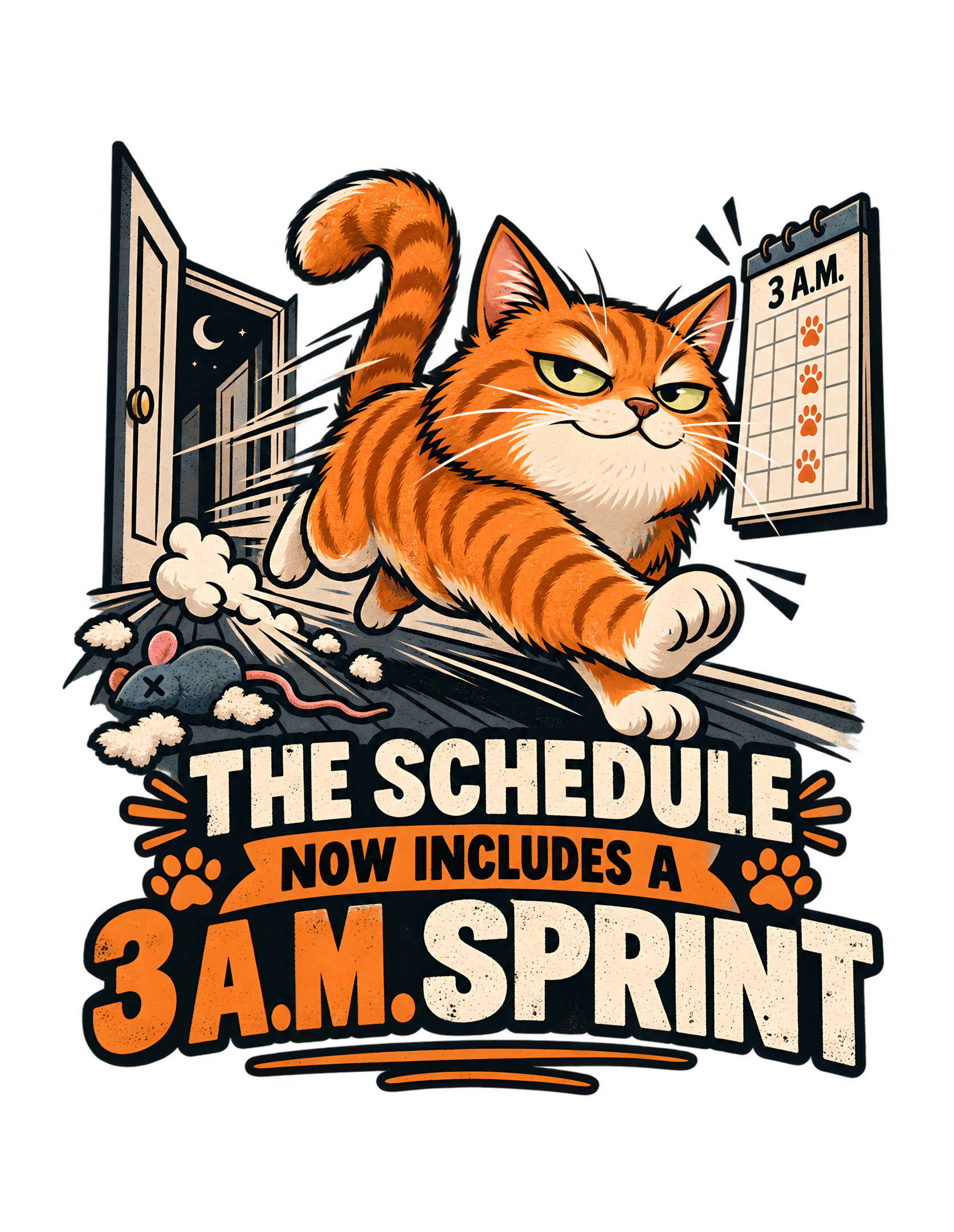
“THE SCHEDULE NOW INCLUDES A 3 A.M. SPRINT” takes one of the most recognizable forms of feline household chaos and gives it the language of planning. The approved artwork does not show an apologetic cat caught running through the house. It shows an orange tabby already in motion, charging across a hallway with the confidence of someone who believes the event was booked, approved, and properly placed on the calendar.
The canonical concept says the cat treats sudden middle-of-the-night zoomies as a planned and recurring fitness event rather than random chaos. The approved production artwork makes that logic visible. The orange cat is captured mid-sprint with an arched tail, extended front paw, narrowed self-satisfied eyes, and strong motion lines. Behind the cat, an open doorway reveals a dark nighttime space with a crescent moon. A wall calendar-like panel reads “3 A.M.” and shows repeated paw marks. Near the floor, a gray mouse toy, pink tail, and scattered stuffing add a secondary sign that the night shift has already been productive.
Then the typography makes the administrative fiction official: “THE SCHEDULE NOW INCLUDES A 3 A.M. SPRINT.” The line does not ask permission. It does not explain why. It does not admit that the sprint might wake anyone. It simply updates the schedule.
That is exactly where Cats Judging Humans lives. The human thinks the hallway became a racetrack without warning. The cat appears to believe the household failed to review the revised agenda. This page stays grounded in the canonical source and the exact approved artwork. It does not invent product materials, garment colors, prices, shipping, availability, marketplace ratings, or technical claims beyond the supplied production provenance. The artwork is the factual visual authority. The Cats Judging Humans layer is editorial: perhaps the problem was never the 3 A.M. sprint. Perhaps the problem was that the humans failed to check the calendar.
The Joke Turns Nighttime Chaos Into a Calendar Update
The strongest idea in the design is not simply that a cat runs through the house at 3 A.M. The stronger idea is that the cat treats the event as scheduled. That change in framing turns ordinary chaos into procedure. The canonical concept summary says the cat treats sudden middle-of-the-night zoomies as a planned and recurring fitness event rather than random behavior. The visible phrase follows the same logic. “THE SCHEDULE NOW INCLUDES A 3 A.M. SPRINT” sounds like an administrative update issued after a meeting nobody else attended.
That language is deliberately calm. There is no confession, no apology, and no visible concern that the event may be inconvenient. The phrase simply informs the household that the timetable has changed. That deadpan confidence is what makes the movement funny. The cat in the artwork is already sprinting. Motion lines sweep behind the body. The front paw reaches forward. The tail rises in a dramatic curve. The hallway is clearly in use.
The scheduling language therefore arrives after the decision has effectively been implemented. Cats Judging Humans often works by giving cats authority over systems humans assume they control. Here, the system is time itself. The humans may have believed the overnight hours were reserved for sleeping. The cat has revised that assumption.
The joke remains playful because it does not portray the cat as malicious. The sprint is not framed as revenge. It is simply a new program. The household can adapt. The calendar has been updated. Management appreciates flexibility.
The phrase also gives the cat control over sequence. A schedule is not merely a list of activities; it determines what happens when. By placing the sprint on that structure, the design makes the cat look less reactive and more managerial. The household is not experiencing an outburst. It is experiencing execution against plan.
Because the schedule language is so neutral, the cat’s authority feels stronger than it would in a demand. The design never asks whether the event is acceptable. It assumes the question has already been settled elsewhere. That bureaucratic calm is the most efficient way to turn a household nuisance into feline policy.
The Orange Cat Is Captured Mid-Sprint, Not Mid-Apology
The orange cat is the visual engine of the design because the pose communicates momentum without surrendering authority. The cat is not crouched nervously after being discovered, looking backward in guilt, or surprised by its own behavior. Instead, the body is stretched forward with one front paw extended, the tail raised in a dramatic curve, and the face carrying a narrowed, self-satisfied expression. The result is a cat that looks committed to the sprint.
That matters because the phrase only works if the cat seems to believe the schedule is legitimate. A guilty expression would turn the scene into a joke about being caught. A startled expression would make the sprint feel accidental. An overly manic expression would reduce the design to slapstick. The approved artwork chooses something better: purposeful motion paired with calm feline confidence.
The orange fur also gives the central figure immediate visual weight against the black background and cream architectural elements. The cat reads first, even before the viewer processes the calendar or the toy debris. The source identifies the cat as orange, and the artwork makes that identity unmistakable. No additional behavioral claim should be attached to the coat color. The design does not need a theory of orange-cat personality to work.
The cat is orange because that is the approved character. The joke comes from what the character is doing. Cats Judging Humans simply adds the editorial conclusion: the sprint appears to be proceeding exactly as planned.
The body language supports the same authority. The cat’s front leg reaches forward decisively while the rest of the body remains visibly committed to forward motion. Nothing in the pose looks hesitant. The approved artwork therefore makes the phrase feel earned: this is a cat acting as though the appointment began exactly on time.
The forward-facing action also keeps the viewer from treating the cat like a passive mascot. This character is doing the thing the phrase announces. The artwork and words therefore reinforce each other while still preserving the comic contrast between calm administrative language and physical speed.
The Hallway Becomes a Racetrack Without Needing a Literal Track
The setting is simple enough to remain readable at apparel size, but it still does important narrative work. The cat is running through a hallway or corridor space. An open doorway sits behind the sprint path. Floorboards and directional lines create a strong sense of forward movement. The environment is not heavily furnished, and that restraint keeps the action clear.
The source concept describes the hallway as becoming a racetrack after midnight, and the artwork captures that idea without drawing an actual sports venue. That is the right choice. A literal track would make the joke too broad. The hallway is funnier because it is ordinary. This is supposed to be a home. The cat has simply reassigned one part of the home to athletics.
The source design uses a poster-style composition efficiently. The upper half carries the scene, while the lower half carries the phrase. The hallway therefore has one main job: establish domestic space and give the cat somewhere to accelerate.
Cats Judging Humans can interpret this as a zoning decision. Humans saw circulation space. The cat saw a sprinting facility. The difference was apparently resolved without consultation.
The setting also makes the timing matter. A hallway sprint during the day might look merely energetic. A hallway sprint under a nighttime sky becomes a scheduling issue. That is where the ordinary location and the absurdly formal phrase meet.
The simplified hallway also helps the viewer imagine sound without drawing it. Long floor lines and a narrow passage naturally suggest speed moving through a home. The source listing’s image of the hallway becoming a racetrack after midnight is therefore translated into visual structure rather than literal signage.
The hallway’s ordinary architecture also keeps the scenario relatable. Nothing about the setting is luxurious, fantastical, or specialized. The joke depends on a normal domestic passageway being temporarily repurposed by feline decision-making. That ordinary context makes the scheduling fiction feel even more absurd.
The 3 A.M. Calendar Makes the Sprint Look Recurring and Official
The wall panel marked “3 A.M.” is one of the most important pieces of visual evidence in the approved artwork. It is not merely a clock. It looks like a calendar or planning board. Below the time, repeated orange paw marks occupy the grid.
That detail transforms the sprint from a single impulsive moment into something that appears documented. The canonical visual concept explicitly calls for a small wall calendar with a paw-print mark beside 3 A.M. The final artwork strengthens that idea by making the time readable and pairing it with multiple paw marks.
The viewer immediately understands the implication. This has happened before, or at minimum the cat has planned as though it will happen again. The source concept uses the word “recurring,” so the artwork’s repetition fits the canonical premise without needing extra explanation.
The humor comes from the contrast between the ridiculous activity and the seriousness of the record. A calendar suggests preparation. Paw marks suggest feline authorship. “3 A.M.” suggests that the human sleep schedule was not consulted.
Cats Judging Humans often benefits from props that make feline authority look procedural rather than emotional. The calendar does exactly that. The cat is not demanding permission to sprint. The cat is showing documentation.
The paw marks also create a visual signature that belongs to the cat rather than the human. A human calendar might use appointments or notes. This one uses paws. That small substitution is enough to make the scheduling system feel feline while remaining instantly understandable.
The schedule exists. The event is on it. Please direct complaints to the department that created the calendar. Unfortunately, that department appears to have paws.
Repeated paw marks do another job beyond suggesting recurrence: they replace human handwriting with a feline visual language. The schedule looks authored by the same party now executing it. That internal consistency makes the scene feel like a complete system rather than a collection of unrelated props.
The Open Door and Crescent Moon Establish the Night Shift Instantly
The open door behind the running cat gives the scene a clear nighttime context without requiring additional explanatory copy. Through the doorway, the viewer sees a dark space with a crescent moon and small stars. That is enough.
The design does not need a clock on every surface. It does not need a sleeping human. It does not need a bedroom scene. The moon does the work quickly and cleanly.
This matters because the phrase depends on timing. A sprint at 3 P.M. would not carry the same household implication. The approved artwork therefore uses the nighttime doorway to reinforce the “3 A.M.” calendar in a second visual channel. The two cues support each other. The calendar says when. The moon confirms the atmosphere.
The open door also contributes to the sense of motion because it creates a visible route behind the cat. The animal appears to be moving through the house rather than posing in front of a decorative background. The doorway’s open position gives the sprint somewhere to come from or somewhere to go. That ambiguity is useful. The artwork does not need to narrate an exact route. It simply creates the sense that the cat is moving through a larger nighttime household beyond the visible frame.
Cats Judging Humans can read the doorway as evidence that the night shift is operational. The humans may have closed their day. The cat has opened another department.
That is editorial interpretation. The factual visual content remains straightforward: open door, nighttime sky, crescent moon, running orange cat. Together, those elements make the scene immediately legible. The sprint is not abstract. It has a time, a route, and apparently approval.
The night cue also protects the joke from ambiguity. The artwork does not depend only on the phrase to tell us when this is happening. The visual environment confirms the timing independently. That makes the scene easier to understand at a glance, especially when the design is viewed quickly.
The Mouse Toy Shows That the Overnight Program Has Side Effects
Near the bottom left of the scene, the approved artwork includes a gray mouse toy with a pink tail and small tufts of stuffing scattered around it. This is a secondary detail, but it adds useful narrative texture.
The cat is already sprinting. The toy suggests that something else has happened along the route. The canonical visual concept specifically calls for a tipped toy as a secondary hint of overnight chaos. The final image preserves that function.
Importantly, the toy does not become the main joke. The phrase remains about the schedule. The cat remains the focal subject. The calendar remains the administrative proof. The mouse toy simply confirms that the 3 A.M. sprint may leave evidence behind.
That makes the scene richer without overcrowding it. The toy also supports the Cats Judging Humans tone because it suggests the cat would not classify the disruption as a problem. The program was scheduled. The equipment was used. The hallway remains operational. Human concerns about stuffing on the floor may be entered into the minutes.
This is not a claim about a specific cat’s real behavior. It is an editorial reading of the approved composition. The design’s strength comes from how the details cooperate. The cat supplies motion. The calendar supplies procedure. The toy supplies consequences. The typography supplies the official announcement.
The toy also provides a counterweight to the cat’s seriousness. The cat behaves as though this is a disciplined fitness session, while the floor suggests that the session may have included less disciplined activities. That contradiction adds another layer without changing the core joke.
The toy debris remains deliberately small relative to the cat and headline. That scale choice keeps it from becoming a separate joke about destruction. Instead, it functions as evidence that the sprint is part of a broader burst of overnight activity while the scheduling premise remains dominant.
The Formal Phrase Makes the Wild Movement Funnier
The phrase is intentionally more formal than the scene. That mismatch is the design’s core comedic mechanism.
“THE SCHEDULE NOW INCLUDES A 3 A.M. SPRINT” sounds like a meeting note, calendar update, or policy revision. The visible cat, meanwhile, is accelerating through the hallway with enough force to generate motion streaks.
The language says organization. The image says velocity. Neither one cancels the other. Instead, the contrast makes both stronger.
If the phrase were merely “ZOOMIES,” the design would label the action. If the art showed a calm seated cat beside a schedule, the line would lose the physical chaos that gives it meaning. The approved composition pairs deliberate administrative wording with an unmistakably active scene.
That is why the joke feels distinct from generic nighttime-cat humor. The cat is not merely running. The cat has institutionalized running.
Cats Judging Humans often turns ordinary feline behavior into a system humans are expected to respect. This phrase does exactly that. The schedule has changed. The human sleep plan is now outdated. The cat has moved on.
The phrase also avoids assigning motive beyond the source. It does not say why the cat runs. It simply announces that the sprint exists. That restraint keeps the design funny without pretending to explain feline behavior scientifically.
The humor also benefits from the word “includes.” It sounds as though the sprint is one item among many. The source does not tell us what else is on the schedule. One item is enough. At 3 A.M., apparently, the hallway belongs to athletics.
The formal wording also gives the design a subtle power imbalance. Humans usually make schedules for themselves and for the household. Here, the cat is the one announcing a schedule change. The role reversal is complete before any human appears, because the phrase already assumes feline authority.
Motion Lines and Diagonals Turn a Still Image Into a Sprint
The approved artwork uses exaggerated motion lines around and behind the orange cat to make the sprint feel fast. Those marks are especially important in a static apparel graphic.
The image cannot actually move, so the composition has to imply movement through direction. The cat’s extended foreleg, forward lean, lifted tail, floor streaks, and rearward motion marks all point the viewer through the scene. That creates energetic diagonals in the upper half of the design.
The lower typography then acts as a stable base. This contrast is visually useful. The cat moves. The words hold. The schedule sounds official while the subject refuses to remain still.
The source visual concept specifically calls for energetic diagonals, and the approved art follows that direction. The motion is dramatic enough to read quickly but contained enough to preserve the overall silhouette. That balance matters for commercial artwork. Too much scattered motion detail would weaken the shape. Too little would make the sprint feel posed.
The motion lines are stylized rather than literal, which suits the distressed graphic treatment. They function like visual punctuation. The viewer does not need to inspect individual marks; the overall direction is enough to register speed instantly.
Cats Judging Humans gets an additional benefit from the movement because the cat’s face remains composed while the body is in full action. The cat appears to be sprinting intensely without appearing emotionally disorganized.
Maximum movement. Minimum explanation. The schedule covers everything.
The upper scene and lower text also create a useful reading order. The eye catches the cat in motion, then the message clarifies the meaning. That sequence lets the viewer experience the chaos first and the bureaucratic justification second, which sharpens the punchline.
The Cat’s Expression Says This Was Planned, Not Impulsive
The cat’s facial expression may be the driest detail in the entire composition. The eyes are narrowed. The mouth carries a restrained, self-satisfied look. There is no visible panic, surprise, or remorse.
That expression matters because the rest of the body is in explosive motion. The cat is sprinting, but the face looks as though the sprint is simply another item being executed correctly.
That gives the phrase credibility. If the cat looked wild-eyed, the viewer might interpret the scene as accidental chaos. The approved expression supports the opposite idea: this is intentional.
Cats Judging Humans works best when feline authority feels calm. The brand does not need the cat to shout. The cat can be in motion and still look superior. That composure creates the impression that the human is the only party confused by the event.
The cat already knew. The calendar already knew. The hallway, unfortunately, is now finding out.
The expression also keeps the cat from becoming a generic action mascot. Even while running, the face has personality. That gives the design the brand’s judgmental edge and makes the scene feel like a decision rather than random movement.
The visual humor therefore depends on emotional restraint. The body says speed. The face says policy. That is a strong combination because it keeps the design playful instead of frantic.
The cat is not losing control. The cat appears to be following the plan. Human beings may want to review the plan more carefully next time.
The face gives the viewer something to remember after the action is understood. The cat is not merely fast; the cat is smugly certain. That emotional detail turns the piece from a generic action illustration into a character statement, which is central to the Cats Judging Humans identity.
The 3 A.M. Detail Gives Cat Owners an Immediate Point of Recognition
The canonical listing description frames the design around the “classic 3 A.M. sprint through the house” and specifically addresses cat owners who have heard the hallway suddenly become a racetrack after midnight.
That source language explains why the time stamp is commercially useful. It gives the joke a familiar household anchor.
The design does not claim that every cat behaves this way. It does not present 3 A.M. activity as a scientific breed trait or define a universal sleep pattern. It simply builds a joke around a recognizable scenario already supplied by the canonical source.
That distinction matters. The humor is observational, not scientific. The viewer either recognizes the situation or understands it instantly from the art.
The cat runs. The time is unreasonable for humans. The schedule says it is happening anyway. That is enough.
The exact time also makes the phrase more memorable than a vague reference to “late at night.” Specificity creates character. Three in the morning sounds like a real appointment.
The recognition factor is experiential rather than factual. The source already positions the concept for cat owners familiar with after-midnight hallway races. The design uses that shared recognition as the setup, then adds the scheduling language as the original punchline.
Cats Judging Humans gives the appointment feline authority. Humans may describe the event as disruption. The cat has described it as scheduling.
This is the kind of small semantic disagreement that can apparently sustain an entire household. The cat remains confident. The human remains awake. The calendar remains legally unchallenged.
The specific hour also acts like a miniature story prompt. The viewer can imagine the dark house, the sudden movement, and the human reaction without those elements needing to be drawn. The phrase activates that imagined context while the art supplies just enough evidence to make it feel complete.
The Distressed Poster Style Makes the Schedule Feel Official
The approved artwork uses a distressed graphic treatment with bold outlines, limited colors, worn texture, and large block lettering. That style supports the concept because it gives the composition the weight of a poster or badge rather than a casual cartoon caption.
The scene feels announced. The phrase feels published. The event feels official.
The canonical source identifies the art style as distressed graphic and the visual format as poster. The final image visibly aligns with both.
Cream, orange, black, muted green-gray, and small red or pink accents work together without creating a busy palette. The orange cat and the orange “3 A.M.” lettering reinforce each other, while the cream text keeps the rest of the phrase highly readable.
The distressed texture also softens the precision of the typography just enough to match the hand-illustrated cat and hallway. Nothing feels sterile. The design remains energetic and tactile.
The limited palette improves legibility at a distance. The orange cat, cream letters, black ground, and selective accents create clear separation between subject, setting, and typography. That visual economy is especially useful in a dense vertical composition.
Cats Judging Humans benefits from this because the joke is about formal scheduling applied to chaotic behavior. A perfectly clean corporate layout might make the design too cold. The distressed poster treatment preserves authority while keeping the mood playful.
The result feels like a notice issued by a feline athletics department that has existed for years. No one remembers approving it. The department does not seem concerned.
The poster styling also makes the design look like an announcement rather than a snapshot. That distinction supports the text. A snapshot would record the sprint. A poster appears to publicize it. The cat is not hiding the event; the cat seems to be formalizing it for household awareness.
The Typography Builds a Hierarchy From Schedule to Sprint
The lower half of the approved composition is dominated by typography, and the hierarchy is carefully structured. “THE SCHEDULE” appears prominently across the top of the text block. “NOW INCLUDES A” sits inside a smaller orange banner. “3 A.M. SPRINT” forms the largest final declaration.
That sequence matters.
The viewer first understands that this is about a schedule. Then the design announces a change. Finally, the change is revealed. The last line is the punchline.
The scale difference makes “3 A.M. SPRINT” feel like the actual event being added to the program. The typography also balances the busy motion above. The sprinting cat creates an energetic upper silhouette, while the stacked text gives the composition a heavy, readable foundation.
This is useful both visually and narratively. The upper scene shows what happened. The lower text explains how the cat categorizes it. The design therefore does not rely on one element to do all the work.
The banner around “NOW INCLUDES A” acts like a transition between setup and payoff. It visually performs the same job as the words: something has changed. The schedule existed before; the sprint has now been added.
Cats Judging Humans often succeeds when image and phrase tell slightly different versions of the same event. The human sees a cat sprinting through the hallway. The typography says the schedule has been updated.
The gap between those interpretations is the joke. The cat is unavailable for clarification until after the sprint.
The typographic hierarchy also creates a controlled pause. “THE SCHEDULE” establishes the system, the banner announces a change, and “3 A.M. SPRINT” delivers the event. That structure gives the line a rhythm that survives even when the artwork is viewed from a distance.
The Composition Keeps the Chaos Inside a Strong Apparel Silhouette
Despite the motion, the approved artwork remains compact and contained. That is one of its strongest design decisions.
The cat, doorway, calendar, floor lines, toy debris, and typography all fit into one unified vertical shape. There are no fragile extensions that pull the eye too far from the center. The large cat forms the upper focal mass. The text forms the lower base. The calendar and doorway frame the action without competing with it.
This gives the artwork a clear outer silhouette. The source production asset is documented as a 6200 by 8000 transparent PNG, with aspect ratio preserved and a 300-pixel safe margin in its metadata. Those are production provenance facts supplied in the canonical source, not consumer claims.
Editorially, the important point is that the composition was built to hold together as one graphic. The motion does not scatter. The schedule does not feel detached. The toy debris remains secondary.
The strong silhouette allows the scene to feel energetic without becoming visually fragile. The cat’s tail, doorframe, calendar, and text all remain close enough to the main body of the design to read as one unit rather than separate stickers.
That cohesion is especially important because the concept contains many possible props. The approved design uses only what it needs.
Cats Judging Humans approves of this level of administrative efficiency. One cat. One hallway. One suspicious hour. One revised schedule. Everything else is supporting documentation.
The production master’s documented transparent format and safe margin are relevant only as provenance, but they support the visual reading that the artwork was intended as a contained standalone graphic. The editorial page should respect that existing composition rather than proposing visual revisions.
The Human Is Absent, Which Makes the Feline Authority Stronger
No human figure appears in the approved artwork. That absence is useful.
The joke is about the effect on the human household, but the cat does not need a visible person to establish authority. The viewer effectively occupies the human position. We are the ones being informed that the schedule changed. We are the ones expected to understand the 3 A.M. calendar. We are the ones who will presumably hear the sprint.
That perspective gives the design a direct quality. The cat is not performing for another character inside the image. The cat is issuing the update to us.
Cats Judging Humans often works well when the human is implied rather than shown. The brand’s point of view remains feline, while the viewer becomes the subject under review.
Here, the absence also keeps the composition clean. A sleeping human would add clutter. A startled person would shift the joke toward reaction. The approved artwork stays focused on the cat’s certainty. That is stronger.
The missing human also prevents the design from assigning a specific reaction. The viewer can imagine annoyance, resignation, amusement, or simple familiarity. That openness makes the concept more reusable because the cat’s perspective remains fixed while the human response stays personal.
The schedule exists whether the human appears or not. The sprint is already underway. The household can file feedback in the morning.
The cat may or may not attend.
Leaving the human out also gives more room for identification. Different viewers can map their own household onto the scene. The cat remains specific; the human experience stays open. That is a useful balance for an evergreen design built around a common owner-side observation.
The Design Is Evergreen Because the Joke Does Not Need a Trend
The canonical source marks the concept as evergreen, and the design supports that classification. There is no holiday, current event, celebrity, platform interface, or temporary meme format.
The humor depends on a stable household scenario: a cat suddenly running through the home at an hour humans would rather reserve for sleep. The listing description explicitly describes the design as nighttime zoomies turned into absurdly organized feline behavior.
That premise does not require a trend to remain understandable. The visual cues are equally durable: a hallway, moon, calendar, toy, orange cat in motion, and large typography. None of those elements become obsolete because a platform changes its interface or a cultural reference fades.
The design also avoids overexplaining the joke, which helps its longevity. The viewer does not need special context. The phrase and artwork carry the premise themselves.
Evergreen also describes the wording. The phrase does not depend on a specific year, season, device, or online trend. It reads like a timeless household notice, which helps the design retain its joke even when viewed without any surrounding caption.
Cats Judging Humans can revisit schedule humor many times, but this design has a specific identity: the middle-of-the-night sprint has been formally added to the agenda. That precision helps it remain memorable.
The event may be chaotic. The concept is remarkably stable.
The evergreen classification is strengthened by the fact that the joke needs no supporting caption. A viewer can encounter the design alone and still understand the behavior, the timing, and the cat’s attitude. Self-contained humor tends to age better because it carries its own context.
The Design Fits Cats Judging Humans by Treating Feline Chaos as Policy
“THE SCHEDULE NOW INCLUDES A 3 A.M. SPRINT” fits Cats Judging Humans because the cat does not merely create chaos. The cat legitimizes it.
That difference matters.
The hallway sprint becomes a planned event. The calendar becomes evidence. The moon confirms the night shift. The toy debris becomes collateral documentation. The expression says the cat sees no problem. And the typography announces the new policy as though the humans should have known.
That is the brand’s core relationship in compact form. Humans believe they organize the household. Cats quietly revise the operating system.
The design is sarcastic without being cruel. The cat is not punishing anyone. The cat is simply enforcing a schedule that happens to be inconvenient for humans.
The official brand voice calls for dry, clever, judgmental, playful superiority. This design earns that tone visually rather than relying on insult. The cat does not say the human is foolish. The cat simply assumes the human will adapt.
The brand fit is especially strong because the cat’s authority is not explained in a separate logo or slogan. It is embedded in the premise. The cat changes the schedule, the cat occupies the hallway, and the human is expected to accept the revised operating conditions.
That is more feline, and it is more memorable.
The final effect is a complete Cats Judging Humans worldview in one sentence: the sprint was never random. The humans were simply uninformed.
Most importantly, the design never abandons the feline point of view. Every element supports the cat’s interpretation of events. The human perspective—too early, too loud, too chaotic—is implied but never allowed to control the narrative. The cat has already issued the official version.
“THE SCHEDULE NOW INCLUDES A 3 A.M. SPRINT” works because every major element supports the same absurd administrative fiction. The orange cat is already in motion, but the expression remains calm and self-satisfied. The hallway becomes a race route. The open doorway and crescent moon establish the night shift. The wall calendar marks 3 A.M. with paw prints. A gray mouse toy and scattered stuffing suggest that the program has consequences. Then the typography formalizes the entire event as a schedule update.
Nothing in the source requires the article to invent more. The canonical concept already gives the design its durable core: nighttime zoomies treated as a planned recurring fitness event. The approved artwork supplies the factual visual details. The Cats Judging Humans voice supplies the interpretation.
Humans may call it chaos. The cat has documentation. The sprint is on the calendar. Please plan accordingly.
The strength of the piece is that it turns a familiar cat-owner scenario into a complete administrative worldview without losing the immediacy of the visual gag. One glance gives the viewer the cat, the time, the motion, and the policy. The rest is merely human adjustment.