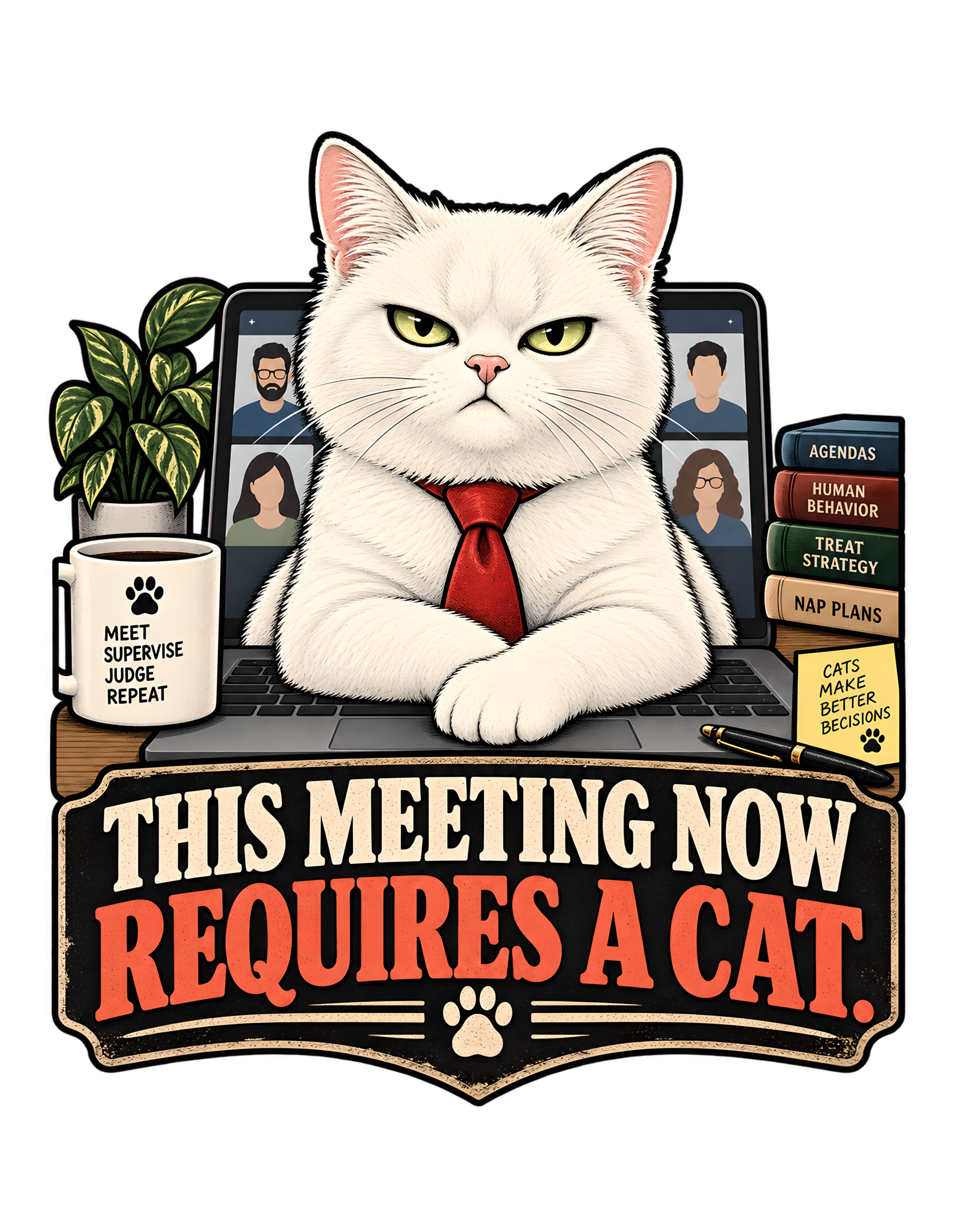
“THIS MEETING NOW REQUIRES A CAT” begins with a familiar remote-work interruption and promotes it into official policy. The approved artwork places a serious white cat directly in front of an open laptop, paws crossed over the keyboard area, wearing a red tie and staring outward with the calm authority of someone who believes the meeting has finally acquired competent leadership. Behind the cat, the laptop screen shows four human participants in a video call. They are visible, technically present, and completely secondary.
The canonical concept is equally direct: a cat inserts itself into remote work as though no meeting can proceed without feline oversight. The approved image turns that premise into a full office hierarchy. A coffee mug says “MEET SUPERVISE JUDGE REPEAT.” A stack of books is labeled “AGENDAS,” “HUMAN BEHAVIOR,” “TREAT STRATEGY,” and “NAP PLANS.” A yellow note declares “CATS MAKE BETTER DECISIONS.” The joke does not need a chaotic cat, a toppled laptop, or a human being visibly inconvenienced. The cat is not disrupting the meeting. In the cat’s interpretation, the meeting was incomplete before its arrival.
That distinction is the heart of the Cats Judging Humans voice. The feline authority is dry rather than aggressive. The cat looks composed, managerial, mildly unimpressed, and entirely certain that oversight is necessary. The humans on the screen are not enemies; they are staff. The red tie, office props, centered posture, and vintage-style typography all support the same reversal of status.
This page treats the approved artwork as the visual authority and the canonical source as the factual source. Everything beyond those facts is transparent editorial interpretation. The result is an evergreen workplace joke about meetings, remote work, feline supervision, and the strange confidence with which cats can occupy a human system and immediately behave as though they were always supposed to run it.
The Joke Begins by Treating Feline Attendance as a Requirement
The central joke is contained in the phrase itself: “THIS MEETING NOW REQUIRES A CAT.” The wording does not ask whether the cat may join. It does not describe the cat as an interruption. It does not apologize for the unexpected appearance of an animal in a professional setting. Instead, it treats feline participation as a new requirement, as though someone with the proper authority has reviewed the agenda and discovered a serious staffing deficiency.
That reversal is what makes the concept work. In ordinary remote work, a cat entering frame is often treated as a charming accident. The approved design refuses that framing. The cat sits directly in front of the laptop camera with a serious managerial posture, transforming accidental visibility into deliberate oversight. The word “requires” does especially useful work because it suggests policy, procedure, and necessity. The meeting can continue, but only after the missing feline role has been filled. The human participants are already on screen, yet their presence is apparently not enough.
Cats Judging Humans turns that bureaucratic language into a status joke. The cat does not need to argue that it belongs in the meeting because the composition behaves as though the decision has already been made. The viewer arrives after the policy change. This gives the design a broader life than a one-off video-call gag. It is about the way cats enter human systems without acknowledging the systems’ original purpose. The laptop was for work. The meeting was for humans. The desk was arranged for productivity. The cat accepts all of those facts and then calmly changes the chain of command.
The premise is stronger because the design never explains who issued the requirement. The cat’s confidence supplies the answer. No vote is shown, no permission is requested, and no appeal procedure appears. Management has joined. The meeting may now begin.
The source and artwork support this reading without needing any claim about a specific owner, employer, meeting platform, or profession. That generality is part of what makes the joke reusable.
The White Cat Owns the Center Before the Humans Can Speak
The approved artwork gives the white cat overwhelming visual priority. It sits in the center of the composition, large enough to cover much of the laptop and strong enough in silhouette that the viewer reads the feline face and body before noticing the individual human participants on the screen. That hierarchy is crucial. If the humans were equally prominent, the design would become a general remote-work scene. Instead, the people are reduced to small video-call tiles behind the cat. They establish the workplace context while also functioning as proof that the cat has inserted itself between the meeting and the viewer.
The white coat creates a strong focal mass against the darker laptop, black outlines, and deep surrounding elements. The cat’s face is symmetrical and controlled, with narrowed yellow-green eyes and a neutral mouth. Nothing in the expression suggests panic, excitement, or confusion. The cat looks like the only participant who arrived prepared.
The source visual concept describes a white cat planted directly in front of a laptop camera with a serious managerial posture. The approved artwork follows that instruction closely, and the rest of the composition reinforces it. Cats Judging Humans uses this visual dominance as a status mechanism. The cat does not need a speech bubble announcing authority. Scale, placement, posture, and gaze do the work.
The humans technically occupy the meeting. The cat occupies the image. That is a much stronger joke because the hierarchy is understood before the viewer has time to read the phrase. By the time the words confirm that the meeting now requires a cat, the artwork has already demonstrated who has the floor.
The contrast also keeps the design readable at smaller sizes. One dominant face, one strong white silhouette, and one controlled expression carry the concept before the smaller props are examined. The humans remain present enough to establish context, but never enough to compete with management.
The visual hierarchy therefore remains clear even when the smaller props are not read. The cat is the authority, the humans are background participants, and the meeting is the system under review.
The Crossed Paws Turn a Keyboard Blockade Into Executive Posture
One of the most effective details in the approved artwork is the cat’s front-paw position. The paws are crossed neatly in front of the body and rest across the laptop’s lower area, making the cat look composed rather than chaotic. That choice matters because a cat on a keyboard could easily become a familiar slapstick image: accidental typing, closed windows, disrupted calls, or frantic humans trying to reclaim the computer. This design chooses the opposite energy. The cat is not scrambling over the keys. It is installed.
The crossed paws read almost like an executive pose. They imply patience, confidence, and a willingness to wait while the humans catch up. The laptop is still visible, the video call remains active, and the cat appears to have no concern that it is occupying the most important piece of equipment. This is where the Cats Judging Humans relationship becomes especially clear. The human might believe the cat is blocking the workstation. The cat appears to believe the workstation has finally been assigned correctly.
The pose also keeps the silhouette clean for apparel use. Instead of multiple limbs competing with office props, the body forms one stable central shape. That gives the design a calm authority that matches the concept summary. Editorially, the crossed paws suggest that the cat is not asking for attention in the middle of a meeting. It is chairing the meeting.
The difference is entirely a matter of perspective, which is why the joke feels so recognizable. Humans see obstruction. Cats see organizational improvement. The posture also visually connects the cat to the laptop beneath it, making the takeover look deliberate rather than accidental. Management is not leaning into the workspace; management has assumed the workspace.
The calm pose also keeps the humor from becoming slapstick. The cat appears to have planned this position, even though the joke depends on the absurdity of treating feline interference as formal procedure.
The Red Tie Gives the Cat Just Enough Corporate Authority
The red tie is one of the clearest workplace signals in the approved artwork. It sits against the white chest, creating a strong central accent and instantly pushing the cat from “pet near laptop” toward “participant with management ambitions.” Importantly, the tie does not turn the scene into a full costume joke. The cat is not dressed head to toe as a person, and the design does not depend on elaborate role-play. One compact accessory is enough to connect the feline posture to the office setting.
The canonical concept already frames the cat as a serious managerial presence in remote work. The tie makes that role visually immediate without needing extra explanation. Its color also matters. The strong red contrasts with the white fur, black outlines, cream typography, and muted office palette. That makes the tie a small but efficient focal cue linking the cat’s body to the warm red-orange lettering below.
Cats Judging Humans benefits from this restraint. The brand is funniest when the cat remains recognizably a cat while the human world bends around it. The tie does not make the cat human. It makes the human office seem as though it has accepted feline leadership. That distinction preserves the slight superiority at the center of the design. The cat is not trying very hard to fit into the workplace. The workplace is trying to accommodate the cat.
The tie is therefore less a costume than a credential. It reinforces the symmetry of the composition, points down toward the typography, and connects the central character to the formal language of meetings and management. The humans have video tiles. The cat has executive presence.
The tie supports the same restraint. It adds workplace symbolism without asking the viewer to accept a fully anthropomorphic character.
The Laptop Camera Turns Remote Work Into a Feline Control Point
The laptop is the structural bridge between the cat and the remote-work premise. Without it, the image would still show a managerial cat, but the meeting joke would lose its specific context. In the approved artwork, the open laptop sits directly behind and beneath the cat. Its screen displays four human participants in a video-call grid. The cat is positioned in front of that camera zone so completely that it visually controls the meeting’s point of access.
This is a recognizable remote-work situation transformed into authority satire. A cat appearing near a camera is ordinary. A cat occupying the camera as though it owns the meeting is the Cats Judging Humans version. The computer also creates a useful double meaning. It is both a human tool and a feline platform. The humans use it to communicate with one another. The cat uses it to become the central figure in their communication.
The design does not show anyone trying to move the cat. That absence is important. Resistance would make the humans active again. Instead, the composition leaves the cat’s control uncontested. Editorially, the laptop becomes the meeting-room door. Whoever occupies it controls who is seen, who is heard, and who appears to matter.
The cat has not merely joined a call. It has occupied the infrastructure. That is why the phrase “now requires a cat” feels believable within the joke. The visual evidence suggests the policy has already been implemented at the hardware level. The screen remains generic enough that the joke is not tied to one software platform, which also helps the concept remain evergreen rather than becoming a dated reference to a specific service.
Because the cat occupies the camera zone rather than merely sitting beside the computer, the takeover is direct. The device intended to present humans now presents feline management instead.
The Four Human Video Tiles Make Everyone Else Look Like Staff
The four human figures on the laptop screen are small but essential. They establish that an actual meeting is taking place and make the cat’s position feel like a deliberate intervention in human work. The approved artwork does not give those participants strong individual identities. They function as generic coworkers in a video call, which keeps the focus on the universal workplace situation rather than a particular character.
Their scale is part of the joke. The humans are reduced to tiles while the cat occupies the physical foreground at several times their visual size. The meeting may belong to them technically, but the composition disagrees. This creates a classic Cats Judging Humans reversal. Humans usually assume that their jobs, screens, calendars, and meetings are important systems in which pets occasionally appear. The cat’s presence recasts those systems as support structures for feline oversight.
The people on screen also make the cat’s direct stare funnier. The cat is not looking at one owner in a private home. It appears to be confronting an entire professional audience. That broadens the satire from pet-owner inconvenience to workplace hierarchy. No one on the screen looks powerful enough to challenge the cat’s central position. They are framed, contained, and distant. The cat is immediate.
Editorially, the humans become evidence that the meeting was already full and still somehow lacked the required expertise. Management has reviewed attendance. There were four humans. Apparently that was the problem. The human tiles also help distinguish the design from a generic “cat at computer” image: this is unmistakably a group meeting, and the cat is unmistakably the participant who now controls it.
The human faces remain generic enough to keep the focus on the category of coworker rather than any one person. They represent the meeting as a whole.
The Mug Turns Supervision Into a Daily Operating Routine
The coffee mug on the left side of the approved artwork carries one of the design’s best supporting jokes: “MEET SUPERVISE JUDGE REPEAT.” A paw mark sits above the wording, turning an ordinary office mug into a compact summary of the cat’s management philosophy. The sequence mirrors familiar productivity slogans while replacing human ambition with feline oversight. Meet. Supervise. Judge. Repeat. The order is funny because it implies that judging is not an occasional emotional reaction. It is part of the workflow.
This prop expands the design without competing with the main phrase. The headline remains the dominant message, while the mug rewards a closer look. It also reinforces the character of the cat. The central pose is calm enough that the viewer might initially read the cat as simply serious. The mug clarifies the role: this is supervision with a recurring schedule.
Cats Judging Humans often works best when ordinary human objects are repurposed as evidence of feline authority. The mug is exactly that kind of detail. Humans use office mugs as minor identity signals. The cat’s version announces an entire organizational philosophy. The joke remains playful because nothing about the supervision is genuinely threatening. The cat is simply doing what cats in the brand always do: observing human behavior and finding it in need of review.
The mug makes that review process feel institutional. It also creates a satisfying visual echo with the broader design. The main phrase says the meeting requires a cat. The mug explains what happens once the cat arrives. There will be supervision. There will be judgment. There will, apparently, be another meeting. The prop’s cream surface and dark lettering also echo the larger palette, keeping the secondary joke integrated rather than ornamental.
The mug also gives the cat an implied routine beyond this single call. If judging repeats, then the meeting is only one instance of an ongoing supervisory function.
The Book Stack Builds an Entire Feline Management Curriculum
On the right side of the approved artwork, a stack of four labeled books turns the cat’s workplace authority into something almost academic. The visible spines read “AGENDAS,” “HUMAN BEHAVIOR,” “TREAT STRATEGY,” and “NAP PLANS.” Each title supports a different layer of the joke.
“AGENDAS” belongs naturally in a meeting environment. “HUMAN BEHAVIOR” reframes the people as the subject being studied rather than the people doing the studying. “TREAT STRATEGY” converts a familiar cat concern into an executive planning category. “NAP PLANS” gives rest the same administrative dignity as any other workstream. Together, the books imply that feline supervision is not improvised. Management has reference material.
That makes the cat’s serious expression even funnier. The viewer is not looking at a pet accidentally sitting near office supplies. The scene suggests a full professional discipline organized around the cat’s priorities. Cats Judging Humans benefits from exactly this kind of supporting detail because it extends the brand voice without requiring more large copy. The props make the world feel internally consistent.
The stack also balances the mug and plant on the opposite side, giving the composition visual stability around the centered cat. Most importantly, the books keep the human workplace satire specific. The design is not just “cat in office.” It is a feline office in which human behavior, snacks, sleep, and meetings have all been incorporated into management policy.
The curriculum is complete. The humans remain remedial. The book titles also establish a miniature hierarchy of priorities in which human behavior is merely one topic among agendas, treats, and naps, which is precisely the sort of organizational chart the brand can make funny without becoming mean.
The stack of books makes that routine feel organized. The cat’s priorities are not random; within the joke, they have been documented, categorized, and apparently approved.
The Sticky Note Delivers the Cat’s Executive Summary
The yellow sticky note at the lower right of the approved artwork states, “CATS MAKE BETTER DECISIONS,” followed by a small paw mark. This is a secondary message, but it acts like the cat’s executive summary of the entire scene. The meeting now requires a cat because, according to the cat’s own documentation, cats make better decisions.
The note is deliberately less formal than the main headline. It looks like a quick office reminder rather than a declaration carved into the design’s central structure. That informality makes it funnier. The cat’s superiority is presented as though it were such an obvious operational fact that it only needed to be written on a sticky note.
The prop also connects neatly to the source concept. The cat inserts itself into remote work as though no meeting can proceed without feline oversight. The sticky note provides the internal justification for that intervention. Cats Judging Humans uses confidence as a recurring comic engine. The cat does not need to prove the claim. The humor comes from the certainty with which the claim exists inside the artwork.
The note also gives the viewer another small reward after the main phrase has landed. At thumbnail distance, the large headline and cat dominate. Up close, the sticky note deepens the joke. This layered reading is valuable for a design page because it shows how the artwork supports more than one level of attention.
The main message establishes policy. The sticky note explains management’s reasoning. No appeal process is visible. Visually, the yellow note is distinct enough to catch the eye during close inspection but small enough to remain subordinate to the cat and headline, which keeps the composition organized.
The sticky note serves the same world-building function in miniature. A simple office object carries a sweeping feline conclusion as though nobody in the workplace would dispute it.
The Plant, Coffee, Pen, and Desk Keep the Absurdity Grounded
The office joke works because the environment is recognizably ordinary. A leafy houseplant sits to the left. A coffee mug rests nearby. A pen lies at the lower right. The laptop anchors the middle. The book stack adds familiar desktop clutter. None of these objects is dramatic by itself. That is exactly why they matter.
The cat’s authority would feel more theatrical if the scene were built like a fantasy throne room or a literal corporate boardroom. Instead, the approved artwork keeps the setting within the visual language of everyday remote work. That grounded environment creates contrast with the cat’s certainty. The desk is normal. The meeting is normal. The props are normal. The only unusual development is that the cat has apparently assumed formal control.
Cats Judging Humans relies on this friction between ordinary human life and extraordinary feline confidence. The more believable the workstation feels, the more satisfying the status reversal becomes. The plant and coffee also soften the scene visually, preventing the composition from becoming a cold technology image. The result feels like a home office rather than a generic corporate environment, which matches the canonical remote-work framing.
Editorially, these objects function as evidence that the human system existed before the cat took over. The desk was furnished. The laptop was open. The participants had joined. Management simply found the existing arrangement inadequate.
The office remains intact. The hierarchy does not. These props also make the satire more accessible because they are recognizable without requiring any particular profession or employer. The workstation could belong to almost anyone, which helps the joke travel beyond one specific kind of office worker.
Those ordinary props make the cat’s confidence feel even more disproportionate, which is exactly where the humor lives. Nothing else in the room is grand enough to justify the authority being displayed.
The Typography Turns a Meeting Joke Into an Official Ruling
The main phrase occupies the entire lower third of the approved artwork in large, high-contrast vintage lettering. “THIS MEETING NOW” appears in warm cream. “REQUIRES A CAT.” appears in a strong red-orange. That hierarchy matters because it gives the sentence the weight of a ruling rather than a casual caption. The first line establishes the situation. The second line delivers the policy change.
The words are enclosed within a dark, decorative badge-like structure with cream edging and small paw details. The treatment makes the phrase feel official, almost like a sign issued by an organization that takes feline involvement very seriously. The typography also supports apparel readability. The words are large, compact, and integrated into the silhouette rather than floating around the cat.
Cats Judging Humans depends heavily on tone, and typography contributes to that tone. A loose handwritten style might make the message feel cute. A sleek corporate font might make it feel sterile. The chosen vintage display treatment lands in a useful middle space: serious enough to suggest authority, playful enough to remain clearly humorous.
The punctuation ends with a single period, which gives the statement a flat finality. There is no question mark because the cat is not asking. There is no exclamation mark because management does not need to raise its voice. The visual ruling has already been entered into the record.
The lower badge also gives the composition a stable base. The cat, laptop, and office details sit visually above a formal statement that feels less like an optional slogan and more like the documented outcome of the meeting itself.
The lower lettering also creates a strong endpoint for the eye. After reading the cat and office scene, the viewer receives the official language that explains how the hierarchy changed.
The Cream, Black, Red, and Gold Palette Keeps Authority Warm
The approved artwork uses a restrained palette built around cream, black, warm red-orange, muted gold, gray, and natural green. The white cat naturally carries much of the cream value, while heavy black outlines and the dark headline panel provide structure. The red tie and lower headline supply the strongest warm accent. Gold appears in supporting details, while the plant introduces a small natural green counterpoint.
This palette supports the design’s authority without making it severe. Black gives the composition weight. Cream keeps the cat and main wording readable. Red adds emphasis. Gold suggests a slightly formal or vintage quality without turning the scene into luxury parody. The result fits the Cats Judging Humans visual language well because the design feels branded without requiring the official logo.
Color also helps organize the information. The eye moves first to the light cat, then the red tie, then the large cream and red headline. Smaller props stay subordinate. That hierarchy is especially useful in a detailed workplace scene. The mug, books, sticky note, laptop screen, plant, and pen all add content, but the palette prevents them from becoming a visual argument among themselves.
Editorially, the colors make the cat’s authority feel established rather than aggressive. This is not an emergency meeting. It is a meeting that has finally been properly staffed.
The subdued human video tiles are also important. They remain visible as context without drawing more attention than the cat. The palette therefore supports the joke structurally: human presence is acknowledged, feline authority receives the contrast.
The color relationships also help the red tie and lower red-orange line feel connected. The eye can move through the composition without any one supporting prop stealing attention from the central character.
The palette remains restrained enough that the artwork feels cohesive rather than novelty-heavy. Warm accents support the joke instead of turning every prop into a separate focal point.
The Badge-Like Composition Makes the Whole Office Read as One Graphic
The approved artwork is built as one centered apparel composition rather than a loose collection of office objects. The cat, laptop, desk props, and headline form a single strong silhouette. That structural decision matters because the concept contains many elements: cat, tie, laptop, human video tiles, plant, mug, books, note, pen, and typography. Without careful hierarchy, the design could easily become cluttered.
Instead, the cat occupies the top center, the desk props frame the sides, and the large phrase forms a stable base. The decorative lower panel visually locks the typography into the rest of the scene. The laptop sits behind the cat rather than beside it, which prevents the remote-work context from becoming a competing focal point.
This compact structure is one reason the artwork remains readable despite its supporting jokes. At first glance, the viewer sees “serious cat in meeting” and the main phrase. Only afterward do the smaller details reveal themselves. That two-speed reading is valuable. The design works from a distance and rewards closer inspection.
Cats Judging Humans benefits from that approach because the brand voice often depends on an immediate judgment followed by secondary evidence. The first judgment here is simple: the cat has taken over the meeting. The evidence is everywhere.
Management prefers a well-organized file. The centered silhouette also allows the design to feel deliberate rather than like a collection of unrelated office references. Every prop has a place, every smaller joke supports the same premise, and the headline closes the case at the bottom.
The composition behaves almost like a seal of approval issued by the cat. The lower panel formalizes the ruling, while the illustration above supplies the evidence that feline authority has already taken effect.
That cohesion is important because the concept contains several secondary jokes. A strong central silhouette lets the image remain readable before those details are discovered.
The Humor Works Because the Cat Is Serious and the Situation Is Not
The cat’s expression is the key to the design’s tone. The eyes are narrowed. The mouth is neutral. The posture is still. Nothing about the cat suggests that it recognizes the situation as funny. That seriousness allows the viewer to supply the humor.
If the cat were grinning, winking, or visibly performing for the joke, the design would become more cartoonish and less authoritative. Instead, the approved artwork treats feline involvement as completely ordinary. That dry delivery matches the Cats Judging Humans voice: clever, judgmental, playful, and slightly superior without becoming cruel.
The humans are not being punished. They are simply being supervised. The joke also avoids aggression. There are no threats, no anger, and no humiliation. The hierarchy reversal is enough. This makes the concept widely recognizable to anyone familiar with cats entering workspaces, sitting near screens, appearing during calls, or behaving as though human activity should naturally reorganize around them.
The canonical description frames the cat as a colleague who was never invited but clearly considers attendance mandatory. The approved artwork captures exactly that energy. The cat is not embarrassed to be there. The cat is embarrassed that the meeting began without it.
That straight-faced delivery is central to the brand. Cats Judging Humans works when the cat behaves as though the joke is simply the correct description of reality. The viewer understands the exaggeration, but the cat does not appear to consider anything exaggerated at all. That difference in perspective keeps the humor dry rather than loud.
The cat’s seriousness also prevents the scene from becoming sentimental. The animal can be visually appealing while the joke remains about judgment, hierarchy, and the absolute confidence of an uninvited supervisor.
The deadpan expression also makes the cat seem more competent than the humans, even though no actual performance comparison is shown. That inference belongs to the editorial joke, not a factual claim.
The Design Is Evergreen Because Meetings Keep Creating Openings for Cats
The canonical source marks the concept as evergreen, and the approved artwork supports that status by focusing on a broad remote-work situation rather than a dated event or seasonal reference. Meetings, laptops, office mugs, notes, books, and cats interfering with or supervising human activity are not tied to one holiday or trend.
The joke also remains flexible because it does not depend on a particular software platform. The laptop shows a generic grid of human participants rather than a branded interface. That keeps the concept focused on behavior rather than technology. The meeting could belong to an office worker, freelancer, remote team, or anyone using a laptop for group conversation. The cat’s intervention remains understandable.
The design’s strongest evergreen quality is the relationship dynamic. Human systems are temporary. Feline confidence is apparently permanent. Cats Judging Humans turns that familiar relationship into a reusable workplace satire: humans organize the meeting, and the cat decides whether it has sufficient oversight.
The approved artwork also avoids narrow professional references. The book titles and office objects are broad enough to work across many kinds of work. That gives the page longevity without requiring the article to invent an audience profile that the source does not supply.
The joke does not need an update. The cat already considers the policy final. Remote work provides the immediate setting, but the deeper idea is broader: whenever humans create a system inside feline territory, the cat remains available to review it. Meetings simply provide especially visible evidence.
The absence of a dated reference also means the design can remain relevant as particular meeting platforms change. The behavior is the evergreen part: humans meet, cats intervene, and the hierarchy becomes negotiable.
The setting can remain recognizable for years because its key objects are generic office and home-office cues rather than branded technology or trend-specific references.
This Meeting Fits Cats Judging Humans by Making Supervision Feel Inevitable
“THIS MEETING NOW REQUIRES A CAT” fits Cats Judging Humans because it turns ordinary feline presence into a human performance review without making the cat hostile. The core relationship is visible even before the phrase is read. The humans are small on the screen. The cat is large, centered, composed, and dressed with just enough corporate symbolism to make the hierarchy unmistakable.
The supporting props extend that same relationship. The mug says the cat meets, supervises, judges, and repeats. The books treat human behavior as a subject worthy of study. The sticky note claims cats make better decisions. The laptop camera has effectively become a feline podium. Everything points toward one idea: the cat believes human activity improves under supervision.
That is the brand concept in miniature. The design also avoids relying on the official logo, which keeps the artwork itself responsible for carrying the identity. The feline judgment must be understandable without external branding, and here it is.
The canonical concept says no meeting can proceed without feline oversight. The approved artwork makes that idea visually complete. The humans have the agenda. The cat has authority. From the Cats Judging Humans perspective, only one of those things was ever going to matter.
The strongest brand fit comes from perspective. A human sees a pet entering a meeting. The cat sees an understaffed operation finally receiving competent supervision. No extra explanation is required because every visual choice supports that reversal. The result is specific to the design and recognizably part of a larger world in which human systems remain permanently subject to feline review.
The result is a compact brand statement: human activity continues, feline oversight arrives, and the cat behaves as though this was always the correct operating model.
The approved “THIS MEETING NOW REQUIRES A CAT” artwork succeeds because every major element agrees on the same hierarchy. A serious white cat sits directly in front of a laptop camera. Four human participants remain visible behind it. The red tie suggests corporate authority. The crossed paws make obstruction look like executive posture. The mug turns judging into a routine. The books build a miniature feline management curriculum. The sticky note claims better decision-making. The large vintage phrase converts all of that visual evidence into policy.
Nothing in the joke requires the cat to be aggressive. The superiority comes from certainty. The humans have already joined, the desk is already arranged, and the meeting is already underway. The cat simply identifies the missing requirement and occupies the appropriate position.
That is why the design sits comfortably inside Cats Judging Humans. It takes a recognizable human system and lets the cat reinterpret it without asking permission. The canonical concept calls for feline oversight in remote work. The artwork delivers exactly that, with enough secondary detail to reward a closer look while keeping the main joke readable from a distance.
Humans may continue discussing the agenda. Management is now present.