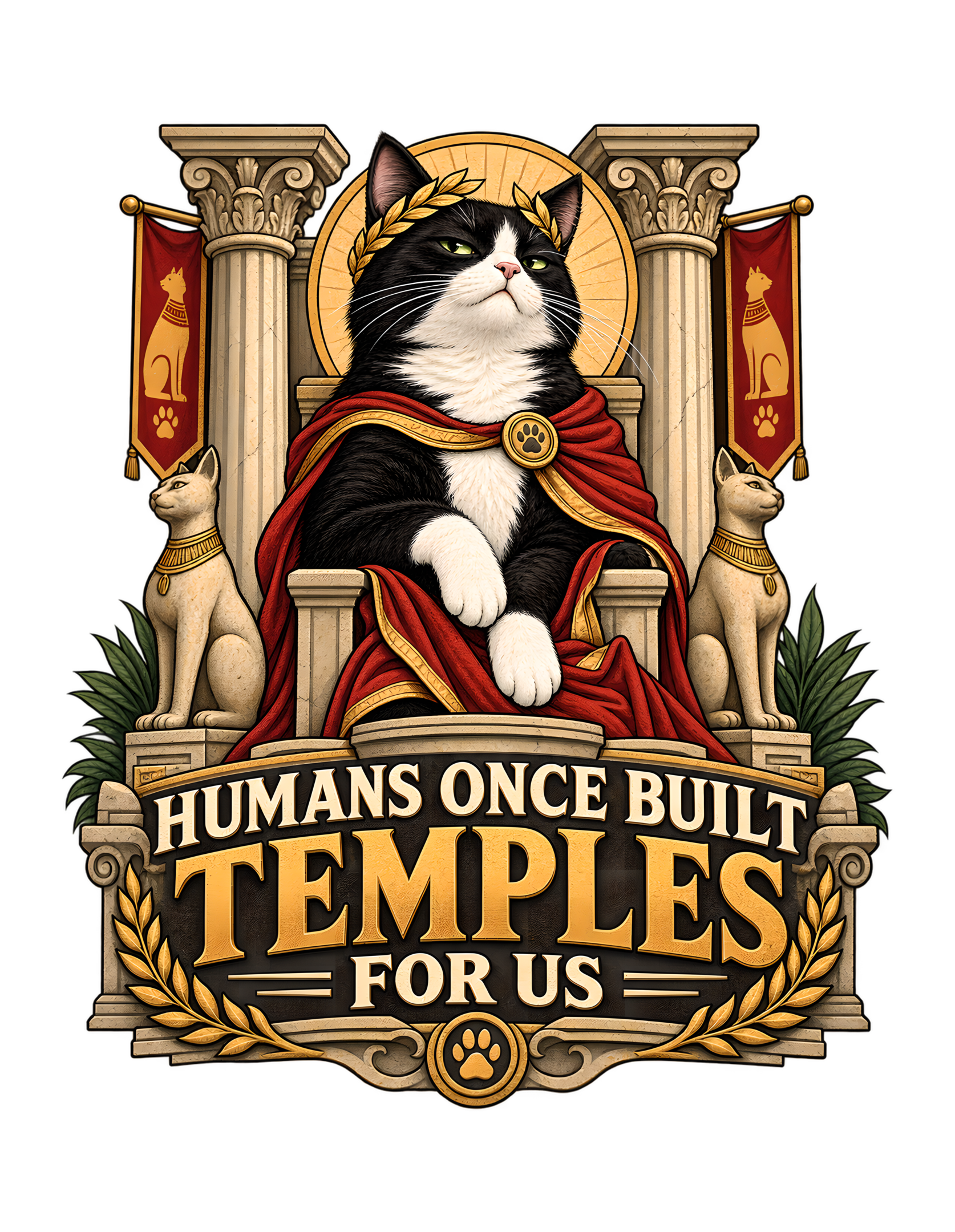
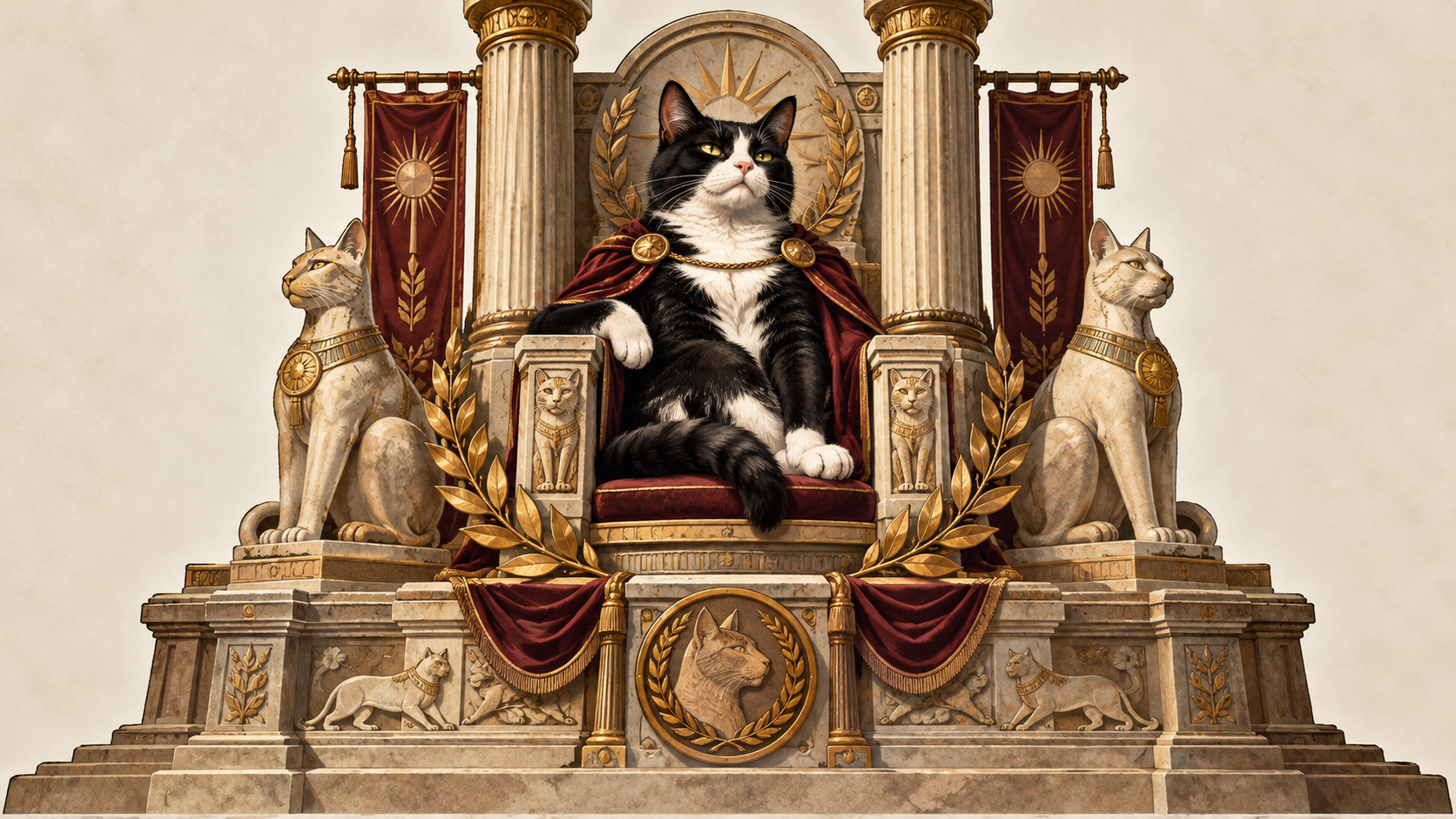
“Humans Once Built Temples for Us” begins with a deliberately oversized feline premise: the cat is not merely a pet, roommate, or household favorite, but a figure whose standards were supposedly established at the level of ceremony, monuments, columns, banners, and formal reverence. The approved artwork makes that joke instantly readable. A composed tuxedo cat sits at the center in a red, gold-trimmed cloak, framed by classical columns, stylized feline statues, laurel details, and a circular golden backdrop. Beneath the scene, the phrase is built into the architecture of the composition rather than treated like a casual caption. The result feels less like a modern slogan and more like a decree carved into a monument—exactly the sort of presentation an unimpressed cat might consider overdue.
The humor does not depend on a literal historical claim. It works as feline point-of-view satire: a cat looks at ordinary human service and judges it against an absurdly elevated standard. That contrast gives the design its Cats Judging Humans identity. The cat’s expression is calm rather than angry, which matters. The joke is not that the feline is furious; it is that the feline is certain. Humans are the ones who have allowed standards to deteriorate. By combining regal visual language with familiar cat-owner dynamics, the design turns a grand ceremonial scene into a recognizable household truth: cats often behave as though the home, the schedule, the furniture, and the staff were all arranged for them in the first place.
The Joke Starts by Treating Reverence as the Baseline
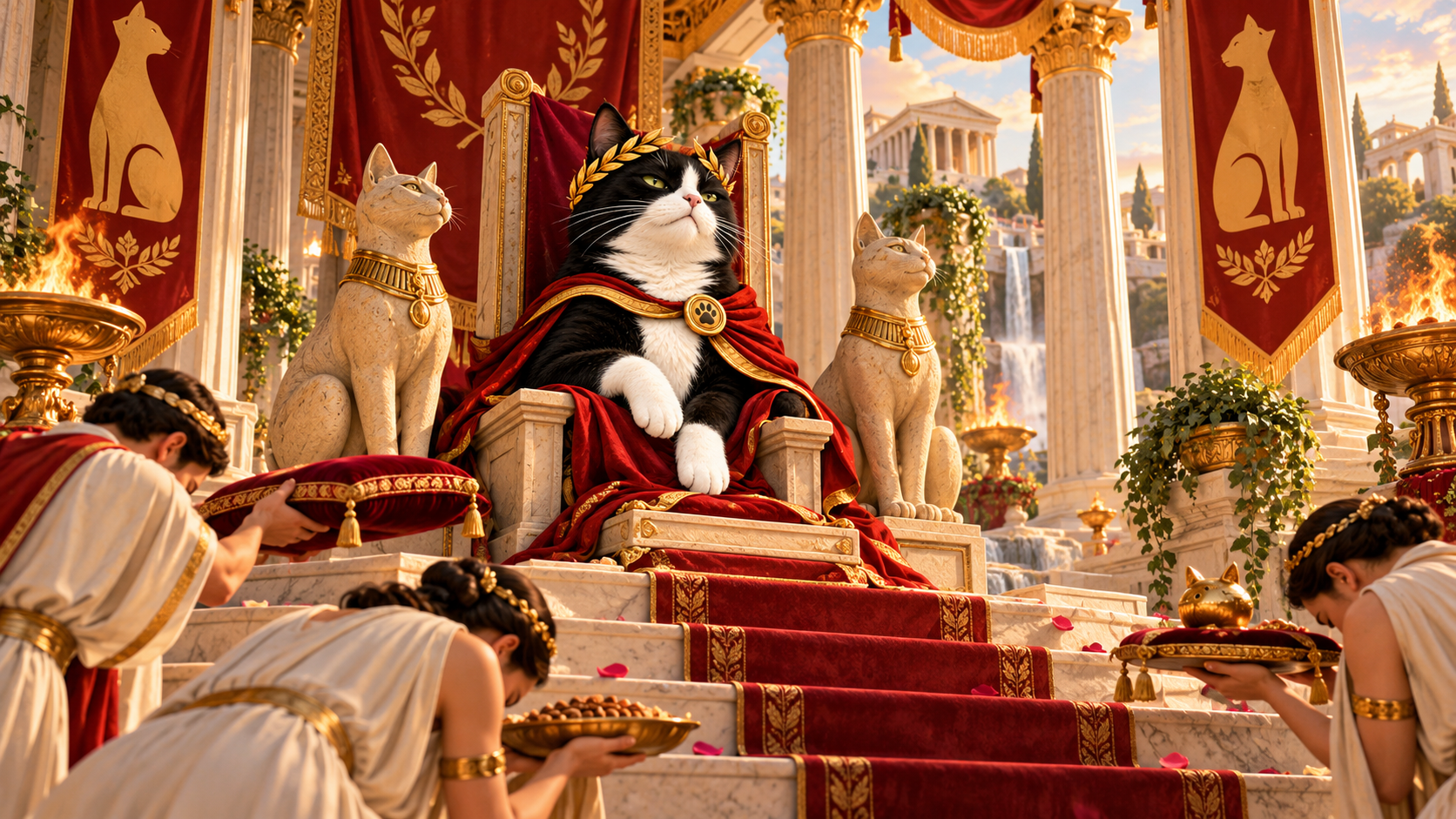
The strongest part of the concept is the reversal built into the premise. Most jokes about demanding cats begin with a small domestic inconvenience: a food bowl that is not sufficiently full, a closed door that should obviously be open, or a human who has failed to understand an apparently urgent stare. “Humans Once Built Temples for Us” skips past those everyday complaints and establishes an absurdly grand starting point. In the cat’s imagined version of the relationship, temples are not an exaggeration. They are evidence of the level of service humans were once capable of providing.
That makes the phrase function like a performance review delivered from above. The cat is not asking for improvement so much as documenting a decline. Modern household service is being compared with ceremonial architecture, and naturally it does not fare well. This gives the joke more range than a simple “cats are royalty” statement. The humor is not only about status; it is about standards, memory, and disappointment. The cat appears to believe there is a documented precedent for better treatment and that humans have simply stopped meeting it.
The approved visual concept supports that reading by surrounding the tuxedo cat with elements that look ceremonial rather than cozy. Classical columns rise behind the central figure. Red hanging banners reinforce the sense of formal display. Stylized cat statues sit at the lower sides like guardians or attendants. Laurel leaves and a warm circular disc elevate the subject further. None of these elements need a literal historical explanation to work. Their purpose is visual shorthand: this cat expects a level of respect that ordinary domestic life cannot possibly match.
The joke becomes especially recognizable to cat people because the emotional logic is familiar even when the architecture is exaggerated. Many cats carry themselves with remarkable certainty in spaces they did not build, pay for, or maintain. The design simply gives that attitude the monumental setting it seems to deserve.
A Tuxedo Cat Becomes the Center of Authority
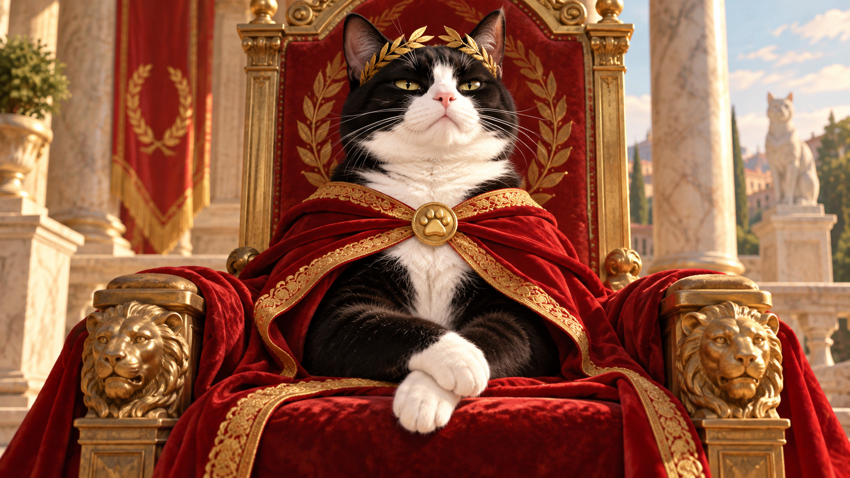
The tuxedo cat is crucial because its natural black-and-white contrast already carries a suggestion of formality. In this composition, that visual association is pushed further through posture, expression, and costume. The cat is seated upright and centered, with one front paw resting over the other in a pose that reads as composed rather than active. There is no scramble, no pounce, and no slapstick movement. The authority comes from stillness. The cat does not need to prove anything because the entire setting has already arranged itself around the cat.
The face supports the same idea. The eyes are narrowed just enough to suggest judgment without turning the character hostile. The head is slightly lifted, and the overall expression reads as self-possessed, observant, and mildly disappointed. That emotional register is central to Cats Judging Humans. The cat is not a villain and does not need to threaten the viewer. A quiet look of certainty is funnier because it suggests that the verdict has already been reached.
The ceremonial cloak adds another layer without disguising the fact that the subject is still recognizably a tuxedo cat. Rich red fabric with gold edging falls around the body and across the seat, while the black-and-white fur remains highly visible at the head, chest, and paws. A round paw-emblem clasp keeps the feline identity connected to the regalia rather than allowing the costume to become generic royal dress. The laurel crown also works less as historical specificity and more as a clear symbol of elevated status.
Most importantly, the cat remains readable at a glance. The silhouette is broad, frontal, and uncomplicated. Even before the viewer reads the phrase, the subject communicates “authority figure who expects deference.” The typography then reveals the exact joke. That sequencing—first attitude, then explanation—gives the design a strong apparel and social-media read. The cat’s role is understood before the words finish the sentence.
Columns, Banners, and Cat Statues Build the Feline Temple
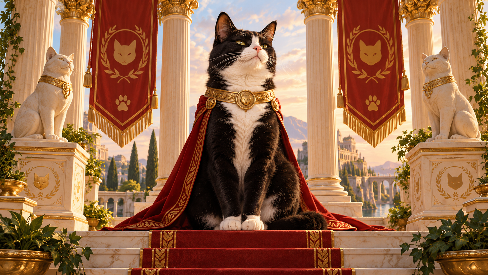
The setting is deliberately theatrical, but it is also disciplined. The approved artwork does not attempt to render a vast architectural complex. Instead, it chooses a small set of symbols that can communicate monumentality inside a compact apparel composition. Two large classical columns frame the upper half. Their ornate capitals give the scene visual weight, while the symmetry immediately suggests a formal civic or ceremonial space rather than an ordinary living room.
Red banners hang on both sides, each carrying a stylized feline emblem and paw motif. These banners matter because they make the environment feel as though it belongs to a cat-centered institution. The setting is not merely classical; it has been reorganized around feline symbolism. That supports the phrase without requiring extra explanatory text. The visual world already assumes that cats are the subjects of honor.
Below the banners, two sculptural cat figures sit on matching pedestals. Their presence expands the joke in a quiet way. The central tuxedo cat is not simply dressing up for a single moment. The surrounding iconography implies a whole system of feline reverence, complete with statuary, ceremonial graphics, and architectural framing. Yet the statues remain secondary to the living cat at the center. Their lighter stone tones and side placement support the hierarchy rather than competing with it.
Green foliage at the lower edges softens the architecture and prevents the composition from becoming rigid. It also creates a useful transition between the sculptural upper scene and the large typographic structure below. Gold leaf forms repeat this organic motif near the lettering, tying the upper and lower halves together.
Taken as a whole, the environment does not try to recreate a literal historical temple. It creates a feline ceremonial stage. That distinction keeps the artwork focused on humor and brand identity. The architecture exists to make the cat’s inflated expectations feel visually reasonable for one glorious moment—until the viewer remembers that the subject is still judging a modern human household.
Red, Gold, Cream, and Black Create a Regal Hierarchy
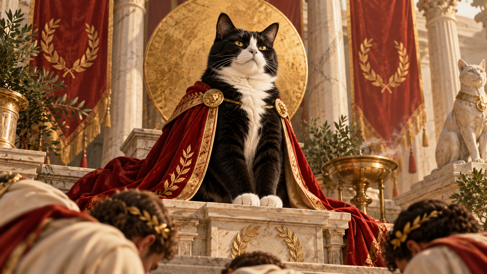
Color does a large amount of storytelling in this design. The tuxedo cat supplies the most important natural contrast: deep black fur against a bright white chest, muzzle, and paws. Around that high-contrast center, the artwork uses a warm ceremonial palette of red, gold, cream, stone, and muted green. The result feels established and premium without becoming glossy or overly ornamental.
Red carries the strongest emotional accent. It appears in the cat’s cloak and the hanging banners, connecting the central figure to the surrounding environment. Because the red is deep and muted rather than neon, it reads as ceremonial fabric rather than a modern warning color. Gold outlines and accents then elevate that red, appearing along garment edges, medallions, laurel forms, and selected typography. The gold is warm and aged in character, which suits the vintage-inspired illustration and prevents the composition from feeling digitally slick.
Cream and stone tones provide the structural field. The columns, statues, and smaller lettering are lighter than the black and red elements, so they remain visible while allowing the tuxedo cat and the main word “TEMPLES” to carry the strongest visual emphasis. The large golden circular shape behind the cat’s head works almost like a halo or medallion. It is not subtle, but subtlety would work against the joke. The whole concept depends on presenting feline self-importance with complete seriousness.
Black grounds the lower typographic panel and repeats the cat’s dark fur, giving the composition a strong visual base. This is important because the artwork contains many ceremonial details. Without a dark anchor, the scene could become scattered. Instead, the black field lets cream and gold lettering read immediately and allows the red cloak above to remain distinct.
The palette therefore does more than make the piece attractive. It organizes the hierarchy: cat first, phrase second, ceremonial details third. Every color choice reinforces the impression that this is a formal declaration from a feline authority who considers the current state of human service historically disappointing.
Symmetry Makes the Cat Look Official Before the Joke Lands
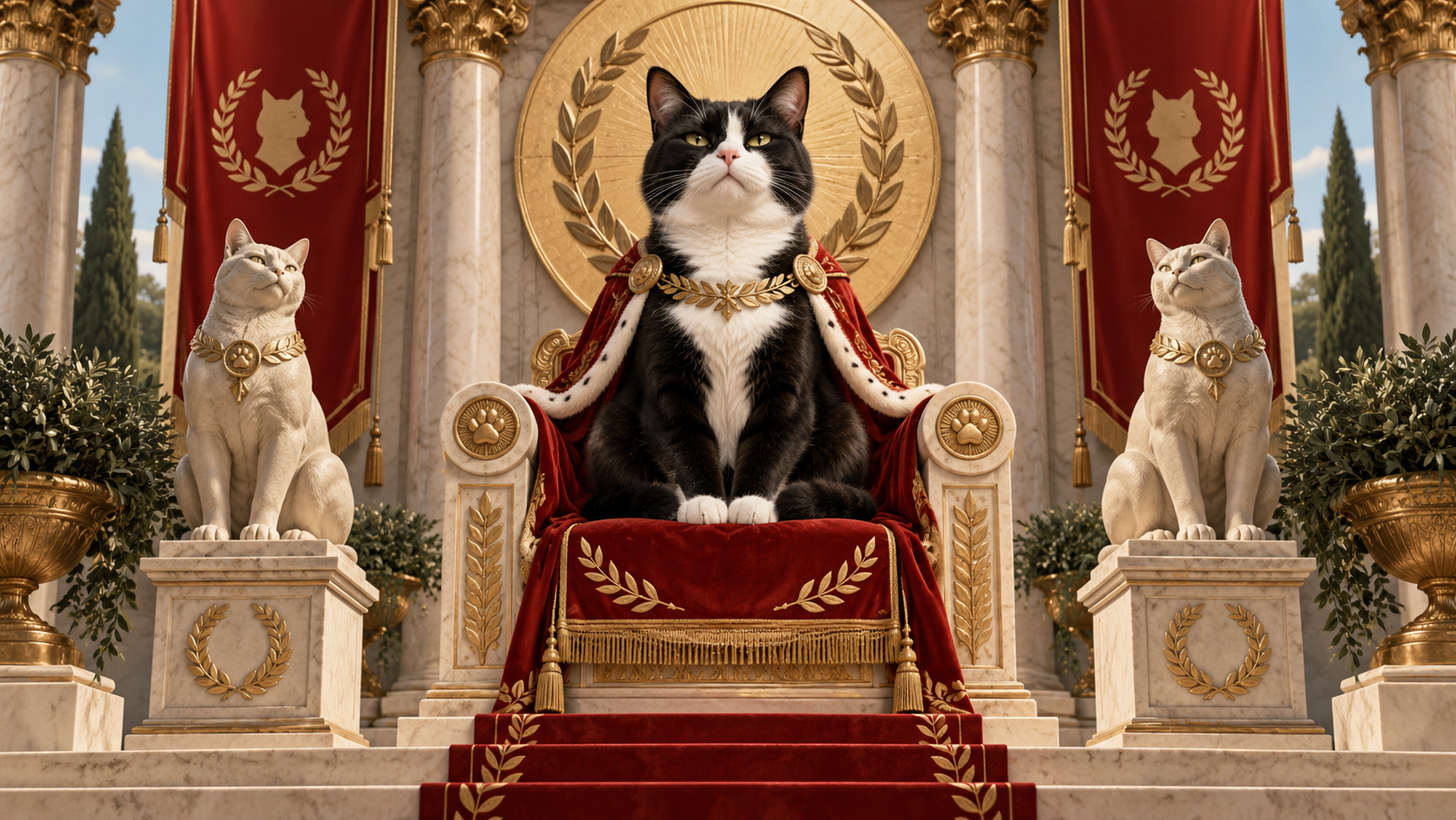
The composition is built around symmetry, and that choice is central to why the design feels authoritative. The main cat sits almost directly on the vertical centerline. Columns rise at matching positions on either side. Banners balance one another. Cat statues mirror each other below. Laurel forms frame the lower text panel. This order makes the entire artwork feel ceremonial before the viewer reads a single word.
Symmetry carries associations with stability, institutions, monuments, and official presentation. Here, those associations are used for comedy. The cat is treated with the same compositional seriousness normally reserved for rulers, emblems, or civic symbols. Because the scene is so balanced, the feline attitude seems less like a personal opinion and more like an established system. The viewer is not encountering one eccentric cat with delusions of grandeur. The artwork implies a whole administrative structure in which feline superiority is simply policy.
The central circular disc behind the cat’s head strengthens that effect. It creates a clear focal zone and separates the face from the architecture behind it. The eye goes first to the cat, then downward through the cloak and throne, then into the typographic monument. The composition therefore guides the viewer in a deliberate sequence without needing arrows or visual tricks.
The symmetry also helps the artwork survive reduction. Apparel graphics are often seen from several feet away, in motion, or in a small thumbnail. A balanced silhouette remains understandable under those conditions. The twin columns and statues form a recognizable frame, while the broad central cat and large lower lettering maintain the joke’s readability.
This disciplined structure is what allows the design to contain many details without feeling chaotic. Every decorative element has a counterpart or a supporting role. The order itself becomes part of the humor: humanity may be failing its duties, but the feline court is clearly running a very organized operation.
The Phrase Is Built Like a Monument, Not a Caption
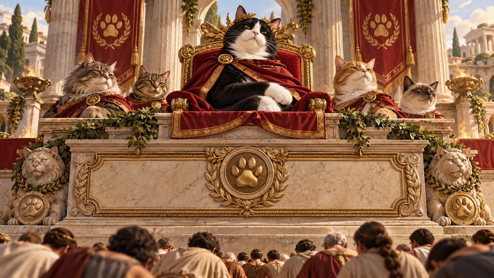
The wording “HUMANS ONCE BUILT TEMPLES FOR US” would still be funny as a plain sentence, but the artwork gives it architectural weight. The typography occupies the lower third of the composition in a heavy, framed structure that feels connected to the columns and pedestal above. This matters because it makes the phrase appear permanent. It is not a passing thought from the cat. It looks like a statement meant to be carved, preserved, and consulted whenever modern humans forget the standard.
The hierarchy is immediate. “HUMANS ONCE BUILT” appears in a strong cream serif across the top of the text block. “TEMPLES” is dramatically larger and rendered in warm gold, becoming the visual center of the phrase. “FOR US” returns to a smaller cream treatment below. That scale change tells the joke visually: the word that carries the absurd grandeur receives the largest treatment.
The letterforms are bold and traditional rather than playful or handwritten. That decision keeps the humor dry. A novelty font would announce that the design is joking; the current typography behaves as though the statement is official. The seriousness of the type lets the absurdity of the message do the comedic work.
Decorative rules, laurel branches, carved-looking side forms, and a central paw medallion turn the lettering into part of the monument. The bottom panel could almost be read as the inscription beneath a ceremonial statue. That is precisely the right visual role. The design asks the viewer to imagine that someone considered this phrase worthy of permanent architectural treatment.
From a practical reading standpoint, the type also remains unusually clear for a detailed illustration. The words are large, high contrast, and grouped into a logical sequence. The viewer can understand the statement quickly, while the illustration rewards a second look. That balance is important: the joke lands fast, but the design does not feel disposable.
The Humor Is a Performance Review of Modern Humanity
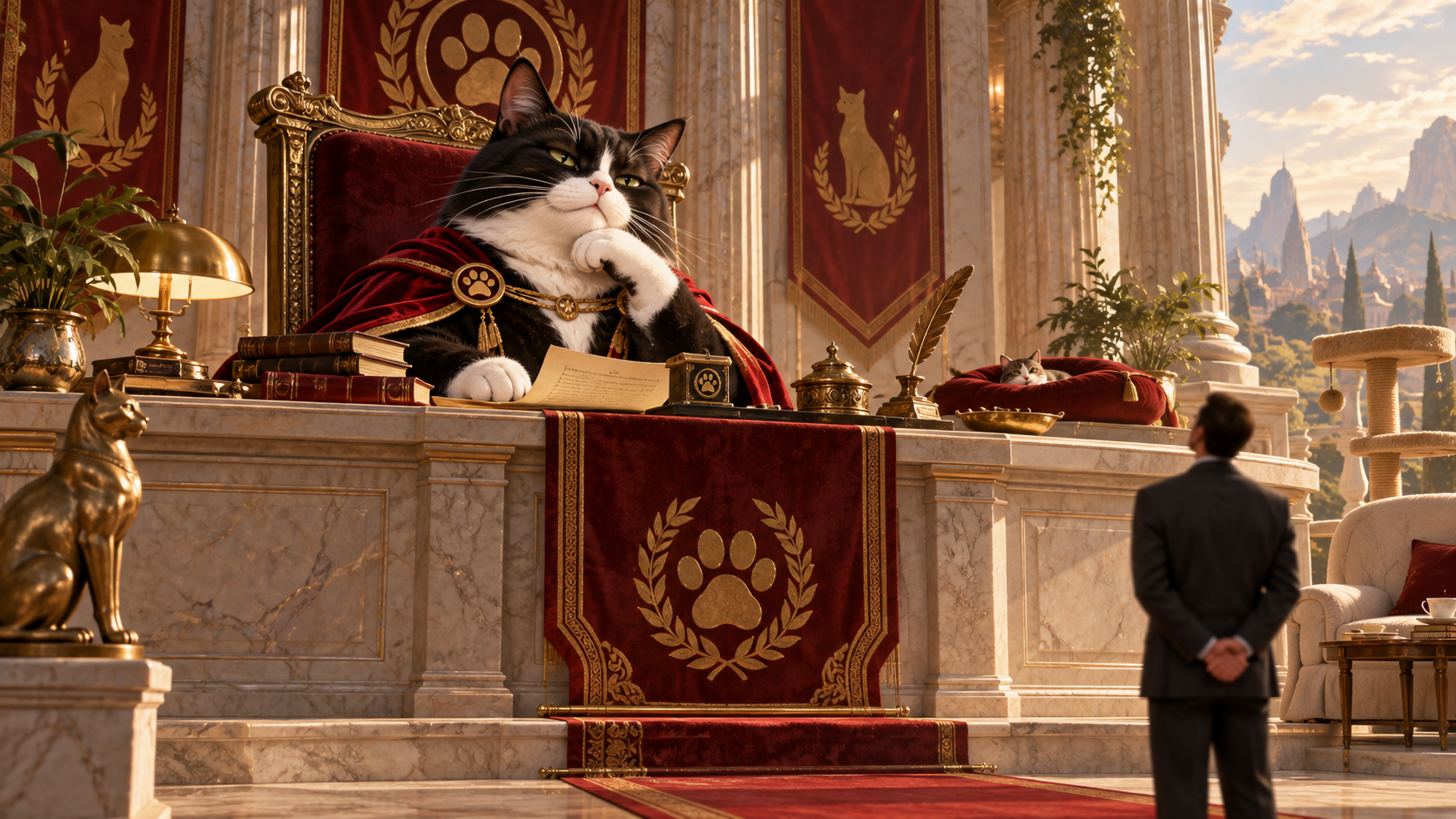
At its core, the design is not really about ancient architecture. It is about contemporary human underperformance, as evaluated by a cat. The phrase uses the past tense—“once built”—to create the impression that a better era existed and has since been squandered. That single word, “once,” does a great deal of comedic work. It introduces nostalgia, disappointment, and comparison without requiring the cat to say anything more.
The modern human is absent from the artwork, which makes the judgment broader. There is no specific owner to blame and no visible household to defend itself. The accusation is directed toward humanity in general. The cat sits in full ceremonial authority while the viewer effectively occupies the position of the disappointing descendant. It is a simple but useful inversion: the person looking at the image becomes the one being reviewed.
That dynamic fits the Cats Judging Humans concept especially well because it turns ordinary pet ownership into an evaluation system. Humans typically think of themselves as the decision-makers: they choose the food, pay the bills, set schedules, and maintain the home. Cat humor often works by reversing that assumption. From the feline point of view, the human is staff. The only real question is whether the staff is meeting expectations.
By choosing temples as the comparison point, the design makes those expectations impossible to satisfy. A clean litter box, a favorite chair, or an on-time meal cannot compete with columns, banners, statues, and public reverence. The standard is unfair by design. That unfairness is what keeps the judgment playful rather than mean. The viewer is invited to recognize the exaggeration and, at the same time, admit that the cat probably would prefer the grander arrangement.
The result is a joke about status, service, and the strange confidence cats bring into domestic life. It takes a familiar household relationship and gives it the scale of an institutional grievance.
Why the Regal Cat Still Feels Like a House Cat
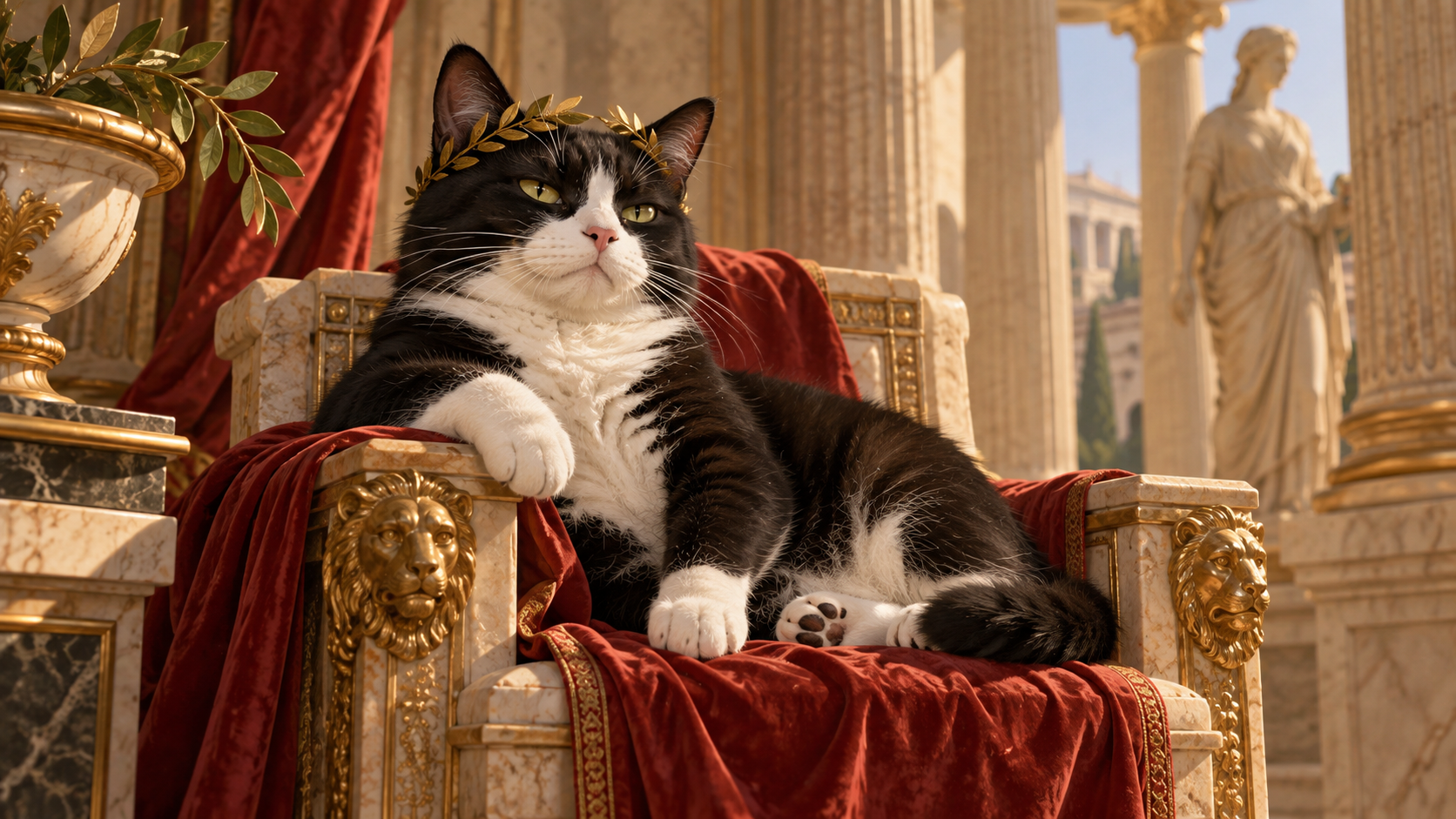
The design works because the cat remains recognizably feline even while the setting becomes grand. The posture is formal, the cloak is ceremonial, and the architecture is monumental, but the subject is still a tuxedo cat with familiar proportions, visible paws, whiskers, ears, and an unmistakably catlike expression. That grounding prevents the illustration from drifting into generic fantasy royalty.
The face is particularly important. Many successful cat jokes depend on expressions that humans recognize as disapproval, skepticism, or indifference. The approved artwork uses that familiar visual language without exaggerating it into anger. The cat looks composed enough to sit in judgment all day. That expression is easy for cat owners to project onto everyday situations: a delayed meal, an interrupted nap, an inadequate box, a closed door, or a human occupying the preferred seat.
The paws reinforce the domestic connection. One rests visibly across the front of the throne while the other settles beneath it. They are not transformed into human hands, and the cat is not acting out a complicated human gesture. The character remains cat-first. The costume and setting elevate the animal without replacing its identity.
That distinction makes the humor more relatable. If the subject became too humanized, the joke could feel like a person in a cat costume. Here, the comedy comes from imagining that an ordinary cat already possesses this level of self-importance. The artwork merely reveals the internal court that the cat has apparently been operating all along.
This also helps the design remain broad in appeal. Viewers do not need to recognize a specific breed beyond seeing a black-and-white tuxedo cat, and they do not need specialized historical knowledge. The image communicates through familiar feline attitude and universally legible symbols of status. The cat is both absurdly elevated and completely believable to anyone who has ever been silently judged by one.
Ancient-Style Symbols Support the Satire Without Becoming a History Lesson
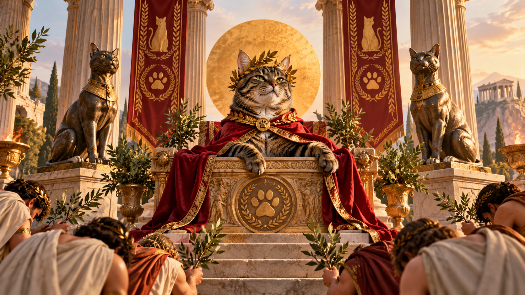
The artwork borrows a broad vocabulary of classical and ceremonial imagery—columns, laurel leaves, statues, banners, a throne-like seat, and a circular golden backdrop—but it does not depend on literal archaeological accuracy. That is an important distinction for reading the design. The page is about a visual joke, not a claim that the specific scene depicts a real historical temple or a documented ritual.
Those symbols function because viewers already understand their general meaning. Columns suggest monumentality and institutions. Laurels suggest honor. Formal banners suggest public ceremony. Statues suggest permanence and reverence. The circular disc behind the cat’s head gives the central figure an iconic, elevated presence. Together, these devices create a setting in which the cat looks officially important.
The design then overlays feline-specific details on that ceremonial language. The banners feature cat imagery and paws. The cloak clasp carries a paw emblem. Cat statues replace generic guardian figures. A paw medallion anchors the lower inscription. These substitutions are where the satire becomes specific. The world has not merely borrowed classical architecture; it has been reorganized around feline status.
Because the concept is visual satire, restraint helps. The artwork does not pile on explanatory dates, invented inscriptions, faux historical quotations, or documentary claims. It lets the phrase and composition establish the fictional premise. That keeps the design flexible and protects the humor from being overexplained.
The result is a useful example of how a strong concept can borrow the emotional meaning of historical visual language without pretending to be historical evidence. Viewers understand the scene immediately: this cat believes human civilization once understood its priorities. Whether the viewer interprets the columns as Roman, classical, temple-like, imperial, or simply grand is less important than the shared conclusion. The cat is receiving the kind of formal treatment modern household service has failed to maintain.
The Design Rewards Both a Fast Read and a Second Look
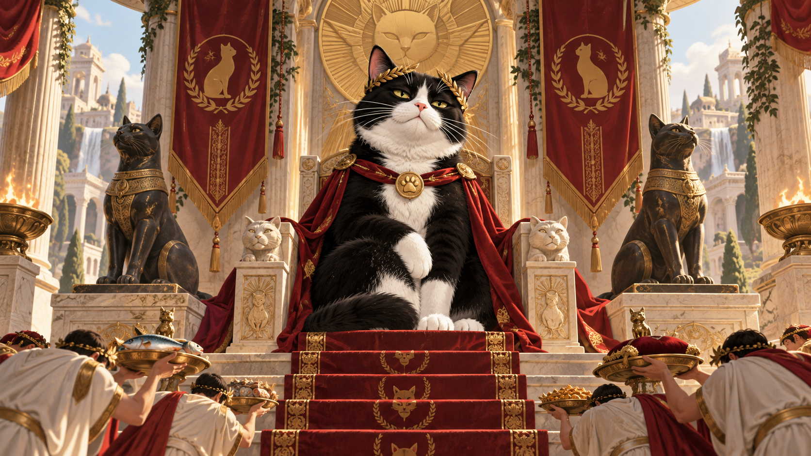
A strong apparel illustration has to work at more than one viewing distance, and this design is structured for that. At first glance, the viewer sees three things: a regal tuxedo cat, monumental framing, and a large phrase about humans once building temples. That is enough for the joke to land. The main silhouette is broad, the cat’s face is centrally positioned, and the word “TEMPLES” is large enough to become an immediate visual anchor.
A closer look reveals the smaller details that deepen the concept. The cat wears a laurel crown. The cloak is secured with a paw medallion. The side banners carry feline symbols. The statues are cats rather than generic figures. Laurel branches frame the lower text. The throne-like architectural base links the character and the inscription into one continuous monument. None of those elements are necessary for basic comprehension, but together they make the world of the joke feel complete.
This layered readability matters because over-detailed apparel graphics can become muddy, while overly simple graphics can feel disposable. Here, the main forms remain large enough to survive reduction. The detail is concentrated inside those larger structures instead of being scattered across the canvas. The eye does not have to search for the subject or the punchline.
The composition also uses contrast strategically. Dark fur and the black text panel establish the strongest masses. Cream stone and white fur create light breaks. Red fabric pulls attention toward the central figure. Gold defines both status and typography. Because the palette is controlled, the smaller details feel intentional rather than noisy.
That makes the design suitable for viewers who appreciate the joke immediately and for those who enjoy inspecting the illustration afterward. The first read is about attitude. The second read is about how thoroughly the feline court has documented its own importance.
The Audience Recognition Comes From Everyday Cat Ownership
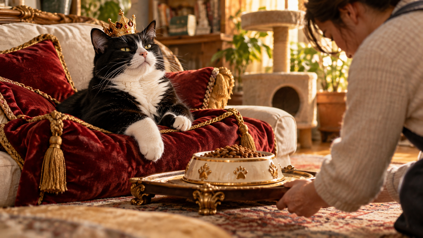
The scene is grand, but the emotional source of the joke is ordinary cat ownership. Cats routinely create a strange imbalance between actual dependence and apparent authority. Humans purchase food, clean litter, open doors, schedule appointments, move furniture, and reorganize routines. The cat, meanwhile, often behaves as though these services were not favors but baseline obligations. The design takes that familiar dynamic and asks what the cat would consider an appropriate historical comparison.
The answer is deliberately unreasonable: temples. That exaggeration is funny because it feels consistent with the attitude. A cat that stares at an empty patch of bowl around perfectly good food may also seem capable of believing civilization peaked when monumental architecture was involved. The design does not need to show the everyday household situations because viewers bring those experiences with them.
That recognition gives the page value beyond describing the artwork. The design succeeds because it lets people map their own cat’s behavior onto the central character. A tuxedo-cat owner may see a direct resemblance, but the joke is broad enough for anyone who has lived with a confident feline. The exact coat pattern is less important than the attitude: composed, superior, and entirely certain that human service is being evaluated.
The phrase also invites a kind of affectionate surrender. It does not ask the viewer to resent the cat’s arrogance. It asks the viewer to enjoy it. The humor depends on the shared understanding that humans continue providing care despite the lack of gratitude—or perhaps because the lack of gratitude is part of the charm.
In that sense, the design is not really about worship. It is about the theatrical seriousness with which cats can occupy ordinary domestic space. The temple imagery simply makes visible the status many cats already seem to assume.
An Evergreen Joke Built on Status Rather Than a Trend
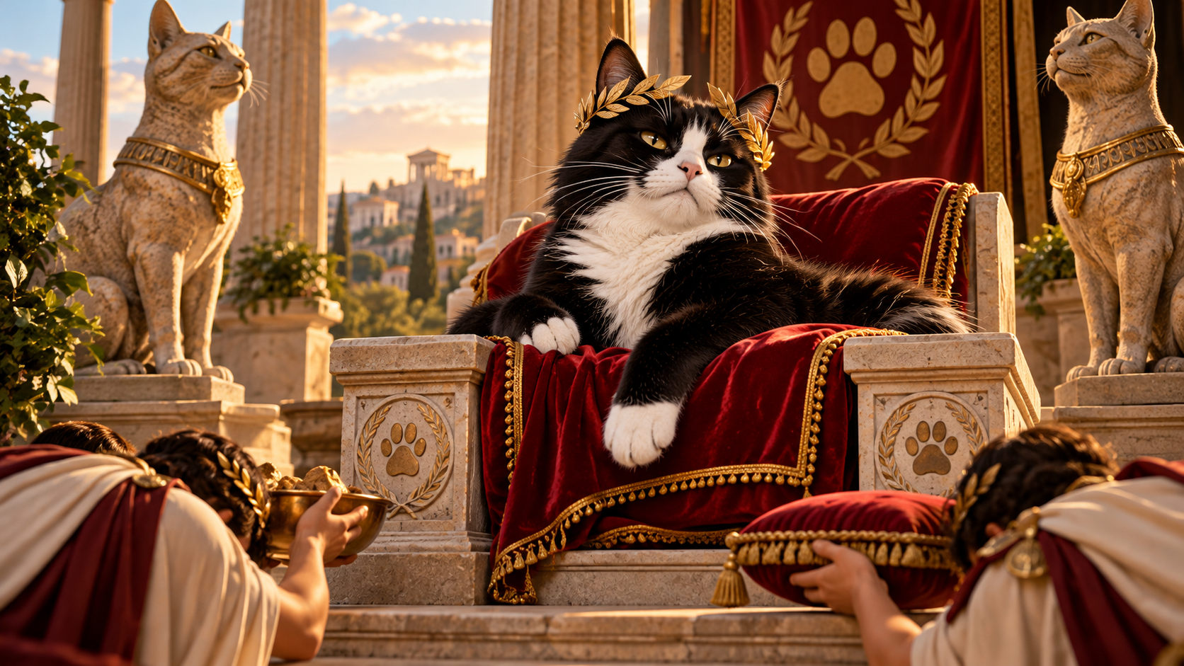
The concept is evergreen because it does not depend on a current meme, platform format, celebrity, news event, or short-lived phrase. Its humor comes from a stable relationship pattern: cats often appear to regard themselves as socially superior to the humans who care for them. That premise has room to stay funny because it can be recognized in many different homes and generations of cat owners.
The ancient-style framing extends that durability. Instead of tying the joke to a contemporary office, device, app, or cultural reference, the artwork creates a deliberately timeless stage. Columns, banners, laurels, statues, and monumental typography suggest something established and ceremonial. The visual language feels old enough to support the phrase while still reading clearly as stylized illustration.
Evergreen does not mean generic. The design remains specific because of its central contrast: past human reverence versus present feline disappointment. The tuxedo cat, throne-like seat, matching statues, red cloak, paw emblems, and temple-style framing give the idea a distinct identity. The joke could not be reduced to any random “cats are royalty” graphic without losing the performance-review tone created by the word “once.”
That balance is useful for a catalog. A design can stay relevant over time while still having its own visual and verbal hook. It also means the piece can sit comfortably alongside other Cats Judging Humans concepts that place cats in roles of authority—supervisors, inspectors, rulers, or evaluators—without becoming dependent on the same setting or joke structure.
The lasting appeal is simple: as long as cats continue to occupy couches like thrones, demand service with minimal explanation, and look personally disappointed when humans fail to anticipate their needs, the premise remains understandable. The monuments may be fictional, but the attitude is familiar.
How the Artwork Fits the Cats Judging Humans World
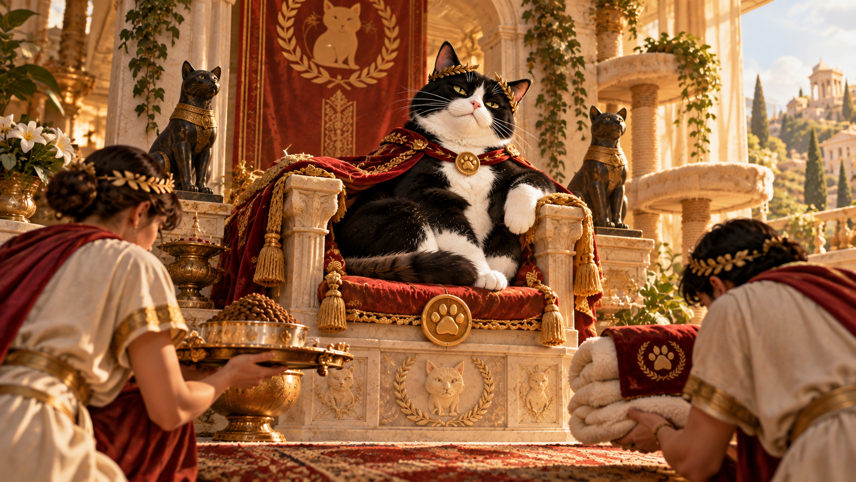
Cats Judging Humans is built around a recurring point of view: humans may believe they run the household, workplace, schedule, or civilization, but cats are quietly evaluating the results. This design fits that world by giving the feline evaluator unusually high status. Instead of a cat commenting from the sofa, the central figure sits inside a ceremonial system that appears designed to formalize the judgment.
The brand voice is dry rather than frantic, and the artwork respects that. The cat does not shout, rage, or perform exaggerated slapstick. The humor comes from the calm certainty of the pose and the oversized seriousness of the environment. The line “HUMANS ONCE BUILT TEMPLES FOR US” is delivered as a statement of record, not a punchline with a wink attached. That tonal confidence is what makes it feel properly feline.
The design also reinforces several recurring Cats Judging Humans themes without needing the official logo inside the artwork. There is human incompetence, but it is framed as declining service rather than outright hostility. There is feline superiority, but it is playful and theatrical. There is household hierarchy, but the viewer is invited to recognize and enjoy the exaggeration. The cat remains intelligent, composed, and slightly aristocratic rather than aggressive.
Visually, the vintage-inspired illustration, limited warm palette, bold silhouette, and strong typography sit comfortably within a catalog of retro, emblematic, and screen-print-influenced cat designs. At the same time, the classical setting gives this piece its own identity. It does not need to repeat an office, kitchen, bedroom, or modern domestic scene to communicate the brand.
The result is a useful example of brand consistency without sameness. The specific costume and architecture can change from design to design, but the core relationship remains stable: the cat has standards, the human is being assessed, and the cat sees no reason to lower expectations.
Grand Visual Seriousness Makes the Absurdity Funnier
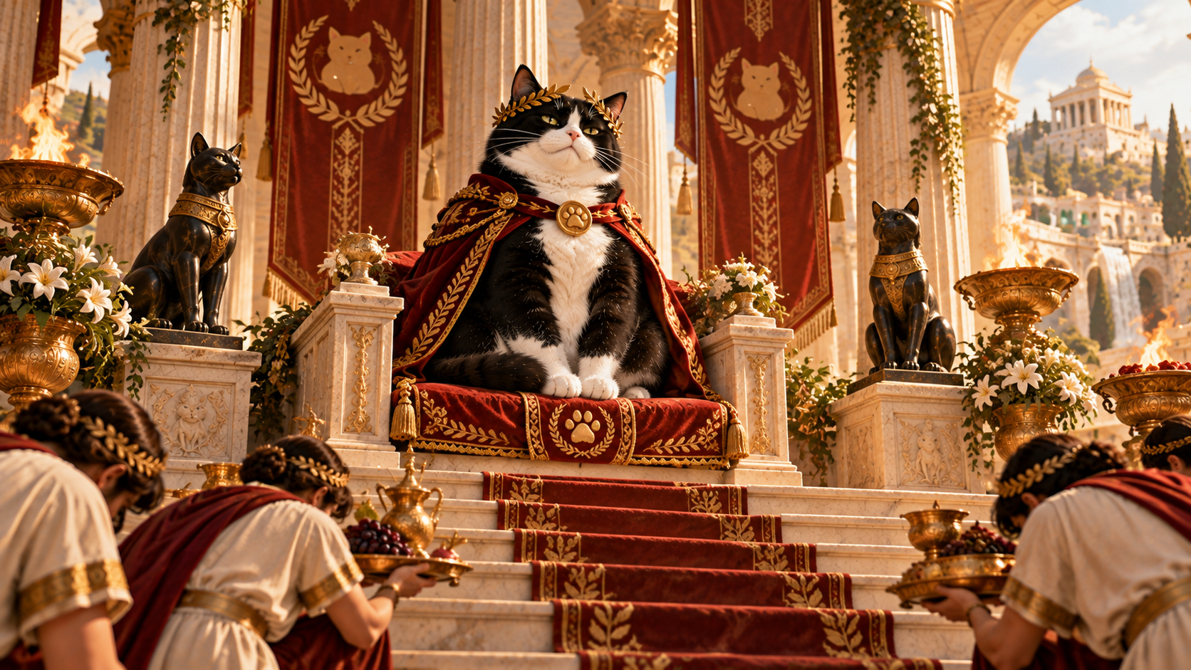
The final strength of the design is its refusal to visually apologize for the joke. Everything is presented with conviction. The cat is centered like a ruler. The columns are substantial. The banners hang formally. The statues sit in attendance. The cloak is richly trimmed. The phrase is built into a monumental text panel. If any of those elements were treated with obvious silliness, the humor would become broader and less dry.
Instead, the artwork behaves as though the premise deserves full ceremonial production. That seriousness creates the comedic gap. The viewer knows the subject is a household cat, yet the visual system treats the cat as a civilizational authority. The more confidently the scene presents that contradiction, the better the joke works.
This approach also protects the cat from becoming merely cute. The subject is attractive and expressive, but the design is not built around sweetness. The cat is impressive first and amusing second. That distinction gives the artwork more personality than a generic pet illustration with a funny caption. The visual character and the phrase are telling the same story.
There is also a useful contrast between scale and restraint. The concept is enormous—temples, reverence, historical decline—but the composition itself is controlled. The cat does not gesture wildly. The environment is symmetrical. The palette is limited. The type is organized. The restraint makes the grandeur feel intentional rather than noisy.
For the viewer, that creates a satisfying double read. At first the scene looks genuinely regal. Then the phrase reveals what the grandeur is for: a cat complaining that humans used to do better. The artwork never needs to break character. The cat’s certainty carries the final line of the joke.
From Feline Throne to Apparel Graphic, the Silhouette Holds Together
One reason the approved artwork feels complete is that the illustration and lettering form a single vertical structure rather than two unrelated pieces stacked together. The cat, throne, columns, statues, and banners create a broad upper mass, while the framed typographic panel creates a substantial lower base. The transition between them is handled through repeated stone shapes, gold trim, laurel forms, and centered geometry. The viewer therefore reads one emblematic composition instead of an illustration floating above a caption.
That cohesion matters for the design’s visual personality. The upper scene supplies character and narrative: a tuxedo cat has been elevated into a ceremonial ruler. The lower structure supplies the declaration that explains why the scene exists. Neither half has to carry the full joke alone. The image establishes authority, and the phrase establishes the complaint. Together they create a compact piece of visual storytelling that can be understood without additional context.
The silhouette also remains intentionally contained. The columns rise high enough to frame the cat without producing long fragile extensions. The banners stay close to the architecture. The cat statues sit within the overall footprint rather than drifting outward. Laurel branches hug the lower frame. Those choices help the design feel dense and finished while preserving a recognizable outer contour.
The same structure reinforces the premium, vintage-inspired tone. A centered emblem with a heavy base feels more deliberate than a loose collage of props. It gives the piece the visual confidence of an insignia, plaque, or ceremonial crest, which suits a joke about supposedly lost standards of human reverence. The cat is not merely pictured in front of grand objects; the entire composition has been organized to function like a monument to the cat’s own expectations.
That is why the artwork can support both humor and visual seriousness. The joke is ridiculous, but the composition is not careless. Its order, weight, and integrated silhouette make the feline complaint feel official enough to be absurd.
“Humans Once Built Temples for Us” succeeds because every part of the artwork supports the same feline argument. The tuxedo cat’s calm, superior expression sets the tone. The red ceremonial cloak, laurel crown, classical columns, banners, statues, and gold accents elevate that attitude into a full visual institution. The large inscription beneath the scene turns the phrase into something that feels permanent: not a casual complaint, but a standard humanity is expected to remember.
The design remains playful because the standard is obviously impossible. No modern household can compete with the fictional level of reverence suggested by the scene, and that unfair comparison is exactly the point. Cat owners recognize the emotional truth behind the exaggeration: cats often behave as though comfort, access, attention, and service are not gifts but obligations. The artwork simply scales that expectation up until it becomes architecture.
Within Cats Judging Humans, the piece is a clean expression of the brand’s central relationship. The cat is composed, the human is implicitly under review, and the judgment arrives without cruelty or chaos. Humanity may no longer be building monuments, but from the cat’s perspective, that sounds like a human problem.