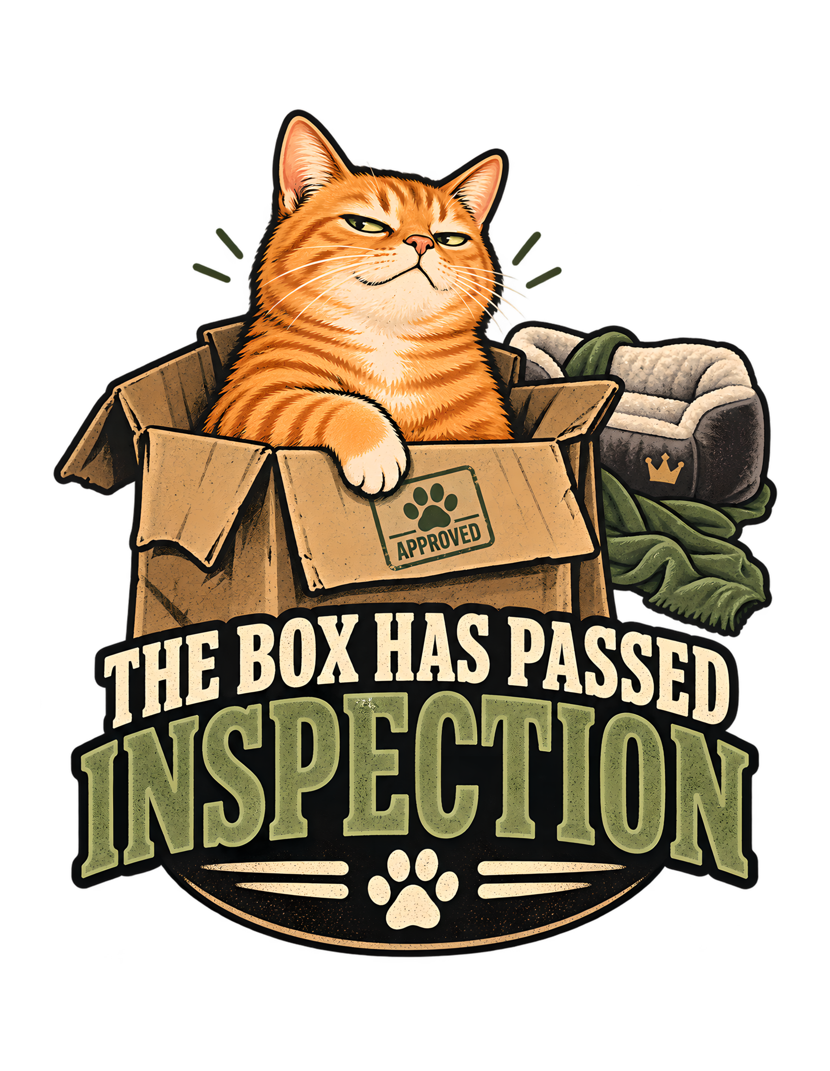
“THE BOX HAS PASSED INSPECTION” is built around one of the clearest kinds of Cats Judging Humans authority: the cat does not merely choose a cardboard box; the cat certifies it. The canonical concept says an orange cat treats a random cardboard box as an officially approved premium destination after a rigorous personal inspection. The approved artwork turns that premise into a compact vintage badge: a confident orange tabby sits inside a slightly dented box, one paw resting over the flap near a small “APPROVED” stamp, while a plush-looking cat bed sits ignored behind it.
The humor depends on contrast. Humans often assign value through design, comfort, cost, intention, and presentation. The cat in this artwork appears to use a different procurement standard. The box is plain, visibly cardboard, and slightly battered. The nearby bed looks soft and deliberately made for a cat. Yet the feline inspector has reached a decision, and the decision favors the box.
That choice is not presented as confusion. It is presented as certification.
The phrase “THE BOX HAS PASSED INSPECTION” makes the entire scene feel procedural. The orange tabby is not simply lounging. The cat has apparently reviewed the available facilities and issued approval. The little stamp reinforces that reading, while the ignored bed becomes secondary evidence that human purchasing logic is not controlling the final outcome.
This page stays grounded in the canonical source and the approved production artwork. It does not invent why the cat chose the box, what the bed cost, what material the bed uses, how long the inspection took, or whether every cat would make the same choice. The joke does not require those claims. The source gives us everything we need: orange cat, cardboard box, ignored comfortable option, approval mark, vintage badge composition, and a dry feline verdict that turns an ordinary preference into a formal quality-control decision.
The Joke Begins When a Cardboard Box Becomes the Premium Destination
The core joke is not simply that the cat is sitting in a box. The joke is that the box has apparently defeated the option humans thought was more appropriate.
The canonical concept summary describes an orange cat treating a random cardboard box as an officially approved premium destination after a rigorous personal inspection. That wording gives the scene its structure. “Random cardboard box” establishes the ordinary object. “Premium destination” creates the contradiction. “Officially approved” turns preference into policy. “Inspection” gives the cat authority.
The approved artwork makes the contrast immediate. The orange tabby occupies the box with complete confidence. The cardboard edges are visibly worn and slightly irregular, which preserves the everyday nature of the object. Nothing about the box needs to look luxurious because the cat’s approval is what elevates it.
That is an important distinction. The design does not joke that the box secretly became expensive or transformed into a throne. It remains a box. The cat simply treats it as though quality control has concluded successfully.
Cats Judging Humans works especially well when human assumptions are not attacked directly but quietly overruled. A human may believe that comfort should be designed, purchased, upholstered, and placed deliberately. The cat’s presence in the box makes that entire chain of reasoning optional.
The source’s marketplace description describes the concept as celebrating a recognizable cat behavior for owners who know the box usually wins. The page should preserve that as audience recognition rather than turn it into a scientific claim about all cats.
The design therefore starts from a familiar visual contradiction and gives it bureaucratic dignity.
Humans supplied options.
The cat performed an inspection.
One option passed.
Management considers the matter settled.
The concept’s strength is that the box never needs to become special. Its ordinariness is the point. The entire premium status comes from feline approval, which lets the cat’s judgment create value instead of merely recognizing it. That makes the joke about authority as much as preference.
The approval framing also makes the cat’s preference feel intentional rather than impulsive. The source does not tell us how long the cat considered the options, but the inspection language invites the viewer to imagine that standards were applied. That suggestion is enough to create the joke without inventing an actual process. The box does not win because it is objectively better. It wins because the feline authority says it passed.
The Orange Tabby Sits Like an Inspector Who Has Already Reached a Decision
The approved artwork gives the orange tabby a particularly useful expression: calm, self-satisfied, and mildly superior. The cat is not surprised to be in the box. The cat looks as though the result was obvious all along.
That facial attitude is essential because the phrase is procedural rather than emotional. “THE BOX HAS PASSED INSPECTION” needs a cat who appears capable of issuing a decision, not a cat who looks startled by where it ended up.
The visual direction from the source explicitly calls for an orange cat sitting proudly inside the box. Pride changes the scene. A curled sleeping cat would make the artwork about coziness. A playful cat climbing into the box would make it about activity. A proud seated cat makes the box feel chosen and certified.
The paw position adds another layer. In the approved artwork, one front paw rests confidently over the box edge near the approval mark. That creates the impression of ownership without requiring a human-like gesture. The cat remains recognizably feline while the staging gives the paw administrative meaning.
The source does not specify an orange-tabby temperament or claim that coat color predicts behavior. The orange cat is the visual character selected for this design. The article should not turn that choice into breed or personality science.
What the artwork does support is a very specific attitude inside the joke: the inspector is pleased with the result.
Cats Judging Humans often relies on feline certainty rather than exaggerated comedy. The cat does not need to celebrate loudly. A half-lidded expression and confident posture are enough.
The result is a character who looks less like someone who found a box and more like someone who approved a facility.
Human procurement may now close the ticket.
The orange tabby’s visual dominance also helps the viewer read the decision before reading the words. The cat is physically larger and brighter than the ignored bed, so the composition makes clear whose opinion controls the frame. The expression supplies the attitude; the phrase supplies the paperwork.
The tabby’s posture also gives the artwork a sense of finality. The cat is already settled into the approved destination, which visually suggests that the evaluation phase is over. That is different from a cat merely investigating a box. The decision has been made, the inspector is occupying the result, and the human is left looking at the unused alternative.
The Ignored Cat Bed Creates the Design’s Most Important Secondary Joke
The box alone would make a recognizable cat image, but the ignored cat bed is what turns the design into a human-behavior joke.
The canonical visual concept specifically places a discarded, expensive-looking cat bed in the background as a secondary gag. The approved artwork preserves that idea with a plush dark bed, a soft lining, a green blanket, and a small crown-like decorative mark.
The article should be careful with the word “expensive-looking.” The source uses that visual description, but it does not provide a real price, brand, material specification, or product value. The bed’s role is symbolic. It represents deliberate human effort to provide something comfortable and appropriate.
The cat’s choice makes that effort look adorably irrelevant.
This is where the design moves from “cat in box” to Cats Judging Humans. The human has made a reasonable decision based on human criteria. The cat has reviewed the decision and selected something else.
There is no cruelty in the joke. The human is not punished for trying. The attempt is simply overruled.
The bed also works because it stays secondary. It is visible enough to explain the contrast but not so large that it competes with the orange tabby and the phrase. That hierarchy matters.
The viewer’s first read is the cat in the box.
The second read is the ignored bed.
The third read is the realization that the cat has apparently converted preference into an inspection result.
That sequence gives the artwork more depth without making the composition busy.
From the cat’s point of view, the bed has not necessarily failed.
It simply did not win the contract.
The bed’s secondary placement is also editorially disciplined. The design does not need to humiliate the human choice by making the bed ridiculous. It looks comfortable enough to make the human logic understandable. That fairness makes the cat’s rejection funnier because the human option was perfectly reasonable.
The ignored bed also gives the design emotional balance. It shows that the human’s intention was caring rather than incompetent. Someone tried to provide comfort. The cat simply had different criteria. That keeps the humor affectionate and recognizable instead of turning the scene into mockery of the human. The joke is about mismatched expectations, not about bad intentions.
The APPROVED Stamp Turns Feline Preference Into Quality-Control Procedure
The small “APPROVED” stamp on the box flap is one of the most efficient details in the artwork because it converts an ordinary choice into a formal outcome.
Without the stamp, the cat could simply be sitting in a box.
With the stamp, the box has passed something.
That change matters because the main phrase is written in institutional language. “Passed inspection” implies criteria, evaluation, authority, and a decision process. The approval mark gives that abstract language a visual confirmation.
The stamp also keeps the joke feline. A small paw symbol sits above the word, making the approval system feel like it belongs to the cat rather than to a human office.
This is an important design principle throughout Cats Judging Humans: the best authority jokes do not merely put cats inside human systems. They make the systems feel feline.
The approved artwork achieves that with very little clutter. There is no paperwork, no checklist, no inspector uniform, and no elaborate quality-control station. One small mark is enough.
That restraint protects the visual hierarchy. The orange tabby remains the focal point. The box remains the setting. The phrase remains the major verbal message. The stamp functions as evidence.
The source does not define the actual inspection criteria. That absence is useful. If the design explained why the box passed, the joke would become more literal and less elegant.
The cat knows the standards.
The human does not.
The approval mark confirms that the standards exist.
From a brand perspective, that is perfect. Human logic is not rejected with an argument. It is rejected with a stamp.
There is something beautifully final about feline bureaucracy when the only appeal available is another box.
The stamp also gives the design a tiny moment of visual storytelling that rewards closer inspection. At first glance, the viewer sees cat and box. Then the approval mark confirms that the box is not merely occupied; it has been certified. The joke gets more official the longer the viewer looks.
The stamp’s placement on the box flap strengthens the sense that the object itself has been reviewed. It is not a generic approval symbol floating near the composition. It appears attached to the chosen destination, which makes the verdict feel concrete. This small detail helps the image tell the story even before the viewer reads the large phrase below.
The Phrase Makes an Ordinary Choice Sound Like a Completed Review
“THE BOX HAS PASSED INSPECTION” is funny because it transforms preference into process.
The cat does not say, “I like this box.”
The cat does not say, “This is comfortable.”
The phrase announces that a review occurred and a result was issued.
That language elevates the cat from occupant to evaluator.
It also gives the design a useful deadpan quality. Inspection language is normally associated with standards, safety, compliance, quality control, and formal acceptance. Applying that vocabulary to a slightly dented cardboard box creates the absurdity.
The phrase is especially effective because it does not explain what happened to the bed. The viewer sees the bed and understands the implication without needing a second line.
That economy is one of the design’s strengths.
The words establish procedure.
The picture establishes the choice.
The ignored bed establishes the human failure.
No extra punchline is required.
The phrase also avoids sounding hostile. The cat is not insulting the human. The cat is simply reporting an outcome. That makes the superiority feel playful rather than mean.
Cats Judging Humans is strongest when feline judgment sounds calm enough to be reasonable even when the logic is ridiculous. This phrase achieves exactly that.
The box has passed.
The bed has not been discussed.
The human is left to infer what happened during procurement review.
The source’s normalized phrase matches the visible phrase, which confirms that the wording is the core concept rather than a decorative caption.
That gives the page a clear editorial anchor: every visual element exists to support the idea that the cat has conducted a review and reached a decision.
The human may disagree with the methodology.
The results remain certified.
The phrase’s calm tone is especially effective beside the cat’s expression. Both are declarative rather than argumentative. The design never asks the human to agree. It reports the result. That confidence is what makes a simple box preference feel like a completed quality-control decision.
The phrase also benefits from being declarative instead of comparative. It never says the box is better than the bed. The image handles that comparison. By keeping the wording focused on inspection, the design avoids overexplaining and lets the visual contrast do the secondary work. That makes the headline cleaner, drier, and more memorable.
Vintage Badge Composition Gives the Decision the Weight of an Official Seal
The source specifies a vintage screen-print badge composition with bold shapes and minimal interior detail, and the approved artwork follows that direction closely.
The cat, box, bed, phrase, and paw motif are all contained inside one strong vertical emblem. Nothing feels like a loose collage. The composition behaves like a seal of approval.
That is especially appropriate for the concept because the joke depends on certification.
A badge shape implies identity, status, and official designation. The phrase is not floating beneath a random illustration. It is embedded into the same visual system that contains the inspector and the approved object.
The upper half carries the narrative: orange cat inside cardboard box, ignored bed behind, approval mark on the flap.
The lower half carries the declaration: THE BOX HAS PASSED INSPECTION.
Those two halves reinforce each other.
The badge format also helps the artwork feel compact and self-contained, which is useful for apparel. The outer silhouette remains readable even when the viewer cannot inspect every detail.
The approved production asset preserves a tall 6200 by 8000 composition with a documented safe margin and aspect ratio preservation. Those are production provenance facts rather than marketing claims, but they reinforce the fact that the artwork was finalized as a contained vertical unit.
Editorially, that matters because the page should analyze the composition as one object.
The box is not merely above the words.
The cat is not merely above the box.
Everything is integrated into an approval emblem.
That visual unity makes the joke feel official enough to be ridiculous.
If the concept had been laid out as a loose room scene, the humor would feel observational.
As a badge, it feels institutional.
The box has not only been chosen.
It has been accredited.
The badge structure also protects the joke from feeling like a random domestic snapshot. By compressing the scene into an emblem, the artwork suggests that this is not merely something that happened; it is a standard worthy of display. The cat’s choice becomes policy rather than anecdote.
The badge form creates another layer of humor because badges usually identify institutions, awards, or official standards. Here, that seriousness is applied to cardboard. The more formal the frame appears, the funnier the subject becomes. The design is effectively a seal of feline quality control for something humans would normally consider temporary packaging.
The Limited Palette Keeps the Box, Cat, and Verdict Easy to Read
The approved artwork uses a restrained palette built around orange, cream, black, olive green, brown cardboard, and muted warm accents. That palette supports both the vintage screen-print direction and the readability of the composition.
The orange tabby naturally becomes the strongest warm focal point in the upper half. The cardboard box sits close enough in hue to feel related, but its browner, flatter tones keep the cat visually distinct.
The dark background and black framing create contrast around the lighter cream typography. Olive green is used for the word “INSPECTION” and for some secondary accents, helping the lower text block feel structured rather than monochrome.
The cat bed uses darker charcoal and green tones, which keeps it visible without allowing it to compete with the cat.
That hierarchy is especially important because the bed is a secondary joke. It must be discovered quickly, but it should not become the first read.
The palette also helps the design feel cohesive with the Cats Judging Humans visual world. The brand often favors near-black, warm bone, burnt orange, vintage gold, and muted earthy tones. The artwork’s specific color choices sit comfortably inside that broader direction without forcing every brand color into the composition.
There is also a practical visual benefit to restraint. Too many colors would weaken the badge structure and make the box-versus-bed contrast harder to parse.
The approved artwork instead gives the eye a clear sequence:
orange cat,
cardboard box,
cream and olive phrase,
dark ignored bed.
That is enough.
The result feels designed rather than decorated.
And because the palette is muted rather than glossy or hyper-saturated, the joke retains its dry vintage character.
The inspector has standards.
Apparently color discipline is one of them.
The muted palette further prevents the design from becoming overly cute. The cat remains charming, but the visual system gives the joke authority. Warm orange, cardboard brown, olive, cream, and black make the scene feel like a vintage certification mark instead of a pastel pet illustration.
The color hierarchy also helps separate function from decoration. The warm cat and box dominate the upper story, while the cream and olive text dominate the lower declaration. The darker bed recedes naturally. This keeps the secondary gag visible but subordinate, which is exactly where it belongs if the cat and approved box are to remain the unmistakable first read.
Distressed Screen-Print Texture Makes the Approval Feel Established Rather Than New
The artwork’s distressed screen-print treatment adds age and tactile character without changing the underlying story.
That matters because the concept is about approval. A perfectly clean, modern corporate graphic might make the joke feel contemporary and promotional. A distressed vintage treatment makes the approval system look as though it has existed for a while.
The cat did not invent standards today.
The visual language suggests the standards were already in place.
That is funny because the object being certified is a plain cardboard box.
The distress is also controlled. It appears in the lettering, outlines, box texture, and illustrated surfaces, but the artwork remains highly legible.
That balance matters.
Too much distress would make the phrase harder to read and weaken the cat’s expression. Too little would lose the vintage character.
The source’s visual direction specifically calls for bold shapes and minimal interior detail. The approved artwork honors that by keeping the major forms clear even when small textures are present.
The orange tabby’s fur has enough line work to feel expressive, but the silhouette stays strong.
The box looks worn, but not visually messy.
The bed looks plush, but not overloaded with tiny detail.
The typography carries age through texture while remaining readable.
That combination makes the design feel like a printed emblem rather than a digital poster.
Cats Judging Humans benefits from this kind of visual seriousness because the humor is stronger when the artwork refuses to wink too hard.
The cat’s decision is absurd.
The design treats it with conviction.
The distressed treatment gives the whole approval system the look of a long-standing feline department that has been issuing box certifications for generations.
No human records were consulted.
The screen-print texture also creates a useful tension with the soft bed. The bed represents comfort, but the entire artwork is rendered in a graphic, emblematic style that favors bold decisions over softness. The visual treatment therefore supports the cat’s verdict without needing additional explanation.
The distressed surface treatment also makes the design feel less like a slick advertisement and more like an old institutional emblem. That difference is useful for the brand. The joke is about feline standards, not retail polish. A worn visual texture suits a box that is itself slightly dented and reinforces the idea that perfection was never part of the approval criteria.
Human Comfort Logic Is the Real Subject of the Joke
The cat is the star of the design, but the actual target of the joke is human reasoning.
The human side of the premise is implied through the ignored bed.
Someone chose that bed.
Someone placed it near the cat.
Someone presumably believed it was the more appropriate destination.
The source does not tell us who bought it, what it cost, what it is made from, or why it was chosen. Those details should remain unstated.
The design only needs the broader human assumption: purpose-built comfort should win.
The cat’s choice contradicts that assumption.
That contradiction is what gives the artwork its Cats Judging Humans identity.
A generic cat-in-box illustration could celebrate cuteness. This design instead makes the human’s logic look overengineered.
The box is ordinary.
The bed is intentionally comfortable-looking.
The inspector chooses the box.
The phrase certifies the choice.
That sequence turns feline preference into a critique of human planning.
Importantly, the joke is affectionate. The human is not depicted as foolish for caring about the cat’s comfort. The human simply discovers that feline approval cannot be purchased or predicted by visual sophistication alone.
That is a much more recognizable household tension.
Humans build systems.
Cats introduce exceptions.
The design’s humor depends on that mismatch rather than on any biological explanation for why a cat might choose a box.
The source does not provide such an explanation, and the page should not invent one.
All we need is the observed comic structure established by the concept itself.
The human prepared an option.
The cat conducted an inspection.
The box won.
The review process is complete.
Human behavior remains central because the bed proves that someone tried to anticipate feline preference. That attempt is what gives the cat something to judge. Without the bed, the box would simply be occupied. With the bed, the box becomes a review of human assumptions about comfort.
The human-behavior satire therefore works through restraint. The design never needs to show a disappointed owner, a receipt, or a failed attempt to persuade the cat. The ignored bed silently represents the human plan. The occupied box silently represents the cat’s override. The viewer supplies the rest from personal recognition.
The Box Joke Is Evergreen Because the Visual Conflict Needs No Trend
The canonical source marks the concept as evergreen, and the artwork supports that classification.
There is no holiday.
No current event.
No celebrity.
No platform interface.
No dated technology.
No trend-dependent phrase.
The joke comes from a durable visual conflict between what the human considers the premium option and what the cat actually approves.
That makes the concept understandable without context.
A viewer sees the orange cat in the box, notices the ignored bed, reads the phrase, and understands the hierarchy immediately.
The vintage badge treatment strengthens that timelessness because it does not rely on a design language tied to one current social-media format.
The humor can remain legible years from now because the key elements are basic: cat, box, bed, approval, human expectations.
Evergreen does not mean generic, however.
The artwork has a very specific hook. The cat is not merely sitting in cardboard. The box has “passed inspection.”
That phrase gives the familiar behavior a distinct institutional identity.
Cats Judging Humans can therefore place the design beside other authority-role concepts without losing variety. One cat may investigate a household noise. Another may manage a meeting. This orange tabby performs quality control on feline accommodations.
The relationship stays consistent.
The role changes.
That is exactly how a catalog develops brand coherence without repeating the same joke.
The source’s strong brand-fit and commercial scores make sense in that context. Those scores are catalog metadata, not promises about sales, but they confirm that the concept was selected as a particularly strong fit for the brand and its audience.
The box is ordinary.
The joke is durable.
The inspector remains available for future audits.
The evergreen classification also benefits from the lack of explanation. The design does not depend on a specific reason cats choose boxes, which means it does not need scientific context to remain funny. Recognition comes from the situation itself and the exaggerated authority layered onto it.
The evergreen strength also comes from the fact that the scene does not depend on one exact household layout. The visual language is specific enough to be distinctive but broad enough to remain understandable anywhere. A box and a cat bed need very little explanation, which lets the inspection joke travel cleanly across contexts and years.
The Cat’s Superiority Stays Playful Because the Decision Is About Standards, Not Hostility
The orange tabby looks superior, but the design never becomes cruel.
That balance is important to the Cats Judging Humans voice.
The cat is judging a human decision, not attacking a human person.
The human’s mistake is mild: they believed a comfortable-looking bed would be appealing.
The cat’s correction is equally mild: choose the box instead and issue approval.
That makes the humor feel familiar rather than adversarial.
The cat’s expression contributes heavily to this tone. The approved artwork shows a confident, almost smug face, but not an aggressive one. The cat looks pleased with the outcome.
That distinction matters because the phrase itself is neutral. “THE BOX HAS PASSED INSPECTION” is not an insult. It is a report.
The human is left to infer that the nearby bed did not receive the same result.
Cats Judging Humans often works best when the cat never needs to say anything explicitly rude. The superiority comes from the certainty with which feline standards replace human ones.
That is exactly what happens here.
The bed is not mocked.
The human is not scolded.
The box is simply approved.
The silence around the rejected option does the rest.
This makes the design broadly relatable without becoming mean-spirited. Cat owners can recognize the absurdity of providing something intentional only to see the cat choose something ordinary.
The source’s marketplace description frames that recognition directly: the box usually wins.
The article should preserve the joke as shared household experience rather than claim that every cat will make the same choice.
The cat’s superiority is theatrical.
The human’s defeat is harmless.
Quality control continues.
The cat’s superiority is therefore unusually gentle. The human effort is not mocked as foolish; it is simply superseded. That lets the viewer laugh at the mismatch without feeling attacked. The feline inspector remains confident, but the household relationship stays warm and familiar.
The cat’s calm superiority also gives the audience permission to laugh at the human side without feeling attacked. The human is not portrayed as foolish for trying to provide comfort. The cat is simply portrayed as the final authority on what counts as acceptable. That distinction keeps the satire light, affectionate, and recognizably feline.
The Approved Production Master Preserves the Design as One Immutable Visual Decision
The canonical production metadata records the approved artwork as an immutable production master with transparency, a width of 6200 pixels, a height of 8000 pixels, preserved aspect ratio, and a documented safe margin.
Those details are not consumer product claims. They are provenance information that tells the website system which visual asset is authoritative.
That distinction matters for the landing page.
The approved artwork should be described as it exists, not mentally redesigned in prose.
The orange tabby is in the box.
The ignored bed is behind it.
The approval mark is on the box flap.
The phrase is built into the lower badge.
The palette, silhouette, and distress are part of the approved composition.
Because the asset is immutable, future editorial work should treat those details as settled visual facts.
This also explains why the long-form page should avoid introducing extra props or backstory merely to add variety. The design already has a complete narrative system.
Cat.
Box.
Bed.
Inspection.
Approval.
Human logic quietly overruled.
That is enough.
The production master’s preserved aspect ratio also supports reading the artwork as one unified vertical emblem. The relationship between cat, box, bed, phrase, and lower paw motif is part of the composition.
Stretching or reinterpreting those proportions would change the design’s hierarchy.
The page’s role is therefore analytical rather than corrective.
It can explain why the box is funny.
It can explain why the bed matters.
It can explain how the badge structure supports authority.
It should not pretend the approved artwork needs additional evidence.
The inspection has already been completed.
The immutable production master also protects the factual visual record. The website page may expand the interpretation, but it should not rewrite the approved scene. This is especially important for design pages, where editorial prose can easily drift into describing details that were never actually drawn.
The production provenance also gives future website and marketing systems a stable visual reference. Because the approved master is recorded as immutable, any later crop, derivative, or editorial illustration should preserve the composition’s identity rather than casually changing the cat, box, bed, stamp, or phrase. The approved artwork remains the visual source of truth.
The Design Fits Cats Judging Humans by Making Feline Approval the Final Authority
At the deepest level, “THE BOX HAS PASSED INSPECTION” belongs in Cats Judging Humans because it places the cat at the top of the decision chain.
Humans provide options.
The cat evaluates them.
The feline result becomes final.
That relationship is the brand in miniature.
The humor is not simply that the cat likes a box. The humor is that human intention becomes irrelevant once the cat issues a verdict.
The ignored bed represents human planning.
The cardboard box represents the unexpected alternative.
The approval stamp represents feline authority.
The phrase turns the decision into policy.
Every major element supports the same point of view.
That consistency is what gives the design strong brand identity.
It also distinguishes the artwork from generic pet humor. The cat is not merely cute, sleepy, playful, or mischievous.
The cat is an evaluator.
The human is being educated.
The correction is delivered without hostility.
That is exactly the dry, slightly superior tone the brand needs.
The design also fits the broader CJH catalog because the authority role is specific. This is not a manager, investigator, ruler, or committee chair. This orange tabby is a quality-control inspector for feline accommodations.
The role gives the familiar box behavior a fresh structure.
The source’s official concept summary says the cat treats the box as an officially approved premium destination after a rigorous personal inspection.
That is the entire brand relationship compressed into one image.
Humans may supply luxury.
Cats decide whether it counts.
In this case, the cardboard has passed.
The human procurement department may update its recommendations accordingly.
The final brand fit comes from one simple principle: the human may supply the environment, but the cat supplies the verdict. That hierarchy is reusable across Cats Judging Humans, while the box-inspection role keeps this particular design distinct from the brand’s other feline authority jokes.
The strongest brand takeaway is that the cat does not merely reject human reasoning; it replaces it with a more confident standard. That is the recurring Cats Judging Humans dynamic in its most compact form. Humans may create the environment, but the feline verdict determines what actually counts as approved.
“THE BOX HAS PASSED INSPECTION” works because every part of the approved artwork supports the same compact reversal. The human-facing logic says the purpose-built, comfortable-looking cat bed should be the premium option. The feline inspector chooses the slightly dented cardboard box instead. The small approval mark turns that choice into procedure, while the vintage badge composition gives the decision the weight of an official seal.
Nothing else is required.
The design does not need a scientific explanation for box preference. It does not need a price comparison, a material comparison, or a story about who bought the bed. Those claims are not in the source, and the joke is stronger without them.
What the source does support is immediately readable: orange cat, approved box, ignored bed, dry inspection humor, and an evergreen human-versus-cat logic that cat owners can recognize.
The cat is not rejecting human effort with hostility.
The cat is simply applying different standards.
Cats Judging Humans turns that difference into authority.
The box has passed.
The bed remains unendorsed.
The human may submit revised accommodations for future review.