
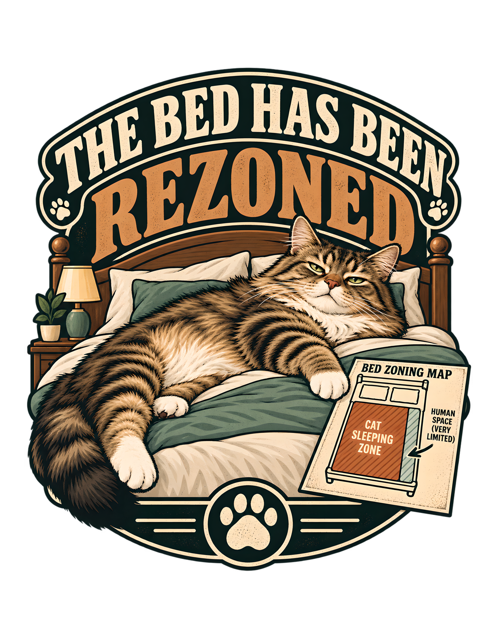
“THE BED HAS BEEN REZONED” takes a familiar cat-owner sleeping problem and turns it into property-management satire. The approved artwork shows a large fluffy tabby sprawled diagonally across most of a neatly made bed. The cat looks settled and mildly unimpressed, while a small “BED ZONING MAP” formalizes the arrangement: most of the mattress is labeled “CAT SLEEPING ZONE,” and the remaining strip is marked “HUMAN SPACE (VERY LIMITED).” Above the scene, the phrase “THE BED HAS BEEN REZONED” is treated like a permanent household ruling rather than a temporary bedtime complaint.
The canonical source describes the same idea in plain terms. A cat treats the human bed as flexible-use property that has been officially converted into feline sleeping territory. That sentence supplies the design’s central logic. The joke is not merely that the cat takes up too much room. The joke is that the cat behaves as though the redistribution has been reviewed, mapped, approved, and implemented through a legitimate administrative process.
The approved artwork remains the factual visual authority for this page. Its visible elements—the sprawling tabby, dark green and cream bedding, warm wooden headboard, restrained bedroom cues, vintage badge framing, paw motifs, and zoning diagram—provide enough material for a full editorial reading without inventing product claims or unsupported story details.
Cats Judging Humans naturally treats the scene as a governance problem. Humans buy furniture and assume ownership creates usage rights. Cats inspect the same furniture and discover a planning error. This design exists to document the correction.
The Joke Starts With a Bed the Human Mistakenly Believed Was Shared Property
The canonical concept says the cat treats the human bed as flexible-use property that has been officially converted into feline sleeping territory.
That source-supported point gives this section a specific job. The finished artwork supports that premise by placing the tabby across most of the mattress while the human receives only a narrow allocation on the zoning map. The approved artwork therefore does not need additional narrative machinery to make the idea understandable. The viewer can read the situation directly from the cat, the bed, the text, and the zoning device.
The important distinction is between taking space and formally reclassifying space. A simple ownership joke says the cat wants the bed. A zoning joke says the cat has changed the rules governing the bed. This is where the design moves beyond a generic sleeping-cat illustration. The humor is carried by the mismatch between an ordinary domestic event and a disproportionately official interpretation. Humans normally use administrative language to organize buildings, neighborhoods, property, and access. Here, the cat appears to have borrowed that language for the mattress.
The visual hierarchy also helps. The cat remains the emotional focal point, while the headline and diagram provide the explanation. That order matters because the design should still work as a cat image before the viewer studies every secondary detail. Once the zoning language registers, the initial observation becomes a policy joke.
Nothing in the source requires a larger backstory about leases, houses, or actual property law. The satire works at the household level, where the language of administration is deliberately excessive. That restraint keeps the page faithful to the canonical source and the approved image. It also keeps the Cats Judging Humans tone playful rather than over-literal.
Cats Judging Humans makes the human’s mistake procedural: the person did not lose an argument; the person misunderstood the approved land-use plan. That line is editorial framing, not a factual claim about real feline intent. The brand’s job is to interpret a recognizable human-cat dynamic through dry authority and mock procedure.
The result is a section with its own value: it explains one mechanism of the design without restating the entire concept. The same bed, the same cat, and the same phrase can support several readings, but each reading depends on a different visual or verbal choice. Here, the key is that the source and artwork make this particular choice visible enough to stand on its own.
The Diagonal Sprawl Makes the Cat’s Claim Instantly Readable
The source visual concept specifies a fluffy tabby sprawled diagonally across most of a neatly made bed.
That source-supported point gives this section a specific job. In the approved image, the body crosses the mattress at an angle, one front leg extends comfortably, and the tail occupies additional room, so the cat’s physical position already communicates the imbalance before the viewer reads the map. The approved artwork therefore does not need additional narrative machinery to make the idea understandable. The viewer can read the situation directly from the cat, the bed, the text, and the zoning device.
A diagonal pose is stronger than a compact curl because it fragments the remaining mattress and visually converts a large shared surface into feline territory. This is where the design moves beyond a generic sleeping-cat illustration. The humor is carried by the mismatch between an ordinary domestic event and a disproportionately official interpretation. Humans normally use administrative language to organize buildings, neighborhoods, property, and access. Here, the cat appears to have borrowed that language for the mattress.
The visual hierarchy also helps. The cat remains the emotional focal point, while the headline and diagram provide the explanation. That order matters because the design should still work as a cat image before the viewer studies every secondary detail. Once the zoning language registers, the initial observation becomes a policy joke.
The artwork does not need to show active pushing, fighting, or displacement. The cat is already settled, which keeps the scene dry and authoritative rather than chaotic. That restraint keeps the page faithful to the canonical source and the approved image. It also keeps the Cats Judging Humans tone playful rather than over-literal.
The cat’s body effectively becomes the first zoning boundary; the graphic merely records what management has already implemented. That line is editorial framing, not a factual claim about real feline intent. The brand’s job is to interpret a recognizable human-cat dynamic through dry authority and mock procedure.
The result is a section with its own value: it explains one mechanism of the design without restating the entire concept. The same bed, the same cat, and the same phrase can support several readings, but each reading depends on a different visual or verbal choice. Here, the key is that the source and artwork make this particular choice visible enough to stand on its own.
The Bed Becomes Flexible-Use Property the Moment the Cat Arrives
The phrase “flexible-use property” in the canonical concept is the key to the design’s property-management satire.
That source-supported point gives this section a specific job. The furniture itself remains recognizably a bed, but the cat’s occupation changes how the surface is allocated: the central sleeping area belongs to the cat while the human is reduced to a token strip. The approved artwork therefore does not need additional narrative machinery to make the idea understandable. The viewer can read the situation directly from the cat, the bed, the text, and the zoning device.
That lets one physical object carry two meanings at once. The human sees shared sleeping furniture. The cat sees an underutilized resource ready for reclassification. This is where the design moves beyond a generic sleeping-cat illustration. The humor is carried by the mismatch between an ordinary domestic event and a disproportionately official interpretation. Humans normally use administrative language to organize buildings, neighborhoods, property, and access. Here, the cat appears to have borrowed that language for the mattress.
The visual hierarchy also helps. The cat remains the emotional focal point, while the headline and diagram provide the explanation. That order matters because the design should still work as a cat image before the viewer studies every secondary detail. Once the zoning language registers, the initial observation becomes a policy joke.
The page should not invent legal ownership, household finances, or literal municipal procedure. The humor depends on borrowing administrative language, not pretending that a real zoning process occurred. That restraint keeps the page faithful to the canonical source and the approved image. It also keeps the Cats Judging Humans tone playful rather than over-literal.
Humans supplied the furniture; the cat supplied the new permitted use. That line is editorial framing, not a factual claim about real feline intent. The brand’s job is to interpret a recognizable human-cat dynamic through dry authority and mock procedure.
The result is a section with its own value: it explains one mechanism of the design without restating the entire concept. The same bed, the same cat, and the same phrase can support several readings, but each reading depends on a different visual or verbal choice. Here, the key is that the source and artwork make this particular choice visible enough to stand on its own.
The Bed Zoning Map Turns an Everyday Sleeping Problem Into Official Documentation
The approved artwork visibly includes the labels “BED ZONING MAP,” “CAT SLEEPING ZONE,” and “HUMAN SPACE (VERY LIMITED).”
That source-supported point gives this section a specific job. The map shows a large feline area and a narrow human strip, translating the cat’s physical sprawl into a compact diagram that looks like a formal allocation rather than a casual nap. The approved artwork therefore does not need additional narrative machinery to make the idea understandable. The viewer can read the situation directly from the cat, the bed, the text, and the zoning device.
The map works because it arrives after the viewer has already seen the evidence. It does not create the joke from nothing; it certifies the joke the body position has already established. This is where the design moves beyond a generic sleeping-cat illustration. The humor is carried by the mismatch between an ordinary domestic event and a disproportionately official interpretation. Humans normally use administrative language to organize buildings, neighborhoods, property, and access. Here, the cat appears to have borrowed that language for the mattress.
The visual hierarchy also helps. The cat remains the emotional focal point, while the headline and diagram provide the explanation. That order matters because the design should still work as a cat image before the viewer studies every secondary detail. Once the zoning language registers, the initial observation becomes a policy joke.
The diagram should be read as parody, not as a technical plan. Its purpose is visual shorthand for bureaucracy and unequal allocation. That restraint keeps the page faithful to the canonical source and the approved image. It also keeps the Cats Judging Humans tone playful rather than over-literal.
The cat is not merely comfortable; the cat has documentation. That line is editorial framing, not a factual claim about real feline intent. The brand’s job is to interpret a recognizable human-cat dynamic through dry authority and mock procedure.
The result is a section with its own value: it explains one mechanism of the design without restating the entire concept. The same bed, the same cat, and the same phrase can support several readings, but each reading depends on a different visual or verbal choice. Here, the key is that the source and artwork make this particular choice visible enough to stand on its own.
HUMAN SPACE (VERY LIMITED) Is the Quietest and Sharpest Secondary Punchline
The human zone is explicitly labeled “HUMAN SPACE (VERY LIMITED)” in the approved artwork.
That source-supported point gives this section a specific job. The wording sits beside a visibly narrow strip of the bed, so the parenthetical note and the diagram agree with each other immediately. The approved artwork therefore does not need additional narrative machinery to make the idea understandable. The viewer can read the situation directly from the cat, the bed, the text, and the zoning device.
The line is funny because it is polite. It does not evict the human outright. It acknowledges human presence, reduces that presence to a technical limitation, and moves on. This is where the design moves beyond a generic sleeping-cat illustration. The humor is carried by the mismatch between an ordinary domestic event and a disproportionately official interpretation. Humans normally use administrative language to organize buildings, neighborhoods, property, and access. Here, the cat appears to have borrowed that language for the mattress.
The visual hierarchy also helps. The cat remains the emotional focal point, while the headline and diagram provide the explanation. That order matters because the design should still work as a cat image before the viewer studies every secondary detail. Once the zoning language registers, the initial observation becomes a policy joke.
The secondary text should not be inflated into a story about actual deprivation or conflict. The stakes remain intentionally small: bedtime comfort and mattress territory. That restraint keeps the page faithful to the canonical source and the approved image. It also keeps the Cats Judging Humans tone playful rather than over-literal.
The system is technically inclusive, which is exactly how the cat would prefer the report to read. That line is editorial framing, not a factual claim about real feline intent. The brand’s job is to interpret a recognizable human-cat dynamic through dry authority and mock procedure.
The result is a section with its own value: it explains one mechanism of the design without restating the entire concept. The same bed, the same cat, and the same phrase can support several readings, but each reading depends on a different visual or verbal choice. Here, the key is that the source and artwork make this particular choice visible enough to stand on its own.
The Neatly Made Bed Makes the Takeover Feel Administrative Rather Than Chaotic
The canonical visual concept calls for a neatly made bed, and the approved art shows orderly bedding, pillows, and a visible headboard around the cat.
That source-supported point gives this section a specific job. Muted green bedding, cream pillows, and a warm wooden headboard create a stable bedroom setting rather than a scene of destruction or mess. The approved artwork therefore does not need additional narrative machinery to make the idea understandable. The viewer can read the situation directly from the cat, the bed, the text, and the zoning device.
That order is crucial. Rezoning implies organized reassignment, not wreckage. The cat’s takeover is funnier when nothing is damaged and the only real change is who controls the usable space. This is where the design moves beyond a generic sleeping-cat illustration. The humor is carried by the mismatch between an ordinary domestic event and a disproportionately official interpretation. Humans normally use administrative language to organize buildings, neighborhoods, property, and access. Here, the cat appears to have borrowed that language for the mattress.
The visual hierarchy also helps. The cat remains the emotional focal point, while the headline and diagram provide the explanation. That order matters because the design should still work as a cat image before the viewer studies every secondary detail. Once the zoning language registers, the initial observation becomes a policy joke.
The page should not invent a specific room layout beyond what is visible. The bedroom cues are restrained and exist mainly to anchor the domestic setting. That restraint keeps the page faithful to the canonical source and the approved image. It also keeps the Cats Judging Humans tone playful rather than over-literal.
The property is intact. The use classification has changed. Management considers this an efficient outcome. That line is editorial framing, not a factual claim about real feline intent. The brand’s job is to interpret a recognizable human-cat dynamic through dry authority and mock procedure.
The result is a section with its own value: it explains one mechanism of the design without restating the entire concept. The same bed, the same cat, and the same phrase can support several readings, but each reading depends on a different visual or verbal choice. Here, the key is that the source and artwork make this particular choice visible enough to stand on its own.
The Cat’s Expression Suggests Mild Offense at the Very Idea of Sharing
The source visual concept says the cat should look fully settled and mildly offended by the idea of sharing.
That source-supported point gives this section a specific job. The approved tabby has a half-lidded, unimpressed expression that avoids both cartoon panic and overt aggression. The approved artwork therefore does not need additional narrative machinery to make the idea understandable. The viewer can read the situation directly from the cat, the bed, the text, and the zoning device.
That face turns the viewer’s expectation of equal bed access into the absurd position. The cat looks less like a trespasser and more like an official puzzled by an obviously invalid complaint. This is where the design moves beyond a generic sleeping-cat illustration. The humor is carried by the mismatch between an ordinary domestic event and a disproportionately official interpretation. Humans normally use administrative language to organize buildings, neighborhoods, property, and access. Here, the cat appears to have borrowed that language for the mattress.
The visual hierarchy also helps. The cat remains the emotional focal point, while the headline and diagram provide the explanation. That order matters because the design should still work as a cat image before the viewer studies every secondary detail. Once the zoning language registers, the initial observation becomes a policy joke.
The expression is an artistic cue, not a factual claim about feline motives. The page can describe what the artwork communicates without pretending to know what a real cat thinks. That restraint keeps the page faithful to the canonical source and the approved image. It also keeps the Cats Judging Humans tone playful rather than over-literal.
Why are you questioning the zoning? The map is right there. That line is editorial framing, not a factual claim about real feline intent. The brand’s job is to interpret a recognizable human-cat dynamic through dry authority and mock procedure.
The result is a section with its own value: it explains one mechanism of the design without restating the entire concept. The same bed, the same cat, and the same phrase can support several readings, but each reading depends on a different visual or verbal choice. Here, the key is that the source and artwork make this particular choice visible enough to stand on its own.
The Vintage Typography Makes a Domestic Dispute Look Like Permanent Policy
The visible phrase is “THE BED HAS BEEN REZONED,” with “REZONED” given the strongest typographic emphasis.
That source-supported point gives this section a specific job. Large cream lettering curves across the top while the warmer tan-orange “REZONED” dominates the center, integrated into the dark badge structure around the cat. The approved artwork therefore does not need additional narrative machinery to make the idea understandable. The viewer can read the situation directly from the cat, the bed, the text, and the zoning device.
The word choice is already formal, and the heavy vintage type makes it feel durable. This does not look like a temporary note or a nightly complaint; it looks like a standing policy. This is where the design moves beyond a generic sleeping-cat illustration. The humor is carried by the mismatch between an ordinary domestic event and a disproportionately official interpretation. Humans normally use administrative language to organize buildings, neighborhoods, property, and access. Here, the cat appears to have borrowed that language for the mattress.
The visual hierarchy also helps. The cat remains the emotional focal point, while the headline and diagram provide the explanation. That order matters because the design should still work as a cat image before the viewer studies every secondary detail. Once the zoning language registers, the initial observation becomes a policy joke.
The page should preserve the exact visible wording rather than paraphrasing the design phrase into generic bed humor. That restraint keeps the page faithful to the canonical source and the approved image. It also keeps the Cats Judging Humans tone playful rather than over-literal.
A bedtime disagreement might be negotiable. A zoning decision looks suspiciously permanent. That line is editorial framing, not a factual claim about real feline intent. The brand’s job is to interpret a recognizable human-cat dynamic through dry authority and mock procedure.
The result is a section with its own value: it explains one mechanism of the design without restating the entire concept. The same bed, the same cat, and the same phrase can support several readings, but each reading depends on a different visual or verbal choice. Here, the key is that the source and artwork make this particular choice visible enough to stand on its own.
Muted Green, Cream, Tan, and Near-Black Keep the Property Satire Warm
The approved image visibly uses muted green bedding, cream elements, warm tan-orange lettering, dark structural framing, and natural tabby fur tones.
That source-supported point gives this section a specific job. Those colors separate the cat from the bedding while keeping the overall piece cohesive with the wooden headboard and vintage badge treatment. The approved artwork therefore does not need additional narrative machinery to make the idea understandable. The viewer can read the situation directly from the cat, the bed, the text, and the zoning device.
The palette prevents the bureaucracy joke from becoming visually cold. The language says policy; the colors still say bedroom and comfort. This is where the design moves beyond a generic sleeping-cat illustration. The humor is carried by the mismatch between an ordinary domestic event and a disproportionately official interpretation. Humans normally use administrative language to organize buildings, neighborhoods, property, and access. Here, the cat appears to have borrowed that language for the mattress.
The visual hierarchy also helps. The cat remains the emotional focal point, while the headline and diagram provide the explanation. That order matters because the design should still work as a cat image before the viewer studies every secondary detail. Once the zoning language registers, the initial observation becomes a policy joke.
The page can describe visible color relationships but should not invent hidden symbolic meanings or promise exact print behavior. That restraint keeps the page faithful to the canonical source and the approved image. It also keeps the Cats Judging Humans tone playful rather than over-literal.
The notice of changed sleeping conditions is severe only in jurisdiction, not in mood. That line is editorial framing, not a factual claim about real feline intent. The brand’s job is to interpret a recognizable human-cat dynamic through dry authority and mock procedure.
The result is a section with its own value: it explains one mechanism of the design without restating the entire concept. The same bed, the same cat, and the same phrase can support several readings, but each reading depends on a different visual or verbal choice. Here, the key is that the source and artwork make this particular choice visible enough to stand on its own.
The Vintage Badge Composition Turns Bedroom Politics Into an Official Emblem
The source calls for a vintage badge layout, and the approved artwork uses curved framing, large headline treatment, decorative lines, paw accents, and a central paw emblem.
That source-supported point gives this section a specific job. The cat and bed occupy the middle, the map sits at lower right, and the badge-like framing contains the entire dispute inside one compact silhouette. The approved artwork therefore does not need additional narrative machinery to make the idea understandable. The viewer can read the situation directly from the cat, the bed, the text, and the zoning device.
Badge formats imply certification, membership, jurisdiction, or authority. Here that visual language makes a private sleeping arrangement feel like a formal household rule. This is where the design moves beyond a generic sleeping-cat illustration. The humor is carried by the mismatch between an ordinary domestic event and a disproportionately official interpretation. Humans normally use administrative language to organize buildings, neighborhoods, property, and access. Here, the cat appears to have borrowed that language for the mattress.
The visual hierarchy also helps. The cat remains the emotional focal point, while the headline and diagram provide the explanation. That order matters because the design should still work as a cat image before the viewer studies every secondary detail. Once the zoning language registers, the initial observation becomes a policy joke.
The design does not imitate a specific government seal or institution. Its authority is generic and comedic. That restraint keeps the page faithful to the canonical source and the approved image. It also keeps the Cats Judging Humans tone playful rather than over-literal.
The issuing agency is feline, the jurisdiction is the mattress, and enforcement appears immediate. That line is editorial framing, not a factual claim about real feline intent. The brand’s job is to interpret a recognizable human-cat dynamic through dry authority and mock procedure.
The result is a section with its own value: it explains one mechanism of the design without restating the entire concept. The same bed, the same cat, and the same phrase can support several readings, but each reading depends on a different visual or verbal choice. Here, the key is that the source and artwork make this particular choice visible enough to stand on its own.
The Property-Management Satire Works Because Cats Already Treat Space as Negotiable
The concept summary is grounded in a familiar cat-owner experience: the cat converts human sleeping space into feline territory.
That source-supported point gives this section a specific job. The approved art concentrates that experience into one decisive image rather than showing a sequence of events. The approved artwork therefore does not need additional narrative machinery to make the idea understandable. The viewer can read the situation directly from the cat, the bed, the text, and the zoning device.
The joke becomes fresher because the cat is not simply saying “mine.” The cat is changing the permitted use of a shared resource, which is more specific, more formal, and more absurd. This is where the design moves beyond a generic sleeping-cat illustration. The humor is carried by the mismatch between an ordinary domestic event and a disproportionately official interpretation. Humans normally use administrative language to organize buildings, neighborhoods, property, and access. Here, the cat appears to have borrowed that language for the mattress.
The visual hierarchy also helps. The cat remains the emotional focal point, while the headline and diagram provide the explanation. That order matters because the design should still work as a cat image before the viewer studies every secondary detail. Once the zoning language registers, the initial observation becomes a policy joke.
The page should keep the humor observational rather than making universal claims about all cats. It is a recognizable cat-owner scenario expressed through the brand’s editorial voice. That restraint keeps the page faithful to the canonical source and the approved image. It also keeps the Cats Judging Humans tone playful rather than over-literal.
The human thought the bed was shared. The cat identified an underutilized asset and acted. That line is editorial framing, not a factual claim about real feline intent. The brand’s job is to interpret a recognizable human-cat dynamic through dry authority and mock procedure.
The result is a section with its own value: it explains one mechanism of the design without restating the entire concept. The same bed, the same cat, and the same phrase can support several readings, but each reading depends on a different visual or verbal choice. Here, the key is that the source and artwork make this particular choice visible enough to stand on its own.
Restrained Bedroom Details Keep the Focus on the Cat’s Jurisdiction
The approved artwork includes a wooden headboard, cream pillows, muted green bedding, a small lamp, and a plant as restrained bedroom cues.
That source-supported point gives this section a specific job. Those elements establish a human-maintained domestic environment without turning the design into a detailed room portrait. The approved artwork therefore does not need additional narrative machinery to make the idea understandable. The viewer can read the situation directly from the cat, the bed, the text, and the zoning device.
The limited setting helps the viewer identify the location instantly and then return attention to the actual joke: the cat controls the usable surface. This is where the design moves beyond a generic sleeping-cat illustration. The humor is carried by the mismatch between an ordinary domestic event and a disproportionately official interpretation. Humans normally use administrative language to organize buildings, neighborhoods, property, and access. Here, the cat appears to have borrowed that language for the mattress.
The visual hierarchy also helps. The cat remains the emotional focal point, while the headline and diagram provide the explanation. That order matters because the design should still work as a cat image before the viewer studies every secondary detail. Once the zoning language registers, the initial observation becomes a policy joke.
The page should not add furniture, décor, or room features that are not visible in the approved art. That restraint keeps the page faithful to the canonical source and the approved image. It also keeps the Cats Judging Humans tone playful rather than over-literal.
The room looks human-furnished and cat-governed, which is an efficient summary of the entire brand premise. That line is editorial framing, not a factual claim about real feline intent. The brand’s job is to interpret a recognizable human-cat dynamic through dry authority and mock procedure.
The result is a section with its own value: it explains one mechanism of the design without restating the entire concept. The same bed, the same cat, and the same phrase can support several readings, but each reading depends on a different visual or verbal choice. Here, the key is that the source and artwork make this particular choice visible enough to stand on its own.
The Missing Human Makes Every Cat Owner the Displaced Resident
No human figure appears in the approved artwork, even though the zoning map explicitly reserves a very limited human area.
That source-supported point gives this section a specific job. The absent person is represented indirectly through the bed, the map label, and the fact that the room is clearly arranged for human use. The approved artwork therefore does not need additional narrative machinery to make the idea understandable. The viewer can read the situation directly from the cat, the bed, the text, and the zoning device.
That omission makes the design more universal. Instead of depicting one specific person squeezed to the edge, it lets the viewer mentally occupy the narrow strip. This is where the design moves beyond a generic sleeping-cat illustration. The humor is carried by the mismatch between an ordinary domestic event and a disproportionately official interpretation. Humans normally use administrative language to organize buildings, neighborhoods, property, and access. Here, the cat appears to have borrowed that language for the mattress.
The visual hierarchy also helps. The cat remains the emotional focal point, while the headline and diagram provide the explanation. That order matters because the design should still work as a cat image before the viewer studies every secondary detail. Once the zoning language registers, the initial observation becomes a policy joke.
The page should not invent what the unseen human looks like, how they react, or whether they are actually present at that moment. That restraint keeps the page faithful to the canonical source and the approved image. It also keeps the Cats Judging Humans tone playful rather than over-literal.
If you have ever negotiated mattress space with a cat, you already know which zone is yours. That line is editorial framing, not a factual claim about real feline intent. The brand’s job is to interpret a recognizable human-cat dynamic through dry authority and mock procedure.
The result is a section with its own value: it explains one mechanism of the design without restating the entire concept. The same bed, the same cat, and the same phrase can support several readings, but each reading depends on a different visual or verbal choice. Here, the key is that the source and artwork make this particular choice visible enough to stand on its own.
The Design Is Evergreen Because Bed-Space Negotiations Require No Trend or Season
The canonical source marks the design as evergreen.
That source-supported point gives this section a specific job. Nothing visible ties the artwork to a holiday, platform interface, dated technology, celebrity, or temporary trend. The approved artwork therefore does not need additional narrative machinery to make the idea understandable. The viewer can read the situation directly from the cat, the bed, the text, and the zoning device.
The humor depends on a durable household situation: a cat occupying more of the bed than the human expected and acting as though that allocation is perfectly normal. This is where the design moves beyond a generic sleeping-cat illustration. The humor is carried by the mismatch between an ordinary domestic event and a disproportionately official interpretation. Humans normally use administrative language to organize buildings, neighborhoods, property, and access. Here, the cat appears to have borrowed that language for the mattress.
The visual hierarchy also helps. The cat remains the emotional focal point, while the headline and diagram provide the explanation. That order matters because the design should still work as a cat image before the viewer studies every secondary detail. Once the zoning language registers, the initial observation becomes a policy joke.
Evergreen does not mean every viewer has the same experience; it means the concept does not require short-lived context to be understood. That restraint keeps the page faithful to the canonical source and the approved image. It also keeps the Cats Judging Humans tone playful rather than over-literal.
Humans keep buying beds. Cats keep revising the usage plan. The policy remains current. That line is editorial framing, not a factual claim about real feline intent. The brand’s job is to interpret a recognizable human-cat dynamic through dry authority and mock procedure.
The result is a section with its own value: it explains one mechanism of the design without restating the entire concept. The same bed, the same cat, and the same phrase can support several readings, but each reading depends on a different visual or verbal choice. Here, the key is that the source and artwork make this particular choice visible enough to stand on its own.
The Approved Production Master Is the Visual Authority, Not a Suggestion for Redesign
The canonical source identifies the approved production asset as an immutable PNG production master recorded at 6200 by 8000 pixels.
That source-supported point gives this section a specific job. The website therefore treats the sprawling tabby, zoning map, bedroom colors, badge framing, visible wording, and paw emblem as settled visual facts. The approved artwork therefore does not need additional narrative machinery to make the idea understandable. The viewer can read the situation directly from the cat, the bed, the text, and the zoning device.
The editorial page can explain those choices without reopening them. Interpretation can expand while the approved art remains unchanged. This is where the design moves beyond a generic sleeping-cat illustration. The humor is carried by the mismatch between an ordinary domestic event and a disproportionately official interpretation. Humans normally use administrative language to organize buildings, neighborhoods, property, and access. Here, the cat appears to have borrowed that language for the mattress.
The visual hierarchy also helps. The cat remains the emotional focal point, while the headline and diagram provide the explanation. That order matters because the design should still work as a cat image before the viewer studies every secondary detail. Once the zoning language registers, the initial observation becomes a policy joke.
Production metadata such as preserved aspect ratio and recorded safe margin belongs to asset provenance and should not be turned into consumer-facing technical promises. That restraint keeps the page faithful to the canonical source and the approved image. It also keeps the Cats Judging Humans tone playful rather than over-literal.
The artwork has already passed inspection. No further committee meeting is required. That line is editorial framing, not a factual claim about real feline intent. The brand’s job is to interpret a recognizable human-cat dynamic through dry authority and mock procedure.
The result is a section with its own value: it explains one mechanism of the design without restating the entire concept. The same bed, the same cat, and the same phrase can support several readings, but each reading depends on a different visual or verbal choice. Here, the key is that the source and artwork make this particular choice visible enough to stand on its own.
The Published Marketplace Listing Confirms the Core Reading Without Defining the Editorial Page
The source records a published Zazzle listing titled “Cat T-Shirt – The Bed Has Been Rezoned,” with a description that repeats the flexible-use property premise.
That source-supported point gives this section a specific job. That listing context confirms the intended reading of the same approved artwork without adding new visual facts. The approved artwork therefore does not need additional narrative machinery to make the idea understandable. The viewer can read the situation directly from the cat, the bed, the text, and the zoning device.
The website has a different job from the marketplace. It can explain composition, wording, feline authority, map logic, and audience recognition rather than duplicating sales copy. This is where the design moves beyond a generic sleeping-cat illustration. The humor is carried by the mismatch between an ordinary domestic event and a disproportionately official interpretation. Humans normally use administrative language to organize buildings, neighborhoods, property, and access. Here, the cat appears to have borrowed that language for the mattress.
The visual hierarchy also helps. The cat remains the emotional focal point, while the headline and diagram provide the explanation. That order matters because the design should still work as a cat image before the viewer studies every secondary detail. Once the zoning language registers, the initial observation becomes a policy joke.
The JSON must not include the marketplace URL, and the CTA must not claim stock, price, shipping, materials, garment colors, ratings, or availability. That restraint keeps the page faithful to the canonical source and the approved image. It also keeps the Cats Judging Humans tone playful rather than over-literal.
The marketplace can handle the listing. The website can explain why the cat’s planning department won. That line is editorial framing, not a factual claim about real feline intent. The brand’s job is to interpret a recognizable human-cat dynamic through dry authority and mock procedure.
The result is a section with its own value: it explains one mechanism of the design without restating the entire concept. The same bed, the same cat, and the same phrase can support several readings, but each reading depends on a different visual or verbal choice. Here, the key is that the source and artwork make this particular choice visible enough to stand on its own.
“THE BED HAS BEEN REZONED” works because every visible element points toward the same absurd administrative conclusion. The fluffy tabby occupies most of the mattress. The bedroom remains orderly and comfortable. The cat looks settled and mildly unimpressed. The headline announces a permanent change of use. The small zoning map documents the new boundaries. “CAT SLEEPING ZONE” receives the overwhelming share, while “HUMAN SPACE (VERY LIMITED)” survives as a narrow concession.
The canonical source describes the same joke in plain terms: the human bed has become flexible-use property that has been officially converted into feline sleeping territory. The published marketplace description confirms that reading, while the website page can explore the visual logic in more depth without turning into duplicated sales copy.
This is not a design about hostility. It is about certainty. The cat does not argue for more bed. The cat behaves as though the planning process ended before the human arrived.
That certainty is what makes the piece fit Cats Judging Humans. The human may still own the mattress, maintain the bedding, and believe bedtime requires equal access. Those concerns have been acknowledged.
The zoning remains in effect.