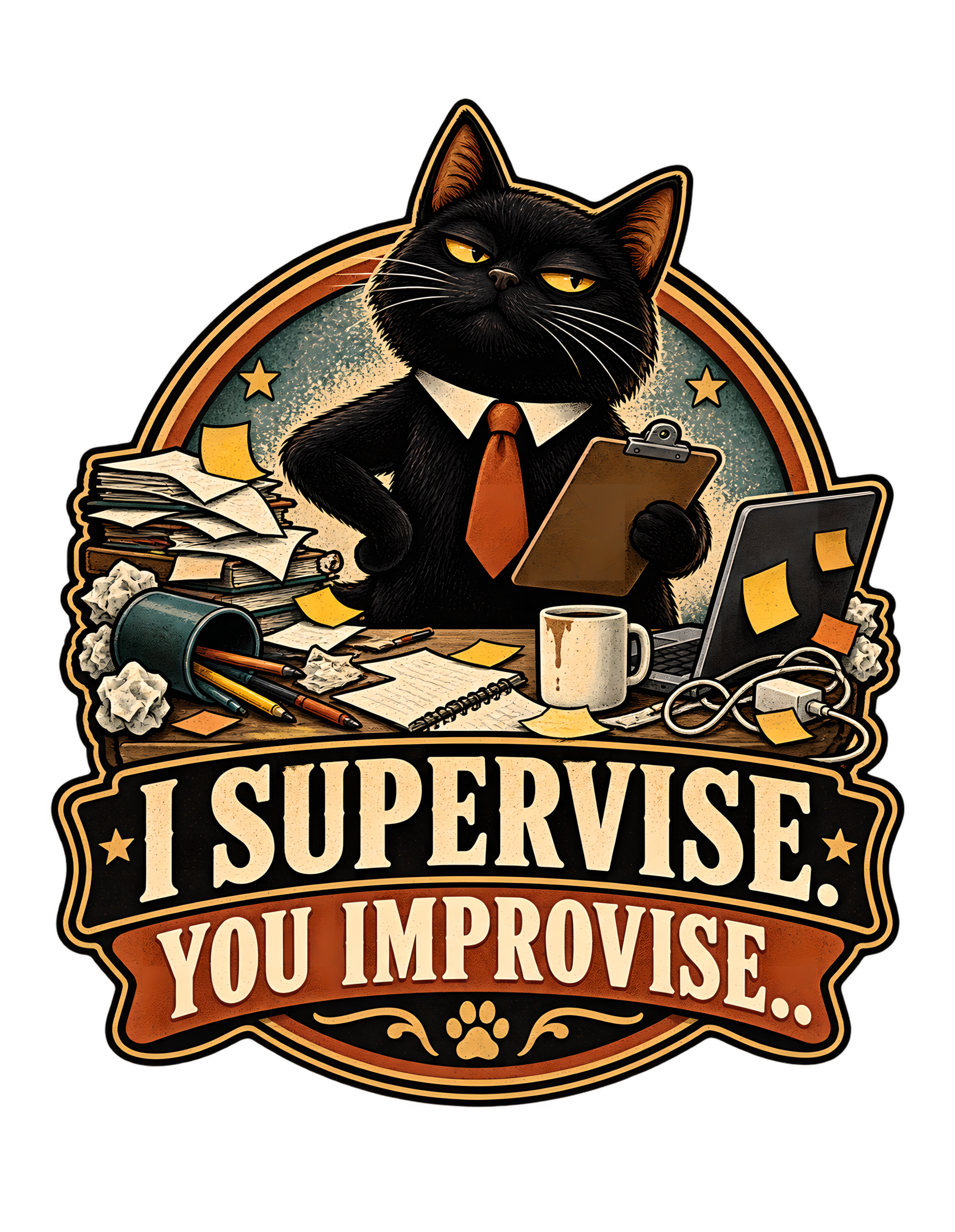
“I Supervise. You Improvise.” takes one of the most familiar Cats Judging Humans power arrangements and gives it an office title. The approved artwork presents a black cat standing behind a heavily cluttered workstation, dressed with a crisp white collar and orange tie and holding a clipboard like the only person in the room who has read the procedures. Around the cat are piles of papers, an open laptop covered with sticky notes, a coffee mug, a tipped container spilling pens and pencils, an open notebook, loose notes, cords, and crumpled paper. The human is not shown, which only strengthens the premise: somebody clearly created this operational environment, and the cat has arrived to assess the consequences.
The source concept defines the relationship directly. The cat considers itself the competent supervisor while the human handles daily life with questionable improvisation. That distinction is what makes the phrase more than a generic office joke. The cat is not helping. It is supervising. The human is not following a plan. The human is improvising. The whole visual scene has been organized around that asymmetry. The black cat looks composed, upright, and certain; the workstation looks as though several decisions were made quickly and none were documented properly.
The humor remains dry because the cat never needs to panic. The chaos belongs to somebody else. The cat's job, apparently, is to stand there with the clipboard, maintain standards, and allow the human enough freedom to demonstrate why supervision was necessary in the first place. That is pure Cats Judging Humans: feline authority, questionable human execution, and a workplace review that feels unfair only because the evidence is sitting all over the desk.
The illustration also works as a compact catalog piece because nothing essential depends on a specific profession or a specific human identity. The workstation is broad enough to suggest office work, remote work, studying, freelancing, planning, or the ordinary administrative sprawl of modern life. That flexibility keeps the joke focused where it belongs: not on one worker, but on the universal difference between how organized humans think they are and how organized a cat believes they should be.
The Joke Begins With a Perfectly Unequal Division of Labor
The phrase “I SUPERVISE. YOU IMPROVISE.” establishes the joke by assigning two very different jobs. The cat gets supervision, a role associated with oversight, judgment, standards, and the luxury of not doing the actual scrambling. The human gets improvisation, which sounds creative until it is placed beside a cluttered workstation full of papers, notes, cables, a laptop, a mug, and scattered writing tools. In that context, improvisation begins to look less like innovation and more like a polite management term for making it up as you go.
That division of labor is the core of the concept supplied with the design. The cat considers itself the competent supervisor while the human handles daily life with questionable improvisation. The approved artwork does not need to show a literal meeting or performance review because the hierarchy is already visible. The cat stands upright behind the desk, wearing a collar and orange tie and holding a clipboard. Everything below the cat suggests unfinished work, competing priorities, and a human process that has escaped neat containment.
Cats Judging Humans works especially well when the feline character claims the prestigious half of a shared arrangement. The cat does not type, sort, file, clean, answer, or repair. It supervises. That means the human can remain responsible for every practical problem while the cat retains the right to evaluate the result.
The asymmetry is funny because it feels emotionally familiar to cat owners. A cat can sit beside a task without contributing anything measurable and still project the confidence of upper management. The design turns that familiar household presence into explicit workplace structure.
The human's role is never described as incompetent in a cruel way. Instead, the phrase gives the human a strangely optimistic title: improviser. The cat, naturally, knows what that means. It means management should keep the clipboard close.
The Black Cat Looks Like Management Before the Clipboard Appears
The approved artwork uses a black cat as the central authority figure, and the silhouette does much of the work before any prop is considered. The cat is broad through the head and chest, upright, centered, and visually dominant over the workstation. Its golden eyes are narrowed into an expression that reads as observant and unimpressed rather than angry. That distinction is essential to the Cats Judging Humans tone. The cat is not threatening the human; it is simply disappointed that the current process has apparently passed for a process at all.
Black fur also gives the character strong visual weight against the lighter papers, cream details, teal background field, and warm orange accents. The cat becomes the darkest and most stable mass in a composition otherwise filled with scattered objects. That contrast supports the joke visually: the supervisor is coherent; the operation is not.
The face matters because the phrase requires certainty. A surprised cat would look caught in the chaos. A cheerful cat would soften the judgment too far. This cat appears to have arrived after reviewing enough evidence to skip directly to conclusions. The eyes suggest that the human explanation has been heard, documented, and found creatively worded.
The character also remains recognizably feline despite the office role. The cat is not transformed into a human executive. The paws stay paws, the ears remain upright, and the facial structure is unmistakably catlike. The workplace costume supplies the role without replacing the animal.
That balance keeps the joke grounded in the brand's central idea: cats already behave as though they supervise human life. The design merely gives one the visual credentials it seems to believe it has always possessed.
The Orange Tie Turns Feline Confidence Into Office Authority
The orange tie is one of the most efficient pieces of visual storytelling in the artwork. It immediately shifts the black cat from ordinary household observer to workplace authority without requiring a full human costume. A crisp white collar frames the tie, creating a small formal zone at the center of the cat's chest while leaving the rest of the figure unmistakably feline.
The tie also connects the character to the broader palette. Warm orange appears elsewhere in the artwork through sticky notes, accent bands, and decorative elements, so the costume does not feel pasted on. Instead, the tie becomes part of the design's visual hierarchy: the viewer sees the cat, then the formal accessory, then the clipboard and workstation that explain the role.
What makes the costume funny is its restraint. The cat is not wearing a complete business suit, carrying a briefcase, or performing an exaggerated executive gesture. The collar and tie are enough. That allows the cat's natural posture and expression to remain the source of authority.
The workplace satire also benefits from the cultural shorthand of a tie. It suggests professionalism, management, and the expectation that somebody is accountable for what is happening. The cat has clearly decided that somebody should be accountable. The fact that the cat is holding the clipboard rather than cleaning the desk tells us exactly who that somebody is not.
Cats Judging Humans often succeeds by giving feline confidence a formal context. Here, the orange tie converts a familiar unimpressed black cat into the person who has been copied on every email and intends to ask why none of them solved the problem. The human may still control the keyboard. The cat has the title.
The Clipboard Makes Supervision Look Official
The clipboard is the most direct symbol of the cat's claimed supervisory role. Held upright in one paw, it gives the character the visual language of inspection, documentation, and performance review. Nothing readable needs to appear on the board for the function to be obvious. The object says that the cat is not merely observing. The cat is recording findings.
That is important because the phrase hinges on the difference between casual presence and formal oversight. A cat sitting beside a messy desk would already be relatable. A cat standing behind that desk with a clipboard turns the situation into a workplace evaluation.
The approved artwork supports the joke by making the clipboard look plain and practical rather than elaborate. It is a tool associated with order, which makes it especially funny beside the disorder of the workstation. The cat holds the instrument of procedure while the human's side of the arrangement is represented by loose pages, sticky notes, cords, and an overturned container.
The clipboard also allows the cat to look active without doing actual work. That is a very specific kind of managerial comedy. The cat can point, note, review, and supervise while remaining safely separated from the consequences of execution.
From a Cats Judging Humans perspective, this is almost ideal governance. The human retains responsibility for implementation. The cat retains authority over interpretation. If the result succeeds, supervision was effective. If it fails, the human improvised incorrectly.
The clipboard therefore does more than identify the role. It completes the power structure. The cat has documentation. The human has a desk that looks like documentation lost a fight.
The Messy Workstation Is the Human Character Without Showing a Human
One of the strongest visual decisions in the approved artwork is that the human does not appear. Instead, the workstation functions as the human character. The piles of papers, sticky notes, open laptop, coffee mug, notebook, cords, pens, pencils, tipped container, and crumpled paper create a portrait of somebody trying to keep multiple things moving at once.
That absence gives the joke more reach. There is no specific person to blame, no age, gender, profession, or identity that limits the scene. The viewer can easily place themselves in the empty chair or imagine their own work surface becoming the subject of feline review.
The concept supplied with the design says the human handles daily life with questionable improvisation. The desk translates that abstract idea into visible evidence. Nothing on the desk is inherently absurd by itself. A laptop, a mug, notes, papers, and pens are normal work objects. The comedy comes from accumulation and arrangement: too many things are active at once, and the cat is the only figure who appears completely composed.
This makes the mess functional rather than decorative. The scattered objects are not random filler. They explain what “you improvise” looks like in the world of the design. The human process leaves traces everywhere.
The cat's position behind the desk then reframes those traces as evidence in a management case. The human may call them priorities, drafts, reminders, cables, and tools. The supervisor sees an opportunity for a very long meeting.
By keeping the human offstage, the artwork lets every viewer inherit the workstation. The cat's judgment becomes broader, and therefore more useful. Nobody is singled out. Everybody with a desk is implicated.
The Laptop and Sticky Notes Suggest a System That Became a Situation
The open laptop on the right side of the artwork is covered with sticky notes, a small visual detail that perfectly supports the premise. A laptop usually suggests organization, communication, and digital productivity. Sticky notes suggest an additional layer of reminders placed on top of that system. Together, they create the impression that one organizational method was not enough, so another had to be physically attached to it.
That visual is particularly effective for the phrase “YOU IMPROVISE.” The human appears to be solving problems by adding more notes, more reminders, and more temporary fixes. Nothing in the source claims that this is literally how a specific person works; it is simply the visible comic logic of the approved illustration.
The cat, by contrast, carries one clipboard. The distinction is almost unfair. The supervisor has one clean instrument of authority while the human workstation contains multiple layers of apparent self-management.
The laptop also modernizes the workplace setting without tying the design to a temporary platform, app, or trend. It is recognizable enough to suggest desk work and remote-work life while remaining generic. That helps the design stay evergreen.
The sticky notes add warmth through their cream, yellow, and orange tones while breaking up the dark laptop surface. They also create small visual echoes with the orange tie and the warm typographic accents below.
Editorially, the laptop becomes a symbol of good intentions under pressure. The human has tools. The human has reminders. The human has apparently developed several systems. The cat is still holding the clipboard, which tells us management has some follow-up questions.
Coffee, Pens, and Crumpled Paper Turn Improvisation Into a Daily Routine
The smaller desk objects keep the workplace satire grounded in ordinary life. A plain coffee mug sits near the center-right. Pens and pencils spill from a tipped container on the left. Crumpled paper balls appear around the workstation. An open notebook sits beneath the cat's line of sight. These are modest props, but together they make the scene feel lived-in rather than staged.
The coffee mug is especially useful because it suggests routine. This is not a dramatic workplace emergency. It looks like an ordinary day that simply became more complicated than intended. That everyday quality makes the cat's supervisory posture funnier. The cat is treating normal human work clutter as an operational concern worthy of formal review.
The spilled writing tools contribute a different kind of disorder. They imply motion and interruption without showing any human action. The viewer can imagine how the desk reached this state, but the artwork never has to explain it.
The crumpled paper adds another layer of imperfect process. Something was attempted, rejected, and discarded. Again, the design does not need to say whether the work was good or bad. The point is that the human appears to be working through uncertainty while the cat appears to have no uncertainty at all.
That contrast gives the scene its rhythm. The desk is full of evidence that work is happening. The cat is full of confidence that it could be happening better.
Cats Judging Humans turns that familiar imbalance into a joke about authority: the person producing the work looks messy, while the person producing the judgment looks immaculate.
The Composition Builds a Visual Chain From Boss Cat to Human Evidence
The approved artwork is organized so the viewer understands the hierarchy quickly. The black cat occupies the upper center, becoming the clear focal point. The clipboard sits close to the body, reinforcing the role. The workstation spreads horizontally beneath and around the cat, filling the lower-middle area with evidence of human improvisation. The large phrase then anchors the bottom.
This creates a useful reading sequence. First, the viewer sees the cat and recognizes authority. Second, the cluttered desk explains what the authority is supervising. Third, the phrase resolves the relationship: “I supervise. You improvise.”
The composition also uses balance without becoming perfectly symmetrical. The laptop and mug create weight on the right, while the paper piles, tipped pen container, and crumpled notes create weight on the left. The cat remains stable between them.
That stability is important. If the cat were leaning, scrambling, or participating in the mess, the hierarchy would weaken. Instead, the character acts as the visual center of gravity while everything else suggests active work.
The circular badge-like frame behind the cat gives additional structure and helps contain the busy office details. It also connects the upper illustration to the banner-style typography below, making the design feel like one emblem rather than an illustration sitting on top of unrelated words.
For a commercial apparel graphic, that cohesion matters. The concept has multiple props, but the silhouette remains compact and readable. The cat stays dominant, the desk remains understandable, and the joke lands without requiring the viewer to inspect every object first.
The Vintage Badge Treatment Makes Office Chaos Look Official
The artwork uses a vintage badge or emblem structure around a very modern workplace joke. That combination gives the design much of its personality. The circular framing, bold outer lines, star accents, banner forms, and decorative lower ornament make the composition feel established and official. The subject inside that official-looking structure is a black cat supervising a desk that appears to have rejected official structure entirely.
That tension is useful because it mirrors the phrase. Supervision receives the badge. Improvisation receives the clutter.
The emblem format also gives the cat something like institutional legitimacy. This is not simply a pet standing on a desk. The composition presents the cat as the representative of a management system that may have existed long before the human was informed of it.
The vintage styling fits the Cats Judging Humans visual language described by the brand concept, but this specific design remains grounded in the visible artwork. Thick outlines, distressed texture, cream lettering, burnt-orange accents, a teal field, and dark structural shapes all contribute to the printed-apparel character.
The badge approach also keeps the office scene from becoming too literal. Instead of showing a complete room or a realistic workstation, the design compresses the essential props into a symbolic office environment. That makes the joke easier to read and the silhouette stronger.
There is also a subtle irony in giving improvisation such a formal frame. The human process may be improvised, but the cat's judgment has apparently been professionally branded, approved, and archived.
That is exactly the level of disproportion the joke needs.
The Limited Palette Separates Authority From Disorder
The artwork relies on a controlled palette built around near-black, cream, burnt orange, muted teal, warm tan, and small golden accents. That restraint helps a visually busy concept remain coherent. There are many objects on the desk, but they all belong to the same visual world.
The black cat and dark outlines create the strongest structural mass. Cream appears in the collar, papers, mug, and large typography, giving the design bright areas that remain readable against the darker framework. Burnt orange appears in the tie, accent banner, sticky notes, and decorative details, creating a warm visual thread that connects character, workstation, and text.
Muted teal is especially important because it gives the circular background field a cool counterweight to the warm orange. That teal also helps the black cat stand forward without relying on a stark white backdrop.
The palette therefore organizes the scene as much as it decorates it. The cat remains dominant. The workstation objects stay distinct. The lower phrase retains high contrast. Nothing needs a neon color or a rainbow effect to claim attention.
This limited-color approach also supports the vintage printed feel visible in the artwork. Slight texturing and warm off-white tones keep the piece from looking slick or sterile, which suits a joke about office life lived under feline supervision.
Most importantly, the colors reinforce the hierarchy. The supervisor is visually stable and dark. The evidence of human improvisation is broken into lighter, warmer fragments around it. Even the palette appears to have chosen sides.
The Typography Works Like a Two-Line Performance Review
The phrase is split into two statements with different visual weights: “I SUPERVISE.” above and “YOU IMPROVISE.” below. That separation matters because the joke depends on contrast. The first line states the cat's role with confidence. The second assigns the human role and carries the sharper comic consequence.
The upper line appears in large cream lettering inside a dark banner, making it feel like an official title or declaration. The lower line sits in a warm burnt-orange banner beneath it, still bold and highly readable but visually distinct. The result resembles a compact performance review with management's role established first and the employee's condition documented second.
The letterforms are bold and vintage-inspired rather than handwritten or whimsical. That choice keeps the humor dry. A playful novelty font could make the cat seem like it knows it is joking. The current typography behaves as though the statement is policy.
The periods matter to the rhythm as well. Each sentence feels complete and final. The cat is not asking whether it supervises or whether the human improvises. It is recording the division of labor.
The type also provides a strong base for the detailed illustration above. The workstation contains many small shapes and props, so the broad banners and large letters give the design visual weight at the bottom.
That balance makes the piece readable at multiple distances. From far away, the cat and phrase carry the joke. Up close, the office details explain exactly why the cat has reached that conclusion.
The Missing Human Makes the Judgment Apply to Everyone
The human is central to the premise and completely absent from the picture. That is one of the design's smartest choices because it makes the judgment universal. The cat is clearly supervising somebody, but the artwork never specifies who.
Instead, the viewer sees the human's work environment. The laptop, papers, coffee mug, sticky notes, notebook, cords, pens, pencils, and crumpled pages imply presence without showing a body. The human exists through consequences.
That allows the design to speak directly to anyone who recognizes their own working habits in the desk. A remote worker can see a home office. An office worker can see a familiar desk. A student or freelancer can see the general condition of trying to keep too many tasks visible at once. The source specifically frames the design as workplace-cat humor and remote-work humor, and the approved image keeps that setting broad enough to support those associations without locking itself to one occupation.
The absence also strengthens the cat's authority. There is nobody else in the composition to compete for the viewer's attention. The cat owns the upper center and effectively speaks for management.
Cats Judging Humans often becomes funnier when the human is reduced to evidence. The cat has a face, posture, costume, and clipboard. The human has a laptop covered in notes and a container that failed to remain upright.
It is a remarkably efficient performance review. The employee does not even need to attend.
The Work-From-Home Recognition Comes From Shared Space and Shared Nerves
The design has a natural connection to work-from-home humor because the central joke depends on a cat occupying the same space where human work is being attempted. The source concept explicitly identifies a workplace-cat arrangement in which the cat provides confident oversight while the human handles questionable execution. The approved artwork translates that into a compact workstation rather than a corporate office.
That distinction matters because cats are especially plausible supervisors in spaces where home life and work life overlap. They do not need a badge, building access, or calendar invitation. They are simply there, observing the laptop, the papers, the coffee, the cords, and whatever increasingly improvised method the human has developed to finish the day.
The design does not need to make factual claims about cats interrupting remote work. Its humor comes from the familiar idea of a cat present near human activity and the visual absurdity of giving that presence a formal management role.
The messy workstation helps because it looks personal rather than institutional. Sticky notes sit directly on the laptop. The coffee mug is close to the work. Pens and pages have escaped neat storage. The environment feels like a place where tasks and domestic life have merged.
The cat's formal tie and clipboard then become even funnier. The human may be working from home, but management has apparently followed.
That is why the design can resonate with people who recognize the peculiar experience of doing serious work in a space where a cat has never agreed that the work outranks the cat.
The Humor Is Evergreen Because Management and Improvisation Never Retire
The concept is evergreen because it does not rely on a current app, platform, corporate scandal, celebrity, meme format, or temporary workplace trend. Its humor comes from two durable ideas: somebody believes they are supervising, and somebody else is making things up under pressure.
The cat-human relationship gives that office structure a familiar comic form. Cats often appear observant and self-possessed while humans handle the practical complications of daily life. The design does not need to claim that this is literal feline intent. It simply uses the contrast as character comedy.
The office props are equally durable. Papers, notes, a laptop, coffee, writing tools, and a clipboard are generic enough to remain understandable without dating the joke to a specific software era. The visual setting feels contemporary but not trend-dependent.
The phrase itself also has broad reach. “I supervise. You improvise.” can describe a workplace relationship, a household dynamic, a project under pressure, or the emotional experience of being watched by a cat while trying to solve a problem. That flexibility gives the design a longer life than a joke built around one narrow scenario.
The vintage badge treatment reinforces that durability by giving the phrase the appearance of an established motto. The cat does not sound like it discovered this arrangement yesterday. It sounds like this has been policy for years.
From the Cats Judging Humans perspective, that may be the most believable part of the design. Humans continue improvising. Cats continue supervising. The organizational chart remains stable.
The Design Fits the Cats Judging Humans World by Making Judgment a Job
Cats Judging Humans is built around the idea that cats occupy positions of authority humans may not remember creating. They supervise, inspect, review, manage, evaluate, and quietly document the consequences of questionable human decisions. “I Supervise. You Improvise.” fits that world by turning judgment into a workplace role.
The cat is not merely unimpressed. It has a tie. It has a clipboard. It stands behind the workstation. The visual language says that feline judgment has been formalized into management.
The human side of the relationship is equally on-brand. The concept does not portray the human as malicious or hopeless. The human is simply improvising, which is a gentle way of saying that the process is less controlled than the cat would prefer.
That tonal balance is important. The cat is superior without being cruel. The workstation is messy without becoming catastrophic. The joke is judgmental without becoming hostile.
The design also expands the brand's visual world beyond thrones, historical settings, or purely domestic jokes. A workstation provides a modern context for the same power structure. The cat still has standards. The human is still under review. Only the department has changed.
The vintage graphic treatment, strong cat face, limited palette, bold typography, and emblem structure further connect the piece to the brand's commercial visual language while allowing this particular design to have its own identity.
The result is a compact summary of the Cats Judging Humans worldview: the cat provides oversight, the human provides reasons oversight exists, and everyone is expected to continue operating under those conditions.
A Strong Apparel Silhouette Keeps the Workplace Story Legible
The approved composition contains many workplace objects, yet it still resolves into a strong apparel silhouette because the details are organized around one central figure. The cat occupies the top and middle of the design, the workstation forms a broad horizontal band beneath it, and the typography creates a substantial base. That three-part structure prevents the visual story from dissolving into a loose pile of office props.
The circular framing behind the cat helps contain the upper scene and gives the head, ears, tie, and clipboard a clear zone of contrast. The desk objects then spread outward just enough to communicate clutter without breaking the overall footprint. Even the tipped pen container and the cords stay close to the central mass rather than becoming fragile extensions.
The lower banners further stabilize the design. They give the illustration weight and make the phrase readable as part of the same emblematic system rather than as a caption added afterward. That matters because the phrase and scene depend on each other: without the office clutter, the joke would be more abstract; without the phrase, the cat's exact managerial relationship to the human would be less specific.
The composition therefore balances density with containment. There is enough visual evidence to explain the joke, but the evidence remains subordinated to the cat's face and the large wording.
That hierarchy is what lets the design operate at different viewing sizes. At a distance, the viewer sees a boss-like black cat and bold workplace phrase. At closer range, the details reward inspection and reveal just how thoroughly the human operation has been documented.
The result is a design that feels busy because the concept is busy, not because the composition is careless.
“I Supervise. You Improvise.” works because every visible element supports the same workplace hierarchy. The black cat stands upright with narrowed golden eyes, a white collar, orange tie, and clipboard, looking calm enough to imply that management has already reviewed the situation. Below and around the cat, the human workstation tells the other half of the story through papers, sticky notes, a laptop, a coffee mug, scattered writing tools, cords, a notebook, and crumpled pages.
The design never needs to show the human. The human is present in the evidence. That makes the joke broader and lets viewers recognize their own working habits in the scene without being assigned a specific identity.
The vintage badge structure, limited warm palette, bold two-part typography, and compact silhouette then turn the whole arrangement into something that looks almost official. That formality is the final joke: the cat's authority is presented as established policy while the human's contribution is described as improvisation.
The visual balance is what keeps the humor from becoming merely cluttered. The cat remains the strongest figure, the desk remains readable as the human side of the story, and the phrase turns the contrast into a concise organizational chart. Nothing in the scene requires a particular profession or a particular type of worker, so the joke can travel easily from home office to workplace to any situation where a cat appears more confident than the person actually doing the task.
In the Cats Judging Humans universe, this is a perfectly reasonable arrangement. The cat watches. The human works. The desk becomes evidence. And if the execution looks questionable, management already has a clipboard.
The artwork also earns its length as an editorial subject because the joke is doing more than assigning a bossy personality to a cat. It creates a complete operating model. The cat has the authority symbol, the formal accessory, the central position, and the calm expression. The human has the workload, the clutter, the incomplete systems, and the invisible responsibility for making everything function. That structure gives the design a clear internal logic that remains funny even after the first read.
The workstation details make that logic concrete without requiring a literal narrative sequence. A viewer can infer deadlines, revisions, unfinished tasks, reminders, and interruptions from the objects alone. The cat does not need a speech bubble explaining what went wrong because the visual evidence has already been submitted. Likewise, the phrase does not need a second joke attached to it. Its strength comes from how cleanly it names the relationship the picture has already established.
That economy is important to the broader CJH catalog. A strong design should be understandable quickly, but it should also reward a closer look. Here, the first glance delivers a black cat boss and a sharp workplace phrase. The second reveals the sticky notes, papers, laptop, mug, pens, cords, crumpled drafts, and the careful way every object supports the same human-improvisation premise. The humor becomes richer because the visual details do not introduce unrelated subplots; they all report to the same manager.
The final effect is affectionate satire rather than genuine criticism. The human is not portrayed as incapable. The human is portrayed as busy, adaptive, and slightly overwhelmed. The cat simply interprets that condition as proof that supervision was required all along. It is an unfair conclusion, naturally. It is also exactly the conclusion a Cats Judging Humans supervisor would put on the record.
Management, in other words, has achieved the ideal arrangement: maximum authority, minimal implementation, and a workstation full of evidence that somebody else was responsible for the details. The cat considers this excellent organizational design.