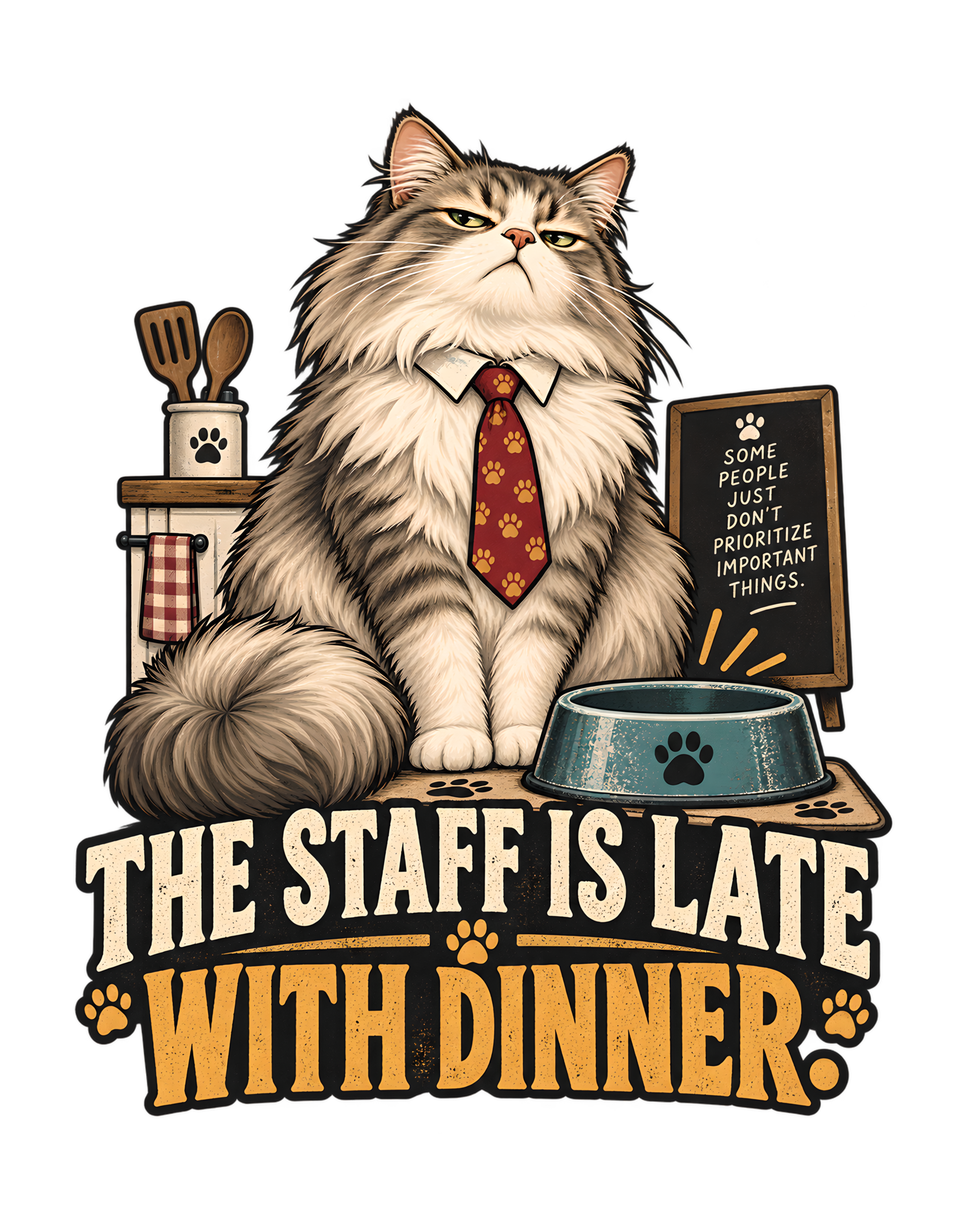
“The Staff Is Late With Dinner” takes one of the simplest cat-owner situations imaginable and promotes it into a workplace failure. The canonical concept is direct: a cat treats an ordinary feeding delay as unacceptable employee performance. The approved artwork turns that idea into a compact visual hierarchy. A large fluffy gray-and-cream cat sits upright beside an empty teal food bowl, wearing a crisp white collar and a red tie patterned with paw prints. The expression is not frantic or pleading. It is controlled, unimpressed, and managerial. The human responsible for dinner never appears, which makes the joke sharper: management is present, staff is absent, and the evidence is sitting in the bowl.
The supporting domestic details reinforce that reading. Wooden utensils, a checked towel, and a simple kitchen-like surface keep the scene grounded in ordinary household life. On the opposite side, a dark board visibly declares, “SOME PEOPLE JUST DON’T PRIORITIZE IMPORTANT THINGS.” That secondary message deepens the central complaint. Dinner is not merely late; the delay has become proof that the human has failed to rank priorities correctly.
The Cats Judging Humans voice thrives on this kind of reversal. Humans think they feed cats. The cat’s version of the relationship is that staff delivers dinner. The empty bowl becomes documentation, the tie becomes rank, and the unimpressed face becomes the review. The design works because the cat never needs to explain the hierarchy. It simply behaves as though everybody already agreed to it. The result is an evergreen joke about feeding time, household service, and the extraordinary confidence with which a cat can convert one late meal into an organizational concern.
The Joke Starts by Promoting the Human From Owner to Staff
The phrase “THE STAFF IS LATE WITH DINNER.” performs the entire power reversal in one sentence. The human is not called owner, caretaker, companion, or person. The human is staff. That change in title does most of the conceptual work because it turns feeding from a household routine into a service obligation. Once the human is staff, lateness can be reviewed as performance.
The canonical concept explicitly supports this framing: a cat treats an ordinary feeding delay as unacceptable employee performance. The approved artwork makes the hierarchy visible through posture, wardrobe, and evidence. The cat sits upright in a collar and tie beside the empty bowl, looking like the person who will document the problem rather than solve it.
That structure is central to Cats Judging Humans. The human does all of the practical work, yet the cat claims the supervisory position. The person buys, prepares, serves, cleans, and maintains. The cat observes the final outcome and retains the right to decide whether standards were met.
The humor is dry because the phrase never sounds emotional. It reports a condition. Staff is late. Dinner is pending. Management has noticed. There is no pleading and no dramatic complaint. The certainty is what makes it funny.
The human is not treated cruelly. The joke is about status, not punishment. The staff may be late, but the relationship continues. The cat simply believes that somebody should be accountable.
By changing the human’s job title, the design transforms a routine feeding delay into a complete performance-review premise. The facts remain tiny. The hierarchy becomes enormous. That disproportion is the engine of the joke.
That wording also protects the concept from becoming a generic “hungry cat” gag. Hunger alone would make the cat reactive; “staff” makes the cat managerial. The person responsible for the meal has been placed inside an organization that exists only in the cat’s imagination, yet the visual presentation treats that organization as completely legitimate. That invented institutional confidence is what gives the design its identity rather than leaving it as a simple complaint about timing.
The Fluffy Cat Looks Like Management Before Saying a Word
The approved cat has a large, fluffy silhouette that immediately carries visual authority. The full chest, substantial ruff, broad seated posture, and thick tail make the character feel physically grounded in the center of the composition. Nothing about the pose looks hurried. The cat is still, upright, and composed.
That stillness matters because the design is built around executive disappointment rather than hunger panic. A frantic cat would make the scene about need. A calm cat makes the scene about standards. The expression suggests that the problem has already been identified and the responsible department is simply late.
The narrowed eyes do much of the tonal work. They communicate judgment without aggression. The mouth remains neutral, and the posture stays controlled. This is exactly the emotional register that suits Cats Judging Humans: the cat is mildly disappointed, entirely certain, and not especially interested in hearing excuses.
The fluffy appearance also softens the authority enough to keep the humor playful. The cat looks substantial and important, but still domestic. It does not need a throne or a large office. The body itself creates the visual weight.
The character also remains unmistakably feline. The clothing never replaces the animal. Ears, paws, fur, tail, and face remain dominant, while the formal accessories simply add role information.
That balance keeps the joke believable inside the brand world. Cats already look capable of judging human routines simply by sitting nearby. The artwork gives that natural expression a managerial context. Before the viewer sees the bowl, board, or phrase, the cat already appears to have seniority.
The visual authority also depends on scale. The cat occupies enough of the upper composition that the surrounding props read as its environment rather than objects competing for attention. That makes the face the first emotional read. Viewers understand the attitude before they inventory the kitchen details. The design therefore lets character establish the joke first and lets the evidence explain it second, a sequence that keeps the feline personality at the center.
The Paw-Print Tie Turns Feline Confidence Into Executive Disapproval
The red tie patterned with paw prints is one of the most efficient props in the artwork. It converts a fluffy house cat into a management figure without pushing the character into a full human costume. A white collar frames the tie, but the rest of the cat remains fully feline.
That restraint is important. If the character were dressed like a complete office executive, the joke could become generic animal cosplay. The simple collar-and-tie combination instead works like a title badge. It tells the viewer that the cat has formalized the authority it already believed it possessed.
The paw-print pattern keeps the accessory inside the feline world. This is not a borrowed human uniform with no relation to the subject. It looks like something a cat-centered institution might actually approve as official management attire.
The warm red also gives the composition a strong focal accent. It sits against cream and gray fur, drawing the eye toward the center of the cat’s body and visually linking the character to the warm orange and gold accents used elsewhere.
Most importantly, the tie changes the emotional interpretation of the empty bowl. A cat beside an empty bowl might be waiting. A cat beside an empty bowl wearing a tie looks like it has scheduled a review.
That is the entire Cats Judging Humans mechanism in miniature. The practical situation is ordinary, but the cat assigns itself an absurdly formal role. Dinner is late, management is displeased, and the tie makes the complaint look official enough to enter the record.
The tie also creates a useful contrast with the cat’s natural fluffiness. One element says domestic comfort; the other says formal review. Putting them together creates a character who is visually soft but administratively severe. That contradiction keeps the illustration from feeling like ordinary office parody. The cat still belongs in a home, but the tie suggests that somebody has converted that home into an organization with procedures, standards, and an extremely narrow definition of acceptable dinner timing.
The Empty Food Bowl Is the Entire Case Against the Human
The empty teal food bowl is the clearest piece of evidence in the composition. It sits beside the cat in a position that makes the feeding delay visually understandable without requiring any additional explanation. Dinner is late because the bowl is empty. The case is almost offensively simple.
That simplicity is useful because the design already contains a strong central character, supporting props, secondary text, and large typography. The bowl does not need elaborate treatment. Its emptiness is the story.
The paw emblem on the front reinforces feline ownership of the object. Within the joke, this is not merely a household dish. It is the official receiving station for a scheduled service that has failed to arrive.
The bowl also gives the composition a practical focal point below the cat’s face. The viewer can move naturally from the expression to the empty bowl and then to the large phrase. That visual chain turns the abstract idea of “late dinner” into something concrete.
Cats Judging Humans changes the meaning of the object through interpretation. A human sees an empty bowl and thinks, “I need to feed the cat.” The cat’s implied version is, “The service department has missed a deadline.” The physical evidence is identical. The management language changes everything.
That is why the bowl matters so much. It turns the joke from a general complaint into a documented failure. The human may not be present to explain the delay, but the bowl has already submitted its testimony.
Because the bowl is so ordinary, it keeps the satire grounded. The design does not need a fancy dish, elaborate place setting, or exaggerated feast to communicate importance. In fact, the simpler the bowl remains, the funnier the cat’s interpretation becomes. Management is not objecting to luxury standards; management is objecting to the failure to complete the most basic service transaction in the household. That makes the visual evidence immediate and the overreaction sharper.
The Missing Human Makes the Feeding Failure Universal
The approved artwork never shows the person who is late with dinner. That absence makes the design more universal because no specific human identity narrows the joke. There is no age, gender, occupation, appearance, or personality attached to the employee. The viewer can immediately inherit the role.
The human is represented entirely through consequences. The empty bowl shows the missed responsibility. The kitchen-like props establish the domestic environment. The cat’s expression supplies the review. Nothing else is required.
This is especially effective for Cats Judging Humans because the brand often works best when the human is reduced to evidence. The cat receives posture, wardrobe, expression, and authority. The human receives a service failure.
The absence also protects the visual hierarchy. No second face competes with the cat. The entire upper composition belongs to the feline manager, which keeps the joke easy to read.
The concept remains affectionate because the human is not humiliated in a literal scene. The viewer simply recognizes the accusation and laughs at the disproportion. A small delay has become a staffing issue.
That broadness gives the design strong evergreen recognition. Anyone who understands the idea of feeding a cat can understand the scenario without needing a particular kind of household.
The human is missing, but the employee record is fully present. Management has the bowl, the time, the priority concern, and the expression. Apparently attendance at the review is optional.
The invisible human also creates a useful point of view. We are effectively standing where the staff member would stand, looking at management and the evidence. That makes the composition feel slightly accusatory without becoming aggressive. The viewer is not watching someone else get judged. The viewer is the person arriving late to the review. That directness helps the joke feel personal while still remaining broad enough to apply to nearly any cat-owner household.
The Kitchen Props Turn Feeding Into a Service Department
The domestic props behind the cat are modest but important. Wooden utensils, a checked towel, and a compact kitchen-like surface establish where the service failure occurred. They place the joke inside an ordinary home while giving the cat enough visual context to behave as though it runs a department.
That contrast is what makes the management framing work. The setting is not a corporate office. It is a kitchen. The service being reviewed is not a quarterly target. It is dinner. The cat nevertheless treats the situation with full professional seriousness.
The props stay secondary in scale, which keeps the cat dominant. They explain the setting without becoming clutter. That matters because the design needs to read as one compact apparel graphic rather than a full room illustration.
The checked towel contributes a friendly domestic note, while the utensils suggest food preparation without showing unsupported details about the actual meal. The source only supports a feeding delay, so the artwork wisely keeps the environment broad.
Cats Judging Humans uses the props as institutional shorthand. If there are utensils and a bowl, then apparently there is a food-service operation. If there is a food-service operation, then somebody is accountable. Management has already reached that conclusion.
The human may think they live in a home. The cat has apparently reclassified the kitchen as a service department. The utensils are infrastructure. The bowl is the delivery point. The missed meal is now an operational failure.
The kitchen objects also prevent the management joke from drifting into an abstract corporate setting. The cat may be behaving like an executive, but every surrounding object reminds us that this authority exists inside a domestic routine. That collision between home and office language is essential. The cat has not entered the human workplace. It has redefined the kitchen as its own workplace and quietly reassigned the human to service staff without changing the furniture.
The Side Board Turns a Late Meal Into a Failure of Priorities
The dark board beside the cat adds a second layer of judgment. Its visible message, “SOME PEOPLE JUST DON’T PRIORITIZE IMPORTANT THINGS.”, shifts the complaint from timing to values. Dinner is not merely late. The human has apparently failed to understand what matters.
That escalation is central to the humor. A small scheduling delay becomes evidence about judgment, priorities, and competence. The cat does not just want dinner; it believes the staff has demonstrated a broader organizational weakness.
The board works because it remains secondary to the main phrase. The large wording at the bottom carries the primary joke, while the smaller message rewards a closer look. That gives the design two reading speeds without making the composition confusing.
It also deepens the cat’s character. The viewer learns that management has not interpreted the delay as an isolated incident. It has already produced a theory about the human’s decision-making.
This is exactly the kind of dry exaggeration that suits Cats Judging Humans. The cat turns a trivial domestic issue into a moral and administrative conclusion. The seriousness of the language is wildly disproportionate to the event, which is why it remains funny.
Visually, the board also balances the kitchen props on the opposite side and helps frame the cat without competing with the face.
The human may disagree with the priorities assessment. Unfortunately, the assessment has already been posted next to the evidence.
The board also gives the cat a philosophy, not just a complaint. The central phrase reports what happened; the secondary message explains how management thinks. That difference adds depth without requiring another character or panel. It tells us the cat believes priorities are measurable and that dinner ranks extremely high. The viewer is invited to recognize the absurdity while also understanding exactly why the cat considers the case settled.
Executive Disappointment Works Better Than a Tantrum
The cat’s expression avoids the obvious route of dramatizing hunger. There is no open-mouthed yowl, frantic movement, exaggerated anger, or theatrical pleading. The cat simply looks disappointed.
That choice is much funnier for this concept because disappointment belongs to management. A tantrum would make the cat look dependent on the human. Calm judgment makes the cat look like the person conducting the review.
The narrowed eyes suggest that the explanation has already been considered. The upright posture suggests there is no need to argue. Even the tail remains part of the stable silhouette rather than a source of exaggerated motion.
Cats Judging Humans is strongest when the cat appears certain that its authority is obvious. The character does not need to prove that dinner should have arrived earlier. In its own internal system, the schedule is self-evident and the human failure is already established.
This emotional restraint also keeps the humor from becoming hostile. The cat is judging the staff, not attacking the staff. The human has disappointed management, but the relationship is not genuinely threatening.
The result is a visual performance review delivered entirely through posture and face. The crisis is tiny. The professionalism is immaculate.
That contrast is the heart of the design. Dinner is late by some unspecified amount, yet the cat carries itself like an executive evaluating a serious service failure. The smaller the actual problem, the funnier the composure becomes.
Restraint also improves the apparel read. A highly animated face or dramatic action would add visual noise around an already detailed composition. The controlled expression keeps the silhouette stable and lets the props carry the narrative. That is useful commercially as well as comically: the cat’s face remains legible at a glance, and the emotional message survives reduction. Management looks displeased even before the viewer can read every supporting detail.
The Large Phrase Functions Like a Formal Performance Notice
The main phrase occupies the lower portion of the artwork in large, bold display lettering, giving it the weight of an official notice rather than a casual caption. That visual treatment supports the management premise before the viewer even considers the exact wording.
The sentence is concise and declarative. It does not ask a question, make a request, or express emotion. It reports a condition: the staff is late with dinner. The grammar is clipped enough to sound like something entered into a performance file.
The large type also provides structural balance to the detailed illustration above. The cat, bowl, board, utensils, and towel create visual activity in the upper half. The broad typography consolidates the composition into a stable base.
Cream and warm orange tones keep the phrase readable while connecting it to the cat’s tie and the warm decorative accents. Dark outlines and backing shapes provide enough contrast for apparel-scale reading.
The wording itself is where the human demotion becomes complete. “Dinner is late” would describe a schedule. “The staff is late with dinner” identifies responsibility and rank.
That extra noun is the joke. The cat has assigned job titles without consultation.
By the time the viewer reaches the final period, the organizational chart is fully established. Management is seated. The bowl is empty. Staff is late. The notice has been issued.
The sentence also behaves like a headline because it names both the responsible party and the failure. That makes it unusually efficient. There is no need to add “please hurry” or “feed the cat” because those instructions would weaken the superior tone. The cat is not requesting remediation. It is reporting a breach. The viewer supplies the obvious next step, which lets the phrase remain dry, compact, and far more judgmental than a direct demand would be.
The Warm Palette Keeps the Complaint Playful Instead of Punitive
The approved artwork uses a warm, restrained palette built around cream, gray-brown fur, charcoal, muted teal, red, orange, and small gold accents. That palette helps the design remain playful even though the cat is clearly dissatisfied.
The cat’s light fur areas create softness around the face and chest, while darker gray and brown tones give the body depth. The red paw-print tie provides a strong focal accent and reinforces the management role.
The teal bowl is particularly useful because it separates the practical evidence from the warmer cat and typography. The viewer can identify the empty bowl quickly without the object overpowering the composition.
Warm cream lettering and orange accents give the typography a vintage printed character rather than a harsh warning-sign feel. Dark outlines maintain clarity while keeping everything visually cohesive.
The palette matters to the brand tone. Cats Judging Humans should feel sarcastic and superior, not genuinely cruel. The colors help maintain that boundary by keeping the artwork inviting and humorous.
Nothing in the scene looks dangerous or angry. Even the complaint feels theatrical rather than punitive.
The design therefore manages a useful contradiction: the cat takes the problem extremely seriously, while the viewer understands that the entire crisis is about dinner. The warm palette lets both ideas exist at once.
The color choices also help distinguish function. Warm accents gather around authority, typography, and decorative details, while the teal bowl isolates the practical problem. The result is not merely attractive; it directs attention. Viewers can identify the cat, evidence, and verdict in sequence because the palette separates them. That visual organization is especially valuable in a busy commercial graphic, where too many equally strong colors could flatten the hierarchy and weaken the joke.
The Composition Builds a Clear Chain From Cat to Bowl to Verdict
The composition is organized around a simple reading sequence. The fluffy cat dominates the upper center and becomes the first focal point. The empty bowl sits lower beside the cat and establishes the practical problem. The large phrase anchors the bottom and provides the final management interpretation.
Supporting objects are distributed around those elements without disrupting the hierarchy. Kitchen utensils and the towel occupy one side. The dark board occupies the other. The cat remains larger and more visually important than every prop.
That arrangement matters because the concept contains several layers: feeding delay, domestic setting, feline authority, workplace satire, and a supporting priorities joke. A weaker composition could make those ideas compete.
Instead, the artwork lets each element answer a different question. Who is in charge? The cat. What went wrong? The bowl is empty. Where did it happen? The kitchen cues explain that. How does management interpret it? The typography and side board answer that.
The broad fluffy silhouette also creates a strong apparel shape. The tail fills one lower side, while the bowl and board help balance the other. The typography provides a wide structural base.
Nothing essential depends on a distant background or tiny detail. The core joke remains readable at a glance.
The composition therefore behaves like a visual report: authority, evidence, context, verdict. Management would presumably approve the organization, even if it has concerns about dinner service.
The side-to-side balance also keeps the composition from feeling static. The cat is centered, but the props create small asymmetries that make the scene feel lived-in. The board on one side and kitchen elements on the other turn the central cat into a stable axis. That arrangement reinforces the character’s role: everything around management may be imperfectly organized, but management itself remains immovable. The visual structure therefore mirrors the joke’s power structure.
The Domestic Setting Keeps the Joke Relatable Instead of Grandiose
The design keeps the setting firmly domestic, which strengthens the workplace satire. The visible kitchen cues, empty bowl, utensils, and towel all point back to the everyday household routine of feeding a cat.
That ordinary setting matters because the humor comes from exaggeration. If the cat were already in a grand office or ceremonial hall, the management language would feel expected. A kitchen makes the executive tone absurd.
The house becomes a workplace only because the cat says so. The kitchen becomes a service department only because dinner is late. The human becomes staff only because management has decided the relationship requires clearer accountability.
That is the Cats Judging Humans mechanism in one compact scene: take a normal relationship, let the cat rename everyone’s roles, and treat the new hierarchy as obvious.
The domestic setting also gives the design broad audience recognition. Viewers do not need a particular profession or lifestyle to understand the joke. They only need to recognize the routine of a cat waiting for food and imagine how seriously the cat might interpret a delay.
The artwork avoids technical or time-specific details, which helps the concept stay evergreen. The props are familiar and simple.
Humans may believe they live in a home. The cat has apparently reviewed the floor plan and identified a food-service department. The distinction is administrative.
Keeping the environment domestic also prevents the concept from needing extra explanation. A kitchen towel, utensils, and food bowl are enough to establish the service context immediately. The viewer does not have to decode a fictional company or office department. That economy is valuable because it lets the workplace metaphor stay metaphorical. The cat’s authority feels absurd precisely because the room has not changed. Only the cat’s interpretation of the room has.
Feeding-Time Recognition Makes the Joke Instantly Familiar
The design depends on recognition rather than factual claims about every cat. The source does not say all cats react this way, and the artwork does not need to pretend otherwise. The humor comes from a familiar emotional idea: a cat waiting for food can appear to assign extraordinary importance to the timing.
The empty bowl makes that recognition immediate. The viewer understands the situation before reading the phrase. The tie and expression then elevate the ordinary moment into a workplace review.
That sequence keeps the joke accessible. There is no specialized reference, no platform-specific meme, and no complicated backstory. The viewer needs only to understand dinner, lateness, and the attitude of a cat with standards.
The side board extends the recognition by turning the delay into a priorities dispute. The human may have had many things to do. The cat has already determined that those things were incorrectly ranked.
Cats Judging Humans works especially well when viewers can imagine their own cat making the same judgment, even though the brand never needs to present the joke as literal science.
The design therefore uses a broad cultural understanding of demanding-cat humor without overclaiming. It turns a small domestic routine into a character-driven satire.
The human sees a schedule slip. The cat sees evidence that management should remain involved. That gap between interpretations is where the joke lives.
Audience recognition also comes from the asymmetry of effort. Humans handle the complicated logistics of acquiring and serving food, yet the cat’s review considers only the final delivery time. That selective accounting is part of the humor. The staff receives no credit for procurement, preparation, or prior meals. One late service event dominates the record. It is an unfair system, but it is instantly understandable because the cat has chosen the only metric that matters to the cat.
The Design Fits Cats Judging Humans by Making Service the Real Relationship
Cats Judging Humans is built around a recurring inversion: humans believe they care for cats, while cats appear to interpret the arrangement as service. “The Staff Is Late With Dinner” expresses that inversion with unusual efficiency because the phrase directly names the human’s role.
The cat never needs to call itself boss, ruler, or manager. Those titles are implied by the word “staff.” If the human is staff, the cat must occupy the position above them.
The artwork reinforces that implication through the tie, upright posture, empty bowl, and unimpressed expression. The supporting board about priorities makes the management perspective even more explicit.
The humor remains on-brand because the superiority is playful rather than cruel. The cat is demanding, but the demand is dinner. The human is judged, but the failure is ordinary and relatable.
The vintage-inspired typography, paw motifs, bold feline character, limited palette, and compact silhouette also fit the broader visual world of the brand while preserving this design’s own identity.
Most importantly, the concept preserves the central CJH relationship: the cat has standards, the human has responsibilities, and the cat reserves the right to evaluate whether those responsibilities were fulfilled.
The practical arrangement may be completely different from the cat’s interpretation. That is irrelevant to management. The staff designation has already been approved internally.
The design also fits the brand because the human incompetence is implied rather than shouted. There is no insult directed at a specific person and no cruelty in the setup. The cat simply assumes that its own needs define the standard. That confidence is enough to make the human look underqualified. The brand voice therefore stays clever and superior without becoming mean, which is essential to keeping the joke enjoyable rather than adversarial.
The Joke Is Evergreen Because Dinner Will Always Have a Deadline
The canonical source marks the concept as evergreen, and the reason is straightforward. The joke does not depend on a current event, platform, app, holiday, celebrity, or temporary trend. It depends on dinner, lateness, household routine, and feline expectations.
Those ideas are durable. As long as humans continue feeding cats, there will be room for humor about cats interpreting timing as a service standard.
The workplace language is equally stable. Staff, lateness, priorities, and performance are broadly understood concepts that do not require a specific corporate setting. The kitchen is enough.
The artwork also avoids technology that might date quickly. The bowl, towel, utensils, tie, and board are simple visual symbols. The vintage treatment adds character without tying the design to a narrow era.
The phrase itself is self-contained. It carries the hierarchy and the complaint in one sentence. No external caption is required to make the joke work.
That self-sufficiency gives the design long-term flexibility. A viewer only needs to understand that dinner is late and the cat believes someone should be accountable.
Cats Judging Humans benefits from concepts that remain funny because the cat-human relationship does not fundamentally change. Humans serve. Cats judge. Dinner arrives. Or it does not.
Management has selected a metric with excellent long-term stability.
The evergreen quality is strengthened by the fact that the phrase does not depend on a specific clock time. It never says five minutes late, an hour late, morning, evening, or a named feeding schedule. That omission keeps the complaint universal. Any delay can fit the joke because the cat’s standard is unstated and therefore absolute. The viewer can project their own familiar routine onto the design without finding a detail that dates or limits the scenario.
The Artwork Rewards a Fast Read and a Closer Look
At a fast glance, the design communicates everything essential: fluffy cat, empty bowl, unimpressed expression, and large phrase. That immediate clarity is important for a commercial graphic because the central joke should not require close study.
A closer look adds secondary rewards. The paw-print tie sharpens the management role. The kitchen utensils and checked towel establish the service setting. The paw emblem on the bowl connects the object directly to the cat. The side board adds the additional line about priorities.
Those details deepen the character without creating competing jokes. Every supporting element reinforces the same idea: dinner is late, management has noticed, and the human appears to have misunderstood what matters.
This two-level structure gives the artwork more staying power. The first read delivers the main punchline. The second shows how thoroughly the cat has formalized the complaint.
The strong silhouette and typography preserve readability, while the smaller props give the design personality. Nothing depends on tiny technical text or hidden symbolism.
Cats Judging Humans works especially well when the second look makes the cat seem even more serious than the first. That happens here. The viewer discovers not only a late dinner complaint, but also a tie, branded bowl, domestic service context, and posted priorities assessment.
The staff should probably stop inspecting the artwork and address the outstanding meal.
The closer-look details also create stronger memory. A viewer may first remember the headline and the fluffy manager, then later recall the paw-print tie, empty teal bowl, checked towel, or priority board. Those secondary details give the design enough personality to feel specific rather than interchangeable with other feeding jokes. Every one of them supports the same world: a cat-centered household where dinner service is monitored with much more seriousness than the humans anticipated.
“The Staff Is Late With Dinner” succeeds because every visible element supports one clean reversal: the human thinks feeding is a household routine, while the cat treats it as staff responsibility. The approved artwork presents that reversal with disciplined clarity. A large fluffy gray-and-cream cat sits upright in a white collar and red paw-print tie. An empty teal bowl provides the evidence. Kitchen utensils and a checked towel establish the service environment. A small dark board declares that some people do not prioritize important things. The large phrase turns the entire scene into a formal performance notice.
The design does not need a visible human or a complicated story. The employee is represented by the missed service. That makes the joke broad enough for viewers to place themselves directly into the role of staff.
The concept also remains evergreen because dinner, lateness, household routine, and feline expectations are not tied to any temporary trend. The workplace language simply gives a familiar feeding-time hierarchy a sharper title.
In Cats Judging Humans terms, the case is complete. Management is seated. The bowl is empty. The staff is late. The priorities have been questioned. And the next review will presumably begin the moment dinner is delayed again.