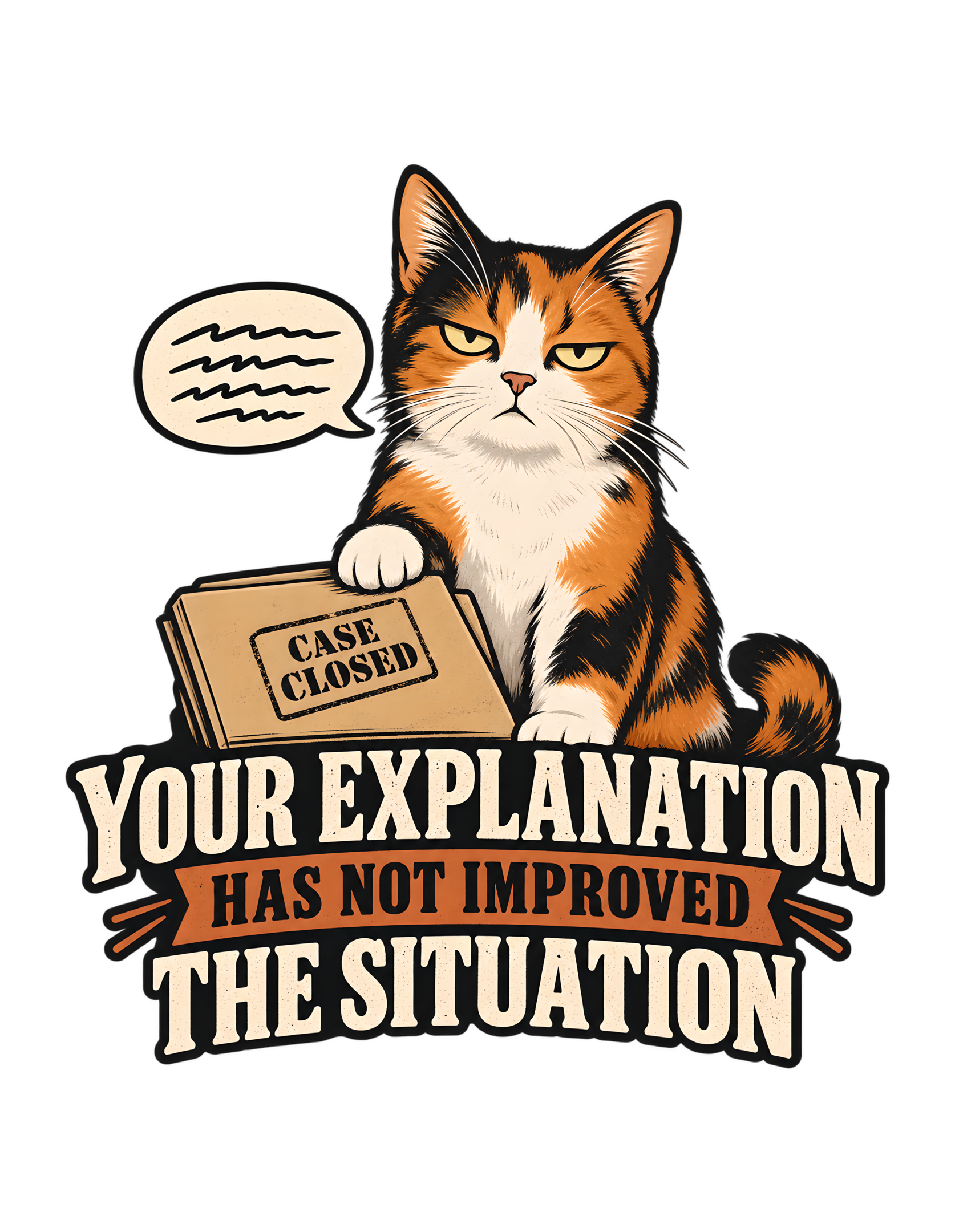
“YOUR EXPLANATION HAS NOT IMPROVED THE SITUATION” is built around a familiar human mistake: believing that more explanation will automatically make a bad outcome look better. The approved artwork gives that impulse a feline audience and, more importantly, a feline verdict. A calico cat sits upright with a flat, unimpressed expression. Beside the cat, a speech bubble contains only abstract lines rather than readable words. One paw rests on a closed tan folder stamped “CASE CLOSED.” Beneath the illustration, the phrase appears in large, high-contrast type: “YOUR EXPLANATION HAS NOT IMPROVED THE SITUATION.”
The joke is not that the human failed to speak clearly. The joke is that the cat has heard enough. That distinction gives the design its dry authority. The source concept describes a cat listening to a human justify a mistake and remaining completely unconvinced, as though the explanation itself has made things worse. The final artwork makes that idea immediately visible without needing to show the human. The speech bubble represents the explanation. The folder represents the review. The cat represents the decision.
Cats Judging Humans works best when feline superiority is expressed as procedure rather than cruelty. This design does exactly that. The cat is not shouting, attacking, or mocking the human with theatrical outrage. It is simply finished. This page stays grounded in the canonical source and the uploaded approved artwork. It does not invent garment colors, prices, stock, shipping, marketplace ratings, materials, or unsupported production claims. The artwork is the visual authority. The Cats Judging Humans layer is editorial: the human submitted an explanation, the explanation was reviewed, and the situation somehow emerged less improved than before.
The Joke Begins Where the Human Thinks the Explanation Should Help
The core joke is unusually precise: the human has already made a mistake, and then attempts to repair the situation with an explanation. Instead of improving matters, the explanation becomes additional evidence. That is what makes the phrase stronger than a generic “cat is unimpressed” joke.
“YOUR EXPLANATION HAS NOT IMPROVED THE SITUATION” assumes a full invisible sequence. Something happened. The human was challenged. The human started explaining. The cat listened. The explanation failed. The design therefore begins after the original incident. We never see what the human did wrong, and that omission is useful. The viewer supplies the missing mistake from personal experience. The problem could be trivial. It could be ridiculous. It could be a familiar household failure that seemed perfectly defensible until someone started talking.
Cats Judging Humans places the cat at the end of that process, not the beginning. The cat is not investigating. The cat is not confused. The cat is reviewing the appeal. That bureaucratic framing is what gives the design its dry tone. The source concept explicitly says the cat listens to a human justify a mistake and remains completely unconvinced, as though the explanation itself has made things worse. The approved image supports that exact reading.
The speech bubble shows that the human has spoken. The folder shows that a case existed. The cat’s expression shows that the review did not go well. The phrase delivers the ruling. Nothing else is needed. The joke also leaves the human in a recognizable position: the dangerous moment when you realize that additional context is not saving you. You are no longer clarifying. You are extending the hearing.
The wording creates an invisible timeline that the art does not need to show. The viewer can infer the original mistake, the defensive explanation, and the unsuccessful appeal from one frozen moment. That narrative compression is what lets the design feel complete without becoming a multi-panel comic. The cat, naturally, would prefer that you stop.
The design also benefits from refusing to show the original mistake. Because the offense stays offstage, the verdict can apply to any human moment where explanation outlives usefulness. That keeps the joke broad without making it vague.
The Calico Critic Looks Like the Final Reviewer, Not a Participant in the Debate
The approved artwork places a calico cat at the center of the composition, and the character’s role is clear before the viewer reaches the words. This is not a cat participating in the human explanation. This is a cat reviewing it.
The cat sits upright, facing outward, with half-lidded eyes and a neutral mouth. The expression is flat rather than dramatic. That restraint matters because it keeps the joke dry. A furious cat would turn the scene into confrontation. A surprised cat would imply uncertainty. A playful cat would weaken the sense of judgment. The approved expression communicates something more useful: the conclusion has already been reached.
The source concept identifies the cat role as critic, and the final artwork visually supports that role without needing a costume, title badge, or literal review desk. The posture alone is enough. The cat occupies the central vertical space with the confidence of someone who has no need to prove authority.
The calico pattern also gives the character strong visual contrast. Orange, black, and white areas break up the body while keeping the face immediately readable against the dark surrounding space. None of those colors are treated as behavioral evidence. The artwork uses a calico cat because that is the approved visual character. The humor comes from posture, expression, props, and phrase—not from any unsupported claim about calico temperament.
Cats Judging Humans benefits from that discipline. The cat is visually specific without becoming a stereotype. The centered posture also makes the criticism feel stable. The body is not leaning away or reacting to sudden movement. It occupies the composition as though the review session belongs to the cat. That visual stillness reinforces the authority created by the phrase.
The result is a critic who does not need to raise a paw for attention. The meeting is already under control. Unfortunately for the human, so is the verdict.
The cat's upright silhouette strengthens that final-reviewer role. Nothing about the pose looks provisional. The body is settled, the paw is planted, and the visual message is that the human is the only participant still trying to reopen the matter.
The Speech Bubble Shows That the Human Has Talked Enough Without Repeating a Single Word
The speech bubble is one of the smartest visual elements in the design because it represents human explanation without forcing the artwork to write the explanation out. Inside the bubble are simple abstract black lines. There are no readable words. That choice keeps the human’s actual defense irrelevant.
We know the person has spoken. We know the cat has heard it. We do not need to know what was said. This is a powerful editorial shortcut because it protects the design from becoming too specific. If the bubble contained a literal excuse, the joke would be tied to one mistake. By using abstract lines, the artwork allows the viewer to imagine any explanation that has gone on too long.
The source visual concept specifically calls for a small speech-bubble motif filled with simple abstract lines. The approved image follows that direction closely. The bubble also creates a useful contrast with the cat’s silence. The human side is represented by noise. The cat side is represented by stillness. That asymmetry carries the brand logic beautifully. Humans explain. Cats assess.
The abstract lines also avoid privileging any one language or excuse. The bubble reads as speech, not content. That is enough for the joke because the premise depends on the failure of explanation, not on the details of the explanation itself.
The bubble therefore does more than fill space beside the character. It establishes the imbalance in the conversation. One party keeps adding information. The other party has already formed an opinion. Cats Judging Humans turns that imbalance into authority. The cat does not need a reply bubble. The folder already says the matter has been closed. The large phrase below delivers the only response that counts.
In that sense, the abstract speech bubble may be the most accurate representation of overexplaining in the entire design: a lot was said, none of it changed the outcome.
Because the speech bubble contains only marks, it functions almost like visual static. The human contribution is acknowledged but not privileged. The cat's judgment gets legible words; the human's defense gets lines. That imbalance is the joke in miniature.
The CASE CLOSED Folder Makes the Feline Decision Look Procedural
The tan folder under the cat’s paw changes the joke from personal skepticism into official disposition. The stamp reads “CASE CLOSED.” That visible wording is part of the approved artwork and directly supports the source concept.
Without the folder, the cat would still look unimpressed. With the folder, the cat looks finished. That is a much stronger distinction. A closed case suggests that evidence was considered, a decision was reached, and further argument is unnecessary. The cat’s paw resting on the folder makes the relationship even clearer: this is not a document lying nearby by accident. It belongs to the review.
The human explanation therefore arrives too late. The procedural moment is over. Cats Judging Humans frequently works by assigning feline characters familiar human authority roles—critic, manager, supervisor, reviewer, inspector. Here, the folder lets the cat occupy that role without needing any elaborate office setting.
The entire administrative system is compressed into one prop. There was a case. There was a review. There was a closure. The human kept talking anyway. That is the joke.
The folder’s warm tan color also separates it from the black surrounding space and from the cream typography below. It reads quickly as paper or case material, allowing the viewer to understand the prop before reading the stamp. The “CASE CLOSED” stamp creates a useful secondary punchline beneath the larger phrase. The main text says the explanation did not improve the situation. The folder says there will be no additional hearing.
Those two messages reinforce each other without repeating the same wording. The cat’s paw makes the finality feel personal. Not emotional. Personal. The cat has physically placed the case where it belongs.
Closed. Human counsel may now stop speaking.
The folder also prevents the scene from reading as simple mood. It converts expression into action: the cat has not merely formed an opinion but has processed the matter. The administrative prop gives the skepticism a beginning, middle, and end.
The Cat’s Half-Lidded Expression Does More Work Than a Dramatic Reaction Would
The facial expression is deliberately restrained. The cat’s eyes are half-lidded and directed outward. The mouth is neutral. The ears are upright. There is no exaggerated grimace, no open-mouthed complaint, and no theatrical anger.
That emotional economy is essential. The phrase already contains the judgment. The face does not need to compete with it. Instead, the expression confirms the tone: unimpressed, skeptical, and finished.
This is a familiar Cats Judging Humans principle. The more calmly the cat delivers the verdict, the more authority it appears to have. A dramatic reaction would imply that the human has successfully disturbed the cat. The approved expression implies something colder and funnier: the human has merely failed the review.
The source description calls the cat “completely unconvinced,” and the artwork makes that visible through the eyes rather than through action. There is also a useful difference between boredom and judgment here. The cat is not shown asleep, looking away, or disengaged. It is facing forward. The eyes are narrowed, but the posture is attentive enough to suggest that the explanation was actually considered.
The expression remains especially effective because it is not softened into cuteness. The cat is attractive and expressive, but the face serves the premise first. That protects the design from becoming a generic portrait with a joke pasted underneath.
That is what makes the rejection sting. The cat listened. The cat understood. The cat remains unimpressed. Cats Judging Humans then converts that into the most feline possible conclusion: perhaps the human should stop assuming that additional words count as improvement.
The expression works because it does not beg the viewer to laugh. It simply holds the gaze. The human can decide what that means. The folder has already decided.
That controlled face is especially useful at a distance. The viewer does not need to inspect tiny emotional details to understand the attitude. Narrowed eyes and still posture communicate enough, while the phrase supplies the exact verdict underneath.
The Phrase Uses Bureaucratic Calm Instead of an Insult
“YOUR EXPLANATION HAS NOT IMPROVED THE SITUATION” is funny because it sounds like professional feedback. The sentence is not emotional. It is evaluative. That is a crucial part of the design’s voice.
The cat does not say the human is stupid. The cat does not say the excuse is ridiculous. The cat does not threaten punishment. It simply reports that the explanation failed to produce improvement. That restrained phrasing is more effective than a direct insult because it leaves the human with nowhere to argue. The sentence sounds objective even though the entire setup is absurdly feline.
The wording also implies that improvement was possible. The human had an opportunity. The human used words. The result did not change. Cats Judging Humans thrives on exactly this kind of deadpan authority. The cat behaves as though it is merely documenting outcomes, while the viewer recognizes the emotional reality underneath.
The source concept describes the explanation as making things worse, and the phrase captures that without explicitly saying “worse.” “Has not improved” is more bureaucratic, more controlled, and therefore funnier. The phrase also avoids the word “excuse,” which keeps the judgment broader. An explanation can be sincere and still unhelpful. That ambiguity gives the joke more range because the cat is evaluating results, not claiming to know the human’s motives.
The sentence has a useful rhythm. “YOUR EXPLANATION” identifies the human contribution. “HAS NOT IMPROVED” delivers the assessment. “THE SITUATION” closes the ruling. Every part sounds like a line from a review process.
That makes the cat’s role as critic feel completely natural inside the joke. The cat is not being rude. The cat is providing feedback. The distinction is important. Especially to the cat.
The professional cadence also makes the sentence reusable beyond one domestic scenario. It sounds like feedback from a review, a meeting, or an appeal, yet the cat makes all of those human systems feel faintly ridiculous by occupying the evaluator's seat.
The Typography Makes the Verdict Feel Larger Than the Explanation
The visual hierarchy gives the final verdict far more weight than the human explanation. The speech bubble is relatively small. The folder is secondary. The cat is central. The large phrase dominates the lower half of the composition.
That hierarchy mirrors the story. The human explanation happened. The feline verdict matters more.
The phrase is set in large, bold cream lettering, with “HAS NOT IMPROVED” placed on an orange banner-like strip between the larger cream text above and below. The result creates a strong three-part reading sequence. First: “YOUR EXPLANATION.” Then: “HAS NOT IMPROVED.” Finally: “THE SITUATION.”
The middle line functions like a formal finding. The outer lines establish the subject and consequence. This structure gives the design a strong apparel silhouette while also helping the joke read quickly. The source visual concept says typography should lead the composition, and the approved artwork clearly follows that direction.
The orange middle banner creates a visual pause at the exact point where the sentence delivers its assessment. That makes “HAS NOT IMPROVED” feel like a formal finding rather than ordinary connective text.
The text is not a caption added after the illustration. It is half of the design. The cat and folder establish authority. The type delivers the official language of that authority.
Cats Judging Humans benefits from the scale difference because it makes the viewer feel as though the ruling has been issued publicly. The human may have had a speech bubble. The cat has the entire lower half of the poster.
That seems fair. The case is closed.
The typographic scale ensures that the final sentence remains the first thing many viewers remember. The illustration creates character, but the phrase converts that character into a quotable judgment. Neither half has to carry the entire concept alone.
The Limited Palette Keeps the Editorial Illustration Sharp and Commercially Focused
The approved artwork uses a compact palette built around black, warm cream, orange, tan, and the natural calico colors of the cat. That limited range keeps the composition coherent.
The black surrounding space gives the character and typography a strong silhouette. Cream lettering creates immediate contrast. The orange banner ties visually to the orange areas in the cat’s coat. The tan folder introduces a paper-like neutral that fits the administrative gag.
These choices support the concept without turning the design into a literal office scene. The source identifies the art style as editorial illustration, and the final artwork feels consistent with that description. The cat is cleanly drawn, the props are simplified, and the typography carries a large share of the communication.
The black surrounding space is also useful because it removes environmental distraction. The palette behaves more like a graphic system than a literal room, keeping attention on the cat, folder, bubble, and phrase.
The palette helps the face remain readable. White fur areas define the muzzle and chest. Dark fur frames the eyes. Orange patches keep the character warm enough to feel playful rather than severe.
Cats Judging Humans needs that balance. The brand can be judgmental, but it should not look hostile. The colors help maintain that line. The visual world is dry and official, but not cold. The cat looks unimpressed, not threatening. The folder looks procedural, not punitive. The typography looks authoritative, not aggressive.
That is an important distinction for a design whose entire joke is about rejection. The human explanation has failed. The design still feels fun enough to wear.
The palette also supports the source's editorial rather than photorealistic direction. Flat areas of strong color and high contrast make the image feel intentionally designed, which suits a verdict-driven concept better than a busy or naturalistic background would.
The Missing Human Makes the Viewer Feel Like the One Being Reviewed
No human figure appears in the approved artwork. That omission is one of the design’s strongest narrative choices. The human is present only through the speech bubble.
Because no specific person is shown, the viewer can occupy the human role automatically. You are the one who explained. You are the one awaiting a response. You are the one facing the cat. The phrase “YOUR EXPLANATION” makes that second-person perspective explicit.
This gives the design a directness that would be harder to achieve if a drawn human were placed beside the cat. A visible person would turn the joke into a scene about that character. The current design turns it into a scene about the viewer.
Cats Judging Humans frequently benefits from this kind of implied human presence. The brand does not need to show people making mistakes in every image. Sometimes the feline reaction is enough to make the audience remember their own behavior.
The second-person wording turns the viewer into the subject without requiring a human character. That direct address is one reason the design can feel personal while remaining visually minimal.
The speech bubble proves that a human voice exists somewhere outside the frame. The folder proves that the cat has considered it. The expression proves that the result is not encouraging.
That is all the story needs. The absence also keeps the composition compact and focused. There is one authority figure. One case file. One useless explanation. One verdict.
The human can remain offstage. Their performance is already documented.
By leaving the human unseen, the design also avoids telling the viewer how to react. Embarrassment, defensiveness, resignation, and amusement are all available. The cat's position stays fixed while the audience supplies the human side of the exchange.
The Role Reversal Works Because the Cat Controls the Review Process
The humor mechanism becomes especially clear when the design is read as role reversal. Humans usually imagine themselves as the household decision-makers. They explain. They justify. They assess. They close cases.
The artwork gives all of those functions to the cat. The human becomes the one whose conduct requires explanation. The cat becomes the critic. That reversal is supported directly by the source metadata, which identifies the cat role as critic and the design category as human judgment.
The final image visualizes those abstractions cleanly. The speech bubble is human testimony. The folder is feline administration. The phrase is the ruling. The cat’s paw physically bridges character and document, making it clear who controls the case.
The role reversal also keeps the cat from becoming merely decorative. The cat is not a mascot beside a joke. The cat is the personification of the joke’s authority structure.
Cats Judging Humans does not need to make the human visibly incompetent for this to work. The very fact that the human is explaining is enough. The cat’s authority becomes funny because it is treated as ordinary.
No crown. No gavel. No uniform. Just a folder and a face that says the matter has been reviewed. That understatement protects the joke from becoming theatrical. The role reversal feels almost plausible inside the brand’s world.
The human made a mistake. The cat heard the explanation. The file is closed. The household can move on.
Preferably without further comment.
Role reversal gives the phrase its authority without requiring cruelty. The humor comes from jurisdiction: somehow the cat has become the party empowered to assess whether a human explanation has merit. The human's only mistake may have been assuming otherwise.
The Minimal Setting Lets the Judgment Read Before Any Background Story
The approved composition uses almost no environmental detail. There is no room. No desk. No courtroom. No office wall. No household furniture. The cat, speech bubble, folder, and typography are enough.
That minimal setting is important because the concept is about judgment, not location. A detailed office could make the design feel workplace-specific. A courtroom could push the joke toward legal parody. A living room could make the scene feel like one domestic incident.
The approved artwork stays broader. That lets the phrase work across many kinds of human explanation. The mistake could have happened at home, at work, in a relationship, or in some entirely imaginary feline tribunal.
Cats Judging Humans benefits from that openness because the joke remains evergreen and reusable. The visual logic is still clear. Speech bubble means explanation. Folder means case. Cat means reviewer. Phrase means outcome. Nothing in the design requires additional scenery to become understandable.
The minimal setting also gives future editorial illustrations room to explore the concept without tracing the approved artwork. A website section image can show review, skepticism, or overexplaining in new scenes while the T-shirt art remains immutable.
That economy keeps the silhouette strong. Every visible element contributes directly to the premise. There is very little decorative filler. The result feels more like a compact editorial emblem than a scene extracted from a larger story.
That is useful for the brand because the judgment remains immediate. The human does not get to distract the panel with context.
Apparently that was already tried.
The lack of scenery also makes every prop easier to read at once. There is no visual competition between the case file and the environment. The composition behaves like a concise visual argument, with each element acting as one piece of evidence.
The Joke Feels Familiar Because Humans Often Keep Explaining After the Decision Has Already Been Made
The design has broad audience recognition because the underlying behavior is not cat-specific. Humans overexplain. Humans justify. Humans add context after discovering that the first explanation did not land. Humans often believe that one more sentence will finally repair the situation.
The design turns that tendency into feline judgment. That does not require the article to invent any external behavioral science or statistics. The humor is observational.
The source concept already gives us the complete premise: the human explains a mistake, and the cat remains unconvinced as though the explanation itself has made things worse. The approved artwork keeps that recognition accessible by refusing to specify the mistake.
This is what lets viewers project their own examples into the design. Maybe the human broke something. Maybe the human forgot something. Maybe the human made a questionable decision. The cat does not care. The explanation has been processed.
The human tendency to explain more when persuasion is failing gives the design emotional recognition beyond cat ownership. The feline framing makes that recognition playful rather than confrontational.
Cats Judging Humans removes the social politeness humans usually add to these moments. The cat does not say, “I understand what you mean.” The cat does not say, “That makes sense.” The cat does not say, “Let’s revisit this later.”
The cat says nothing. The phrase does the administrative work. The folder does the rest.
If the viewer recognizes that feeling, the design has already succeeded.
Recognition also comes from the timing of the joke. The explanation is not rejected before it begins; it is rejected after the human has invested effort in it. That delayed failure is what makes the cat's calm finality feel so satisfyingly unfair.
The Design Is Evergreen Because the Human Excuse Never Needs a Trend Cycle
The canonical source marks the concept as evergreen, and the approved artwork supports that classification. There is no holiday reference. No current event. No celebrity. No platform interface. No temporary meme format. No dated technology.
The joke depends on a durable interaction: someone explains a mistake, and the explanation fails to improve the outcome. That premise is unlikely to require updating.
The visual props are equally timeless. A speech bubble. A paper folder. A stamped case label. A skeptical cat. Bold typography. None of those elements depend on a particular year or trend.
Evergreen status is strengthened by the fact that the phrase is not dependent on slang. The sentence sounds formal enough to remain understandable even as internet humor changes.
The source listing description uses the phrase “familiar feline expression,” and that familiarity is part of the design’s long-term strength. The cat’s unimpressed face does not need special cultural context.
Cats Judging Humans also avoids tying the joke to a specific platform or product inside the artwork. The design is not about social media. It is not about an app. It is not about a particular workplace tool. It is about explanation itself.
That gives the page a broad editorial angle and gives the design a durable identity. Humans will continue explaining. Cats will continue appearing unimpressed.
The case remains evergreen.
The timelessness extends to the emotional structure. People will continue to rationalize mistakes, and observers will continue to decide that the rationalization did not help. The cat simply gives that social moment a cleaner, funnier face.
The Composition Holds Together as One Complete Apparel Graphic
The approved artwork is organized as one compact vertical mass. The cat occupies the upper center. The speech bubble sits to the upper left. The folder rests across the middle. The large phrase creates a substantial lower base. The tail curls inward rather than extending far away from the composition.
Those choices keep the design contained. The source production asset is documented as an immutable transparent PNG at 6200 by 8000 pixels, with provenance metadata stating that aspect ratio was preserved and a 300-pixel safe margin was used during production processing. Those are source facts about the approved asset, not consumer-facing product claims.
Editorially, the important point is that the design has a clear silhouette. The character does not float above unrelated text. The folder links the upper illustration to the lower typography. The speech bubble stays close enough to the cat to remain part of the same visual unit. The large type anchors everything.
The production provenance establishes that the approved asset is a finalized master. The website page therefore discusses what is visibly present rather than reopening or redesigning the artwork.
That cohesion helps the design feel intentional rather than assembled from separate stickers. Cats Judging Humans gets an additional benefit from the structure because the hierarchy mirrors the story.
Human speech enters from one side. Feline authority occupies the center. The official verdict lands below. The viewer can understand the sequence in a glance.
The design is compact because the case was efficiently processed.
The compact silhouette also protects the hierarchy of the joke. The eye moves from cat to folder to phrase without getting lost. That visual path mirrors the narrative path from evaluator, to decision, to formal statement of the outcome.
The Marketplace Listing Supports the Same Core Reading Without Defining the Website Page
The canonical marketplace listing describes a calico cat listening to the human explanation and remaining completely unconvinced. It says the design captures a familiar feline expression suggesting that the excuse has been heard, evaluated, and found deeply unhelpful.
That description supports the same core reading as the approved artwork. The website page, however, should not simply reproduce marketplace copy at greater length. The editorial value comes from examining how the joke works.
The listing tells us what the design is. The page can explain why the speech bubble matters, why the folder matters, why the expression matters, why the typography carries authority, and why the absent human strengthens identification.
The marketplace listing is already published according to the source data, but this JSON intentionally omits the marketplace URL because the website system supplies canonical links separately.
The listing title “Cat T-Shirt – Cat Rejects Your Explanation” summarizes the same premise in marketplace language, while the website page preserves the full distinctive design phrase as its editorial H1.
The CTA can still invite the reader to view the design on Zazzle without making claims about stock, price, shipping, or availability. That separation keeps the page useful.
It is not a sales page disguised as an essay. It is a standalone editorial and catalog page grounded in the source and artwork.
Cats Judging Humans gets to explain the joke. The marketplace gets to sell the item. The cat, naturally, gets final approval over both.
Keeping marketplace information separate also protects the editorial tone. The page can examine character, humor, and composition without turning every paragraph into a sales prompt. The CTA appears once, where it belongs, after the design has been understood.
The Design Fits Cats Judging Humans by Making Feline Judgment Feel Administrative
This design fits Cats Judging Humans because the cat does not merely look annoyed. The cat has a process. That difference is the entire brand advantage.
A generic cat-humor design might stop at an unimpressed face. This one adds a speech bubble, a case folder, a closure stamp, and a bureaucratically phrased verdict. The human behavior is therefore not just observed. It is reviewed.
The cat’s superiority is not expressed through aggression. It is expressed through procedure. That is exactly the right tone for the brand: dry, sarcastic, clever, judgmental, playful, slightly superior, and never cruel.
The cat does not insult the human. The cat simply records that the explanation failed. The design also avoids unnecessary brand decoration inside the artwork. It does not need an additional logo to make the concept feel like Cats Judging Humans. The relationship itself carries the identity.
The brand fit is strongest in the last beat: the cat never needs to prove superiority. The human has already done the talking. The cat simply decides whether any of it mattered.
Human explains. Cat evaluates. Case closes. Humans remain confused about why additional explanation did not help. Cats Judging Humans knows why.
The meeting was already over.
The final joke is not that the cat refuses to understand. The final joke is that the cat understands perfectly and remains unconvinced.
That is much worse for the human. And much better for the design.
That administrative quality is ultimately what makes the concept unmistakably CJH. The cat is not merely superior in attitude; it appears to have systems, standards, and authority. Human behavior is not mocked randomly. It is formally reviewed and quietly rejected.
“YOUR EXPLANATION HAS NOT IMPROVED THE SITUATION” succeeds because every visible element supports one clean idea. The human has spoken. The cat has listened. The case is closed.
The speech bubble establishes the explanation without distracting the viewer with literal wording. The folder turns skepticism into procedure. The “CASE CLOSED” stamp gives the review finality. The calico cat’s flat, half-lidded expression provides the judgment. The large typography delivers the official ruling.
Nothing in the concept requires a dramatic confrontation. That restraint is the design’s strength. The canonical source describes a cat hearing a human justification and remaining completely unconvinced. The approved artwork turns that into a compact visual system where the cat’s authority feels calm, bureaucratic, and complete.
That is exactly the Cats Judging Humans relationship. Humans make mistakes. Humans explain. Cats evaluate. Sometimes the explanation helps. This is not one of those times.
The design remains evergreen because the joke does not depend on a trend, product feature, or current event. It remains visually specific because the calico critic, speech bubble, folder, stamp, and typography all serve one premise. It remains on-brand because the cat never becomes cruel; it simply reaches a conclusion.
The human may stop now.