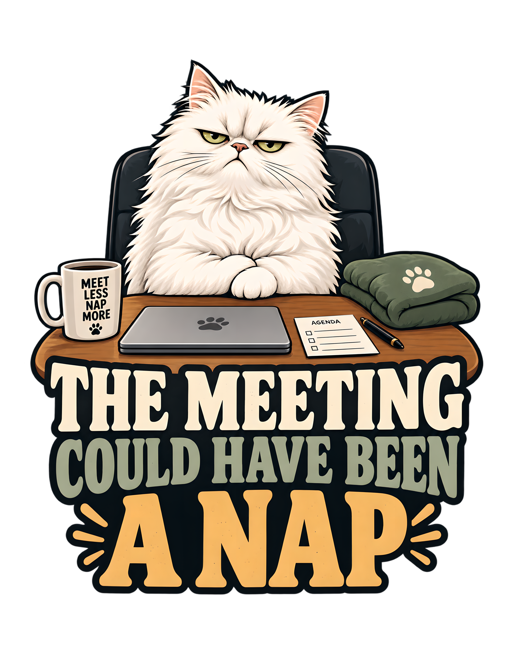
Some meetings end with a decision. Some end with another meeting. This one has already been reviewed by a fluffy white cat, and the conclusion is less complicated: THE MEETING COULD HAVE BEEN A NAP. The phrase appears in large, emphatic lettering beneath a small scene of workplace formality. A cat sits upright behind a wooden tabletop, near a closed laptop, a little agenda sheet, a mug, and a folded cushion. Everything necessary for a recognizable office encounter is present. Everything necessary for a genuinely urgent encounter appears to be missing. The cat has noticed the difference.
The joke is not that sleeping is always more important than work. It is that humans sometimes mistake a scheduled gathering for useful activity, then congratulate themselves for having attended. A calendar can prove that people occupied a block of time; it cannot, by itself, prove that the block was well spent. The cat's alternative is not a complicated efficiency framework. It is a nap, proposed without apology and presented as the obvious use of the same resources.
This Cats Judging Humans design turns an ordinary frustration into an unusually composed verdict. The artwork never shows a disastrous meeting or an incompetent colleague. Instead, the white cat occupies the position of critic, and the props quietly establish the case. Its expression suggests that the result of the review was predictable. The typography makes the finding impossible to miss, while smaller details reward a second look. The whole scene is playful rather than cruel: the humans are judged for a recognizable habit, not condemned as people. Management would like its afternoon back. This time, management has brought a cushion.
The Real Subject Is Time Mistaken for Progress
The central joke begins long before the cat makes its appearance. It begins with a familiar human substitution: something has been placed on a schedule, so it starts to feel automatically worthwhile. A meeting has a title, perhaps a purpose, and certainly a start time. Those trappings lend it a ceremonial dignity. What they cannot establish is whether everybody needed to be there. The design invites the viewer to make that distinction without reproducing a single minute of actual meeting dialogue.
THE MEETING COULD HAVE BEEN A NAP offers a deliberately absurd comparison. Most people do not literally weigh every appointment against an opportunity to sleep. But the comparison is revealing because a nap has an identifiable outcome: someone gets to rest. An unnecessary meeting may consume the same period while leaving the participants uncertain about what, exactly, has happened. In the joke, the cat has identified the missing deliverable and proposed an alternative whose value requires no presentation deck.
This is workplace satire directed at process rather than at any individual profession or employee. The source concept says the cat evaluates an unnecessary meeting and finds sleeping preferable. It supplies no invented department, disastrous project, or secretly malicious supervisor. That restraint gives the idea range. A person can recognize the humor after a formal office call, a volunteer committee discussion, or a household conversation that mysteriously developed an agenda. The particulars change; the sense that time could have been better allocated does not.
The cat's verdict also reverses the usual human assumption that resting must be justified while organized activity is presumed productive. From a feline perspective, the burden of proof has shifted. If a meeting wishes to replace a nap, it should provide evidence of sufficient merit. The image does not present a spreadsheet proving that claim. It simply puts a small cushion next to workplace objects and lets the viewer recognize which option appears more attractive. A meeting invitation is not a medal. The cat would appreciate humanity learning this before sending another one.
The Fluffy White Cat Treats the Room as a Review Board
The artwork's strongest character choice is the fluffy white cat itself. Its pale coat creates a bright, unmistakable visual mass against the dark office chair behind it. The pointed ears frame a face whose narrowed eyes and still expression communicate unimpressed attention. Nothing about the pose suggests panic or theatrical outrage. The cat appears to be listening to a case that has already failed preliminary inspection.
That calm matters more than any cartoonishly furious reaction would. If the cat were howling or throwing papers, the design might become a joke about a chaotic workplace. Instead, it becomes a joke about quiet judgment. The absurdity lives in the seriousness with which feline priorities are presented as an administrative conclusion. People may be accustomed to explaining their calendar habits to one another. Here, their explanation is being received by an animal whose apparent standard is simple: was this better than resting?
The visual treatment avoids asking the viewer to identify a particular breed. The source specifies a white cat, and the approved image shows a long, full coat and a notably stern expression. Those are visible design details, not evidence for invented temperament or care facts. The cat's role is editorial: it embodies the amused authority that Cats Judging Humans often gives to feline characters. Its face carries a performance review without the need for a speech bubble.
There is also a pleasing imbalance in the scene. The subject looks formally positioned, yet nothing in the room suggests that the human attendees have equal say in the verdict. The reader encounters the cat directly, almost as though arriving late to a meeting that has already been adjourned. The expression leaves room for interpretation: boredom, skepticism, and a practiced refusal to be impressed all fit the visual language. What remains fixed is the power relationship. Humanity may have called the meeting; the cat is deciding what it was worth. An appeal may be filed, preferably in writing, where it can be ignored efficiently.
A Small Office Table Makes the Absurdity Believable
The tabletop is an important part of the joke because it turns the phrase from an isolated slogan into a recognizable situation. The cat sits behind a warm wooden surface, visually arranged as though it has taken the relevant seat in a compact meeting area. There is no crowded conference room and no elaborate machinery. The familiar furniture is enough to suggest workplace procedure, while the simplicity keeps the focus on the judgment.
A large meeting scene full of human faces would narrow the meaning. Readers might wonder who had made the mistake, what the attendees were discussing, or whether one character deserved blame. The approved artwork avoids those distractions. We do not need to see a manager at the other end of the table. The cat's posture and the selected office objects allow the meeting to exist as an implication. This is closer to a visual editorial column than a scene from a specific office drama.
The table also establishes a useful division between character and evidence. Above it sits a creature visibly convinced of its own priorities. On it sit the modest tools of human organization: computer, notes, writing instrument, and beverage. The arrangement makes the props available for inspection without turning the illustration into a cluttered inventory. Its domestic-scale office feels familiar enough to belong to many kinds of work or planning, not a technical specialist's workspace.
Within Cats Judging Humans, everyday surfaces often become stations of feline authority. That is an editorial convention, not a claim that cats hold real meetings. A dining surface can become a boardroom; an armchair can become a throne; a lap can become a mandatory seating assignment. This particular desk performs the same transformation with unusual restraint. The cat does not need an enormous conference table to establish control of the agenda. The tabletop is small, the verdict is large, and the human justification is nowhere visible.
The economy is the point. The scene gives viewers enough context to recognize the joke at once, then stops. By declining to explain the imaginary meeting, the design lets every reader mentally supply an appointment they would gladly trade for a few quiet minutes. Management recognizes numerous qualifying candidates.
The Closed Laptop Quietly Questions the Deliverable
A closed, gray laptop sits in front of the cat. Its lid bears a small paw-like motif, but it does not display a screen full of data, charts, or names. That distinction is editorially useful. A working screen would pull attention toward specific content and might imply that the meeting had a concrete technical purpose. The shut computer instead serves as a recognizable symbol of professional activity that has, for the moment, stopped.
The artwork never tells us whether the fictional meeting occurred online or in person. It would be an invention to claim that the cat has just disconnected a video call, rejected an email, or approved particular minutes. The laptop does something simpler and more effective. It gives the scene the unmistakable vocabulary of office life, while leaving the event itself open to viewers' own experience. Many people can recognize the object without needing to know what application was running.
The closed lid also supports a visual punch line about completion. A human may consider the conclusion of a meeting a success because the meeting ended. The cat appears to be judging the entire interval, not merely celebrating its finish. What was gained by opening the computer in the first place? The design offers no answer, and that omission strengthens the joke. An empty explanation is more recognizable than a fictional list of absurd action items.
There is a second layer in the contrast between the device and the nearby cushion. Both are objects with clear uses; only one seems aligned with the cat's recommendation. The laptop represents the formal task that claimed everyone's attention. The cushion represents a possible alternative that requires neither a connection nor a follow-up. Their presence in the same compact scene puts two approaches to the afternoon within a single glance.
The image remains playful because it does not declare computers useless or work inherently pointless. It targets the moment when familiar professional tools acquire undeserved authority simply by being present. The cat is not opposing productivity. It is asking, through a thoroughly unimpressed stare, whether this specific use of the tools earned its place on the schedule.
The Agenda Sheet Makes a Very Small Case for Procedure
Near the laptop lies a small white sheet marked as an agenda, with compact checklist-style lines and a pen beside it. The visual detail is almost comically modest. After the boldness of the main phrase and the cat's enormous composure, the official-looking preparation appears to occupy very little space. That contrast is the idea: a procedure can be carefully formatted while remaining unconvincing as an explanation of why it was necessary.
The agenda should not be mistaken for a readable record of actual decisions. The image provides the general form of an agenda sheet, not a detailed transcript that the article can quote. It supports the language of meeting organization, and nothing more technical needs to be invented. We can observe its rectangular shape, its placement, and its checklist cues without supplying fictitious meeting items or treating stray marks as evidence for a plot.
For humans, a prepared agenda can be genuinely useful. This design does not deny that. The satire arises when preparation is mistaken for purpose. A checklist can make a discussion tidier; it cannot transform a discussion without value into one that matters simply because boxes are available to tick. The cat's imaginary review treats format as secondary to outcome. It is not impressed that something was written down if the main result was an opportunity for better rest going missing.
This little prop deepens the design for anyone who has encountered process for process's sake. The top-level joke is broad enough to understand instantly, but the agenda adds a quiet extra observation for a closer look. Somebody, in the fictional world implied by the artwork, has cared enough to organize a meeting. The cat remains unconvinced that organizing it was the correct decision. The conflict is not about effort or good intentions. It is about whether those efforts addressed anything worth interrupting.
Cats Judging Humans turns that everyday distinction into an imaginary quality-control procedure. Management thanks the agenda for its neat presentation. The existence of an agenda does not constitute approval of the meeting. Future submissions should include a convincing reason that this could not have been resolved through a nap, preferably one that survives feline scrutiny.
The Folded Cushion Offers a Visible Alternative
To the right of the work surface is a folded, muted-green cushion or soft textile with a pale paw motif. It is modest in size, but conceptually it does enormous work. Without it, the phrase would still be legible as an office joke. With it, the proposed alternative becomes a physical presence. The cat is not merely rejecting a meeting; the illustration has thoughtfully placed the competing use of time within reach.
The cushion's calm color and soft folds contrast with the laptop's clean, hard outline and the crisp paper agenda. This is an accessible visual distinction rather than a supposed scientific argument about sleep. Office objects signal procedure and participation. Soft fabric signals rest. The composition holds both possibilities at the same table, leaving the cat to make the final selection. It is a simple piece of visual rhetoric, with no need for a chart comparing outcomes.
The source concept specifically mentions a folded cushion waiting nearby. The approved art retains that idea while giving the prop a recognizable shape and clear position. That continuity matters because the cushion is not random décor added to make the image pleasant. It is part of the joke's cause-and-effect structure. A cat presented with a meeting and a place to rest appears to view the comparison as elementary. Humans are the ones who made it complicated.
The image does not show the cat actually asleep. This matters to the timing of the humor. We are looking at the judgment before the alternative has been carried out. The cat is awake, alert, and visibly less than enthusiastic about the meeting category. The cushion is therefore a promise of relief, not proof of an event the artwork depicts. Its readiness also suggests that the correct solution required no further planning.
For a reader, this tiny domestic object makes the joke warmer. Workplace frustration can sound bitter when expressed only as complaint. A folded cushion turns it into a playful suggestion, a small imaginary act of mercy for everyone's overstretched calendar. The cat has identified the waste and proposed a humane solution. The fact that management expects first use of the cushion is, naturally, a separate policy matter.
The Mug Adds a Second Voice Without Stealing the Punch Line
A light-colored mug sits at the left edge of the desk. Its stacked lettering reads “MEET LESS NAP MORE,” accompanied by a small paw detail. This is one of the image's most specific supporting jokes, and it is important not to confuse it with the central phrase. The headline delivers the verdict about a meeting that could have been replaced. The mug supplies what looks like the cat's general operating philosophy. One is a ruling on a case; the other is a standing policy.
The difference in scale preserves the main hierarchy. Viewers first notice the cat and the large letters beneath it. Only afterward, when inspecting the desk, are they likely to read the smaller mug text. That progression rewards attention without demanding it. The image still makes sense if the mug is too small to read in a reduced preview. At closer range, the extra phrase gives the fictional workplace a pleasingly consistent management culture.
The mug is also a familiar companion to meetings. Beverages can imply early starts, long conversations, or the need to remain awake through routine obligations. But the artwork does not establish what is inside this cup, whether anyone drinks it, or how long the meeting lasted. No such claims are necessary. It is enough that a cup carrying a blunt preference for fewer meetings and more naps occupies a desk that otherwise resembles a modest office setup.
In commercial artwork, too many slogans can damage a design. Here, the secondary wording works because it is contained on a small object, not fighting for headline prominence. It reads almost like an Easter egg for people willing to examine the full illustration. The cat's face remains expressive; the primary typography remains legible; the mug quietly confirms that management's priorities have not been improvised for this one incident.
The joke also gains a softer edge through the familiar comfort of a hot-drink vessel. Instead of depicting office life as an enemy, the artwork uses ordinary everyday things to stage a disagreement about priorities. Humans may bring coffee to the table to make meetings tolerable. The cat brings a mug whose message suggests avoiding some of those meetings altogether. The stationery department has reviewed the proposal. It is difficult to argue with the merchandise.
A Serious Expression Keeps the Cat From Becoming the Joke
The humor relies on the audience finding the cat's conclusion funny while the cat itself remains completely serious. Its narrowed eyes, composed posture, and centered presence are the visual opposite of a broad grin or exaggerated clownish performance. The cat does not appear to be begging for attention. It appears to believe that an obvious scheduling error has been documented and that the only remaining task is to correct it.
This distinction is at the heart of the Cats Judging Humans voice. If the character behaved as though it were deliberately entertaining people, it would surrender some of the superiority that makes the joke work. The audience laughs because the feline critic is treating a silly comparison with administrative gravity. For the cat, the matter is not silly at all. Time was used badly. A cushion was available. The conclusion follows.
The expression also prevents the workplace satire from becoming personal cruelty. There is no human face to embarrass, no named employee to ridicule, and no aggressive confrontation. The target is the habit of assembling people without sufficient reason. A disapproving cat is a gentle vehicle for that criticism. It allows viewers to recognize their own frustrations, including times they may have called unnecessary meetings, without turning the image into a direct attack.
There is room for readers to project a range of familiar feline attitudes onto the face. Some will see impatience. Others will see tired authority or a creature unimpressed by human procedural enthusiasm. Those are readings of the illustration, not documented traits of a breed or descriptions of a real animal's private thoughts. The artwork supplies the visual signals; the humor invites the interpretation.
This is why the quiet face belongs beside such an enormous headline. The text speaks loudly, but the character does not. The viewer supplies the inner monologue and completes the joke. The combination gives the design a layered personality: instant recognition from the phrase, then a more sustained smile from the small, stern face. The cat is not being ridiculous in its own mind. The ridiculous thing is that anyone expected it to sit through the meeting before arriving at this entirely reasonable conclusion.
“Could Have Been” Is the Perfect Grammar for Regret
The wording is funny partly because it does not order anybody to cancel a meeting. “Could have been” looks backward. It imagines a better outcome after time has already been spent, creating a small and universally recognizable moment of regret. That is precisely when many people become most confident about which conversations were useful and which were not. The calendar has already moved on; the opportunity to use that hour differently has disappeared.
The phrase therefore has a more interesting shape than a general declaration that cats prefer naps. A preference tells us what somebody likes. A counterfactual verdict tells us somebody believes a mistake was made. In this design, the cat is not requesting a future favor. It is issuing an evaluation of a concluded or hypothetical human process. The strength of the joke comes from presenting the evaluation with no visible uncertainty. From the cat's point of view, the alternative was always available and the failure to select it remains baffling.
Grammatically, the sentence also supplies a small narrative without naming anyone. “The meeting” establishes an event. “Could have been” reclassifies that event as avoidable. “A nap” reveals the superior replacement. Readers can understand the mini-story almost instantly. No dialogue balloons, explanatory paragraph, or additional cast is required. The simplicity is particularly useful on a graphic where the headline must compete with an illustrated character for attention.
The contrast between the conventional office noun and the comfortable domestic noun is doing much of the comic work. Meetings sound official, planned, and collective. Naps sound private, spontaneous, and unapologetically unproductive by certain human standards. The design does not actually claim that every form of rest is economically better than every meeting. Its counterfactual is a comic exaggeration of a situation many people recognize: a formal activity failed to justify its claim on the day.
Cats Judging Humans adds the final turn by appointing a feline evaluator. The human mind may continue drafting nuanced explanations for why the event was necessary. The cat has moved beyond that stage. The tense of the sentence suggests that the review is closed. The only question left is whether humanity will learn anything before the next invitation arrives. Management considers the evidence sufficient and is now evaluating suitable cushion locations.
“A Nap” Makes the Punch Line Both Absurd and Generous
The final two words of the design's phrase do more than provide a laugh. They change the emotional temperature of the complaint. A much harsher line might describe the meeting as stupid, pointless, or unbearable. “A nap” avoids all of those direct accusations. It offers an appealing, concrete substitute and lets the audience infer what that comparison says about the original plan. The criticism lands, but the wording remains light.
This matters for a brand built on judgment without cruelty. The cat can be superior, skeptical, and thoroughly unwilling to applaud human scheduling, while the design still feels friendly to people who have lived through too many meetings. Nobody is called a failure. Nobody is assigned a humiliating label. Instead, the alleged offense is measured against a universally legible image of quiet rest. Even someone who does not particularly enjoy napping can understand why the alternative might look more attractive than a discussion that achieved very little.
The joke also uses a form of comic scale reversal. Humans sometimes describe decisions in elaborate language: alignment, priorities, next steps, stakeholder input, and so forth. The cat arrives with a proposal requiring only three letters in the word “nap” and a comfortable place to carry it out. This is not a technical productivity model. It is the deliberate reduction of a complicated human argument to a simple domestic preference, stated with the confidence normally reserved for an executive summary.
Because the main phrase never specifies what the meeting concerned, the nap can serve many readers as a metaphor for better use of time. For one person it might evoke a spare afternoon. For another, a quiet lunch break or the relief of an unexpectedly canceled call. Those associations are audience responses, not events depicted by the artwork. The design gives people space to supply their own remembered frustration without narrowing the fiction.
The cushion in the illustration brings the wording back into the picture: an actual soft object sits near the cat, ready to make the proposal seem almost practical. The solution is ridiculous only because the cat treats it as a formal substitute for a scheduled meeting. In ordinary life, resting is not a bad thing. The joke quietly benefits from that truth. Humanity assembled a committee to discuss what might be done. The cat brought a viable plan and, impressively, has not requested reimbursement for its consulting services.
The Typography Reads Like a Verdict, Not a Caption
The approved artwork puts the main words beneath the desk in oversized, closely grouped display lettering. The first two lines are light-toned and emphatic; the closing “A NAP” is much larger in warm gold. This hierarchy creates a two-stage reading. First, the viewer recognizes the meeting as the object of judgment. Then the final alternative receives the most flamboyant emphasis. The typesetting is not merely a label attached to a picture. It is part of the joke's timing.
The use of large, blocky, retro-inspired characters gives the phrase an oddly official quality. A line about napping might otherwise feel whispered, casual, or deliberately childish. Here it carries the visual weight of a declaration. That seriousness matches the cat's expression, creating a consistent world in which feline preferences are presented like finalized workplace policy. The more confident the typography looks, the less the cat needs to explain.
A different approach could have placed the phrase inside a speech bubble. That would make it seem like a remark spoken during one imaginary meeting. The approved design treats it as a lasting ruling, visible beneath the entire scene. That helps it function as standalone artwork rather than an illustration that requires a precise dialogue moment. It also gives the concept broader use as an editorial idea: the cat's conclusion is not tied to one named participant or one specific calendar day.
Legibility is especially important in this kind of compact commercial graphic. The upper scene contains details such as an agenda and a mug, but none of them is necessary for decoding the main line. Even at reduced size, the viewer can understand the central claim from the bold words and the white cat. The details can wait until there is time for a closer look. That layered approach respects the audience's attention rather than asking for extended effort before revealing the joke.
The period-free headline shown in the design is presented as a visual phrase, and its exact wording is the point; the article need not invent extra slogans to explain it. The type also creates a stable visual base for the illustration above. Cat and lettering feel like one compact identity rather than a photograph placed over an unrelated caption. Management approves of typography that completes its assignment without convening a subcommittee about font size.
Cream, Slate, Olive, and Gold Share the Work
Color plays a quiet but precise role in the approved piece. The cat's pale cream-white coat creates the brightest and most emotionally expressive area. Its dark chair supplies contrast that helps the head and shoulders remain distinct. The desk carries a warm brown tone, while the folded cushion introduces subdued olive green. In the headline, light lettering and muted gray-green give way to the warm golden emphasis of “A NAP.” These choices keep the artwork connected without requiring a crowded palette.
This is not a design whose humor depends on a fashionable neon color or a complicated visual effect. The warmer tones suggest a slightly vintage graphic sensibility, complementing the large display type. The cool and muted elements prevent the composition from becoming uniformly golden or beige. The cat stays visually central, and the color contrast gives the words below enough authority to deliver the joke quickly. Each distinct area has a role in the reading order.
The golden final line is particularly effective because it makes the replacement activity feel like the reward at the end of the sentence. The earlier lines do the administrative work, establishing the questionable meeting. The last line announces the better option with more warmth and visual prominence. Even without examining the desk props, a viewer can feel the shift from procedural obligation to feline satisfaction. Color adds timing rather than merely decoration.
The olive cushion also deserves its place in the palette. It introduces a low-key domestic note without copying the gold of the text or the brown of the table. A bright, saturated cushion might become a competing subject. The restrained textile instead supports the meaning of comfort and stays subordinate to the cat. Similarly, the little gray computer remains recognizable without dominating the foreground.
The source does not specify precise ink counts, printing methods for this illustration, or guaranteed garment-color behavior. Those would be product claims beyond the visual evidence. What can be said is editorial: the approved art achieves a cohesive look by giving the central character, workplace objects, and joke typography their own measured contrast. The composition feels warm while the criticism remains cool. In feline terms, the color department understood that everyone has a job. Unlike certain meetings, the palette can point to what each participant accomplished.
The Compact Silhouette Makes a Whole Meeting Instantly Readable
A useful piece of graphic storytelling can survive the loss of small details. This design demonstrates that principle through a strongly concentrated arrangement: the cat and desk occupy the upper portion, while the oversized text forms a broad base below. The artwork is vertically stacked and deliberately self-contained. There is generous visual separation around the central figure, and the typography creates a firm endpoint that keeps the viewer's eye within the composition.
At a glance, the essential elements are simple: an unimpressed white cat, familiar work objects, and a conspicuous statement about meetings. The mug text, tiny agenda, and paw-marked cushion are closer-reading rewards. The design does not depend on someone deciphering each little object in order to recognize the joke. That is an important quality for a commercial illustration that may appear as a reduced thumbnail, a catalog image, or a feature alongside editorial copy.
The main character also benefits from a distinctive silhouette. The fluffy edges of the coat contrast with the geometric firmness of the chair and laptop. The cat's head rises above the table, while its front paws remain visible, making its seated attitude legible. The surrounding props clarify its environment rather than swallowing its outline. This is why the scene does not need a background filled with walls, coworkers, screens, and office signage. Such elements could make the fictional world more literal but less immediate.
The transparent-background artwork also contributes to this concentrated reading. It is not presented as a photograph of a whole room or a framed poster with an environment continuing toward the edges. It is a single graphic unit: character, scene, and phrase arranged to work together. That visual economy keeps the editorial idea portable while preserving its specific visual identity. The viewer is free to fill in the missing conference room from experience.
The compositional discipline echoes the cat's message. If something does not help the conclusion, why is it occupying space? The illustrator's arrangement shows the restraint the fictional humans failed to demonstrate when they scheduled their meeting. The cat, the table, the cushion, and the words all contribute. Nobody has been invited merely to make the graphic feel busy. Management considers this a model of responsible attendance.
An Absent Human Lets Every Viewer Join the Meeting
The approved design does not show a human attendee. That absence is more than a convenience for keeping the illustration uncluttered. It makes the judgment less personal and more widely recognizable. If a specific boss, coworker, or employee appeared across the table, the joke could become a story about that one character's mistake. Without an identifiable person, the viewer supplies the human side of the conversation from memory. The audience is simultaneously the observer and, potentially, the person being reviewed.
This is a useful storytelling choice for Cats Judging Humans because the brand's recurring structure often depends on an invisible human whose decisions are questionable. The cat's expression turns outward. The reader feels the animal's disapproval without being shown the precise event that inspired it. A simple phrase then gives the disapproval a subject: an unnecessary meeting. The result is not an accusation against a particular individual. It is an invitation to recognize a familiar, occasionally embarrassing cultural habit.
It also allows different readers to inhabit different roles. Someone who sat through a pointless call may see the cat as an ally. Someone who organized that call may recognize the joke at their own expense. Someone whose day rarely involves formal meetings may still understand the wider pattern: people sometimes mistake elaborate group process for the best available use of time. The image leaves all those possibilities open because it refuses to specify a workplace, a topic, or a roster of attendees.
The absence of humans does not mean the human world is absent. The desk, laptop, agenda, pen, and cup are sufficient traces of a system that people have established. The cat sits at the center of that system and calmly reassesses its priorities. Human influence is visible in every object, while the power of interpretation has moved decisively toward the feline critic. The contrast is the brand's world in miniature.
Editorially, this is kinder than a piece that singles out one hapless person. The audience can laugh at a broadly shared weakness without watching anyone get punished for it. The cat's verdict remains slightly superior, but the scenario is not hostile. Humans retain the right to improve their processes. They simply will not be receiving much credit for discovering, at last, that an avoidable meeting was avoidable. Management appreciates progress, even when it arrives after the nap window closes.
The Joke Works Outside an Office Because the Habit Travels
The imagery is unmistakably office-flavored, yet the human tendency being teased is not confined to offices. People assemble groups, organize discussions, distribute agendas, and schedule follow-ups in many areas of life. A household can hold a meeting about chores. A volunteer project can spend longer discussing a modest task than completing it. A planning conversation can acquire an unexpectedly formal shape. The artwork does not depict any of these particular situations, but its deliberately unspecified meeting leaves room for readers to remember them.
That flexibility comes from the comparison rather than the setting. “The meeting” names a recognizable structure. “A nap” names an experience that exists outside that structure. The humorous question is whether the formal activity justified replacing the simple one. Readers do not need to work in a particular profession or know a corporate vocabulary to understand the contrast. The small office props establish the scene quickly; the headline gives the feeling behind it.
The idea also resonates with cat owners because the animal's preference for a comfortable resting place is an accessible comic convention. The design is not offering a factual study of all cats' sleep choices. It is using an easily recognized feline image to exaggerate the priority system in which rest gets more respect than pointless ceremony. The cat's composure adds a further human parallel: it resembles someone who has patiently heard a lengthy explanation and now intends to summarize it in a sentence.
That is why the piece can invite a laugh even from someone who adores meetings when they are useful. It is not an argument against collaboration, communication, or shared decision-making. It is a reminder that those things should have a purpose. Sometimes a short conversation is worthwhile. Sometimes a meeting is necessary. And sometimes the cat's preposterously simple alternative captures exactly how the participants felt after the fact.
The scene also avoids time-specific references. There is no recognizable news event, office software version, political slogan, or date that might explain the humor today but confuse an audience later. The cat does not need to be updated when next year's meeting culture develops a new euphemism for gathering without deciding. The calendar terminology may change. The impulse to schedule first and examine necessity second remains familiar territory for an evergreen joke. Feline management expects recurring demand for this observation.
The Design Extends Feline Authority Into Everyday Workplace Comedy
Cats Judging Humans often finds its most productive jokes by assigning an ordinary feline character the authority humans usually reserve for themselves. A cat may inspect a decision, reject a schedule, supervise a task, or judge a social situation. THE MEETING COULD HAVE BEEN A NAP belongs to that universe, but it has a specific identity. Its territory is time and the human tendency to confuse organized participation with meaningful results. The feline critic is not asking for better food or a more luxurious chair. It is reviewing a meeting as a questionable use of everyone's afternoon.
That specificity matters in a catalog of recurring cat humor. If every design simply declared cats superior, the observation would become familiar too quickly. Here, the superiority is shown through the cat's apparent ability to make a concise judgment that people failed to reach through a more elaborate process. The office details give the claim a setting. The cushion supplies an alternative. The headline turns the alternative into a verdict. Each component makes the joke distinctly about meetings rather than generic feline disapproval.
The cat's role as critic is consistent with the canonical concept. Yet the illustration gives the role personality through its stern white face and quiet desk arrangement, without showing a literal performance review form or inventing a named office hierarchy. That restraint allows the character to feel both specific and reusable. The viewer does not need to learn the fictional cat's name, job title, or biography. The situation itself is enough to convey the relationship between feline judgment and human decisions.
There is a broader emotional reason the combination works. People sometimes respond to bureaucratic absurdity with weary sarcasm because arguing point by point would require another meeting. The cat embodies that exhausted clarity in an amusingly superior form. It can say, in effect, that the better option was always simple. Readers get the release of hearing a complicated frustration condensed into an uncomplicated statement.
This is also why the design fits an evergreen editorial landing page rather than needing to lean on a marketplace pitch. The image is worth discussing as a piece of character-driven humor, visual storytelling, and observational satire on its own. Its printed-art style may support product presentation, but its core value is the recognizable joke. Humanity keeps creating procedures. The cat continues evaluating results. This time, management believes the next agenda should contain one item: leave the cushion undisturbed.
THE MEETING COULD HAVE BEEN A NAP works because it gives a small, unmistakable human frustration a confident feline spokesperson. The fluffy white cat, the little agenda, the closed laptop, the secondary mug slogan, and the waiting cushion each add a different layer of recognition. The bold lettering makes the conclusion immediate. The stern face makes it memorable. Together they create an editorial scene that can be understood quickly and enjoyed again at closer range.
The design does not need a villain, a workplace scandal, or a fictional list of embarrassing meeting minutes. It simply asks whether the human effort required to schedule, organize, and attend an event produced anything that justified the time. That question can be fair and useful in the real world, even while the cat's proposed replacement remains a wonderfully unserious universal solution. The joke respects readers enough to let them supply their own examples.
In the Cats Judging Humans version of professional life, humanity brings the calendar, the computer, and a neat agenda. The cat brings perspective and an emergency reserve of comfort. Perhaps the humans will improve their next meeting. Perhaps they will decide the whole thing could have been an email. The cat's standard is stricter. Could it have been a nap? Until management receives a compelling answer, the cushion is reserved and the case is considered closed.